Oliver Twisted
Oliver, like the more famous fictional London urchin, asks ‘Please, Sir, can I have some more?’ Unlike Master Twist though, Master Twisted always wants more statistics information. Who wouldn’t? Let us not be the ones to disappoint a young, dirty, slightly smelly boy who dines on gruel. When Oliver appears in Discovering Statistics Using JASP, it’s to tell you that there is some awesome extra statistics or JASP information on a webpage. Congratulations, you have found that webpage and now you may feast until overflowing with statistical gruel. (Seriously, please read it because it took so long to write that when I started Charles Dickens was still alive.)
Chapter 1
No Oliver Twisted in this chapter.
Chapter 2
Please, Sir, can I have some more … power?
- pwr: package for R, see this useful chapter
- Power Module in JASP, based on the pwr package
- GLIMMPSE: especially good for multilevel and longitudinal designs
- GPower: free all round software
- nQuery Adviser
- PASS (Power Analysis and Sample Size)
- Power and Precision
Chapter 3
No Oliver Twisted in this chapter.
No solution required.
Chapter 4
No Oliver Twisted in this chapter.
Chapter 5
No Oliver Twisted in this chapter.
Chapter 6
Please, Sir, can I have some more … normality tests?
If you want to test whether a model is a good fit of your data you can use a goodness-of-fit test (you can read about these in the chapter on categorical data analysis in the book), which has a chi-square test statistic (with the associated distribution). The Kolmogorov–Smirnov (K-S) test was developed as a test of whether a distribution of scores matches a hypothesized distribution (Massey, 1951). One good thing about the test is that the distribution of the K-S test statistic does not depend on the hypothesized distribution (in other words, the hypothesized distribution doesn’t have to be a particular distribution). It is also what is known as an exact test, which means that it can be used on small samples. It also appears to have more power to detect deviations from the hypothesized distribution than the chi-square test (Lilliefors, 1967). However, one major limitation of the K-S test is that if location (i.e. the mean) and shape parameters (i.e. the standard deviation) are estimated from the data then the K-S test is very conservative, which means it fails to detect deviations from the distribution of interest (i.e. normal). What Lilliefors did was to adjust the critical values for significance for the K-S test to make it less conservative (Lilliefors, 1967) using Monte Carlo simulations (these new values were about two-thirds the size of the standard values). He also reported that this test was more powerful than a standard chi-square test (and obviously the standard K-S test).
Another test historically used to test normality is the Shapiro–Wilk test (Shapiro & Wilk, 1965) which was developed specifically to test whether a distribution is normal (whereas the K-S test can be used to test against distributions other than normal). They concluded that their test was:
‘comparatively quite sensitive to a wide range of non-normality, even with samples as small as n = 20. It seems to be especially sensitive to asymmetry, long-tailedness and to some degree to short-tailedness’ (p. 608).
To test the power of these tests they applied them to several samples (n = 20) from various non-normal distributions. In each case they took 500 samples which allowed them to see how many times (in 500) the test correctly identified a deviation from normality (this is the power of the test). They show in these simulations (see Table 7 in their paper) that the Shapiro–Wilk test is considerably more powerful to detect deviations from normality than the K-S test. They verified this general conclusion in a much more extensive set of simulations as well (Shapiro et al., 1968).
Tests of normality (and indeed heterogeneity) were historically important. Before the advent of computers it was difficult and time-consuming to plot residuals and visualise data so statisticians relied on these sorts of tests to get an idea of whether their data conformed to the distributional properties they desired (or assumed). The advent of modern computing means that we no longer need these tests and (for reasons explained in the book) they are invariably misleading. So, although it is useful to acknowledge their historic use (and importance) it is even more important that we move beyond them.
Chapter 7
Please, Sir, can I have some more … biserial correlation?
Imagine now that we wanted to convert the point-biserial correlation into the biserial correlation coefficient (\(r_b\)) (because some of the male cats were neutered and so there might be a continuum of maleness that underlies the gender variable). We must use this equation
\[ r_{b} = \frac{r_{\text{pb}}\sqrt{pq}}{y}. \]
in which p is the proportion of cases that fell into the largest category and q is the proportion of cases that fell into the smallest category. Therefore, p and q are simply the number of male and female cats. In this equation, y is the ordinate of the normal distribution at the point where there is a proportion p of the area on one side and a proportion q on the other (this will become clearer as we do an example).
To calculate p and q, create a Frequency table Using the Descriptives module by going to Descriptives > Descriptive Statistics and drag the variable sex to the box labelled Variables. Then head to the Tables tab and tick the checkbox labelled Frequency tables. This will give you what you need to know (namely the percentage of male and female cats). It turns out that 53.3% (.533 as a proportion) of the sample was female (this is p, because it is the largest portion) while the remaining 46.7% (.467 as a proportion) were male (this is q because it is the smallest portion). To calculate y, we use these values and the values of the normal distribution displayed in the Appendix. The extract from the table shown in Figure 1 shows how to find y when the normal curve is split with .467 as the smaller portion and .533 as the larger portion. It shows which columns represent p and q, and we look for our values in these columns (the exact values of .533 and .467 are not in the table, so we use the nearest values that we can find, which are .5319 and .4681 respectively). The ordinate value is in the column y and is .3977.
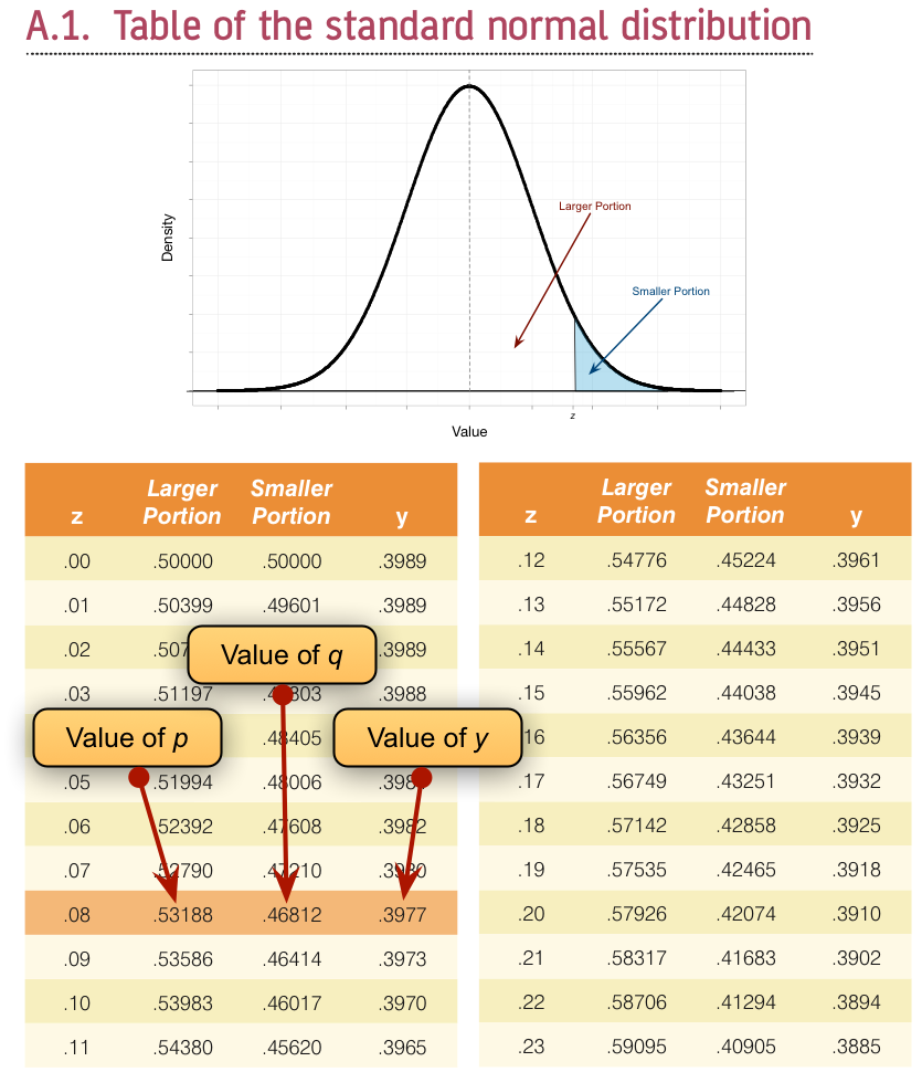
If we replace these values in the equation above we get .475 (see below), which is quite a lot higher than the value of the point-biserial correlation (.378). This finding just shows you that whether you assume an underlying continuum or not can make a big difference to the size of effect that you get:
\[ \begin{align} r_b &= \frac{r_\text{pb}\sqrt{pq}}{y}\\ &= \frac{0.378\sqrt{0.533 \times 0.467}}{0.3977}\\ &= 0.475. \end{align} \]
If this process freaks you out, you can also convert the point-biserial r to the biserial r using a table published by (Terrell, 1982) in which you can use the value of the point-biserial correlation (i.e., Pearson’s r) and p, which is just the proportion of people in the largest group (in the above example, .533). This spares you the trouble of having to work out y in the above equation (which you’re also spared from using). Using Terrell’s table we get a value in this example of .48, which is the same as we calculated to 2 decimal places.
To get the significance of the biserial correlation we need to first work out its standard error. If we assume the null hypothesis (that the biserial correlation in the population is zero) then the standard error is given by (Terrell, 1982) as
\[ SE_{r_\text{b}} = \frac{\sqrt{pq}}{y\sqrt{N}}. \]
This equation is fairly straightforward because it uses the values of p, q and y that we already used to calculate the biserial r. The only additional value is the sample size (N), which in this example was 60. So, our standard error is
\[ \begin{align} SE_{r_\text{b}} &= \frac{\sqrt{0.533 \times 0.467}}{0.3977\sqrt{60}} \\ &= 0.162. \end{align} \]
The standard error helps us because we can create a z-score. To get a z-score we take the biserial correlation, subtract the mean in the population and divide by the standard error. We have assumed that the mean in the population is 0 (the null hypothesis), so we can simply divide the biserial correlation by its standard error
\[ \begin{align} z_{r_\text{b}} &= \frac{r_b - \overline{r}_b}{SE_{r_\text{b}}} \\ &= \frac{r_b - 0}{SE_{r_\text{b}}} \\ &= \frac{.475-0}{.162} \\ &= 2.93. \end{align} \]
We can look up this value of z (2.93) in the table for the normal distribution in the Appendix and get the one-tailed probability from the column labelled Smaller Portion. In this case the value is .00169. To get the two-tailed probability we multiply this value by 2, which gives us .00338.
Chapter 8
No Oliver Twisted in this chapter.
Chapter 9
No Oliver Twisted in this chapter.
Chapter 10
Please Sir, can I have some more … centring?
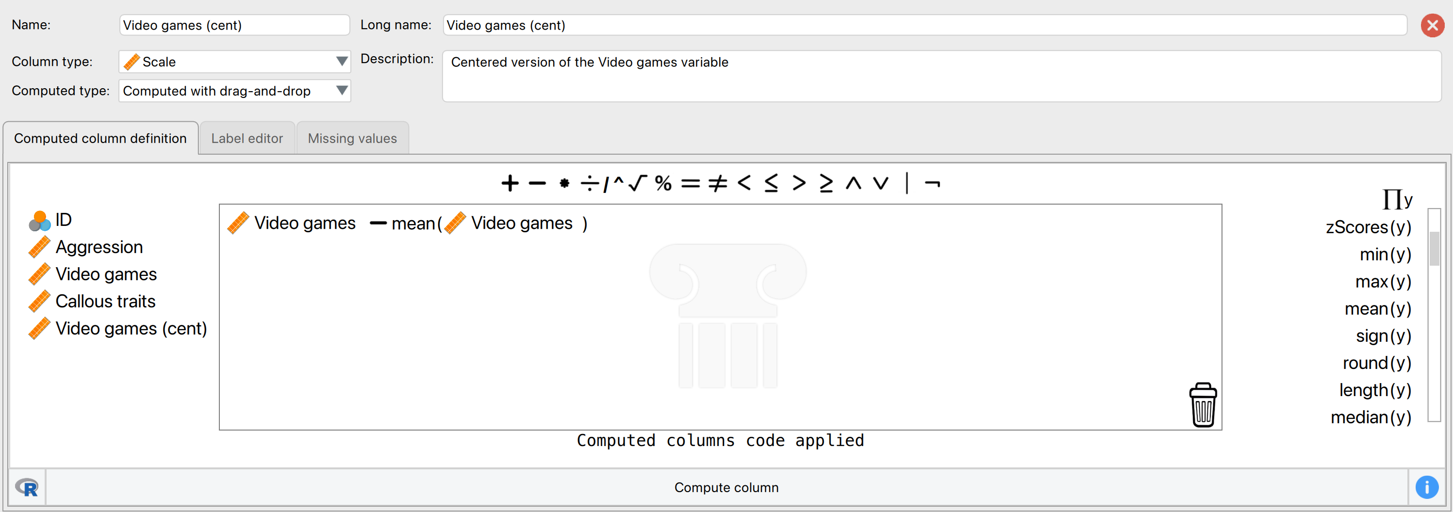
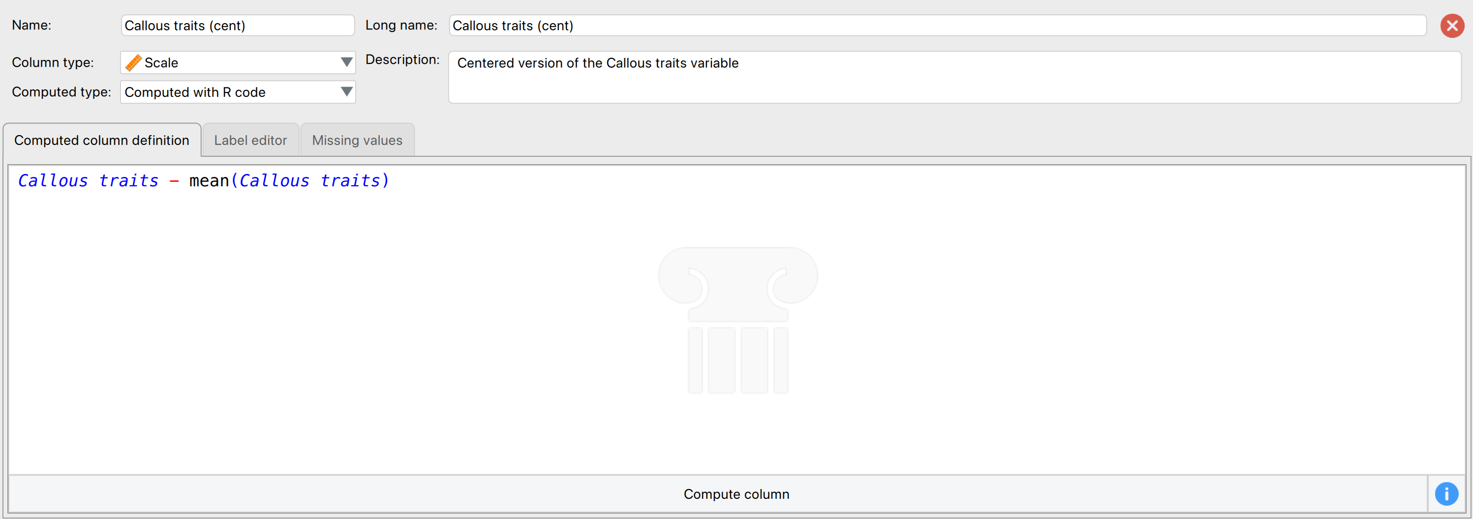
Grand mean centring is really easy: we can use JASP’s compute columns functionality that we encountered in the book. First, head over to the Data viewer and click on the Insert button in the top ribbon bar. Then, select Insert constructor column after and the column constructor interface will open up. Here, we want to compute a new variable based on Video games, which is going to be that variable, with its mean subtracted. First, make sure you have chosen an informative name for your new variable in top left box, and then you are ready to start computing the variable. To do so, first click on Video games from the list on the left, then select the “-” sign from the top menu, and then select the “Mean(y)” operator from the list on the right. The mean operator has a space for one column with values, and you can place a variable from the list on the left in its place (simply clicking on the variable after you have selected “Mean(y)” will also work). If your window looks like it does on Figure 2 below, you can press the Compute column button, and you will have successfully centred the Video games variable! A new variable will be created called Video games (cent), which is centred around the mean of the number of hours spent playing video games. The mean of this new variable should be approximately 0. There is also a .gif illustration of the process here.
You can follow the same steps for Callous traits. You can also centre both variables using R code by selecting Computed with R code and executing (for each variable separately):
Video games - mean(Video games)        # for centring Video games

Callous traits - mean(Callous traits)  # for centring Callous traits
Here is what the menu looks like for creating Callous traits (cent) using R code:
Chapter 11
Please, Sir, Can I have Some More … Welch’s F?
The (Welch, 1951) F-statistic is somewhat more complicated (hence why it’s stuck on the website). First we have to work out a weight that is based on the sample size, \(n_g\), and variance, \(s_g^2\), for a particular group
\[ w_g = \frac{n_g}{s_g^2}. \]
We also need to use a grand mean based on a weighted mean for each group. So we take the mean of each group, \({\overline{x}}_{g}\), and multiply it by its weight, \(w_g\), do this for each group and add them up, then divide this total by the sum of weights,
\[ \bar{x}_\text{Welch grand} = \frac{\sum{w_g\bar{x}_g}}{\sum{w_g}}. \]
The easiest way to demonstrate these calculations is using a table:
| Group | Variance (s2) | Sample size (\(n_g\)) | Weight (\(w_g\)) | Mean (\(\bar{x}_g\)) | Weight × Mean (\(w_g\bar{x}_g\)) |
|---|---|---|---|---|---|
| Control | 1.70 | 5 | 2.941 | 2.2 | 6.4702 |
| 15 Minutes | 1.70 | 5 | 2.941 | 3.2 | 9.4112 |
| 30 minutes | 2.50 | 5 | 2.000 | 5.0 | 10.000 |
| Σ = 7.882 | Σ = 25.8814 |
So we get
\[ \overline{x}_\text{Welch grand} = \frac{25.8814}{7.882} = 3.284. \]
Think back to equation 12.11 in the book, the model sum of squares was:
\[ \text{SS}_\text{M} = \sum_{g = 1}^{k}{n_g\big(\overline{x}_g - \overline{x}_\text{grand}\big)^2} \]
In Welch’s F this is adjusted to incorporate the weighting and the adjusted grand mean
\[ \text{SS}_\text{M Welch} = \sum_{n = 1}^{k}{w_g\big(\overline{x}_g - \overline{x}_\text{Welch grand}\big)^2}. \]
To create a mean square we divide by the degrees of freedom, \(k-1\),
\[ \text{MS}_\text{M Welch} = \frac{\sum{w_g\big(\bar{x}_g - \bar{x}_\text{Welch grand} \big)^2}}{k - 1}. \]
This gives us
\[ \text{MS}_\text{M Welch} = \frac{2.941( 2.2 - 3.284)^2 + 2.941( 3.2 - 3.284)^2 + 2(5 - 3.284)^2}{2}\ = 4.683 \]
We now have to work out a term called lambda, which is based again on the weights,
\[ \Lambda = \frac{3\sum\frac{\bigg(1 - \frac{w_g}{\sum{w_g}}\bigg)^2}{n_g - 1}}{k^2 - 1}. \]
This looks horrendous, but is based only on the sample size in each group, the weight for each group (and the sum of all weights), and the total number of groups, k. For the puppy data this gives us:
\[ \begin{align} \Lambda &= \frac{3\Bigg(\frac{\Big(1 - \frac{2.941}{7.882}\Big)^2}{5 - 1} + \frac{\Big( 1 - \frac{2.941}{7.882}\Big)^2}{5 - 1} + \frac{\Big( 1 - \frac{2}{7.882}\Big)^2}{5 - 1}\Bigg)}{3^2 - 1} \\ &= \frac{3(0.098 + 0.098 + 0.139)}{8} \\ &= 0.126 \end{align} \]
The F ratio is then given by:
\[ F_{W} = \frac{\text{MS}_\text{M Welch}}{1 + \frac{2\Lambda(k - 2)}{3}} \]
where k is the total number of groups. So, for the puppy therapy data we get:
\[ \begin{align} F_W &= \frac{4.683}{1 + \frac{(2 \times 0.126)(3 - 2)}{3}} \\ &= \frac{9.336}{1.084} \\ &= 4.32 \end{align} \]
As with the Brown–Forsythe F, the model degrees of freedom stay the same at \(k-1\) (in this case 2), but the residual degrees of freedom, \(df_R\), are \(\frac{1}{\Lambda}\) (in this case, 1/0.126 = 7.94).
Chapter 12
No Oliver Twisted in this chapter.
Chapter 13
Please, Sir, can I have some more … simple effects?
A simple main effect (usually called a simple effect) is the effect of one variable at levels of another variable. In the book we computed the simple effect of ratings of attractive and unattractive faces at each level of dose of alcohol (see the book for details of the example). Let’s look at how tp calculate these simple effects. In the book, we saw that the model sum of squares is calculated using:
\[ \text{SS}_\text{M} = \sum_{g = 1}^{k}{n_g\big(\bar{x}_g - \bar{x}_\text{grand}\big)^2} \]
We group the data by the amount of alcohol drunk (the first column within each block are the scores for attractive faces and thes econd column the scores for unattractive faces):

Within each of these three groups, we calculate the overall mean (shown in the figure) and the mean rating of attractive and unattractive faces separately:
| Alcohol | Type of Face | Mean |
|---|---|---|
| Placebo | Unattractive | 3.500 |
| Placebo | Attractive | 6.375 |
| Low dose | Unattractive | 4.875 |
| Low dose | Attractive | 6.500 |
| High dose | Unattractive | 6.625 |
| High dose | Attractive | 6.125 |
For simple effects of face type at each level of alcohol we’d begin with the placebo and calculate the model sum of squares. The grand mean becomes the mean for all scores in the placebo group and the group means are the mean ratings of attractive and unattractive faces.
We can then apply the model sum of squares equation that we used for the overall model but using the grand mean of the placebo group (4.938) and the mean ratings of unattractive (3.500) and attractive (6.375) faces:
\[ \begin{align} \text{SS}_\text{Face, Placebo} &= \sum_{g = 1}^{k}{n_g\big(\bar{x}_g - \bar{x}_\text{grand}\big)^2} \\ &= 8(3.500 - 4.938)^2 + 8(6.375 - 4.938)^2 \\ &= 33.06 \end{align} \]
The degrees of freedom for this effect are calculated the same way as for any model sum of squares; they are one less than the number of conditions being compared (\(k-1\)), which in this case, where we’re comparing only two conditions, will be 1.
We do the same for the low-dose group. We use the grand mean of the low-dose group (5.688) and the mean ratings of unattractive and attractive faces,
\[ \begin{align} \text{SS}_\text{Face, Low dose} &= \sum_{g = 1}^{k}{n_g\big(\bar{x}_g - \bar{x}_\text{grand}\big)^2} \\ &= 8(4.875 - 5.688)^2 + 8(6.500 - 5.688)^2 \\ &= 10.56 \end{align} \]
The degrees of freedom are again \(k-1\) = 1.
Next, we do the same for the high-dose group. We use the grand mean of the high-dose group (6.375) and the mean ratings of unattractive and attractive faces,
\[ \begin{align} \text{SS}_\text{Face, High dose} &= \sum_{g = 1}^{k}{n_g\big(\bar{x}_g - \bar{x}_\text{grand}\big)^2} \\ &= 8(6.625 - 6.375)^2 + 8(6.125 - 6.375)^2 \\ &= 1. \end{align} \]
Again, the degrees of freedom are 1 (because we’ve compared two groups).
We need to convert these sums of squares to mean squares by dividing by the degrees of freedom but because all of these sums of squares have 1 degree of freedom, the mean squares are the same as the sum of squares. The final stage is to calculate an F-statistic for each simple effect by dividing the mean squares for the model by the residual mean squares. When conducting simple effects we use the residual mean squares for the original model (the residual mean squares for the entire model). In doing so we partition the model sums of squares and keep control of the Type I error rate. For these data, the residual sum of squares was 1.37 (see the book chapter). Therefore, we get:
\[ \begin{align} F_\text{FaceType, Placebo} &= \frac{\text{MS}_\text{Face, Placebo}}{\text{MS}_\text{R}} = \frac{33.06}{1.37} = 24.13 \\ F_\text{FaceType, Low dose} &= \frac{\text{MS}_\text{Face, Low dose}}{\text{MS}_\text{R}} = \frac{10.56}{1.37} = 7.71 \\ F_\text{FaceType, High dose} &= \frac{\text{MS}_\text{Face, High dose}}{\text{MS}_\text{R}} = \frac{1}{1.37} = 0.73 \end{align} \]
These values match those (approximately) in Output 13.6 in the book.
Please Sir, Can I … customize my model?
Different types of sums of squares
In the sister book on R (Field, 2025), I needed to explain sums of squares because, unlike JASP, R does not routinely use Type III sums of squares. Here’s an adaptation of what I wrote:
We can compute sums of squares in four different ways, which gives rise to what are known as Type I, II, III and IV sums of squares. To explain these, we need an example. Let’s use the example from the chapter: we’re predicting attractiveness from two predictors, facetype (attractive or unattractive facial stimuli) and alcohol (the dose of alcohol consumed) and their interaction (facetype × alcohol).
The simplest explanation of Type I sums of squares is that they are like doing a hierarchical regression in which we put one predictor into the model first, and then enter the second predictor. This second predictor will be evaluated after the first. If we entered a third predictor then this would be evaluated after the first and second, and so on. In other words the order that we enter the predictors matters. Therefore, if we entered our variables in the order facetype, alcohol and then facetype × alcohol, then alcohol would be evaluated after the effect of facetype and facetype × alcohol would be evaluated after the effects of both facetype and alcohol.
Type III sums of squares differ from Type I in that all effects are evaluated taking into consideration all other effects in the model (not just the ones entered before). This process is comparable to doing a forced entry regression including the covariate(s) and predictor(s) in the same block. Therefore, in our example, the effect of alcohol would be evaluated after the effects of both facetype and facetype × alcohol, the effect of facetype would be evaluated after the effects of both alcohol and facetype × alcohol, finally, facetype × alcohol would be evaluated after the effects of both alcohol and facetype.
Type II sums of squares are somewhere in between Type I and III in that all effects are evaluated taking into consideration all other effects in the model except for higher-order effects that include the effect being evaluated. In our example, this would mean that the effect of alcohol would be evaluated after the effect of facetype (note that unlike Type III sums of squares, the interaction term is not considered); similarly, the effect of facetype would be evaluated after only the effect of alcohol. Finally, because there is no higher-order interaction that includes facetype × alcohol this effect would be evaluated after the effects of both alcohol and facetype. In other words, for the highest-order term Type II and Type III sums of squares are the same.
The obvious question is which type of sums of squares should you use:
-
Type I: Unless the variables are completely independent of each other (which is unlikely to be the case) then Type I sums of squares cannot really evaluate the true main effect of each variable. For example, if we enter
facetypefirst, its sums of squares are computed ignoringalcohol; therefore any variance inattractivenessthat is shared byalcoholandfacetypewill be attributed tofacetype(i.e., variance that it shares withalcoholis attributed solely to it). The sums of squares foralcoholwill then be computed excluding any variance that has already been ‘given over’ tofacetype. As such the sums of squares won’t reflect the true effect ofalcoholbecause variance in attractiveness thatalcoholshares withfacetypeis not attributed to it because it has already been ‘assigned’ tofacetype. Consequently, Type I sums of squares tend not to be used to evaluate hypotheses about main effects and interactions because the order of predictors will affect the results. - Type II: If you’re interested in main effects then you should use Type II sums of squares. Unlike Type III sums of squares, Type IIs give you an accurate picture of a main effect because they are evaluated ignoring the effect of any interactions involving the main effect under consideration. Therefore, variance from a main effect is not ‘lost’ to any interaction terms containing that effect. If you are interested in main effects and do not predict an interaction between your main effects then these tests will be the most powerful. However, if an interaction is present, then Type II sums of squares cannot reasonably evaluate main effects (because variance from the interaction term is attributed to them). However, if there is an interaction then you shouldn’t really be interested in main effects anyway. One advantage of Type II sums of squares is that they are not affected by the type of contrast coding used to specify the predictor variables.
- Type III: Type III sums of squares tend to get used as the default in JASP. They have the advantage over Type IIs in that when an interaction is present, the main effects associated with that interaction are still meaningful (because they are computed taking the interaction into account). Perversely, this advantage is a disadvantage too because it’s pretty silly to entertain ‘main effects’ as meaningful in the presence of an interaction. Type III sums of squares encourage people to do daft things like get excited about main effects that are superseded by a higher-order interaction. Type III sums of squares are preferable to other types when sample sizes are unequal; however, they work only when predictors are encoded with orthogonal contrasts.
Hopefully, it should be clear that the main choice in ANOVA designs is between Type II and Type III sums of squares. The choice depends on your hypotheses and which effects are important in your particular situation. If your main hypothesis is around the highest order interaction then it doesn’t matter which you choose (you’ll get the same results); if you don’t predict an interaction and are interested in main effects then Type II will be most powerful; and if you have an unbalanced design then use Type III. This advice is, of course, a simplified version of reality; be aware that there is (often heated) debate about which sums of squares are appropriate to a given situation.
Customizing the model and sums of squares Type in JASP
By default JASP conducts a full factorial analysis (i.e., it includes all of the main effects and interactions of all independent variables specified in the main menu). However, there may be times when you want to customize the model that you use to test for certain things, which can be done by navigating to the Model tab and removing some of the model terms from the box labelled Model Terms. You can add the variables back into your model by dragging components from the left box to the box on the right. For example, you could select facetype and alcohol (you can select both of them at the same time by holding down Ctrl or ⌘ on a Mac). Having done this, drag them to the box labelled Model Terms. If you selected multiple variables at the same time (as you hopefully did), JASP will automatically include all their interaction effects. Although model selection has important uses, it is likely that you’d want to run the full factorial analysis on most occasions and so wouldn’t customize your model.
We looked above at the differences between the various sums of squares. As already discussed, JASP uses Type III sums of squares by default, which have the advantage that they are invariant to the cell frequencies. As such, they can be used with both balanced and unbalanced (i.e., different numbers of participants in different groups) designs. However, if you have any missing data in your design, you should change the sums of squares to Type IV (unfortunately not yet available in JASP, and JASP just omits incomplete observations). At the bottom of the Model tab you can select which type of sums of squares you want to use.
Chapter 14
Please, Sir, can I have some more … sphericity?
Field, A. P. (1998). A bluffer’s guide to sphericity. Newsletter of the Mathematical, Statistical and Computing Section of the British Psychological Society, 6, 13–22.
Please, Sir, can I have some more … normalization?
Confidence intervals (CIs) are essential in presenting psychological data as they allow researchers to gauge the amount of uncertainty in their results. Loftus & Masson (1994) introduced a method for calculating CIs in within-subjects designs based on the ANOVA mean squared error (MSE). This method is widely used because it yields confidence intervals that reflect the expected variability in the data without contamination from individual participant variance.
Cousineau (2005) proposed an alternative method for constructing confidence intervals that involves normalizing the data. The normalization process involves subtracting each participant’s mean performance from each observation and then adding the grand mean score to each observation. In within-subjects designs, each participant is measured under multiple conditions. Participant variability refers to the differences in performance that are due to individual differences rather than the experimental conditions. The normalization proposed by Cousineau helps to remove the influence of these individual differences, allowing the analysis to focus on the effect of the experimental conditions themselves.
However, there is a significant issue with Cousineau’s method: it produces confidence intervals that are smaller than those obtained using Loftus and Masson’s method. The reason for this discrepancy is that normalizing scores induces positive covariance between scores within a condition. This positive covariance reduces the observed variance, leading to confidence intervals that are biased low.
To correct this bias, Morey (2008) suggests a simple adjustment. By multiplying the sample variances of the normalized data by \(\frac{M}{M-1}\), where \(M\) is the number of within-subject conditions, the size of the confidence intervals can be brought into line with those obtained using Loftus and Masson’s method. This correction ensures that the expected size of Cousineau’s confidence intervals do not understate the uncertainty in the data.
Please, Sir, can I have some more … mixing?
In order to illustrate how a mixed ANOVA works, we use a subset of the data reported by Ryan et al. (2013). This data set, “Bugs”, provides the extent to which men and women want to kill arthropods that vary in frighteningness (low, high) and disgustingness (low, high). Each participant rates their attitudes towards all anthropods. As we will see, a mixed ANOVA is simply a Repeated Measures ANOVA where we also specify a Between Subjects Factor - it is therefore a mix of within and between subjects predictors.
In the data set (ryan_2013.jasp), we have the following variables:
- Gender - Participant’s gender (Woman, Man).
- Lo D, Lo F - Desire to kill an artrhopod with low frighteningness and low disgustingness.
- Lo D, Hi F - Desire to kill an artrhopod with low frighteningness and high disgustingness.
- Hi D, Lo F - Desire to kill an artrhopod with high frighteningness and low disgustingness.
- Hi D, Hi F - Desire to kill an artrhopod with high frighteningness and high disgustingness.
The desire to kill an arthropod was indicated on a scale from 0 to 10. For a more detailed description of the study (including pictures of the different arthropods, but please do so at your own risk) see Ryan et al. (2013). We will test the relation between hostility towards insects and their disgustingness and frighteningness for men and woman separately.
Now that we have three categorical predictors, we can enter the fun world of three-way interactions! Remember that a two-way interaction describes how one variable (e.g., frighteningness) might determine the effect of another variable (e.g., disgustingness). In this case, people might only want to kill highly disgusting insects when they are also highly frightening, but not when they are not frightening. A three-way interaction effect takes this one step further, and means that a two-way interaction is determined by a third variable. In this case, it could be the case that there is an interaction between frighteningness and disgustingness for men, but not for women. In other words, men would only kill a disgusting bug when it’s also highly frightening, but women would have the same desire to kill a frightening/disgusting bug as they would kill a non-frightening/disgusting bug. Is your head already spinning?
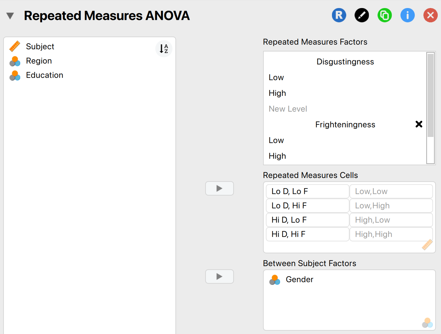
In order to run a Mixed ANOVA in JASP, we follow exactly the same steps as for a Repeated Measures ANOVA. Since we have two repeated measures (Frighteningness and Disgustingness), we follow the same steps as in Chapter 14.13 (p563. Factorial repeated-measures designs using JASP) for specifying the repeated measures structure. After that has been done, also drag the between subjects factor (Gender) into the box labelled Between Subjects Factor. The finished menu should look as follows:
You can also look at the options and results in ryan_2013.jasp, or view the results directly in your browser here.
As you can see, JASP now has enough information to do some analyzing already, and you will see some ANOVA tables in the output panel. The first ANOVA table lists all of the Within Subject Effects. Due to the nature of the Mixed ANOVA, we always have to include the interaction effects between the within subjects factors and the between subjects factors. For instance, we see results for the main effect of Disgustingness, but also its interaction effect with Gender. In this table we see that there is a significant main effect for both Disgustingness and Frighteningness, the two-way interaction between Disgustingness and Frighteningness, and the three-way interaction effect between Disgustingness, Frighteningness, and Gender. The table below it lists the Between Subjects Effects and contains the information needed to assess the main effect of Gender, which is not significant. We could report these effects as follows:
- A three-way ANOVA with gender as the between-subject factor and disgustingness (high vs. low) and frighteningness type (high vs. low) as the within-subject factors yielded a significant main effect of disgustingness, F(1, 85) = 12.06, p < .001, and frighteningness, F(1, 85) = 32.12, p < .001. Additionally, significant interactions were found between disgustingness and frighteningness, F(1, 85) = 4.69, p = .033, and, most important, disgustingness × frighteningness × gender, F(1, 85) = 4.69, p = .033. The remaining main effect and interactions were not significant.
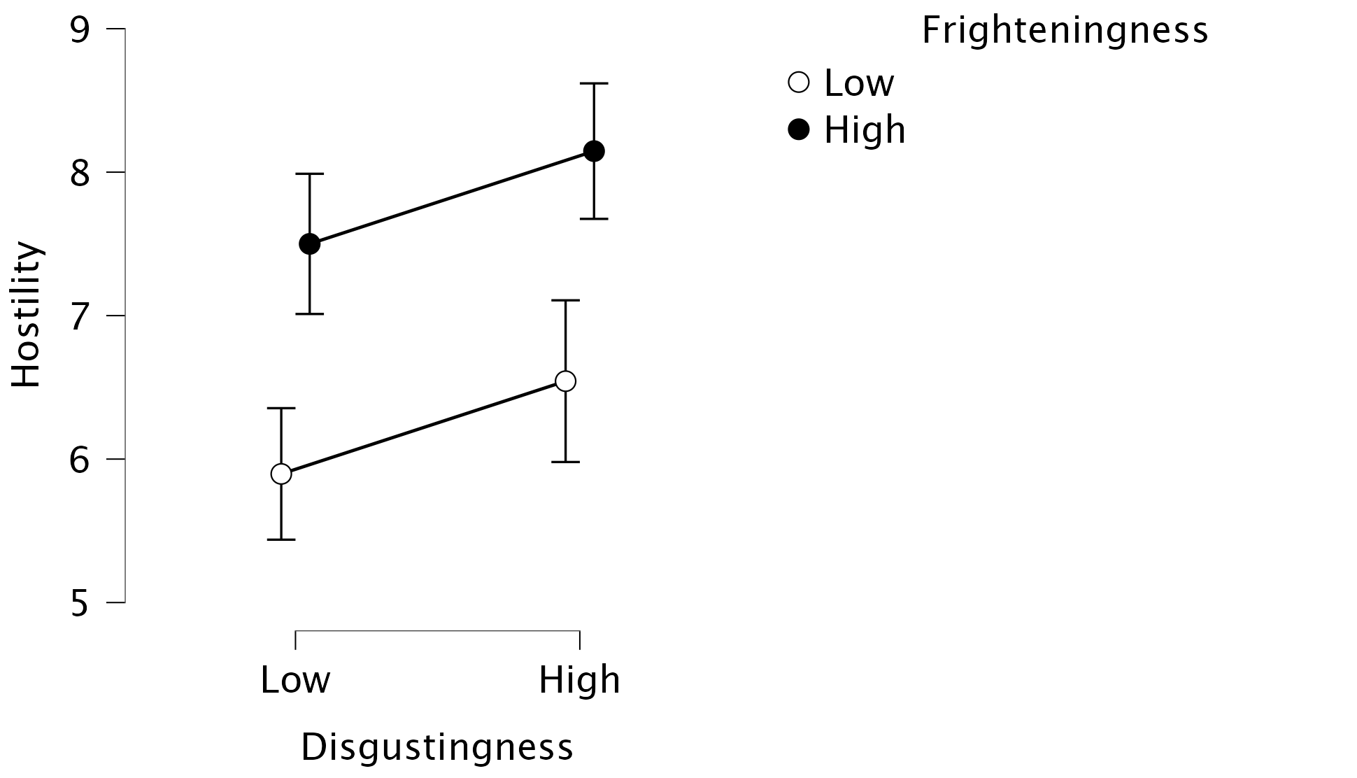
To make more sense of the interactions, we can apply the same tools as described in Chapters 13 and 14, such as diving into Descriptives plots. First, we can visualize the main effects of, and the interaction between, Disgustingness and Frighteningness by setting Disgustingness on the Horizontal Axis and Frighteningness as Separate Lines. The resulting plot shows that especially High Frighteningness has an increased hostility, but that High Disgustingness also sees an increase in hostility (if you are having trouble seeing the main effects from this plot, you can also only add one of the factors on the Horizontal Axis). As for the interaction effect, we can see that the effect of Disgustingness is mostly present for insects that score low on Disgustingness:
To pick apart the three-way interaction we can dive even deeper into the Descriptives Plots. To visualize the three-way interaction, we can specify Disgustingness on the Horizontal Axis and Frighteningness as Separate Lines, and Gender as Separate Plots. This produces the same plot as Figure 5, but now separate for each gender! The resulting plots look as follows:
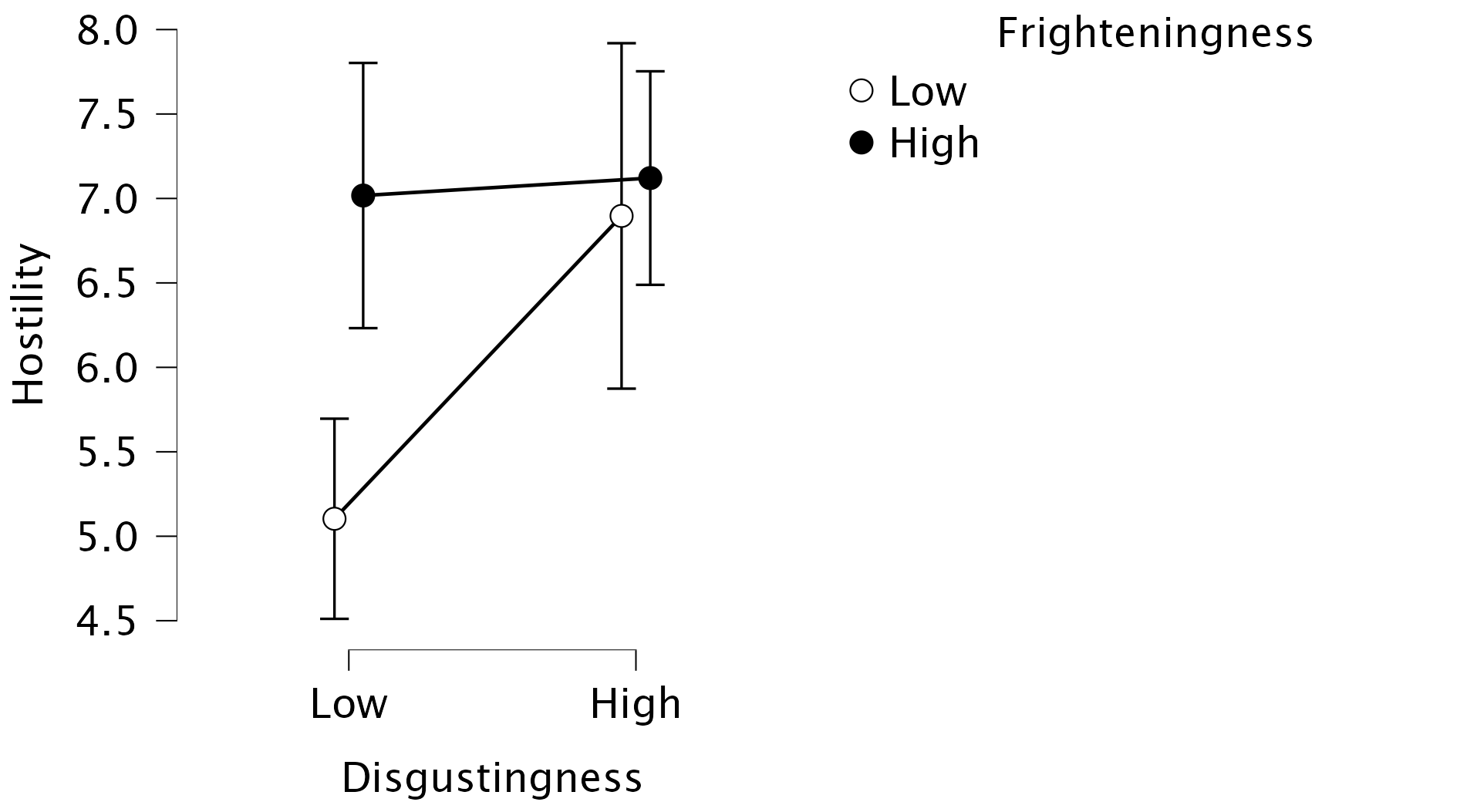
The plot shows the nature of the three-way interaction that was indicated by the hypothesis test: there seems to be no interaction effect between Frighteningness and Disgustingness for women (i.e., parallel lines), while there appears some interaction for men (i.e., non-parallel lines). Note that you are free to change the specific assignments (e.g., Frighteningness on the Horizontal Axis and Disgustingness as Separate Lines), as long as you pay attention to what variable is where.
Lastly, there is a jungle of Post Hoc Tests that you can look at to get some more formal significance tests to investigate where the group differences lie. In the Post Hoc Tests tab, drag the interaction effects to the box on the right-hand side, and make sure to toggle Conditional comparisons for interactions. You will be bombarded with many different types of Post Hoc Tests, that will inform you if (for instance) there is a difference in hostility between high and low frighteningness for men and women separately. Let’s take a look at the table that dissects the three-way interaction, conditional on Gender:
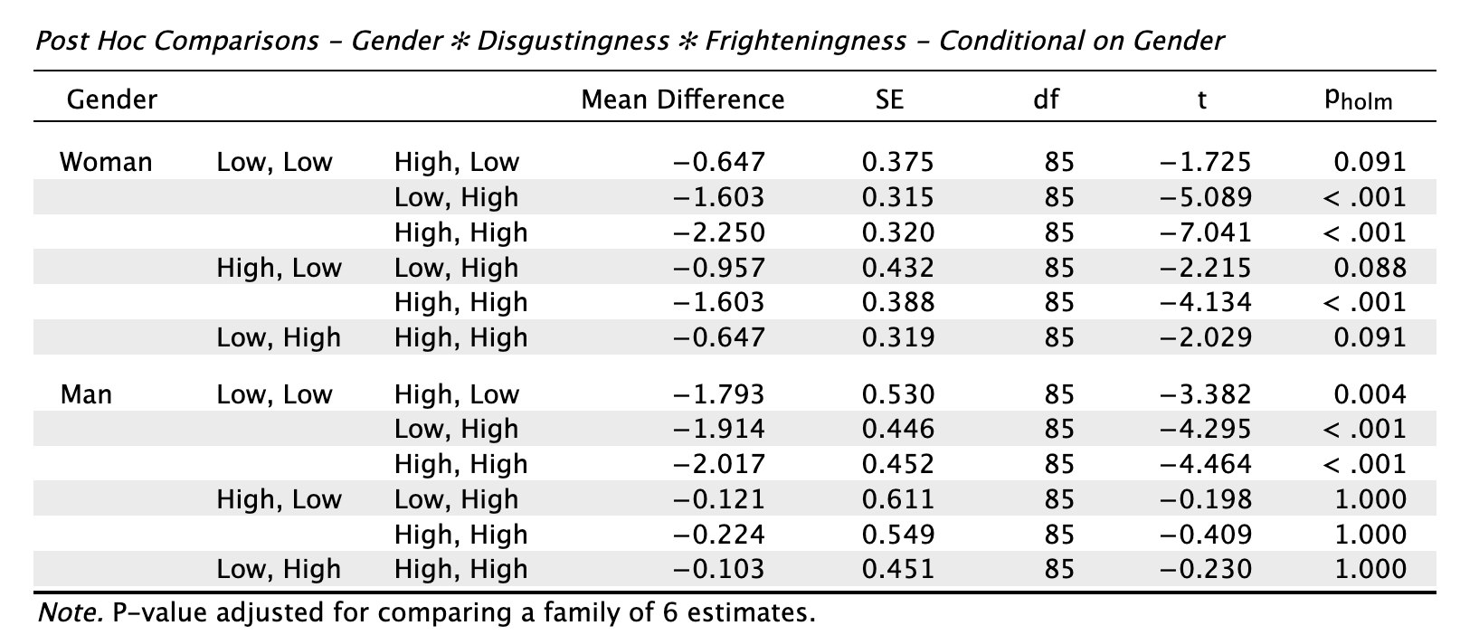
Here we get various comparisons, for men and women separately. What we can see, for instance, is that for both genders, there is a difference in hostility towards insects that score low on disgustingness and low on frighteningness, and insects that score low on disgustingness and high on frighteningness (2nd row; t = -5.089, p < 0.001 for women, t = -4.295, p < 0.001 for men).
Where the genders differ, however, is that women show a difference in hostility towards insects that score high on disgustingness and low on frighteningness, and insects that score high on disgustingness and high on frighteningness (5th row; t = -4.134, p < 0.001). This difference is not shown for men, who have similar levels of hostility towards both types of insects (t = -0.409, p = 1)
These tests tell similar stories as the descriptives plots but in a more convoluted way, which is why I strongly recommend to start with visualizing your results when dealing with three-way interactions, and why this should also serve as a cautionary tale to think very carefully before venturing into four-way interactions and beyond, because it will get harder and harder to properly understand what your effects substantively represent.
Chapter 15
No Oliver Twisted in this chapter
Chapter 16
No Oliver Twisted in this chapter
Chapter 17
No Oliver Twisted in this chapter