Labcoat Leni

Leni is a budding young scientist and he’s fascinated by real research. He says, ‘Andy, I like an example about using an eel as a cure for constipation as much as the next guy, but all of your data are made up. We need some real examples, buddy!’ Leni walked the globe, a lone data warrior in a thankless quest for real data. When Leni appears in Discovering Statistics Using JASP he brings with him real data, from a real research study, to analyse. These examples let you practice your JASP skills on real data from published research studies. This page has the solutions to these tasks.
Keep it real.
Chapter 1
Is Friday 13th unlucky?
Let’s begin with accidents and poisoning on Friday the 6th. First, arrange the scores in ascending order: 1, 1, 4, 6, 9, 9.
The median will be the (n + 1)/2th score. There are 6 scores, so this will be the 7/2 = 3.5th. The 3.5th score in our ordered list is half way between the 3rd and 4th scores which is (4+6)/2= 5 accidents.
The mean is 5 accidents:
\[ \begin{align} \bar{X} &= \frac{\sum_{i = 1}^{n}x_i}{n} \\ &= \frac{1 + 1 + 4 + 6 + 9 + 9}{6} \\ &= \frac{30}{6} \\ &= 5 \end{align} \]
The lower quartile is the median of the lower half of scores. If we split the data in half, there will be 3 scores in the bottom half (lowest scores) and 3 in the top half (highest scores). The median of the bottom half will be the (3+1)/2 = 2nd score below the mean. Therefore, the lower quartile is 1 accident.
The upper quartile is the median of the upper half of scores. If we again split the data in half and take the highest 3 scores, the median will be the (3+1)/2 = 2nd score above the mean. Therefore, the upper quartile is 9 accidents.
The interquartile range is the difference between the upper and lower quartiles: 9 − 1 = 8 accidents.
To calculate the sum of squares, first take the mean from each score, then square this difference, and finally, add up these squared values:
| Score | Error (Score − Mean) |
Error Squared |
|---|---|---|
| 1 | –4 | 16 |
| 1 | –4 | 16 |
| 4 | –1 | 1 |
| 6 | 1 | 1 |
| 9 | 4 | 16 |
| 9 | 4 | 16 |
So, the sum of squared errors is: 16 + 16 + 1 + 1 + 16 + 16 = 66.
The variance is the sum of squared errors divided by the degrees of freedom (N − 1):
\[ s^{2} = \frac{\text{sum of squares}}{N- 1} = \frac{66}{5} = 13.20 \]
The standard deviation is the square root of the variance:
\[ s = \sqrt{\text{variance}} = \sqrt{13.20} = 3.63 \]
Next let’s look at accidents and poisoning on Friday the 13th. First, arrange the scores in ascending order: 5, 5, 6, 6, 7, 7.
The median will be the (n + 1)/2th score. There are 6 scores, so this will be the 7/2 = 3.5th. The 3.5th score in our ordered list is half way between the 3rd and 4th scores which is (6+6)/2 = 6 accidents.
The mean is 6 accidents:
\[ \begin{align} \bar{X} &= \frac{\sum_{i = 1}^{n}x_{i}}{n} \\ &= \frac{5 + 5 + 6 + 6 + 7 + 7}{6} \\ &= \frac{36}{6} \\ &= 6 \\ \end{align} \]
The lower quartile is the median of the lower half of scores. If we split the data in half, there will be 3 scores in the bottom half (lowest scores) and 3 in the top half (highest scores). The median of the bottom half will be the (3+1)/2 = 2nd score below the mean. Therefore, the lower quartile is 5 accidents.
The upper quartile is the median of the upper half of scores. If we again split the data in half and take the highest 3 scores, the median will be the (3+1)/2 = 2nd score above the mean. Therefore, the upper quartile is 7 accidents.
The interquartile range is the difference between the upper and lower quartiles: 7 − 5 = 2 accidents.
To calculate the sum of squares, first take the mean from each score, then square this difference, finally, add up these squared values:
| Score | Error (Score − Mean) |
Error Squared |
|---|---|---|
| 7 | 1 | 1 |
| 6 | 0 | 0 |
| 5 | –1 | 1 |
| 5 | –1 | 1 |
| 7 | 1 | 1 |
| 6 | 0 | 0 |
So, the sum of squared errors is: 1 + 0 + 1 + 1 + 1 + 0 = 4.
The variance is the sum of squared errors divided by the degrees of freedom (N − 1):
\[ s^{2} = \frac{\text{sum of squares}}{N - 1} = \frac{4}{5} = 0.8 \]
The standard deviation is the square root of the variance:
\[ s = \sqrt{\text{variance}} = \sqrt{0.8} = 0.894 \]
Next, let’s look at traffic accidents on Friday the 6th. First, arrange the scores in ascending order: 3, 5, 6, 9, 11, 11.
The median will be the (n + 1)/2th score. There are 6 scores, so this will be the 7/2 = 3.5th. The 3.5th score in our ordered list is half way between the 3rd and 4th scores. The 3rd score is 6 and the 4th score is 9. Therefore the 3.5th score is (6+9)/2 = 7.5 accidents.
The mean is 7.5 accidents:
\[ \begin{align} \bar{X} &= \frac{\sum_{i = 1}^{n}x_{i}}{n} \\ &= \frac{3 + 5 + 6 + 9 + 11 + 11}{6} \\ &= \frac{45}{6} \\ &= 7.5 \end{align} \]
The lower quartile is the median of the lower half of scores. If we split the data in half, there will be 3 scores in the bottom half (lowest scores) and 3 in the top half (highest scores). The median of the bottom half will be the (3+1)/2 = 2nd score below the mean. Therefore, the lower quartile is 5 accidents.
The upper quartile is the median of the upper half of scores. If we again split the data in half and take the highest 3 scores, the median will be the (3+1)/2 = 2nd score above the mean. Therefore, the upper quartile is 11 accidents.
The interquartile range is the difference between the upper and lower quartiles: 11 − 5 = 6 accidents.
To calculate the sum of squares, first take the mean from each score, then square this difference, finally, add up these squared values:
| Score | Error (Score − Mean) |
Error Squared |
|---|---|---|
| 9 | 1.5 | 2.25 |
| 6 | –1.5 | 2.25 |
| 11 | 3.5 | 12.25 |
| 11 | 3.5 | 12.25 |
| 3 | –4.5 | 20.25 |
| 5 | –2.5 | 6.25 |
So, the sum of squared errors is: 2.25 + 2.25 + 12.25 + 12.25 + 20.25 + 6.25 = 55.5.
The variance is the sum of squared errors divided by the degrees of freedom (N − 1):
\[ s^{2} = \frac{\text{sum of squares}}{N - 1} = \frac{55.5}{5} = 11.10 \]
The standard deviation is the square root of the variance:
\[ s = \sqrt{\text{variance}} = \sqrt{11.10} = 3.33 \]
Finally, let’s look at traffic accidents on Friday the 13th. First, arrange the scores in ascending order: 4, 10, 12, 12, 13, 14.
The median will be the (n + 1)/2th score. There are 6 scores, so this will be the 7/2 = 3.5th. The 3.5th score in our ordered list is half way between the 3rd and 4th scores. The 3rd score is 12 and the 4th score is 12. Therefore the 3.5th score is (12+12)/2= 12 accidents.
The mean is 10.83 accidents:
\[ \begin{align} \bar{X} &= \frac{\sum_{i = 1}^{n}x_{i}}{n} \\ &= \frac{4 + 10 + 12 + 12 + 13 + 14}{6} \\ &= \frac{65}{6} \\ &= 10.83 \end{align} \]
The lower quartile is the median of the lower half of scores. If we split the data in half, there will be 3 scores in the bottom half (lowest scores) and 3 in the top half (highest scores). The median of the bottom half will be the (3+1)/2 = 2nd score below the mean. Therefore, the lower quartile is 10 accidents.
The upper quartile is the median of the upper half of scores. If we again split the data in half and take the highest 3 scores, the median will be the (3+1)/2 = 2nd score above the mean. Therefore, the upper quartile is 13 accidents.
The interquartile range is the difference between the upper and lower quartile: 13 − 10 = 3 accidents.
To calculate the sum of squares, first take the mean from each score, then square this difference, finally, add up these squared values:
| Score | Error (Score − Mean) |
Error Squared |
|---|---|---|
| 4 | –6.83 | 46.65 |
| 10 | –0.83 | 0.69 |
| 12 | 1.17 | 1.37 |
| 12 | 1.17 | 1.37 |
| 13 | 2.17 | 4.71 |
| 14 | 3.17 | 10.05 |
So, the sum of squared errors is: 46.65 + 0.69 + 1.37 + 1.37 + 4.71 + 10.05 = 64.84.
The variance is the sum of squared errors divided by the degrees of freedom (N − 1):
\[ s^{2} = \frac{\text{sum of squares}}{N- 1} = \frac{64.84}{5} = 12.97 \]
The standard deviation is the square root of the variance:
\[ s = \sqrt{\text{variance}} = \sqrt{12.97} = 3.6 \]
Chapter 2
No Labcoat Leni in this chapter.
Chapter 3
Researcher degrees of freedom: a sting in the tale
No solution required.
Chapter 4
Gonna be a rock ‘n’ roll singer
Data from Oxoby (2008).
Using a task from experimental economics called the ultimatum game, individuals are assigned the role of either proposer or responder and paired randomly. Proposers were allocated $10 from which they had to make a financial offer to the responder (i.e., $2). The responder can accept or reject this offer. If the offer is rejected neither party gets any money, but if the offer is accepted the responder keeps the offered amount (e.g., $2), and the proposer keeps the original amount minus what they offered (e.g., $8). For half of the participants the song ‘It’s a long way to the top’ sung by Bon Scott was playing in the background; for the remainder ‘Shoot to thrill’ sung by Brian Johnson was playing. Oxoby measured the offers made by proposers, and the minimum accepted by responders (called the minimum acceptable offer). He reasoned that people would accept lower offers and propose higher offers when listening to something they like (because of the ‘feel-good factor’ the music creates). Therefore, by comparing the value of offers made and the minimum acceptable offers in the two groups he could see whether people have more of a feel-good factor when listening to Bon or Brian. These data are estimated from Figures 1 and 2 in the paper because I couldn’t get hold of the author to get the original data files. The offers made (in dollars) are as follows (there were 18 people per group):
Bon Scott group: 1, 2, 2, 2, 2, 3, 3, 3, 3, 3, 4, 4, 4, 4, 4, 5, 5, 5
Brian Johnson group: 2, 3, 3, 3, 3, 3, 4, 4, 4, 4, 4, 5, 5, 5, 5, 5, 5, 5
Enter these data into the JASP data editor, remembering to include value labels, to set the measure property, to give each variable a proper label, and to set the appropriate number of decimal places. My version of how this file should look can be found in acdc.jasp and the first 20 rows should look like this:

Chapter 5
No Labcoat Lenis in this chapter.
Chapter 6
No Labcoat Lenis in this chapter.
Chapter 7
Why do you like your lecturers?
Data from Chamorro-Premuzic et al. (2008).
We can run this analysis by loading the file and just pretty much selecting everything in the variable list and running a Pearson correlation.
The results and settings can be found in the file leni_07.jasp. The results can be viewed in your browser here.
This looks pretty horrendous, but there are a lot of correlations that we don’t need (Tip: try the Display pairiwse option - it might give you a slightly smaller headache). We’re interested only in the correlations between students’ personality and what they want in lecturers. We’re not interested in how their own five personality traits correlate with each other (i.e. if a student is neurotic are they conscientious too?). If you round these values to 2 decimal places they replicated the values reported in the original research paper (part of the authors’ table is below so you can see how they reported these values – match these values to the values in your output):
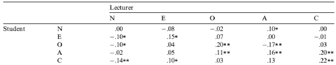
As for what we can conclude, neurotic students tend to want agreeable lecturers, r = .10, p = .041; extroverted students tend to want extroverted lecturers, r = .15, p = .010; students who are open to experience tend to want lecturers who are open to experience, r = .20, p < .001, and don’t want agreeable lecturers, r = −.16, p < .001; agreeable students want every sort of lecturer apart from neurotic. Finally, conscientious students tend to want conscientious lecturers, r = .22, p < .001, and extroverted ones, r = .10, p = .09 (note that the authors report the one-tailed p-value), but don’t want neurotic ones, r = −.14, p = .005. All of these correlations are quite weak, despite being significant.
Chapter 8
I want to be loved (on Facebook)
Data from Ong et al. (2011).
The first linear model looks at whether narcissism predicts, above and beyond the other variables, the frequency of status updates. To do this, drag the outcome variable status to the Dependent Variable box, then drag the variables age, grade, extraversion, and narcissism to the Covariates box, and the variable sex to the Factors box. Then, under the Model tab, define the three models as follows. In Model 0, put age, sex and grade. In Model 1 add extraversion, and then in Model 2 add narcissism.
The results and settings can be found in the file leni_08a.jasp. The results can be viewed in your browser here.
So basically, Ong et al.’s prediction was supported in that after adjusting for age, grade and sex, narcissism significantly predicted the frequency of Facebook status updates over and above extroversion. The positive standardized beta value (.21) indicates a positive relationship between frequency of Facebook updates and narcissism, in that more narcissistic adolescents updated their Facebook status more frequently than their less narcissistic peers did. Compare these results to the results reported in Ong et al. (2011). The Table 2 from their paper is reproduced at the end of this task below.
OK, now let’s fit the second model to investigate whether narcissism predicts, above and beyond the other variables, the Facebook profile picture ratings. Drag the outcome variable profile to the Dependent Variable box, then define the three blocks as follows. In the first block put age, sex and grade, then in Model 1 add extraversion, and finally in Model 2 add narcissism.
The results show that after adjusting for age, grade and sex, narcissism significantly predicted the Facebook profile picture ratings over and above extroversion. The positive beta value (.37) indicates a positive relationship between profile picture ratings and narcissism, in that more narcissistic adolescents rated their Facebook profile pictures more positively than their less narcissistic peers did. Compare these results to the results reported in Table 2 of Ong et al. (2011) below.

Why do you like your lecturers?
Data from Chamorro-Premuzic et al. (2008).
The results and settings can be found in the file leni_08b.jasp. The results can be viewed in your browser here.
Lecturer neuroticism
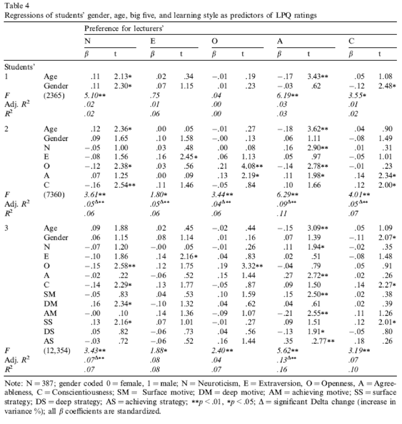
The first model we’ll fit predicts whether students want lecturers to be neurotic. Drag the outcome variable (lec_neurotic) to the box labelled Dependent Variable. Then, drag the variable age and all the student variables (e.g. stu_agree) to the box labelled Covariates, and the variable sex to the box labelled Factors. Then define the models as follows: in model 0 put age and sex, then in model 1 add all of the student personality variables (five variables in all):
Set the options as in the book chapter.
We can interpret the main output as follows: Basically, age, openness and conscientiousness were significant predictors of wanting a neurotic lecturer (note that for openness and conscientiousness the relationship is negative, i.e. the more a student scored on these characteristics, the less they wanted a neurotic lecturer). However, a look at the Q-Q plot and the residual vs. predicted plots do give some reason to worry about possible violatios of the normality and heteroscedasticity assumptions and so should be interpreted with caution
Lecturer extroversion
The second variable we want to predict is lecturer extroversion. You can follow the steps of the first example but drag the outcome variable of lec_neurotic out of the box labelled Dependent Variable and in its place drag lec_extro.
You should find that student extroversion was the only significant predictor of wanting an extrovert lecturer; the model overall did not explain a significant amount of the variance in wanting an extroverted lecturer.
Lecturer openness to experience
You can follow the steps of the first example but drag the outcome variable of lec_open into the box labelled Dependent Variable. Alternatively run the following syntax:
You should find that student openness to experience was the most significant predictor of wanting a lecturer who is open to experience, but student agreeableness significantly predicted this also.
Lecturer agreeableness
The fourth variable we want to predict is lecturer agreeableness. You can follow the steps of the first example but drag lec_agree into the box labelled Dependent Variable.
You should find that age, student openness to experience and student neuroticism significantly predicted wanting a lecturer who is agreeable. Age and openness to experience had negative relationships (the older and more open to experienced you are, the less you want an agreeable lecturer), whereas as student neuroticism increases so does the desire for an agreeable lecturer (not surprisingly, because neurotics will lack confidence and probably feel more able to ask an agreeable lecturer questions).
Lecturer conscientiousness
The final variable we want to predict is lecturer conscientiousness. You can follow the steps of the first example but drag lec_consc into the box labelled Dependent Variable.
Student agreeableness and conscientiousness both signfiicantly predict wanting a lecturer who is conscientious. Note also that gender predicted this in the first step, but its \(\hat{b}\) became slightly non-significant (p = .07) when the student personality variables were forced in as well. However, sex is probably a variable that should be explored further within this context.
Compare all of your results to Table 4 in the actual article (shown below) - our five analyses are represented by the columns labelled N, E, O, A and C).
Chapter 9
You don’t have to be mad here, but it helps
Data from Board & Fritzon (2005).
The columns represent the following: - Group: Managers or Clinical. - Histrionic personality index: The score of each person on the histrionic personality index.
The results and settings can be found in the file leni_09a.jasp. The results can be viewed in your browser here.
We can report that managers scored significantly higher than psychopaths on histrionic personality disorder, t(354) = 7.18, p < .001, d = 1.22.
The results show the presence of elements of PD in the senior business manager sample, especially those most associated with psychopathic PD. The senior business manager group showed significantly higher levels of traits associated with histrionic PD than the clinical sample. Board and Fritzon (2005) conclude that:
‘At a descriptive level this translates to: superficial charm, insincerity, egocentricity, manipulativeness (histrionic).’.
Remember, these people are in charge of large companies. Suddenly a lot things make sense.
Bladder control
Data from Tuk et al. (2011).
We will conduct an independent samples t-test on these data because there were different participants in each of the two groups (independent design).
The results and settings can be found in the file leni_09b.jasp. The results can be viewed in your browser here.
Looking at the means in the Group Descriptives table, we can see that on average more participants in the High Urgency group (M = 4.5) chose the large financial reward for which they would wait longer than participants in the Low Urgency group (M = 3.8). Looking at the Independent Samples T-Test table, we can see that this difference was significant, p = .03.
The Independent Samples T-Test table also shows the effect sizes, and we get \(\hat{d} = 0.44\). In other words, the number of rewards chosen by the high urgency group was almost half a standard deviation more than the number chosen by the low urgency group. However the confidence interval is very wide. If the confidence interval is one of the 95% that contain the true parameter value, then the effect could be as small as 0.04 (i.e., basically zero) or as large as 0.83 (i.e., huge).
On average, participants who had full bladders (M = 4.5, SD = 1.59) were more likely to choose the large financial reward for which they would wait longer than participants who had relatively empty bladders (M = 3.8, SD = 1.49), t(100) = 2.20, p = .03. This effect equates to almost a half standard deviation difference, \(\hat{d} = 0.44 [0.04, 0.83]\).
The beautiful people
Data from Gelman & Weakliem (2009).
We need to run a paired samples t-test on these data because the researchers recorded the number of daughters and sons for each participant (repeated-measures design).
The results and settings can be found in the file leni_09c.jasp. The results can be viewed in your browser here.
Looking at the output, we can see that there was a non-significant difference between the number of sons and daughters produced by the ‘beautiful’ celebrities.
The output shows Cohen’s \(\hat{d} = 0.07\). This means that there is 0.07 of a standard deviation difference between the number of sons and daughters produced by the celebrities, which is a near-zero effect.
In this example the output tells us that the value of t was 0.81, that this was based on 253 degrees of freedom, and that it was non-significant, p = .420. We also calculated the means for each group. We could write this as follows:
There was no significant difference between the number of daughters (M = 0.62, SE = 0.06) produced by the ‘beautiful’ celebrities and the number of sons (M = 0.68, SE = 0.06), t(253) = 0.81, p = .420, \(\hat{d} = 0.07\).
Chapter 10
I heard that Jane has a boil and kissed a tramp
Data from Massar et al. (2012).
The results and settings can be found in the file leni_10.jasp. The results can be viewed in your browser here.
Solution using Baron and Kenny’s method
Baron and Kenny suggested that mediation is tested through three regression analyses:
- A linear model predicting the outcome (gossip) from the predictor variable (age).
- A linear model predicting the mediator (mate_value) from the predictor variable (age).
- A linear model predicting the outcome (gossip) from both the predictor variable (age) and the mediator (mate_value).
These analyses test the four conditions of mediation: (1) the predictor variable (age) must significantly predict the outcome variable (gossip) in model 1; (2) the predictor variable (age) must significantly predict the mediator (mate_value) in model 2; (3) the mediator (mate_value) must significantly predict the outcome (gossip) variable in model 3; and (4) the predictor variable (age) must predict the outcome variable (gossip) less strongly in model 3 than in model 1.
Regression 1 indicates that the first condition of mediation was met, in that participant age was a significant predictor of the tendency to gossip, t(80) = −2.59, p = .011.
Regression 2 shows that the second condition of mediation was met: participant age was a significant predictor of mate value, t(79) = −3.67, p < .001.
Regression 3 shows that the third condition of mediation has been met: mate value significantly predicted the tendency to gossip while adjusting for participant age, t(78) = 3.59, p < .001. The fourth condition of mediation has also been met: the standardized coefficient between participant age and tendency to gossip decreased substantially when adjusting for mate value, in fact it is no longer significant, t(78) = −1.28, p. Therefore, we can conclude that the author’s prediction is supported, and the relationship between participant age and tendency to gossip is mediated by mate value.
Solution using the Process Module
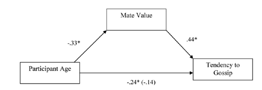
The first output of interest is the table with the R2 value that tells us that the model explains 21.3% of the variance in tendency to gossip and 14.6% in mate value (the model summary table is not so interesting when we are only estimating a single model and don’t do model comparison). Next is a visualization of the model, including the path coefficients.
The first table with parameter estimates shows the path coefficients that are also presented in the graphical model above, and includes some additional statistics for hypothesis testing and parameter estimation. The output shows that age significantly predicts mate value, b = −0.027, z = −3.714, p < .001. The fact that the b is negative tells us that the relationship is negative: as age increases, mate value declines (and vice versa).
The table with path coefficients also shows the results of the model predicting tendency to gossip from both age and mate value. We can see that while age does not significantly predict tendency to gossip with mate value in the model, b = −0.011, z = −1.3, p= .194, mate value does significantly predict tendency to gossip, b = 0.455, z = 3.66, p < .001. The negative b for age tells us that as age increases, tendency to gossip declines (and vice versa), but the positive b for mate value indicates that as mate value increases, tendency to gossip increases also. These relationships are in the predicted direction.
The second table in the output below displays the results for the indirect effect of age on gossip (i.e., the effect via mate value), as well as the effect of age on gossip when mate value is included as a predictor (the direct effect). The first bit of new information is the Indirect effect of X on Y, which in this case is the indirect effect of age on gossip. We’re given an estimate of this effect (\(\hat{b} = −0.012\) ) as well as a standard error and confidence interval.
As we have seen many times before, 95% confidence intervals contain the true value of a parameter in 95% of samples. Therefore, we tend to assume that our sample isn’t one of the 5% that does not contain the true value and use them to infer the population value of an effect. In this case, assuming our sample is one of the 95% that ‘hits’ the true value, we know that the true b-value for the indirect effect falls between −0.028 and −0.006. This range does not include zero (although both values are not much smaller than zero), and remember that b= 0 would mean ‘no effect whatsoever’; therefore, the fact that the confidence interval does not contain zero means that there is likely to be a genuine indirect effect. Put another way, mate value is a mediator of the relationship between age and tendency to gossip.
The third table in the output shows the total effect of age on tendency to gossip (outcome). The total effect is the effect of the predictor on the outcome when the mediator is not present in the model. When mate value is not in the model, age significantly predicts tendency to gossip, \(b = −0.02\), z = −2.7, p = .007. Therefore, when mate value is not included in the model, age has a significant negative relationship with gossip (as shown by the negative \(\hat{b}\) value).
Chapter 11
Science behind the magic?
Data from Jakob et al. (2019).
The results and settings can be found in the file leni_11.jasp. The results can be viewed in your browser here.
First, we can see if there are differences in Machiavellianism between the different houses using a one-way ANOVA. Based on the output, we can conclude that there is a significant difference in Machiavellianism between the different houses, F(3, 843) = 36.26, p < .001, \(\omega^2 = 0.11\) (95% CI [0.07, 0.15 ] ). Still, this does not tell us how any specific house scores on Machiavellianism compared to the others.
The raincloud and descriptives plots seem to suggest that Slytherin does score higher on Machiavellianism, and we can do a formal hypothesis test for such differences using either post hoc tests (where we conduct all pairwise comparisons) or contrast analysis (where we test specific, planned comparisons).
For the contrast analysis we have different options. We can either specify three custom contrasts, where each contrast compares Slytherin to one other house, but we can also specify the weights in such a way that we have a single comparison between Slytherin on the one hand, and the other three houses combined on the other hand. Because it’s just so much fun to specify custom contrasts (just make sure that the weights always sum to 0), I’ve done both! The results indicate that Slytherin scores significantly higher on Machiavellianism than the other three houses combined (t(843) = -9.67 , p < .001, \(d\) = -2.65), but also when compared to each house individually. For all comparisons, the effect size is quite large (and with a narrow confidence interval thanks to the large sample size).
If we want to analyse all pairwise differences, a post hoc test (with Tukey’s p-value correction) is more suitable. Based on the output below, we can see how each sorting house differs from the others. Focusing on Slytherin, we can see that it scores significantly higher on Machiavellianism compared to Ravenclaw t(843) = -7.58, p < .001, compared to Gryffindor t(843) = -7.08, p < .001, and compared to Hufflepuff t(843) = 10.31, p < .001 (note that the sign of the t-value changes depending on the reference point in the table, and how the t-statistics are identical to those from the contrast analysis). Because we look at all differences, we also see that Hufflepuff significantly scores lower than the other houses - how adorable!
Chapter 12
Space invaders
Data from Muris et al. (2008).
To run this analysis access the main menu by going to ANOVA > Classical ANCOVA. Drag int_bias to the box labelled Dependent Variable. Drag training (i.e., the type of training that the child had) to the box labelled Fixed Factors, and then select gender, age and scared by holding down Ctrl (⌘ on a mac) while you click on these variables and drag them to the box labelled Covariates. Note that gender is a categorical variable, but dragging it to the Covariates box makes JASP treat it as if it’s a scale variable. For now we do it like this, but the more proper method is to treat it as a categorical predictor by including it in the Fixed Factors box. We do not discuss multiple categorical predictors until Chapter 13 though, so let’s just stick with this way of doing things. The good news is that the model fitting implication remains the same: we are adding another predictor to the model (whether it be scale or nominal) to hopefully account for additional variance in the dependent variable and to increase our statistical power.
In the chapter we looked at how to select contrasts, but because our main predictor variable (the type of training) has only two levels (positive or negative) we don’t need contrasts: the main effect of this variable can only reflect differences between the two types of training. We can ask for marginal means in the tab labelled “Marginal Means”.
The results and settings can be found in the file leni_12.jasp. The results can be viewed in your browser here.
In the main table, we can see that even after partalling out the effects of age, gender and natural anxiety, the training had a significant effect on the subsequent bias score, F(1, 65) = 13.43, p < .001, \(\omega^2_p = .151\) (95% CI: [0.027, 0.312]).
The adjusted means tell us that interpretational biases were stronger (higher) after negative training (adjusting for age, gender and SCARED). This result is as expected. It seems then that giving children feedback that tells them to interpret ambiguous situations negatively does induce an interpretational bias that persists into everyday situations, which is an important step towards understanding how these biases develop.
In terms of the covariates, age did not have a significant influence on the acquisition of interpretational biases. However, anxiety and gender did. If we want to explore the relationship between the covariates and the dependent variable, we have several options available to us in the Regression Module. A visual option is to create (matrix) scatterplots of these variables, using the Correlation analysis. although these are just pairwise analyses that do not account for the other variables in the model. Another option is to run the same analysis, but using linear regression: there the output has regression weights for each predictor, that indicates whether the relationship is positive or negative.
If we look some more at the Coefficients table after conducting a Linear Regression, we can use the beta values to interpret these effects. For anxiety (scared), \(\hat{b}\) = 2.01, which reflects a positive relationship. Therefore, as anxiety increases, the interpretational bias increases also (this is what you would expect, because anxious children would be more likely to naturally interpret ambiguous situations in a negative way). If you draw a scatterplot of the relationship between scared and int_bias you’ll see a very nice positive relationship. For gender, \(\hat{b}\) = 26.12, which again is positive, but to interpret this we need to know how the children were coded in the data editor. Boys were coded as 1 and girls as 2. Therefore, as a child ‘changes’ (not literally) from a boy to a girl, their interpretation biases increase. In other words, girls show a stronger natural tendency to interpret ambiguous situations negatively. This finidng is consistent with the anxiety literature, which shows that females are more likely to have anxiety disorders.
One important thing to remember is that although anxiety and gender naturally affected whether children interpreted ambiguous situations negatively, the training (the experiences on the alien planet) had an effect adjusting for these natural tendencies (in other words, the effects of training cannot be explained by gender or natural anxiety levels in the sample).
Have a look at the original article to see how Muris et al. reported the results of this analysis – this can help you to see how you can report your own data from an ANCOVA. (One bit of good practice that you should note is that they report effect sizes from their analysis – as you will see from the book chapter, this is an excellent thing to do.)
Chapter 13
Don’t forget your toothbrush
Data from Davey et al. (2003).
The results and settings can be found in the file leni_13.jasp. The results can be viewed in your browser here.
Select ANOVA > ANOVA …. In the main menu, drag the dependent variable checks from the to the space labelled Dependent Variable . Select mood and stop_rule simultaneously by holding down Ctrl (⌘ on a Mac) while clicking on the variables and drag them to the Fixed Factors box.
The resulting output can be interpreted as follows. The main effect of mood was not significant, F(2, 54) = 0.68, p = .51, indicating that the number of checks (when we ignore the stop rule adopted) was roughly the same regardless of whether the person was in a positive, negative or neutral mood. Similarly, the main effect of stop rule was not significant, F(1, 54) = 2.09, p = .15, indicating that the number of checks (when we ignore the mood induced) was roughly the same regardless of whether the person used an ‘as many as can’ or a ‘feel like continuing’ stop rule. The mood × stop rule interaction was significant, F(2, 54) = 6.35, p = .003, indicating that the mood combined with the stop rule significantly affected checking behaviour. To dissect the interaction effect, we can look at a descriptives plot, or conditional post hoc tests.
The error bar plot shows that when in a negative mood people performed more checks when using an as many as can stop rule than when using a feel like continuing stop rule. In a positive mood the opposite was true, and in neutral moods the number of checks was very similar in the two stop rule conditions, just as Davey et al. predicted. The wide error bars indicate some uncertainty about these differences though, so we could investige this further by conducting a conditional post hoc test on the interaction effect. The results show that the difference between the stop rules is only statistically significant for people with a positive mood.
Chapter 14
Are splattered cadavers distracting?
Data from Perham & Sykora (2012).
The results and settings can be found in the file leni_14.jasp. The results can be viewed in your browser here.
Select ANOVA > Repeated Measures ANOVA . In the Repeated Measures Factors box we specify the structure of the data. First, we supply the name and levels for the first within-subject (repeated-measures) variable. The first repeated-measures variable we’re going to enter is the type of sound (quiet, liked or disliked), so replace the word RM Factor 1 with the word Sound. Next, enter the names by replacing Level 1 with the word Quiet, and so on. In this design, if we look at the first variable, Sound, there were three conditions, liked, disliked and quiet. I would recommend to specify the order of these levels in such a way that matches the order in which the variables appear in your data set, because that makes specifying the Repeated Measures Cells a lot easier. Here, that means starting with quiet, then liked, and then disliked.
Repeat this process for the second independent variable, the position of the letter in the list, by entering the word Position into the space that opens up after clicking on New Factor and then, because there were eight levels of this variable, you will have some typing to do, because you need to enter Position 1, Position 2, and so on, as levels of this new factor. This variable doesn’t have a control category and so it makes sense for us to code level 1 as position 1, level 2 as position 2 and so on for ease of interpretation. Here,
Once you did a fair bit of crying and/or screaming, you are ready to match the variables from the list on the left-hand side of the dialog box, into the different Repeated Measures Cells. Because we paid attention to the order of the variables, we can just move all variables into the cells at once, but be sure to always check that the column name matches the cell name - you do not want to accidentally treat the observations in the Quiet/Position 1 condition as if they were observed in the Liked/Position 4 condition.
As always, I can also recommend looking at some descriptives plots, to help us make sense of possible main and/or interaction effects.
The resulting plot displays the estimated marginal means of letters recalled in each of the positions of the lists when no music was played (blue line), when liked music was played (red line) and when disliked music was played (green line). The chart shows that the typical serial curve was elicited for all sound conditions (participants’ memory was best for letters towards the beginning of the list and at the end of the list, and poorest for letters in the middle of the list) and that performance was best in the quiet condition, poorer in the disliked music condition and poorest in the liked music condition.
Mauchly’s test shows that the assumption of sphericity has been broken for both of the independent variables and also for the interaction. In the book I advise you to routinely interpret the Greenhouse-Geisser corrected values for the main model anyway, but for these data this is certainly a good idea.
The main ANOVA summary table (which, as I explain in the book, I have edited to show only the Greenhouse-Geisser correct values) shows a significant main effect of the type of sound on memory performance F(1.62, 38.90) = 9.46, p = .001. Looking at the earlier plot, we can see that performance was best in the quiet condition, poorer in the disliked music condition and poorest in the liked music condition. However, we cannot tell where the significant differences lie without looking at some contrasts or post hoc tests. There was also a significant main effect of position, F(3.83, 91.92) = 41.43, p < 0.001, but no significant position by sound interaction, F(6.39, 153.39) = 1.44, p = 0.201.
The main effect of position was significant because of the production of the typical serial curve, so post hoc analyses were not conducted. However, we did conduct post hoc comparisons on the main effect of sound. These Holm corrected post hoc tests revealed that performance in the quiet condition (level 1. was significantly better than both the liked condition (level 2), p = .004, and in the disliked condition (level 3), p = .04. Performance in the disliked condition (level 3) was significantly better than in the liked condition (level 2), p = 0.040. We can conclude that liked music interferes more with performance on a memory task than disliked music.
Chapter 15
Having a quail of a time?
Data from Matthews et al. (2007).
The results and settings can be found in the file leni_15a.jasp. The results can be viewed in your browser here.
The summary table in the output tells you that the significance of the test was .022 and suggests that we reject the null hypothesis.
The raincloud plots give some insight into the observed differences. We can see that most of the differences are positive, meaning that signalled was greater than control for the majority of cases. In terms related to the study, this means that the number of eggs fertilized by the male in his signalled chamber was greater than for the male in his control chamber, indicating an adaptive benefit to learning that a chamber signalled reproductive opportunity. The one tied rank tells us that there was one female who produced an equal number of fertilized eggs for both males.
The Paired Samples T-Test table tells us the test statistic (13.5), the corresponding z-score (−2.36), and the effect size (-0.7). The p-value associated with the z-score is .024, which means that there’s a probability of .024 that we would get a value of z at least as large as the one we have if there were no effect in the population; because this value is less than the critical value of .05 (assuming that’s the alpha level we’re using) we would conclude that there were a greater number of fertilized eggs from males mating in their signalled context, z = −2.36, p < .05, \(r_{bs}\) = 0.7. In other words, conditioning (as a learning mechanism) provides some adaptive benefit in that it makes it more likely that you will pass on your genes.
The authors concluded as follows (p. 760):
Of the 78 eggs laid by the test females, 39 eggs were fertilized. Genetic analysis indicated that 28 of these (72%) were fertilized by the signalled males, and 11 were fertilized by the control males. Ten of the 14 females in the experiment produced more eggs fertilized by the signalled male than by the control male (see Fig. 1; Wilcoxon signed-ranks test, T = 13.5, p < .05). These effects were independent of the order in which the 2 males copulated with the female. Of the 39 fertilized eggs, 20 were sired by the 1st male and 19 were sired by the 2nd male. The present findings show that when 2 males copulated with the same female in succession, the male that received a Pavlovian CS signalling copulatory opportunity fertilized more of the female’s eggs. Thus, Pavlovian conditioning increased reproductive fitness in the context of sperm competition.
Eggs-traordinary
Data from Çetinkaya & Domjan (2006).
The results and settings can be found in the file leni_15b.jasp. The results can be viewed in your browser here.
For the percentage of eggs fertilized, the test statistic is H = 11.955, with 2 degrees of freedom. The significance value of.003 is less than .05, so we could conclude that the percentage of eggs fertilized was significantly different across the two groups.
For the time taken to initiate copulation the test statistic, H = 32.244, with 2 degrees of freedom. The significance value is .000 and (assuming we’re using an alpha of 0.05 as our criterion) because this value is less than .05 we could conclude that the time taken to initiate copulation differed significantly across the two groups.
We know that there are differences between the groups but we don’t know where these differences lie. One way to see which groups differ is to look at raincloud plots. If we look at the raincloud plot for this first variable (percentage of eggs fertilized), using the control as our baseline, the median (which is represented in the boxplots) for the non-fetishistic male quail and the control group were similar, indicating that the non-fetishistic males yielded similar rates of fertilization to the control group. However, the median of the fetishistic males is higher than the other two groups, suggesting that the fetishistic male quail yielded higher rates of fertilization than both the non-fetishistic male quail and the control male quail. However, these conclusions are subjective. What we really need are some follow-up analyses.
We can also look at Dunn’s follow-up tests. Let’s look at the pairwise comparisons first for the percentage of eggs fertilized first. The diagram shows the average rank within each group: so, for example, the average rank in the fetishistic group was 41.82, and in the non-fetishistic group it was 26.97. This diagram will also highlight differences between groups by using a different coloured line to connect them. In the current example, there are significant differences between the fetishistic group and the control group, and also between the fetishistic group and the non-fetishistic group, which is why these connecting lines are in yellow. There was no significant difference between the control group and the non-fetishistic group, which is why the connecting line is in a different colour (black). The table shows all of the possible comparisons. The column labelled \(p_{bonf}\) and \(p_{holm}\) contain the adjusted p-values and it is these columns that we need to interpret (no matter how tempted we are to interpret the one labelled p). Dependent on how strict you want to be about controlling your type-1 error rate, you can look at the Bonferroni (very strict) or Holm (medium strict) corrected p-values. Let’s be rigorous and be very strict. Looking at the Bonferroni column, we can see that significant differences were found between the control group and the fetishistic group, p = .002, and between the fetishistic group and the non-fetishistic group, p = .039. However, the non-fetishistic group and the control group did not differ significantly, p = 1. We know by looking at the raincloud plot and the ranks that the fetishistic males yielded significantly higher rates of fertilization than both the non-fetishistic male quail and the control male quail.
Let’s now look at the pairwise comparisons for the time taken to initiate copulation (see output above). The table highlights differences between groups. In the current example, there was not a significant difference between the fetishistic group and the control group. However, there were significant differences between the fetishistic group and the non-fetishistic group, and between the non-fetishistic group and the control. The table shows all of the possible comparisons. Interpret the columns labelled pbonf and pholm which contain the p-values adjusted for the number of comparisons. Significant differences were found between the control group and the non-fetishistic group, p< .001 .000, and between the fetishistic group and the non-fetishistic group, p< .001. However, the fetishistic group and the control group did not differ significantly, p= .743 and p= .248. We know by looking at the raincloud plot and the ranks that the non-fetishistic males yielded significantly shorter latencies to initiate copulation than the fetishistic males and the controls.
The authors reported as follows (p. 429):
Kruskal–Wallis analysis of variance (ANOVA) confirmed that female quail partnered with the different types of male quail produced different percentages of fertilized eggs, \(\chi^{2}\)(2, N = 59) =11.95, p < .05, \(\eta^{2}\) = 0.20. Subsequent pairwise comparisons with the Mann–Whitney U test (with the Bonferroni correction) indicated that fetishistic male quail yielded higher rates of fertilization than both the nonfetishistic male quail (U = 56.00, N1 = 17, N2 = 15, effect size = 8.98, p < .05) and the control male quail (U= 100.00, N1 = 17, N2 = 27, effect size = 12.42, p < .05). However, the nonfetishistic group was not significantly different from the control group (U = 176.50, N1 = 15, N2 = 27, effect size = 2.69, p > .05).
For the latency data they reported as follows:
A Kruskal–Wallis analysis indicated significant group differences,\(\ \chi^{2}\)(2, N = 59) = 32.24, p < .05, \(\eta^{2}\) = 0.56. Pairwise comparisons with the Mann–Whitney U test (with the Bonferroni correction) showed that the nonfetishistic males had significantly shorter copulatory latencies than both the fetishistic male quail (U = 0.00, N1 = 17, N2 = 15, effect size = 16.00, p < .05) and the control male quail (U = 12.00, N1 = 15, N2 = 27, effect size = 19.76, p < .05). However, the fetishistic group was not significantly different from the control group (U = 161.00, N1 = 17, N2 = 27, effect size = 6.57, p > .05). (p. 430)
These results support the authors’ theory that fetishist behaviour may have evolved because it offers some adaptive function (such as preparing for the real thing).
Chapter 16
The impact of sexualized images on women’s self-evaluations
Data from Daniels (2012).
The results and settings can be found in the file leni_16a.jasp. The results can be viewed in your browser here.
Because the frequency data have been entered rather than raw data (i.e., we have a column that denotes the Counts), we specify the Contingency Table by dragging picture to the box labelled Rows, drag theme to the box labelled Columns, and then drag self_evaluation to the box labelled Counts.
There are some more options available in the Cells tab. It is important that you ask for expected counts because this is how we check the assumptions about the expected frequencies. It is also useful to have a look at the row, column and total percentages because these values are usually more easily interpreted than the actual frequencies and provide some idea of the origin of any significant effects. There is another options that is useful for breaking down a significant effect (should we get one): select standardized residuals.
Let’s check that the expected frequencies assumption has been met. We have a 2 × 2 Contingency Table table, so all expected frequencies need to be greater than 5. If you look at the expected counts in the contingency table, we see that the smallest expected count is 34.6 (for women who saw pictures of performance athletes and did self-evaluate). This value exceeds 5 and so the assumption has been met.
The expected counts and observed counts help us say which observations occured more, or less, often than expected under the null hypothesis (which states that there is no association between the two variables). For example, for Performance Athletes, there were 97 cases where the theme was absent in what they wrote, while we would expect only 87.4 counts if theme and picture would be unrelated. The standardized residual is positive, which indicates that indeed the observed count was higher than expected. For Sexualized Athletes, this was the other way around, and there were fewer occurrences where the theme was absent in what they wrote. Whether these differences are significant is indicated by the Pearson’s chi-square test.
As we saw earlier, Pearson’s chi-square test examines whether there is an association between two categorical variables (in this case the type of picture and whether the women self-evaluated or not). The value of the chi-square statistic is 16.057. This value is highly significant (p < .001), indicating that the type of picture used had a significant effect on whether women self-evaluated.
The highly significant result indicates that there is an association between the type of picture and whether women self-evaluated or not. In other words, the pattern of responses (i.e., the proportion of women who self-evaluated to the proportion who did not) in the two picture conditions is significantly different. Below is an excerpt from Daniels’s (2012) conclusions:
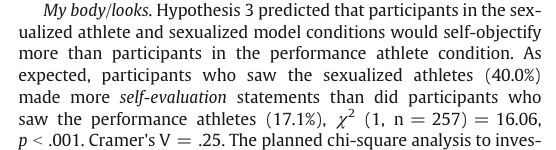
The effect size for 2x2 contingency tables is the odds ratio: How much more likely is it to observe absent in Performance athletes, compared to Sexualized athletes? The odds ratio here is about 3.2, and we saw from the contingency table above that Performance athletes tended to have the theme be absent in what they wrote more often then expected, so then we know the direction in which to interpret this effect: Performance athletes are 3.2 times more likely to have self-objectification be absent from their writing, compared to Sexualized athletes. But we can also phrase it the other way around: Sexualized athletes are 3.2 times morel likely to have self-objectification be present in the writing, compared to Performance athletes.
The odds ratio is computed as the ratio within each row, and then we take the ratio of those ratio’s: For Performance athletes, absent occurred 97/20 = 4.85 times more than present. For Sexualized athletes, absent occurred 84/56 = 1.5 times more than present. So for Performance athletes, absent is 4.85/1.5 = 3.2 times more likely to occur over present, than it does for Sexualized athletes. This ratio significantly differs from 1 (see Fisher’s exact test), which corroborates the result from Pearson’s chi-square test.
Is the Black American happy?
Data from Beckham (1929). The author investigated the happiness of Black Americans. - profession: the respondent’s job - response: yes or no - happy: counts of people who think Black Americans are happy (or not) - you_happy: counts of people who are happy as Black Americans (or not) - should_be_happy: counts of people who think Black Americans should be happy (or not)
The results and settings can be found in the file leni_16b.jasp. The results can be viewed in your browser here.
Are Black Americans happy?
Because the frequency data have been entered rather than raw data (i.e., we have a column, happy, that denotes the Counts), we specify the Contingency Table by dragging profession to the box labelled Rows, drag response to the box labelled Columns, and then drag happy to the box labelled Counts.
The Cells dialog box is used to specify the information displayed in the contingency table. It is important that you ask for expected counts because this is how we check the assumptions about the expected frequencies. It is also useful to have a look at the row, column and total percentages because these values are usually more easily interpreted than the actual frequencies and provide some idea of the origin of any significant effects. We can also select standardized residuals to break down a significant effect (should we get one).
The chi-square test is highly significant, χ2(7) = 936.14, p < .001. This indicates that the profile of yes and no responses differed across the professions. Looking at the standardized residuals, the only profession for which these are non-significant are housewives who showed a fairly even split of whether they thought Black Americans were happy (40%) or not (60%). Within the other professions all of the standardized residuals are much higher than 1.96, so how can we make sense of the data? What’s interesting is to look at the direction of these residuals (i.e., whether they are positive or negative). For the following professions the residual for ‘no’ was positive but for ‘yes’ was negative; these are therefore people who responded more than we would expect that Black Americans were not happy and less than expected that Black Americans were happy: college students, preachers and lawyers. In other words, people thought they were unhappier, compared to their Black American peers.
The remaining professions (labourers, physicians, school teachers and musicians) show the opposite pattern: the residual for ‘no’ was negative but for ‘yes’ was positive; these are, therefore, people who responded less than we would expect that Black Americans were not happy and more than expected that Black Americans were happy. In other words, people thought they were happier, compared to their Black American peers. It’s worth noting that overall, the majority of responses thought that Black Americans would be unhappy.
Are they Happy as Black Americans?
We run this analysis in exactly the same way except that we now have drag the variable you_happy into the box labelled Counts.
The chi-square test is highly significant, χ2(7) = 1390.74, p < .001. This indicates that the profile of yes and no responses differed across the professions. Looking at the standardized residuals, these are significant in most cells with a few exceptions: physicians, lawyers and school teachers saying ‘yes’. Within the other cells all of the standardized residuals are much higher than 1.96. Again, we can look at the direction of these residuals (i.e., whether they are positive or negative).
For labourers, housewives, school teachers and musicians the residual for ‘no’ was positive but for ‘yes’ was negative; these are, therefore, people who responded more than we would expect that they were not happy as Black Americans and less than expected that they were happy as Black Americans. In other words, they were generally unhappier than expected, compared to their Black American peers.
The remaining professions (college students, physicians, preachers and lawyers) show the opposite pattern: the residual for ‘no’ was negative but for ‘yes’ was positive; these are, therefore, people who responded less than we would expect that they were not happy as Black Americans and more than expected that they were happy as Black Americans. In other words, they were generally happier than expected, compared to their Black American peers.
Essentially, the former group are in low-paid jobs in which conditions would have been very hard (especially in the social context of the time). The latter group are in much more respected (and probably better-paid) professions. Therefore, the responses to this question could say more about the professions of the people asked than their views of being Black Americans.
Should Black Americans be happy?
We run this analysis in exactly the same way except that we now have drag the variable should_be_happy into the box labelled Counts.
The chi-square test is highly significant, χ2(7) = 1784.23, p < .001. This indicates that the profile of yes and no responses differed across the professions. Looking at the standardized residuals, these are nearly all significant. Again, we can look at the direction of these residuals (i.e., whether they are positive or negative). For college students and lawyers the residual for ‘no’ was positive but for ‘yes’ was negative; these are, therefore, people who responded more than we would expect that they thought that Black Americans should not be happy and less than expected that they thought Black Americans should be happy. The remaining professions show the opposite pattern: the residual for ‘no’ was negative but for ‘yes’ was positive; these are, therefore, people who responded less than we would expect that they did not think that Black Americans should be happy and more than expected that they thought that Black Americans should be happy.
What is interesting here and in the first question is that college students and lawyers are in vocations in which they are expected to be critical about the world. Lawyers may well have defended Black Americans who had been the subject of injustice and discrimination or racial abuse, and college students would likely be applying their critically trained minds to the immense social injustice that prevailed at the time. Therefore, these groups can see that their racial group should not be happy and should strive for the equitable and just society to which they are entitled. People in the other professions perhaps adopt a different social comparison.
It’s also possible for this final question that the groups interpreted the question differently: perhaps the lawyers and students interpreted the question as ‘should they be happy given the political and social conditions of the time?’, while the others interpreted the question as ‘do they deserve happiness?’
It might seem strange to have picked a piece of research from so long ago to illustrate the chi-square test, but what I wanted to demonstrate is that simple research can sometimes be incredibly illuminating. This study asked three simple questions, yet the data are fascinating. It raised further hypotheses that could be tested, it unearthed very different views in different professions, and it illuminated very important social and psychological issues. There are others studies that sometimes use the most elegant paradigms and the highly complex methodologies, but the questions they address are meaningless for the real world. They miss the big picture. Albert Beckham was a remarkable man, trying to understand important and big real-world issues that mattered to hundreds of thousands of people.
Chapter 17
Heavy metal and risk of harm
This example uses data from a study about suicide risk.
Data from Lacourse et al. (2001).
The results and settings can be found in the file leni_17.jasp. The results can be viewed in your browser here.
The main analysis is fairly simple to specify because we’re forcing all predictors in at the same time, rather than adding one predictor in a model at a time.
We also need to specify our categorical predictor variables (we have only 1, marital_status) as such by dragging it to the box labelled Factors. When working with categorical predictors in (logistic) regression, JASP uses one category as the reference category. In this case, that is Separated or Divorced. You can change the reference category by reordering the levels in the Variable settings in the JASP’s Data Editor. Changing the reference category here will affect the sign of the beta coefficient. I have chosen to leave Separated or Divorced as the reference category purely because it gives us a positive beta as in Lacourse et al.’s table. If you chose to use Together as the reference category the resulting coefficient will be the same magnitude but a negative value instead.
We can conclude that listening to heavy metal did not significantly predict suicide risk in women (of course not; anyone I’ve ever met who likes metal does not conform to the stereotype). However, in case you’re interested, listening to country music apparently does (Stack & Gundlach, 1992). The factors that did significantly (\(\alpha = 0.05\)) predict suicide risk were age, self-estrangement, and drug use. For these three predictors, the regression estimates are positive, indicating that higher scores on these variables are associated with higher suicide risk. It’s important to note here that these results should be treated like any other correlation, and so should not be taken as proof of a causal relationship (the original article is observational in nature, not experimental).
The predictor with the highest odds ratio is drug use. So, this shows you that, for girls, listening to metal was not a risk factor for suicide, but drug use was. To find out what happens for boys, you’ll just have to read the article! This is scientific proof that metal isn’t bad for your health, so download some Deathspell Omega and enjoy!