Self-test Solutions

Nestled within the chapters of Discovering Statistics Using JASP are questions that prompt you to think about the material. This page has the solutions to those questions.
Chapter 1
Self-test 1.1
Based on what you have read in this section, what qualities do you think a scientific theory should have?
A good theory should do the following:
- Explain the existing data.
- Explain a range of related observations.
- Allow statements to be made about the state of the world.
- Allow predictions about the future.
- Have implications.
Self-test 1.2
What is the difference between reliability and validity?
Validity is whether an instrument measures what it was designed to measure, whereas reliability is the ability of the instrument to produce the same results under the same conditions.
Self-test 1.3
Why is randomization important?
It is important because it rules out confounding variables (factors that could influence the outcome variable other than the factor in which you’re interested). For example, with groups of people, random allocation of people to groups should mean that factors such as intelligence, age and gender are roughly equal in each group and so will not systematically affect the results of the experiment.
Self-test 1.4
Compute the mean but excluding the score of 234.
\[ \begin{aligned} \overline{X} &= \frac{\sum_{i=1}^{n} x_i}{n} \\ \ &= \frac{22+40+53+57+93+98+103+108+116+121}{10} \\ \ &= \frac{811}{10} \\ \ &= 81.1 \end{aligned} \]
Self-test 1.5
Compute the range but excluding the score of 234.
Range = maximum score - minimum score = 121 − 22 = 99.
Self-test 1.6
Twenty-one heavy smokers were put on a treadmill at the fastest setting. The time in seconds was measured until they fell off from exhaustion: 18, 16, 18, 24, 23, 22, 22, 23, 26, 29, 32, 34, 34, 36, 36, 43, 42, 49, 46, 46, 57. Compute the mode, median, mean, upper and lower quartiles, range and interquartile range
First, let’s arrange the scores in ascending order: 16, 18, 18, 22, 22, 23, 23, 24, 26, 29, 32, 34, 34, 36, 36, 42, 43, 46, 46, 49, 57.
- The mode: The scores with frequencies in brackets are: 16 (1), 18 (2), 22 (2), 23 (2), 24 (1), 26 (1), 29 (1), 32 (1), 34 (2), 36 (2), 42 (1), 43 (1), 46 (2), 49 (1), 57 (1). Therefore, there are several modes because 18, 22, 23, 34, 36 and 46 seconds all have frequencies of 2, and 2 is the largest frequency. These data are multimodal (and the mode is, therefore, not particularly helpful to us).
- The median: The median will be the (n + 1)/2th score. There are 21 scores, so this will be the 22/2 = 11th. The 11th score in our ordered list is 32 seconds.
- The mean: The mean is 32.19 seconds:
\[ \begin{aligned} \overline{X} &= \frac{\sum_{i=1}^{n} x_i}{n} \\ \ &= \frac{16+(2\times18)+(2\times22)+(2\times23)+24+26+29+32+(2\times34)+(2\times36)+42+43+(2\times46)+49+57}{21} \\ \ &= \frac{676}{21} \\ \ &= 32.19 \end{aligned} \]
- The lower quartile: This is the median of the lower half of scores. If we split the data at 32 (not including this score), there are 10 scores below this value. The median of 10 scores is the 11/2 = 5.5th score. Therefore, we take the average of the 5th score and the 6th score. The 5th score is 22, and the 6th is 23; the lower quartile is therefore 22.5 seconds.
- The upper quartile: This is the median of the upper half of scores. If we split the data at 32 (not including this score), there are 10 scores above this value. The median of 10 scores is the 11/2 = 5.5th score above the median. Therefore, we take the average of the 5th score above the median and the 6th score above the median. The 5th score above the median is 42 and the 6th is 43; the upper quartileis therefore 42.5 seconds.
- The range: This is the highest score (57) minus the lowest (16), i.e. 41 seconds. _ The interquartile range: This is the difference between the upper and lower quartiles: 42.5 − 22.5 = 20 seconds.
Self-test 1.7
Assuming the same mean and standard deviation for the ice bucket example above, what’s the probability that someone posted a video within the first 30 days of the challenge?
As in the example, we know that the mean number of days was 39.68, with a standard deviation of 7.74. First we convert our value to a z-score: the 30 becomes (30−39.68)/7.74 = −1.25. We want the area below this value (because 30 is below the mean), but this value is not tabulated in the Appendix. However, because the distribution is symmetrical, we could instead ignore the minus sign and look up this value in the column labelled ‘Smaller Portion’ (i.e. the area above the value 1.25). You should find that the probability is 0.10565, or, put another way, a 10.57% chance that a video would be posted within the first 30 days of the challenge. By looking at the column labelled ‘Bigger Portion’ we can also see the probability that a video would be posted after the first 30 days of the challenge. This probability is 0.89435, or a 89.44% chance that a video would be posted after the first 30 days of the challenge.
Chapter 2
Self-test 2.1
In Section 1.6.2.2 we came across some data about the number of friends that 11 people had on Facebook. We calculated the mean for these data as 95 and standard deviation as 56.79. Calculate a 95% confidence interval for this mean. Recalculate the confidence interval assuming that the sample size was 56.
To calculate a 95% confidence interval for the mean, we begin by calculating the standard error:
\[ SE = \frac{s}{\sqrt{N}} = \frac{56.79}{\sqrt{11}}=17.12 \]
The sample is small, so to calculate the confidence interval we need to find the appropriate value of t. For this we need the degrees of freedom, N – 1. With 11 data points, the degrees of freedom are 10. For a 95% confidence interval we can look up the value in the column labelled ‘Two-Tailed Test’, ‘0.05’ in the table of critical values of the t-distribution (Appendix). The corresponding value is 2.23. The confidence interval is, therefore, given by:
\[ \begin{aligned} \text{lower boundary of confidence interval} &= \bar{X}-(2.23 \times 17.12) \\ &= 95 - (2.23 \times 17.12) \\ & = 56.82 \\ \text{upper boundary of confidence interval} &= \bar{X}+(2.23 \times 17.12) \\ &= 95 + (2.23 \times 17.12) \\ &= 133.18 \end{aligned} \]
Assuming now a sample size of 56, we need to calculate the new standard error:
\[ SE = \frac{s}{\sqrt{N}} = \frac{56.79}{\sqrt{56}}=7.59 \]
The sample is big now, so to calculate the confidence interval we can use the critical value of z for a 95% confidence interval (i.e. 1.96). The confidence interval is, therefore, given by:
\[ \begin{aligned} \text{lower boundary of confidence interval} &= \bar{X}-(1.96 \times 7.59) = 95 - (1.96 \times 7.59) = 80.1 \\ \text{upper boundary of confidence interval} &= \bar{X}+(1.96 \times 7.59) = 95 + (1.96 \times 7.59) = 109.8 \end{aligned} \]
Self-test 2.2
What are the null and alternative hypotheses for the following questions: (1) ‘Is there a relationship between the amount of gibberish that people speak and the amount of vodka jelly they’ve eaten?’ (2) ‘Does reading this chapter improve your knowledge of research methods?’
‘Is there a relationship between the amount of gibberish that people speak and the amount of vodka jelly they’ve eaten?’
- Null hypothesis: There will be no relationship between the amount of gibberish that people speak and the amount of vodka jelly they’ve eaten.
- Alternative hypothesis: There will be a relationship between the amount of gibberish that people speak and the amount of vodka jelly they’ve eaten.
‘Does reading this chapter improve your knowledge of research methods?’
- Null hypothesis: There will be no difference in the knowledge of research methods in people who have read this chapter compared to those who have not.
- Alternative hypothesis: Knowledge of research methods will be in those who have read the chapter compared to those who have not.
Self-test 2.3
Compare the plots in Figure 2.16. What effect does the difference in sample size have? Why do you think it has this effect?
The plot showing larger sample sizes has smaller confidence intervals than the plot showing smaller sample sizes. If you think back to how the confidence interval is computed, it is the mean plus or minus 1.96 times the standard error. The standard error is the standard deviation divided by the square root of the sample size (√N), therefore as the sample size gets larger, the standard error (and, therefore, confidence interval) will get smaller.
Chapter 3
Self-test 3.1
Based on what you have learnt so far, which of the following statements best reflects your view of antiSTATic? (A) The evidence is equivocal, we need more research. (B) All of the mean differences show a positive effect of antiSTATic, therefore, we have consistent evidence that antiSTATic works. (C) Four of the studies show a significant result (p < .05), but the other six do not. Therefore, the studies are inconclusive: some suggest that antiSTATic is better than placebo, but others suggest there’s no difference. The fact that more than half of the studies showed no significant effect means that antiSTATic is not (on balance) more successful in reducing anxiety than the control. (D) I want to go for C, but I have a feeling it’s a trick question.
If you follow NHST you should pick C because only four of the six studies have a ‘significant’ result, which isn’t very compelling evidence for antiSTATic.
Self-test 3.2
Now you’ve looked at the confidence intervals, which of the earlier statements best reflects your view of Dr Weeping’s potion?
I would hope that some of you have changed your mind to option B: 10 out of 10 studies show a positive effect of antiSTATic (none of the means are below zero), and even though sometimes this positive effect is not always ‘significant’, it is consistently positive. The confidence intervals overlap with each other substantially in all studies, suggesting that all studies have sampled the same population. Again, this implies great consistency in the studies: they all throw up (potential) population effects of a similar size. Look at how much of the confidence intervals are above zero across the 10 studies: even in studies for which the confidence interval includes zero (implying that the population effect might be zero) the majority of the bar is greater than zero. Again, this suggests very consistent evidence that the population value is greater than zero (i.e. antiSTATic works).
Self-test 3.3
Compute Cohen’s d for the effect of singing when a sample size of 100 was used (right-hand plot in Figure 2.21).
\[ \begin{aligned} \hat{d} &= \frac{\bar{X}_\text{singing}-\bar{X}_\text{conversation}}{\sigma} \\ &= \frac{10-12}{3} \\ &= 0.667 \end{aligned} \]
Self-test 3.4
Compute Cohen’s d for the effect in Figure 2.22. The exact mean of the singing group was 10, and for the conversation group was 10.01. In both groups the standard deviation was 3.
\[ \begin{aligned} \hat{d} &= \frac{\bar{X}_\text{singing}-\bar{X}_\text{conversation}}{\sigma} \\ &= \frac{10-10.01}{3} \\ &= -0.003 \end{aligned} \]
Self-test 3.5
Look at Figures 2.22 and Figure 2.23. Compare what we concluded about these three data sets based on p-values, with what we conclude using effect sizes.
Answer given in the text.
Self-test 3.6
Look back at Figure 3.2. Based on the effect sizes, is your view of the efficacy of the potion more in keeping with what we concluded based on p-values or based on confidence intervals?
Answer given in the text.
Self-test 3.7
Use Table 3.2 and Bayes’ theorem to calculate p(human |match).
Answer given in the text.
Self-test 3.8
What are the problems with NHST?
Answer given in the text.
Chapter 4
Self-test 4.1
UUsing what you have learned, try specifying the values for the variable Current member, for yes = 1 and no = 0.
To create the current_member go to the variable view, and edit the Value column. If you want to see how it looks, check out the .jasp file from the website (metallica.jasp).
Self-test 4.2
Why is the
songs_writtenvariable a ‘scale’ variable?
It is a scale variable because the numbers represent consistent intervals and ratios along the measurement scale: the difference between having written (for example) 1 and 2 songs is the same as the difference between having written (for example) 10 and 11 songs, and a band member who has written (for example) 20 songs has written twice as many as a band mamber who has written only 10 songs.
Self-test 4.3
Can you select only bass players that are currently in the band by filtering on Instrument and Current member? What does the corresponding R code look like?
Go to the Variable settings for Instrument in the Data viewer, and uncheck the boxes for all instruments except bass; then do the same for Current member and make sure that only Yes is checked. If you click on the filter icon (in the top left of the data sheet, next to the variable names), you can either specify more filters, or switch to R mode by clicking on the R icon - doing so reveals the underlying R code:
((Instrument.nominal == "Bass") & (Current member.nominal == "Yes"))Chapter 5
Self-test 5.1
Produce a frequency plot for the Strategy variable, using the Distribution plots option.
Drag Strategy to the Variables box in Descriptive Statistics, then head over to the Basic plots tab and select the checkbox labelled Distribution plots to produce the follwing plot:
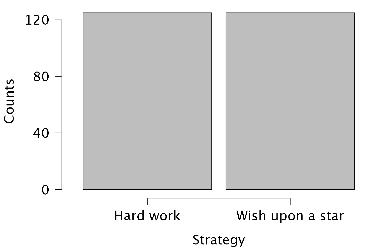
The results and settings can be found in the file ljiminy_cricket.jasp. The results can be viewed in your browser here.
Self-test 5.2
Produce a histogram with separate frequencies for the success scores before the intervention. If that does not feel challenging enough for you, first compute a new variable with the difference between post and pre scores, and plot that variable.
See Figure 5.8 in the book. The results and settings can be found in the file ljiminy_cricket.jasp. The results can be viewed in your browser here.
Self-test 5.3
Produce boxplots for the success scores before the intervention.
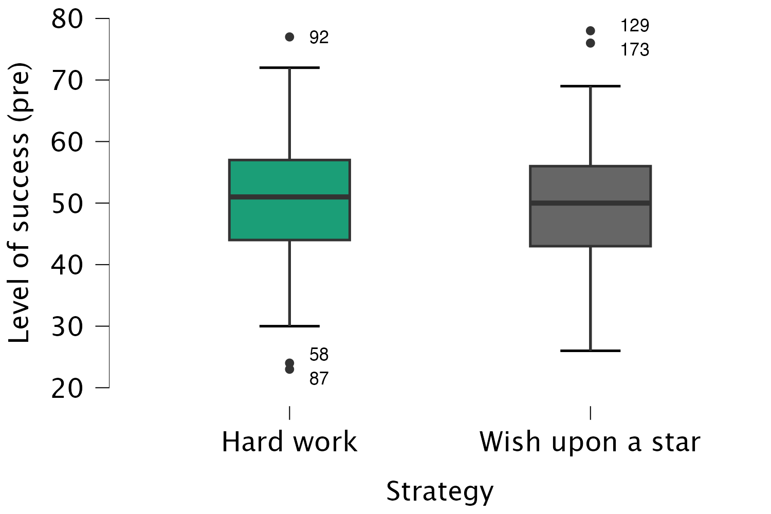
Looking at the resulting boxplots above, notice that there is a tinted box, which represents the IQR (i.e., the middle 50% of scores). It’s clear that the middle 50% of scores are more or less the same for both groups. Within the boxes, there is a thick horizontal line, which shows the median. The workers had a very slightly higher median than the wishers, indicating marginally greater pre-intervention success but only marginally.
In terms of the success scores, we can see that the range of scores was very similar for both the workers and the wishers, but the workers contained slightly higher levels of success than the wishers. Like histograms, boxplots also tell us whether the distribution is symmetrical or skewed. If the whiskers are the same length then the distribution is symmetrical (the range of the top and bottom 25% of scores is the same); however, if the top or bottom whisker is much longer than the opposite whisker then the distribution is asymmetrical (the range of the top and bottom 25% of scores is different). The scores from both groups look symmetrical because the two whiskers are similar lengths in both groups.
Chapter 6
Self-test 6.1
Compute the mean and sum of squared error for the new data set.
First we need to compute the mean:
\[ \begin{aligned} \overline{X} &= \frac{\sum_{i=1}^{n} x_i}{n} \\ \ &= \frac{1+3+10+3+2}{5} \\ \ &= \frac{19}{5} \\ \ &= 3.8 \end{aligned} \]
Compute the squared errors as follows:
| Score | Error (score - mean) | Error squared |
|---|---|---|
| 1 | -2.8 | 7.84 |
| 3 | -0.8 | 0.64 |
| 10 | 6.2 | 38.44 |
| 3 | -0.8 | 0.64 |
| 2 | -1.8 | 3.24 |
The sum of squared errors is:
\[ \begin{aligned} \ SS &= 7.84 + 0.64 + 38.44 + 0.64 + 3.24 \\ \ &= 50.8 \\ \end{aligned} \]
Self-test 6.2
Using what you learnt in Chapter 5 plot a scatterplot of the day 2 scores against the day 1 scores.
See Figure 6.17 in the book.
Self-test 6.3
Now we have removed the outlier in the data, re-plot the scatterplot and repeat the explore command from Section 6.9.2.
See Figure 6.19 in the book.
Self-test 6.4
Follow the main text to try to create a variable that is the natural log of the fear scores. Name this variable
log_fear.
Self-test 6.5
Follow the main text to try to create a variable that is the square root of the fear scores. Name this variable
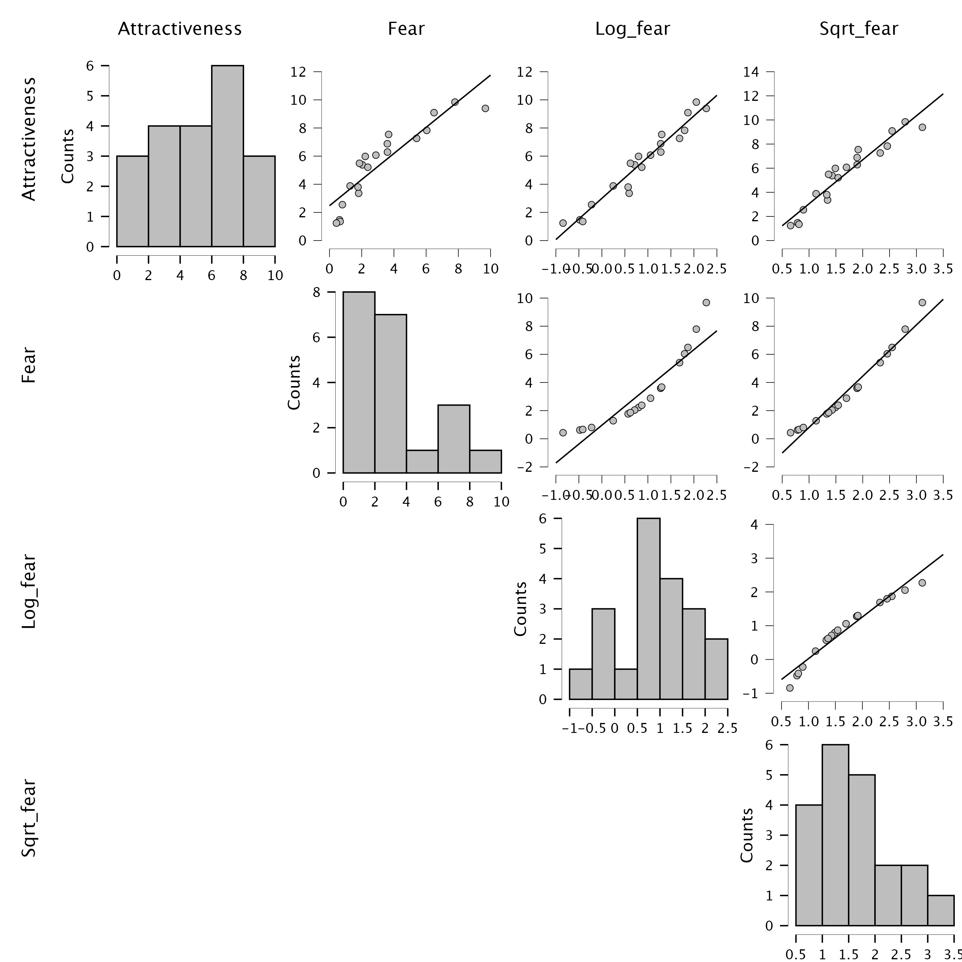
Sqrt_fear. Produce a matrix scatterplot of attractiveness against the raw scores and the two transformed versions of fear.
Follow the instructions in the book to create Sqrt_fear and Log_fear. Then head over to the Descriptive Statistics menu to produce the plot. Remember that you can select multiple variables by holding down the Ctrl key (Cmd on a Mac), and you can then drag them all into the Variables box simultaneously (on a Mac you need to keep Cmd held down as you drag). Then head to the Basic plots tab and select the checkbox labelled Correlation plots.
The resulting scatterplot is below. Look at the top row. These plots show the mean attractiveness ratings on the vertical y-axis, against different versions of the fear variable. Note that the raw fear scores have a curvilinear relationship with attractiveness ratings because the pattern of dots has a noticeable bend (first scatterplot in the top row). However, for log fear scores (second scatterplot in the top row) and square root fear scores (final scatterplot in the top row) the relationship is linear (the pattern of dots follows a straight line). These patterns suggest that the long and square root transformations have improved the linearity of the relationship between fear and attractiveness ratings.
Chapter 7
Self-test 7.1
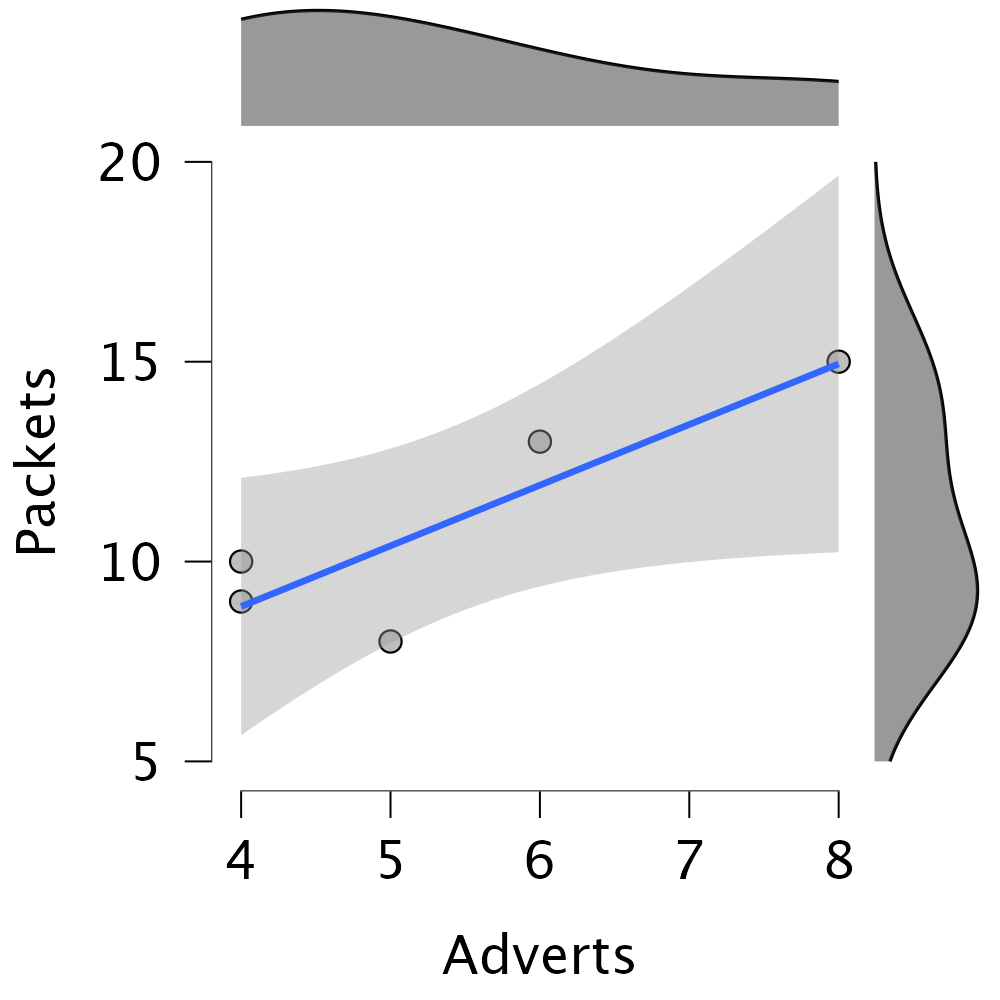
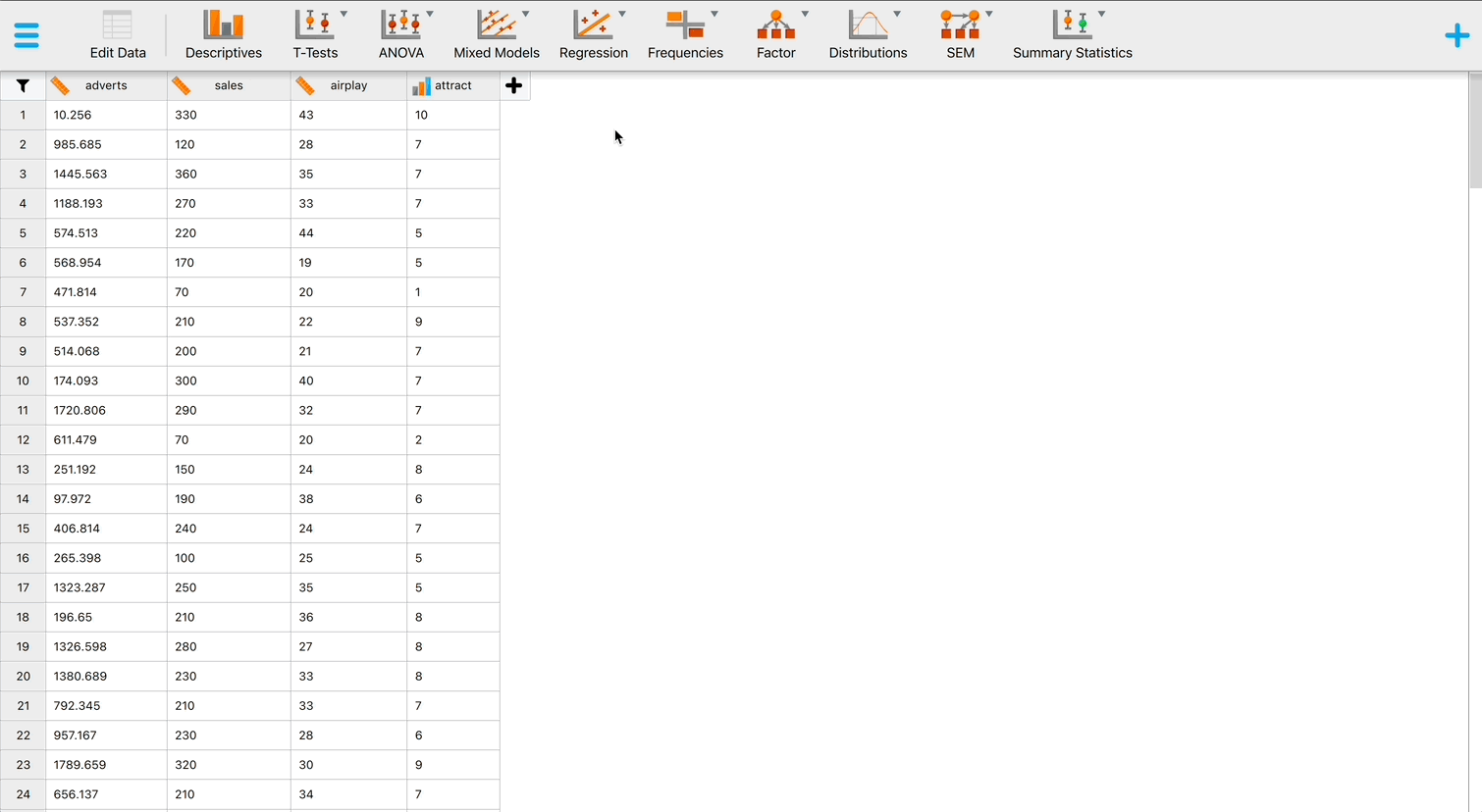
Enter the advert data and produce a scatterplot (number of packets bought on the y-axis, and adverts watched on the x-axis) of the data using the Descriptives module.
The finished Scatter plot should look like this:
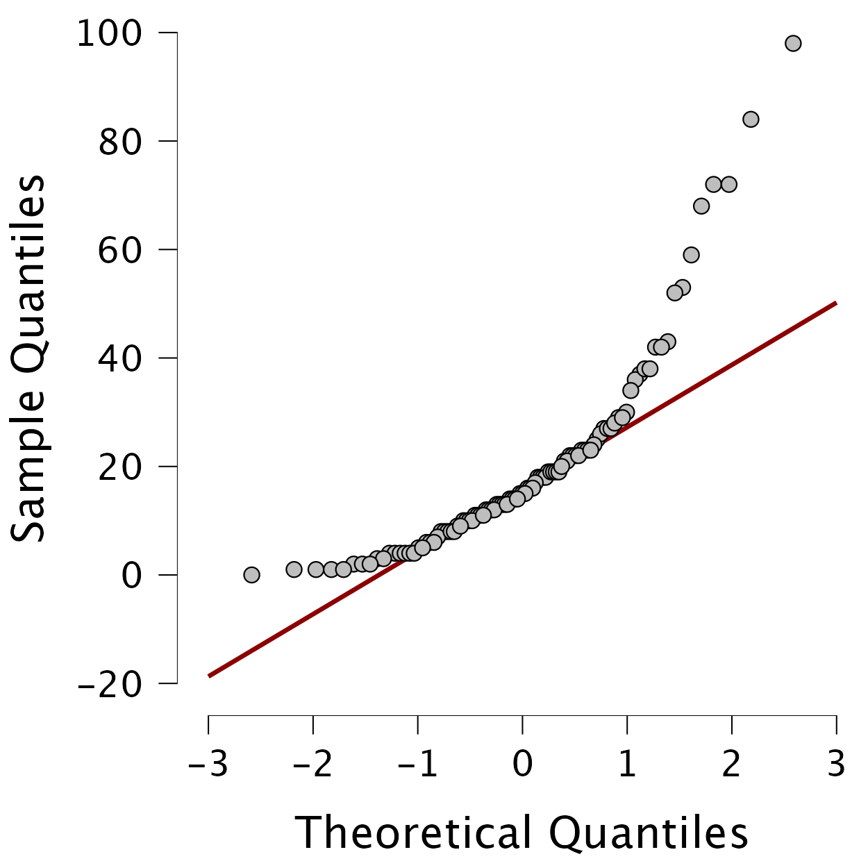
Self-test 7.2
Create Q-Q plots of the variables
revise,exam, andanxiety.
To get a Q-Q plot use Descriptives > Descriptive Statistics > Basic plots > Q-Q plots Drag the three variables revise, exam and anxiety from the variable list to the box labelled Variables and check the box Q-Q plots. The plots are interpreted in the book.
Self-test 7.3
Did creativity cause success in the World’s Biggest Liar competition?
These questions are always a little cheeky, but hopefully serve their purpose in making you remember that correlation does not automatically mean causation. Since we have used observational measures for creativity (questionnaire) and success (place in the competition), we cannot establish a causal relationship between the two variables. One reason is that we cannot rule out a third, confounding, variable. In order to make causal statements, we generally need to employ some experimental manipulation of the independent variable (Section 1.6.2). In this case, we would need to artificially manipulate participants’ creativity, and then see if tat leads to better or worse performance in the liar competition.
Self-test 7.4
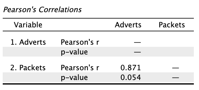
Conduct a Pearson correlation analysis of the advert data from the beginning of the chapter.
Select Regression > Correlation to go to the correlation menu. Drag Adverts and Packets to the Variables box to obtain the following output:
Self-test 7.5
Using the
roaming_cats.jaspfile, compute a Pearson correlation betweenSexandTime.
Select Regression > Correlation to go to the correlation menu. Drag Sex and Time to the Variables box to obtain the output in the book.
Self-test 7.6
Use filtering to compute the correlation coefficient and Fisher z-values between between exam anxiety and exam performance in men and women.
To filter the data, go to the data viewer and double click Gender. In the Label editor there is a column named Filter where you can check/uncheck groups that you want to keep/remove. First, uncheck the box for men, so you obtain the results for the women. The interface, including the results should look like this:
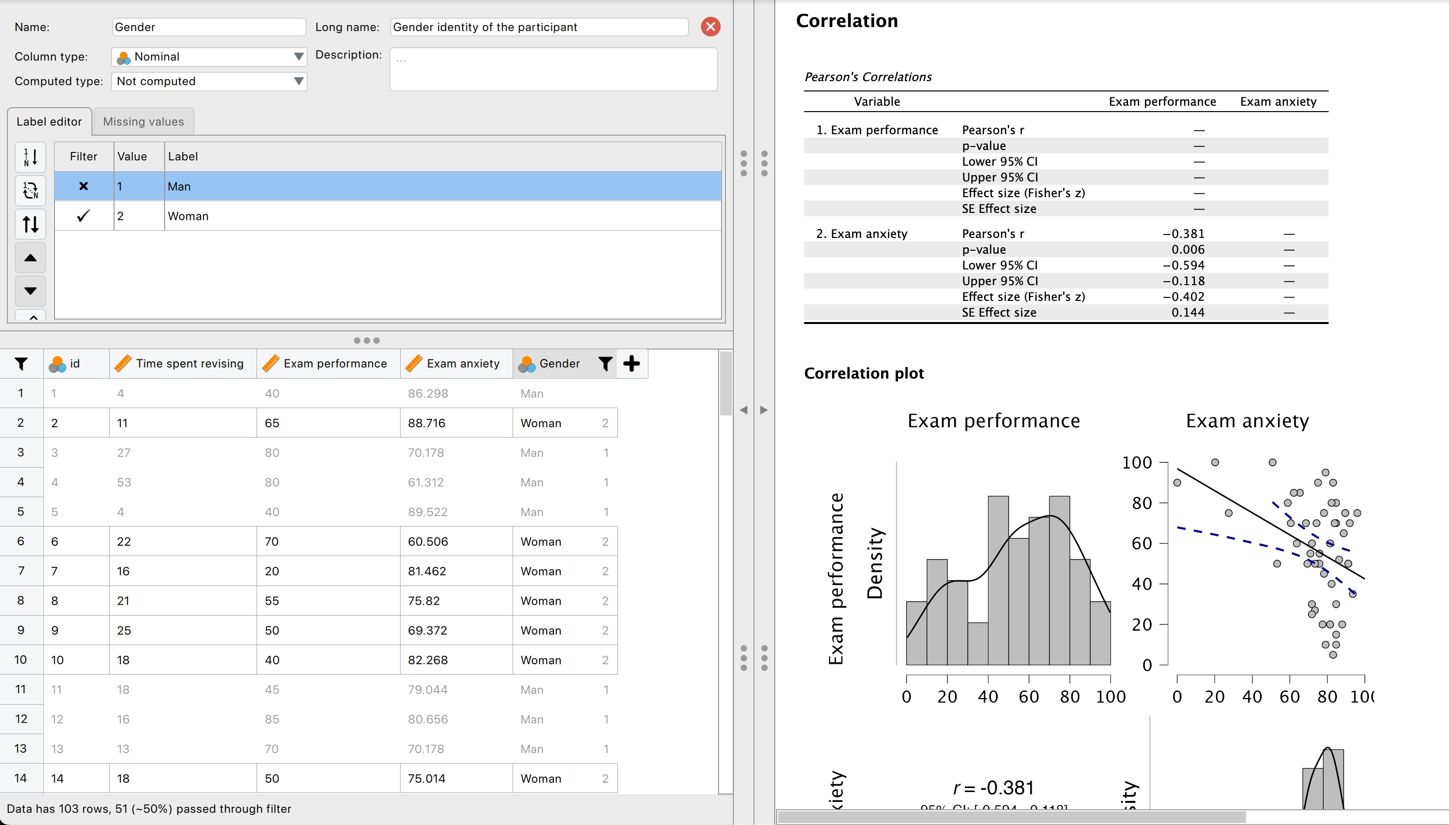
Repeat the same process, but this time filtering out the women, so you obtain the results for the men.
The observed z-score are -0.402 for the women and -0.557 for the men. The book chapter has some interpretation of these findings and suggestions for how to compare the coefficients for men and women.
Chapter 8
Self-test 8.1
Produce a scatterplot of sales (y-axis) against advertising budget (x-axis). Include the regression line.
Create the scatterplot as follows:
Self-test 8.2
If a predictor had ‘no effect’, how would the outcome change as the predictor changes? What would be the corresponding value of b? What, therefore, would be a reasonable null hypothesis?
Answered in the book:
Under the null hypothesis that there is ‘no relationship’ or ‘no effect’ between a predictor and an outcome, then as the predictor changes we would expect the predicted value of the outcome to not change (it is a constant value). In other words, the regression line would be flat. Therefore, ‘no effect’ equates to ‘flat line’ and ‘flat line’ equates to b = 0. If we want a hypothesis test then we can compare the ‘alternative hypothesis’ that there is an effect against this null. When there is an effect, the model will not be flat and b will not equal zero. So, we get the following hypotheses - \(H_0: b = 0\). If there is no association between a predictor and outcome variable we’d expect the parameter for that predictor to be zero. - \(H_1: b \ne 0\). If there is a non-zero association between a predictor and outcome variable we’d expect the parameter for that predictor to be non-zero.
Self-test 8.3
Once you have read Section 9.7, fit a linear model first with all the cases included and then with case 30 deleted.
After running the analysis you should get the output below. (See the book chapter for an explanation of these results.)
To run the analysis with case 30 filtered out, we can go to the variable settings of the case variable, and uncheck the box for value ‘30’. Once you have done this, you will see that case 30 now is greyed out to indicate that this case will be excluded from any further analyses.
Now we can run the regression in the same way as we did before. You should get the same output as mine below (see the book chapter for an explanation of the results).
Self-test 8.4
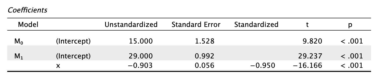
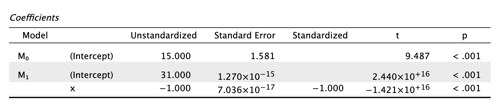
How is the t in Output 9.4 calculated? Use the values in the table to see if you can get the same value as JASP.
The t is computed as follows:
\[ \begin{aligned} t &= \frac{b}{SE_b} \\ &= \frac{0.096}{0.010} \\ &= 9.6 \end{aligned} \]
This value is different to the value in the SPSS output (9.979) because we’ve used the rounded values displayed in the table. If you double-click the table, and then double click the cell for b and then for the SE we get the values to more decimal places:
\[ \begin{aligned} t &= \frac{b}{SE_b} \\ &= \frac{0.096124}{0.009632} \\ &= 9.979 \end{aligned} \]
which match the value of t computed by SPSS.
Self-test 8.5
How many albums would be sold if we spent £666,000 on advertising the latest album by Deafheaven?
Remember that advertising budget is in thousands, so we need to put £666 into the model (not £666,000). The b-values come from the SPSS output in the chapter:
\[ \begin{aligned} \widehat{\text{sales}}_i &= \hat{b}_0 + \hat{b}_1\text{advertising}_i \\ \widehat{\text{sales}}_i &= 134.14 + (0.096 \times \text{advertising}_i) \\ \widehat{\text{sales}}_i &= 134.14 + (0.096 \times 666) \\ \widehat{\text{sales}}_i &= 198.08 \end{aligned} \]
Self-test 8.6
Produce a matrix scatterplot of sales, adverts, airplay and image including the regression line.
You can do this by going to Descriptives > Descriptive Statistics and selecting the Correlation plots from the Basic plots tab, or by going to Regression > Correlation:
Self-test 8.7
Think back to what the confidence interval of the mean represented. Can you work out what the confidence intervals for b represent?
This question is answered in the text just after the self-test box.
Chapter 9
Self-test 9.1
Enter these data into JASP.
The data can be found in the file invisibility_cloak.jasp and show how you should have entered the data.
Self-test 9.2
Produce some descriptive statistics for these data (using the Descriptivs module)
The results and settings can be found in the file invisibility_cloak.jasp. The results can be viewed in your browser here. The results are discussed in the book chapter.
Self-test 9.3
To prove that I’m not making it up as I go along, fit a linear model to the data in
invisibility_cloak.jaspwithcloakas the predictor andmischiefas the outcome using what you learnt in the previous chapter.cloakis coded using zeros and ones as described above.
The results and settings can be found in the file invisibility_cloak.jasp. The results can be viewed in your browser here. The results are discussed in the book chapter.
Self-test 9.4
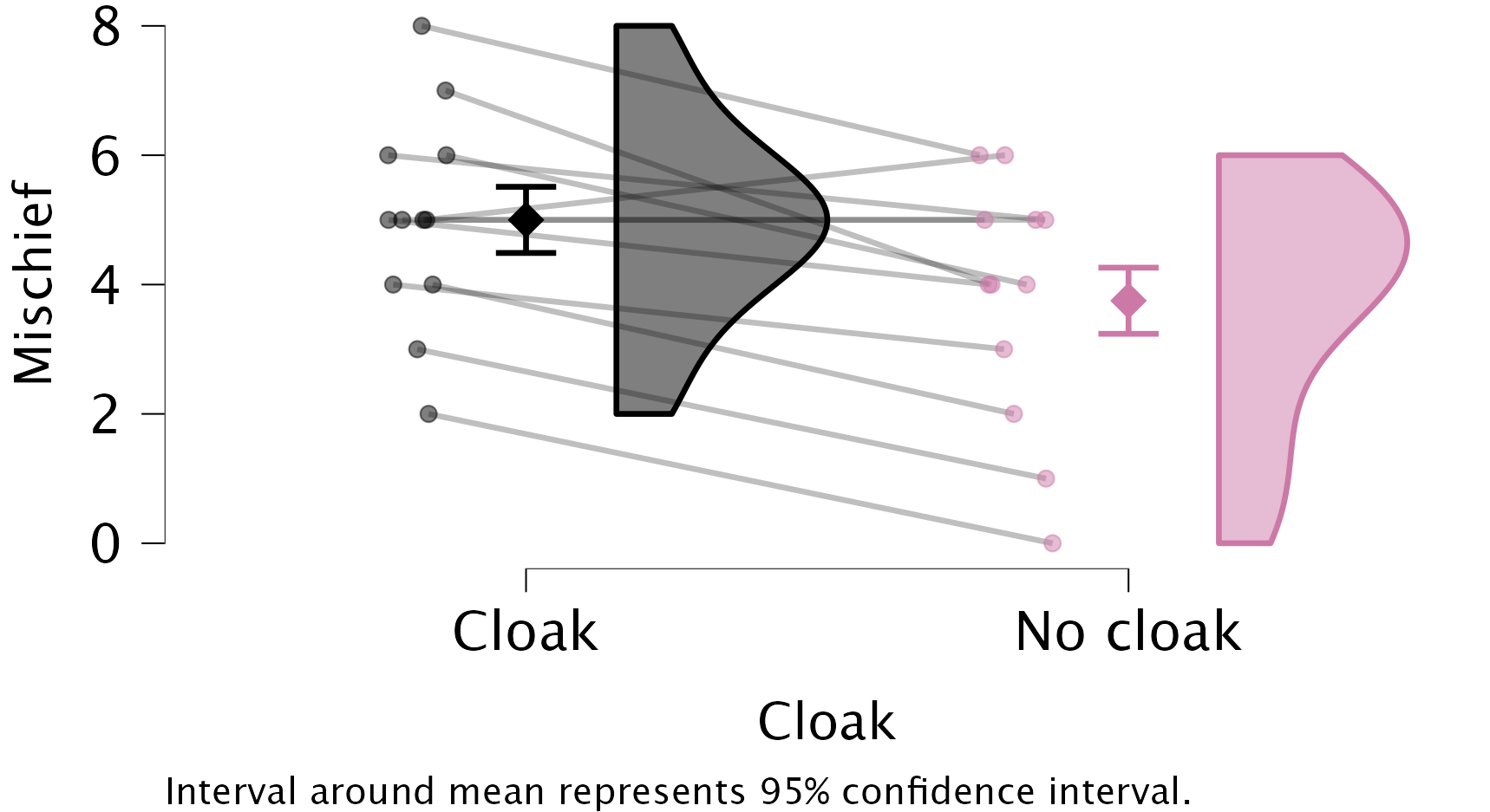
Using the Descriptives module, produce a raincloud plot of the
invisibility_cloak.jaspdata, withcloakas the Primary Factor. Include the mean and confidence interval.
In the Raincloud Plots menu, you can show the mean and confidence interval (instead of the boxplot that is shown by default) by going to the Advanced tab and selecting the checkboxes Mean and Interval around mean. The resulting plot looks as follows:

The results and settings can be found in the file invisibility_cloak.jasp. The results can be viewed in your browser here.
Self-test 9.5
Enter the data in Table 10.1 into the data editor as though a repeated-measures design was used.
We would arrange the data in two columns (one representing the cloak condition and one representing the no_cloak condition). You can see the correct layout in invisibility_rm.jasp.
Self-test 9.6
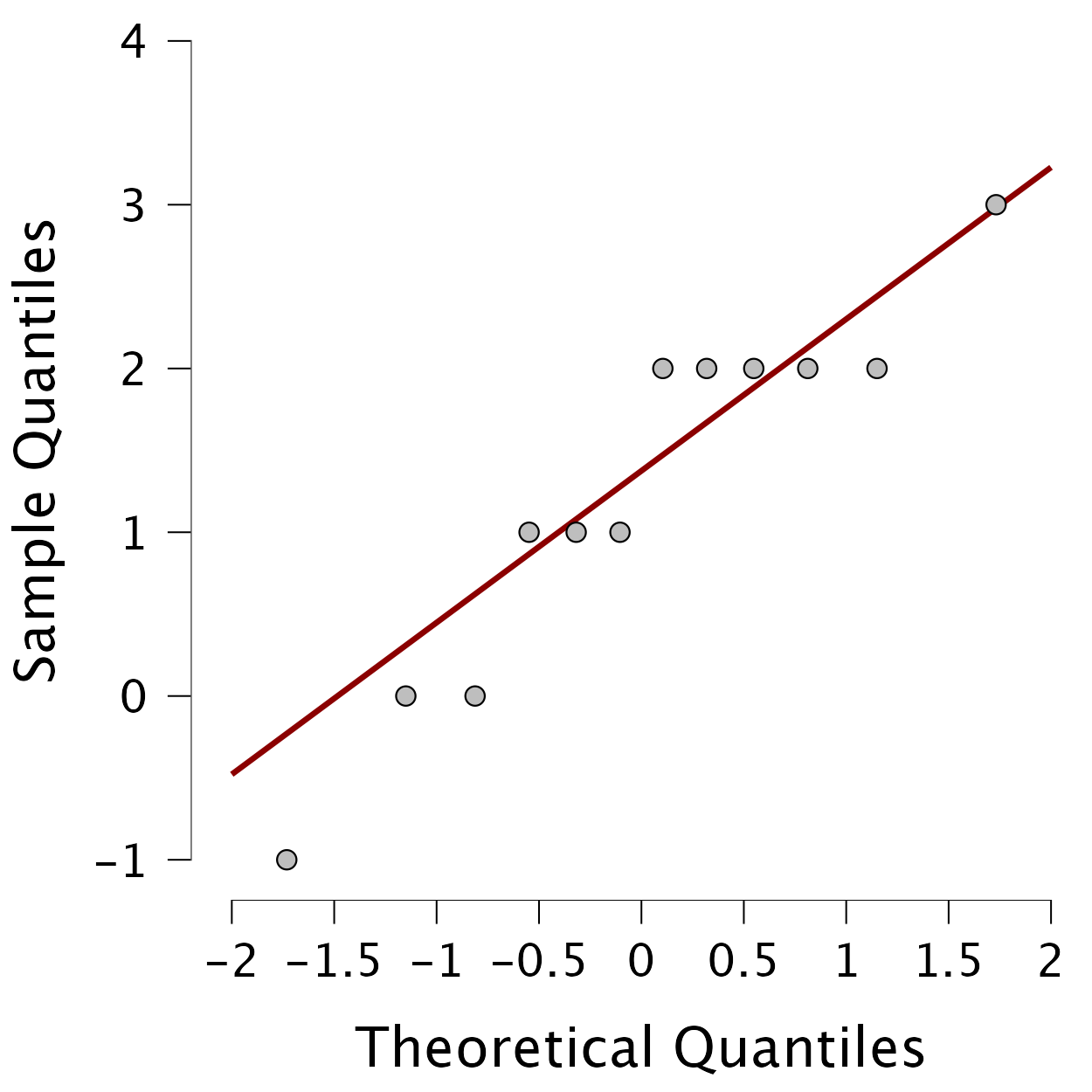
Using the invisibility_rm.jasp data, compute the differences between the cloak and no cloak conditions and check the assumption of normality with a Q-Q plot.
First add a new variable using either the constructor interface, or R mode. You can define the new variable as Cloack - No cloak. Then, you can use your fresh variable in the Descriptive Statistics menu to create a Q-Q plot. The Q-Q plot shows that the quantiles fall pretty much on the diagonal line (indicating normality). As such, it looks as though we can assume that our differences are fairly normal and that, therefore, the sampling distribution of these differences is normal too. Happy days!
Self-test 9.7
First convert the data in
invisibility_rm.jaspto the long format (with three columns:mischief,cloak, andID). If you get stuck, useinvisibility_rm_long.jasp. Then, use the Descriptives module to produce a raincloud plot withmischiefas the Dependent Variable,cloakas the Primary Factor andIDas the ID variable. Include the mean and confidence interval.
The results and settings can be found in the file invisibility_rm_long.jasp. The results can be viewed in your browser here.
If you compare this plot to the plot from Self-test 9.4, you will see that the confidence intervals have become more narrow as a result of including participant ID.
Chapter 10
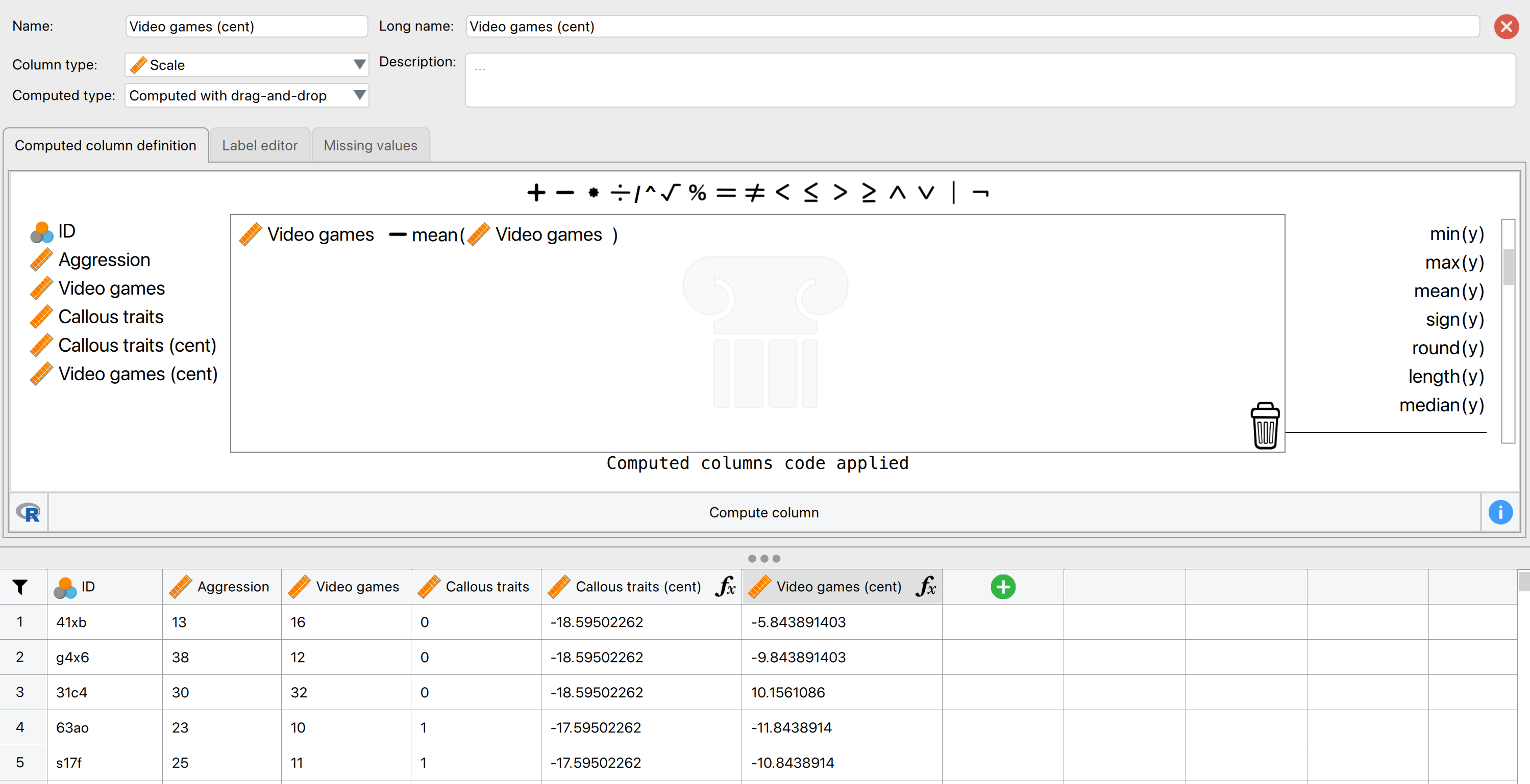
Self-test 10.1
Follow Oliver Twisted’s instructions to create the centred variables
Callous traits (cent)andVideo games (cent)using the Compute columns functionality.
To create the centred variables follow Oliver Twisted’s instructions for this chapter. Here is a screenshot to show what that should look like, including the first five rows of the resulting data, so you can verify you followed the correct steps:
Self-test 10.2
Assuming you have done the previous self-test, fit a linear model predicting
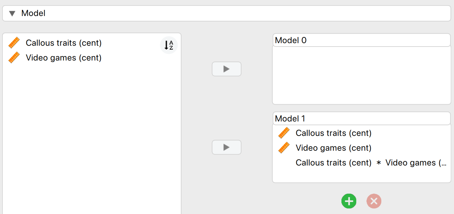
AggressionfromCallous traits (cent),Video games (cent)and their interaction.
To do the analysis access the main menu of Linear Regression box by selecting Regression > Classical Linear Regression. Drag Aggression from the list on the left-hand side to the space labelled Dependent Variable. Drag Callous traits (cent) and Video games (cent) from the variable list to the space labelled Covariates. Then in the Model tab, make sure to also include the interaction effect by selecting both predictors and dragging them to the Model 1 box:
An alternative way to do so, is to create a third variable called Interaction, which is computed as the product of The resulting constructor window and first five rows of the data will look as follows:
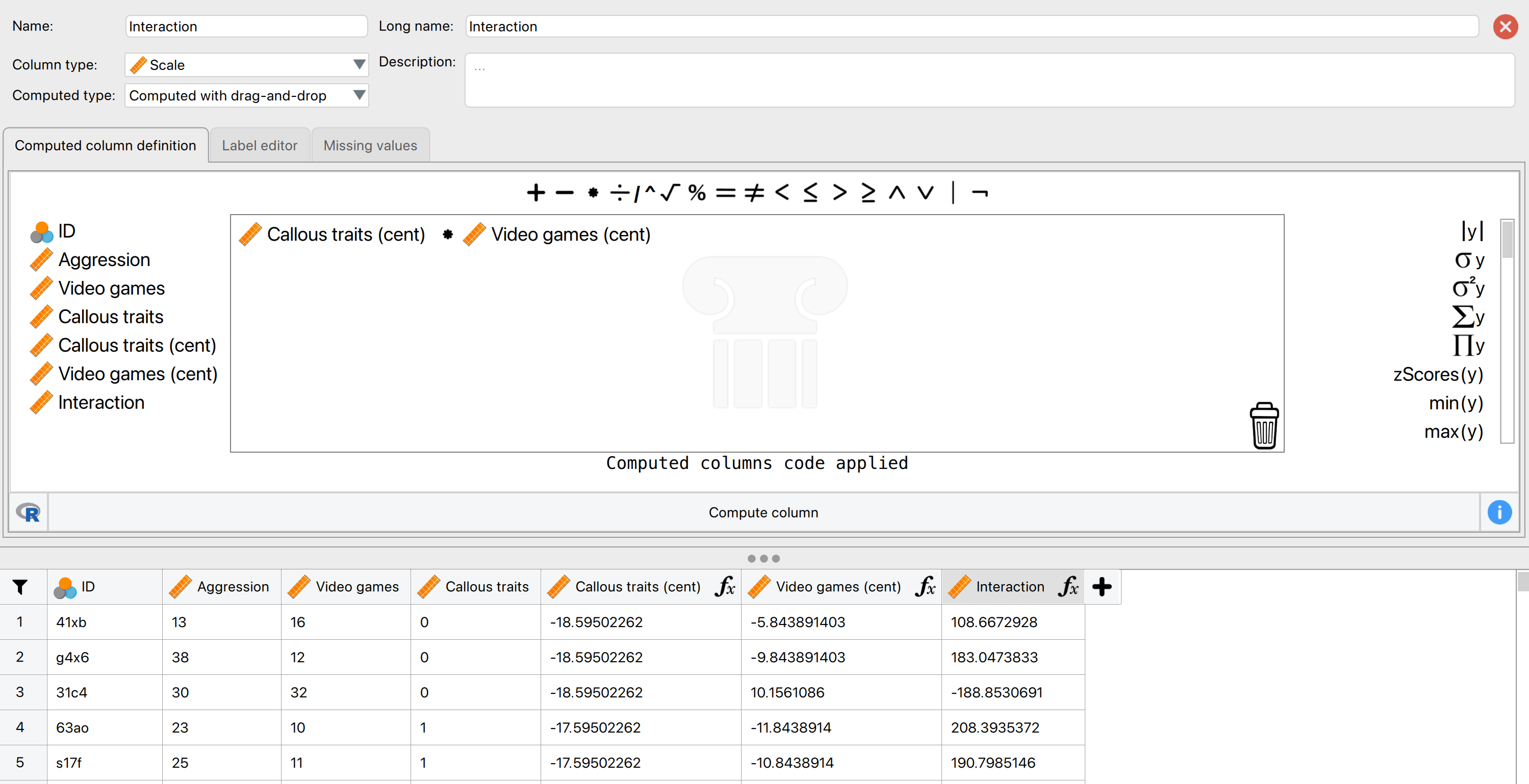
interaction variableAfter that, add your new Interaction as a Covariate in linear regression (without any additional interactions), and you’ll see that you have the same results as before! This shows that an interaction effect between two continuous predictors is nothing more than the product of those two predictors.
Self-test 10.3
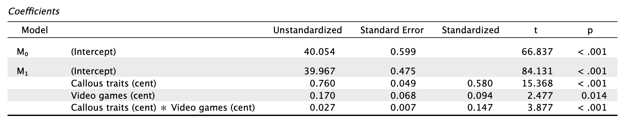
Assuming you did the previous self-test, compare the table of coefficients that you got with those in Output 10.2.
The output below shows the regression coefficients from the regression analysis that you ran using the centred versions of callous traits and hours spent gaming and their interaction as predictors. Basically, the regression coefficients are identical to those in Output 10.2 from using the Process module. The standard errors differ a little from those from the Process output, but that’s because when we used the Process module we asked for heteroscedasticity-consistent standard errors, consequently the p-values are slightly different too (because these are computed from the standard errors: \(\frac{\hat{b}}{SE_{\hat{b}}}\)). The basic conclusion is the same though: there is a significant moderation effect as shown by the significant interaction between hours spent gaming and callous unemotional traits.
Self-test 10.4
Fit the three models necessary to test mediation for Lambert et al’s data: (1) a linear model predicting
InfidelityfromConsumptionLn; (2) a linear model predictingCommitmentfromConsumptionLn; and (3) a linear model predictingInfidelityfrom bothConsumptionLnandCommitment. Is there mediation?
The results and settings can be found in the file lambert_2012.jasp. The results can be viewed in your browser here.
Interpretation
- Model 1 shows that pornography consumption significantly predicts infidelity, \(\hat{b} = 0.59\), 95% CI [0.19, 0.98], t = 2.93, p = .004. As consumption increases, physical infidelity increases also.
- Model 2 shows that pornography consumption significantly predicts relationship commitment, \(\hat{b} = -0.47\), 95% CI [\(-0.89\), \(-0.05\)], t = \(-2.21\), p = .028. As pornography consumption increases, commitment declines.
- Model 3 shows that relationship commitment significantly predicts infidelity, \(\hat{b} = -0.27\), 95% CI [\(-0.39\),\(-0.16\)], t = \(-4.61\), p < .001. As relationship commitment increases, physical infidelity declines.
- The relationship between pornography consumption and infidelity is stronger in model 1, \(\hat{b} = 0.59\), than in model 3, \(\hat{b} = 0.46\).
As such, the four conditions of mediation have been met.
Chapter 11
Self-test 11.1
To illustrate what is going on I have created a file called
puppies_dummy.jaspthat contains the puppy therapy data along with the two dummy variables (ShortandLong) we’ve just discussed (Table 11.4). Fit a linear model predicting happiness fromShortandLong.
The results and settings can be found in the file puppies_dummy.jasp. The results can be viewed in your browser here. The output is further explained in the book chapter.
Self-test 11.2
To illustrate these principles, I have created a file called
puppies_contrast.jaspin which the puppy therapy data are coded using the contrast coding scheme used in this section. Fit a linear model usingHappinessas the outcome andPuppies_vs_noneandShort_vs_longas the predictor variables (leave all default options).
The results and settings can be found in the file puppies_contrast.jasp. The results can be viewed in your browser here. The output is further explained in the book chapter.
Self-test 11.3
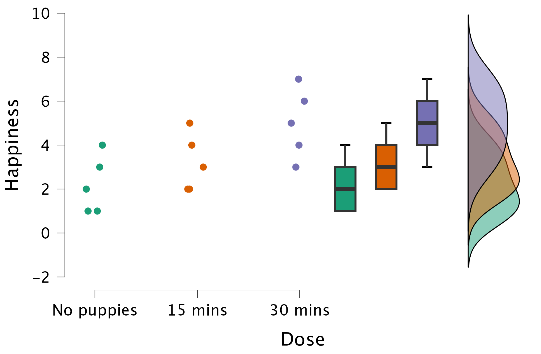
Produce a raincloud plot for the puppy therapy data.
The results and settings can be found in the file puppies.jasp. The results can be viewed in your browser here. Note that you can create this raincloud plot using the ANOVA menu, but can also head over to the Descriptives module for more options for creating a raincloud plot.
Self-test 11.4
Can you explain the contradiction between the planned contrasts and post hoc tests?
The answer is given in the book chapter.
Chapter 12
Self-test 12.1
Use JASP to find the means and standard deviations of both happiness and love of puppies across all participants and within the three groups.
These can be obtained using the Descriptives module. To obtain the group-specific statistics, be sure to specify Dose as the Split variable.
The results and settings can be found in the file puppy_love.jasp. The results can be viewed in your browser here.
Some of the results are also in Table 12.2 of the chapter.
Self-test 12.2
Add two dummy variables to the file
puppy_love.jaspthat compare the 15 minutes to the control (Low_control) and the 30 minutes to the control (High_control) – see Section 11.3.1 for help.
The data should look like the file puppy_love_dummy.jasp.
Self-test 12.3
Fit a hierarchical regression with
Happinessas the outcome. In the first block enter love of puppies (Puppy_love) as a predictor, and then in a second block enter bothLow_controlandHigh_control– see Section 8.10 for help.
The results and settings can be found in the file puppy_love_dummy.jasp. The results can be viewed in your browser here.
Output 12.1 and Output 12.2 (in the book) show the results that you should get and the text in the chapter explains this output.
Self-test 12.4
Fit a model to test whether love of puppies (our covariate) is independent of the dose of puppy therapy (our independent variable).
The results and settings can be found in the file puppy_love.jasp. The results can be viewed in your browser here.
Output 12.3 (in the book) shows the results that you should get and the text in the chapter explains this output.
Self-test 12.5
Fit the model without the covariate to see whether the three groups differ in their levels of happiness.
The results and settings can be found in the file puppy_love.jasp. The results can be viewed in your browser here.
Output 12.4 (in the book) shows the results that you should get and the text in the chapter explains this output.
Self-test 12.6
Produce a scatterplot of love of puppies (horizontal axis) against happiness (vertical axis).
The results and settings can be found in the file puppy_love.jasp. The results can be viewed in your browser here.
Figure 12.7 (in the book) shows the results that you should get and the text in the chapter explains this output.
Chapter 13
Self-test 13.1
The file
goggles_regression.jaspcontains the dummy variables used in this example. Just to prove that this works, use this file to fit a linear model predicting attractiveness ratings fromFacetype,Alcoholand theInteractionvariable.
The results and settings can be found in the file goggles_regression.jasp. The results can be viewed in your browser here.
The output is shown and discussed in Output 13.1 of the book.
Self-test 13.2
What about panels (c) and (d): do you think there is an interaction?
This question is answered in the text in the chapter.
Self-test 13.3
Use the Descriptives module to construct a raincloud plot with confidence intervals for the attractiveness ratings from goggles.jasp, with alcohol consumption as the primary factor and whether the faces being rated were unattractive or attractive as the secondary factor.
The results and settings can be found in the file goggles.jasp. The results can be viewed in your browser here.

Chapter 14
Self-test 14.1
What is a repeated-measures design? (Clue: it is described in Chapter 1.)
Repeated-measures is a term used when the same entities participate in all conditions of an experiment.
Self-test 14.2
Devise some contrast codes for the contrasts described in the text.
The answer is in Table 14.3 in the chapter.
Self-test 14.3
Thinking back to the order in which we specified the levels of Entity (Section 14.8.1), what groups are being compared in each contrast?
Given the order in which we specified the levels of Entity, contrast 1 compares the mannequin and human, contrast 2 compares the shapeshifter to the human, and contrast 3 compares the alien to the shapeshifter.
Chapter 15
Self-test 15.1
What are the null hypotheses for these hypotheses?
- There is no difference in depression levels between those who drank alcohol and those who took ecstasy on Sunday.
- There is no difference in depression levels between those who drank alcohol and those who took ecstasy on Wednesday.
Self-test 15.2
Based on what you have just learnt, try ranking the Sunday data.
The answers are in Figure 15.2. There are lots of tied ranks and the data are generally horrible.
Self-test 15.3
See whether you can use what you have learnt about data entry to enter the data in Table 15.1 into JASP.
See the file drug_long.jasp.
Self-test 15.4
Use JASP’s Descriptives module to test the normality of these data (see Sections 6.9.4 and 6.9.6).
The solution is in the book chapter (Figure 15.4). However, since the normality assumption concerns the residuals being normally distributed (rather than the data), it’s better to look at the Q-Q plots of the residuals that are provided in the T-Test menu. Those Q-Q plots can be found in the file drug_long.jasp. The results can be viewed in your browser here.
Self-test 15.5
Have a go at ranking the data and see if you get the same results as me.
Solution is in the book chapter (Table 15.3).
Self-test 15.6
See whether you can enter the data in Table 15.3 into JASP (you don’t need to enter the ranks). Then conduct a regular ANOVA (see Sections 6.9.4 and 6.9.6, and Chapter 11), including assumption tests (Q-Q plot and Levene’s test).
See soya.jasp for the data only. The results and settings for the ANOVA and assumption tests can be found in the file soya.jasp. The results can be viewed in your browser here.
Self-test 15.7
Have a go at ranking the data and see if you get the same results as in Table 15.4.
Solution is in the book chapter.
Self-test 15.8
Using what you know about inputting data, enter these data into JASP and run a regular repeated-measures ANOVA to get a Q-Q plot of the residuals (see Chapter 14).
See diet.jasp for the data only. The results and settings for the RM ANOVA and assumption tests can be found in the file diet.jasp. The results can be viewed in your browser here.
Chapter 16
Self-test 16.1
Fit a linear model with
Ln_observedas the outcome, andTraining,Danceand their interaction as the three predictors.
The results and settings can be found in the file cat_reg.jasp. The results can be viewed in your browser here.
Self-test 16.2
Fit another linear model using
cat_reg.jasp. This time the outcome is the log of expected frequencies (Ln_expected) andTrainingandDanceare the predictors (the interaction is not included).
The results and settings can be found in the file cat_reg.jasp. The results can be viewed in your browser here.
Self-test 16.3
Using the
cats_weight.jaspdata, change the frequency of cats that had food as reward and didn’t dance from 10 to 28. Re-do the chi-square test. Is there anything about the results that seems strange?
You need to change the score in the data sheet and then follow the instructions in the book to run the analysis. You can also first run the analysis and then change the value - the analysis will automatically be reran with the new data.
The contingency table and corresponding Chi-squared test you get looks like this:
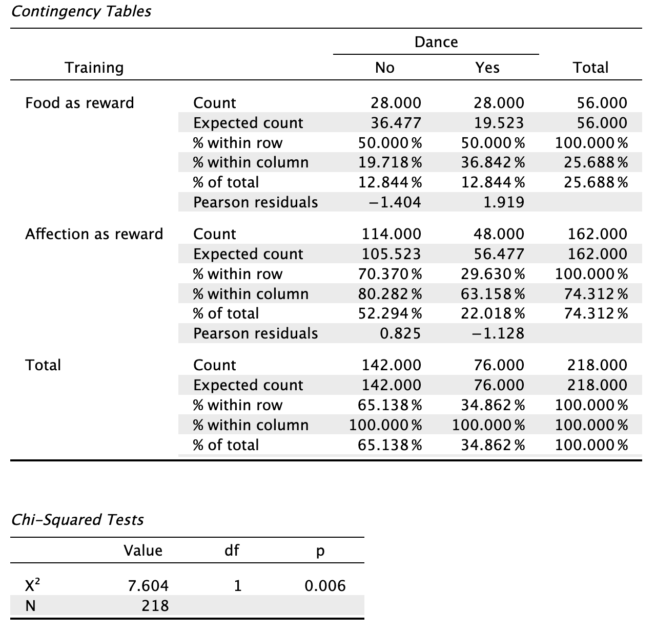
In the row labelled Food as Reward you can see the count of 28 in the column labelled Yes and in the column labelled No. Even though these counts are the same, the Chi-squared test is still significant. This is what might strike you as strange: how can it be that two identical counts of 28 can still have a significant Chi-squared statistic? The answer is that the Expected counts can still differ, if the observed counts in the second row are different from each other. If those would also be the same, then the expected counts would equal the observed counts and the Chi-squared test would have a p-value of 1.
This highlights why it makes sense to also include the conditional proportions in your contingency table, in addition to the observed counts. For instance, the first column represents all the cats that did not dance (n = 142). Within this column 28/142 = 19.7% had food. In other words, of all the cats that did not dance, 19.7% had food. The second column represents all the cats that did dance (n = 76). Within this column, 28/76 = 36.8% had food (i.e. fell into the row representing food as a reward). In other words, of all the cats that danced 36.8% had food. the second column represents all of the cats that did not dance (n = 142). These conditional proportions being different across the columns is already an indication that there is some association between Training and Dance.
Chapter 17
Self-test 17.1
Using equations 17.24, calculate the values Nagelkerke’s \(R^2\). (Remember the sample size, N, is 113.)
JASP reports \(-2LL_\text{new}\) as 144.16 and \(-2LL_\text{baseline}\) as 154.08. The sample size, N, is 113. Since Nagelkerke’s \(R^2\) is based on Cox and Snell’s \(R^2\), we calculate that one first using equation 17.23:
\[ \begin{aligned} R_{\text{CS}}^2 &= 1-exp\bigg(\frac{-2LL_\text{new}-(-2LL_\text{baseline})}{n}\bigg) \\ &= 1-exp\bigg(\frac{144.16-154.08}{113}\bigg) \\ &= 1-exp(-0.0878) \\ &= 1-e^{-0.0878} \\ &= 0.084 \end{aligned} \]
Nagelkerke’s adjustment is calculated as (equation 17.23):
\[ \begin{aligned} R_{\text{N}}^2 &= \frac{R_{\text{CS}}^2}{1-exp(-(\frac{-2LL_\text{baseline}}{n}))} \\ &= \frac{0.084}{1-exp(-(\frac{154.08}{113}))} \\ &= \frac{0.084}{1-e^{-1.3635}} \\ &= \frac{0.084}{1-0.2558} \\ &= 0.113 \end{aligned} \]
Self-test 17.2
Why might the model be better at classifying scored penalty kicks?
This question is answered in the book:
“The classification table gives us a clue as to why scored penalties are better predicted than missed ones. The vast majority of kicks are scored because people tend not to end up as professional soccer players unless they’re extremely good at kicking footballs. Of the 868 penalties in the data 793 are scored and only 75 missed!”