Smart Alex

NoteWho is Smart Alex?
Alex was aptly named because she’s, like, super smart. She likes teaching people, and her hobby is posing people questions so that she can explain the answers to them. Alex appears at the end of each chapter of Discovering Statistics Using JASP to pose you some questions and give you tasks to help you to practice your data analysis skills. This page contains her answers to those questions.
Chapter 1
Task 1.1
What are (broadly speaking) the five stages of the research process?
- Generating a research question: through an initial observation (hopefully backed up by some data).
- Generate a theory to explain your initial observation.
- Generate hypotheses: break your theory down into a set of testable predictions.
- Collect data to test the theory: decide on what variables you need to measure to test your predictions and how best to measure or manipulate those variables.
- Analyse the data: look at the data visually and by fitting a statistical model to see if it supports your predictions (and therefore your theory). At this point you should return to your theory and revise it if necessary.
Task 1.2
What is the fundamental difference between experimental and correlational research?
In a word, causality. In experimental research we manipulate a variable (predictor, independent variable) to see what effect it has on another variable (outcome, dependent variable). This manipulation, if done properly, allows us to compare situations where the causal factor is present to situations where it is absent. Therefore, if there are differences between these situations, we can attribute cause to the variable that we manipulated. In correlational research, we measure things that naturally occur and so we cannot attribute cause but instead look at natural covariation between variables.
Task 1.3
What is the level of measurement of the following variables?
- The number of downloads of different bands’ songs on iTunes:
- This is a discrete ratio measure. It is discrete because you can download only whole songs, and it is ratio because it has a true and meaningful zero (no downloads at all).
- The names of the bands downloaded.
- This is a nominal variable. Bands can be identified by their name, but the names have no meaningful order. The fact that Norwegian black metal band 1349 called themselves 1349 does not make them better than British boy-band has-beens 911; the fact that 911 were a bunch of talentless idiots does, though.
- Their positions in the download chart.
- This is an ordinal variable. We know that the band at number 1 sold more than the band at number 2 or 3 (and so on) but we don’t know how many more downloads they had. So, this variable tells us the order of magnitude of downloads, but doesn’t tell us how many downloads there actually were.
- The money earned by the bands from the downloads.
- This variable is continuous and ratio. It is continuous because money (pounds, dollars, euros or whatever) can be broken down into very small amounts (you can earn fractions of euros even though there may not be an actual coin to represent these fractions).
- The weight of drugs bought by the band with their royalties.
- This variable is continuous and ratio. If the drummer buys 100 g of cocaine and the singer buys 1 kg, then the singer has 10 times as much.
- The type of drugs bought by the band with their royalties.
- This variable is categorical and nominal: the name of the drug tells us something meaningful (crack, cannabis, amphetamine, etc.) but has no meaningful order.
- The phone numbers that the bands obtained because of their fame.
- This variable is categorical and nominal too: the phone numbers have no meaningful order; they might as well be letters. A bigger phone number did not mean that it was given by a better person.
- The gender of the people giving the bands their phone numbers.
- This variable is categorical: the people dishing out their phone numbers could fall into one of several categories based on how they self-identify when asked about their gender (their gender identity could be fluid). Taking a very simplistic view of gender, the variable might contain categories of male, female, and non-binary.
- This variable is categorical: the people dishing out their phone numbers could fall into one of several categories based on how they self-identify when asked about their gender (their gender identity could be fluid). Taking a very simplistic view of gender, the variable might contain categories of male, female, and non-binary.
- The instruments played by the band members.
- This variable is categorical and nominal too: the instruments have no meaningful order but their names tell us something useful (guitar, bass, drums, etc.).
- The time they had spent learning to play their instruments.
- This is a continuous and ratio variable. The amount of time could be split into infinitely small divisions (nanoseconds even) and there is a meaningful true zero (no time spent learning your instrument means that, like 911, you can’t play at all).
Task 1.4
Say I own 857 CDs. My friend has written a computer program that uses a webcam to scan my shelves in my house where I keep my CDs and measure how many I have. His program says that I have 863 CDs. Define measurement error. What is the measurement error in my friend’s CD counting device?
Measurement error is the difference between the true value of something and the numbers used to represent that value. In this trivial example, the measurement error is 6 CDs. In this example we know the true value of what we’re measuring; usually we don’t have this information, so we have to estimate this error rather than knowing its actual value.
Task 1.5
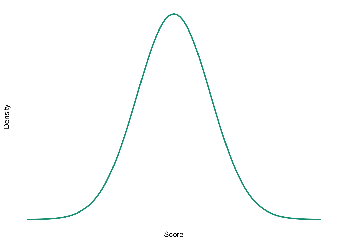
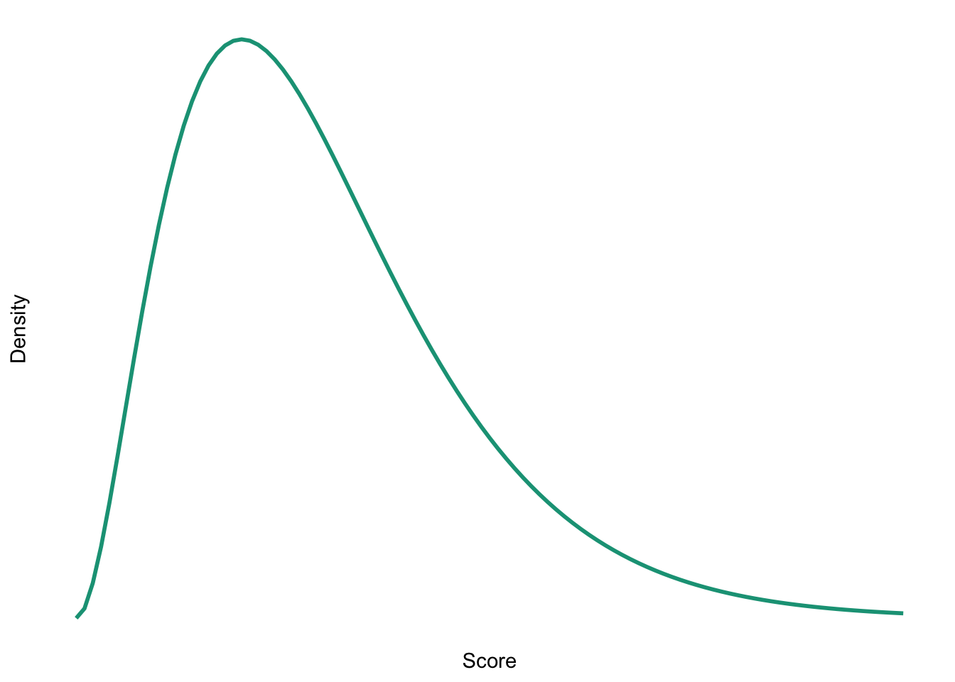
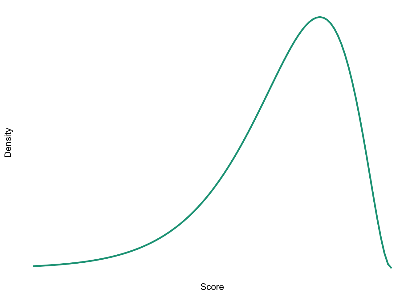
Sketch the shape of a normal distribution, a positively skewed distribution and a negatively skewed distribution.
Normal
Positive skew
Negative skew
Task 1.6
In 2011 I got married and we went to Disney Florida for our honeymoon. We bought some bride and groom Mickey Mouse hats and wore them around the parks. The staff at Disney are really nice and upon seeing our hats would say ‘congratulations’ to us. We counted how many times people said congratulations over 7 days of the honeymoon: 5, 13, 7, 14, 11, 9, 17. Calculate the mean, median, sum of squares, variance and standard deviation of these data.
First compute the mean:
\[ \begin{aligned} \overline{X} &= \frac{\sum_{i=1}^{n} x_i}{n} \\ &= \frac{5+13+7+14+11+9+17}{7} \\ &= \frac{76}{7} \\ &= 10.86 \end{aligned} \]
To calculate the median, first let’s arrange the scores in ascending order: 5, 7, 9, 11, 13, 14, 17. The median will be the (n + 1)/2th score. There are 7 scores, so this will be the 8/2 = 4th. The 4th score in our ordered list is 11.
To calculate the sum of squares, first take the mean from each score, then square this difference, finally, add up these squared values:
| Score | Error (score - mean) | Error squared | |
|---|---|---|---|
| 5 | -5.86 | 34.34 | |
| 13 | 2.14 | 4.58 | |
| 7 | -3.86 | 14.90 | |
| 14 | 3.14 | 9.86 | |
| 11 | 0.14 | 0.02 | |
| 9 | -1.86 | 3.46 | |
| 17 | 6.14 | 37.70 | |
| Total | — | — | 104.86 |
So, the sum of squared errors is:
\[ \begin{aligned} \text{SS} &= 34.34 + 4.58 + 14.90 + 9.86 + 0.02 + 3.46 + 37.70 \\ &= 104.86 \\ \end{aligned} \]
The variance is the sum of squared errors divided by the degrees of freedom:
\[ \begin{aligned} s^2 &= \frac{SS}{N - 1} \\ &= \frac{104.86}{6} \\ &= 17.48 \end{aligned} \]
The standard deviation is the square root of the variance:
\[ \begin{aligned} s &= \sqrt{s^2} \\ &= \sqrt{17.48} \\ &= 4.18 \end{aligned} \]
Task 1.7
In this chapter we used an example of the time taken for 21 heavy smokers to fall off a treadmill at the fastest setting (18, 16, 18, 24, 23, 22, 22, 23, 26, 29, 32, 34, 34, 36, 36, 43, 42, 49, 46, 46, 57). Calculate the sums of squares, variance and standard deviation of these data.
To calculate the sum of squares, take the mean from each value, then square this difference. Finally, add up these squared values (the values in the final column). The sum of squared errors is a massive 2685.24.
| Score | Mean | Difference | Difference squared | |
|---|---|---|---|---|
| 18 | 32.19 | -14.19 | 201.356 | |
| 16 | 32.19 | -16.19 | 262.116 | |
| 18 | 32.19 | -14.19 | 201.356 | |
| 24 | 32.19 | -8.19 | 67.076 | |
| 23 | 32.19 | -9.19 | 84.456 | |
| 22 | 32.19 | -10.19 | 103.836 | |
| 22 | 32.19 | -10.19 | 103.836 | |
| 23 | 32.19 | -9.19 | 84.456 | |
| 26 | 32.19 | -6.19 | 38.316 | |
| 29 | 32.19 | -3.19 | 10.176 | |
| 32 | 32.19 | -0.19 | 0.036 | |
| 34 | 32.19 | 1.81 | 3.276 | |
| 34 | 32.19 | 1.81 | 3.276 | |
| 36 | 32.19 | 3.81 | 14.516 | |
| 36 | 32.19 | 3.81 | 14.516 | |
| 43 | 32.19 | 10.81 | 116.856 | |
| 42 | 32.19 | 9.81 | 96.236 | |
| 49 | 32.19 | 16.81 | 282.576 | |
| 46 | 32.19 | 13.81 | 190.716 | |
| 46 | 32.19 | 13.81 | 190.716 | |
| 57 | 32.19 | 24.81 | 615.536 | |
| Total | — | — | — | 2685.236 |
The variance is the sum of squared errors divided by the degrees of freedom (\(N-1\)). There were 21 scores and so the degrees of freedom were 20. The variance is, therefore:
\[ \begin{aligned} s^2 &= \frac{SS}{N - 1} \\ &= \frac{2685.24}{20} \\ &= 134.26 \end{aligned} \]
The standard deviation is the square root of the variance:
\[ \begin{aligned} s &= \sqrt{s^2} \\ &= \sqrt{134.26} \\ &= 11.59 \end{aligned} \]
Task 1.8
Sports scientists sometimes talk of a ‘red zone’, which is a period during which players in a team are more likely to pick up injuries because they are fatigued. When a player hits the red zone it is a good idea to rest them for a game or two. At a prominent London football club that I support, they measured how many consecutive games the 11 first team players could manage before hitting the red zone: 10, 16, 8, 9, 6, 8, 9, 11, 12, 19, 5. Calculate the mean, standard deviation, median, range and interquartile range.
First we need to compute the mean:
\[ \begin{aligned} \overline{X} &= \frac{\sum_{i=1}^{n} x_i}{n} \\ &= \frac{10+16+8+9+6+8+9+11+12+19+5}{11} \\ &= \frac{113}{11} \\ &= 10.27 \end{aligned} \]
Then the standard deviation, which we do as follows:
| Score | Error (score - mean) | Error squared | |
|---|---|---|---|
| 10 | -0.27 | 0.07 | |
| 16 | 5.73 | 32.83 | |
| 8 | -2.27 | 5.15 | |
| 9 | -1.27 | 1.61 | |
| 6 | -4.27 | 18.23 | |
| 8 | -2.27 | 5.15 | |
| 9 | -1.27 | 1.61 | |
| 11 | 0.73 | 0.53 | |
| 12 | 1.73 | 2.99 | |
| 19 | 8.73 | 76.21 | |
| 5 | -5.27 | 27.77 | |
| Total | — | — | 172.15 |
So, the sum of squared errors is:
\[ \begin{aligned} \text{SS} &= 0.07 + 32.83 + 5.15 + 1.61 + 18.23 + 5.15 + 1.61 + 0.53 + 2.99 + 76.21 + 27.77 \\ &= 172.15 \\ \end{aligned} \]
The variance is the sum of squared errors divided by the degrees of freedom:
\[ \begin{aligned} s^2 &= \frac{SS}{N - 1} \\ &= \frac{172.15}{10} \\ &= 17.22 \end{aligned} \]
The standard deviation is the square root of the variance:
\[ \begin{aligned} s &= \sqrt{s^2} \\ &= \sqrt{17.22} \\ &= 4.15 \end{aligned} \]
- To calculate the median, range and interquartile range, first let’s arrange the scores in ascending order: 5, 6, 8, 8, 9, 9, 10, 11, 12, 16, 19. The median: The median will be the (\(n + 1\))/2th score. There are 11 scores, so this will be the 12/2 = 6th. The 6th score in our ordered list is 9 games. Therefore, the median number of games is 9.
- The lower quartile: This is the median of the lower half of scores. If we split the data at 9 (the 6th score), there are 5 scores below this value. The median of 5 = 6/2 = 3rd score. The 3rd score is 8, the lower quartile is therefore 8 games.
- The upper quartile: This is the median of the upper half of scores. If we split the data at 9 again (not including this score), there are 5 scores above this value. The median of 5 = 6/2 = 3rd score above the median. The 3rd score above the median is 12; the upper quartile is therefore 12 games.
- The range: This is the highest score (19) minus the lowest (5), i.e. 14 games.
- The interquartile range: This is the difference between the upper and lower quartile: 12−8 = 4 games.
Task 1.9
Celebrities always seem to be getting divorced. The (approximate) length of some celebrity marriages in days are: 240 (J-Lo and Cris Judd), 144 (Charlie Sheen and Donna Peele), 143 (Pamela Anderson and Kid Rock), 72 (Kim Kardashian, if you can call her a celebrity), 30 (Drew Barrymore and Jeremy Thomas), 26 (Axl Rose and Erin Everly), 2 (Britney Spears and Jason Alexander), 150 (Drew Barrymore again, but this time with Tom Green), 14 (Eddie Murphy and Tracy Edmonds), 150 (Renee Zellweger and Kenny Chesney), 1657 (Jennifer Aniston and Brad Pitt). Compute the mean, median, standard deviation, range and interquartile range for these lengths of celebrity marriages.
First we need to compute the mean:
\[ \begin{aligned} \overline{X} &= \frac{\sum_{i=1}^{n} x_i}{n} \\ &= \frac{240+144+143+72+30+26+2+150+14+150+1657}{11} \\ &= \frac{2628}{11} \\ &= 238.91 \end{aligned} \]
Then the standard deviation, which we do as follows:
| Score | Error (score - mean) | Error squared | |
|---|---|---|---|
| 240 | 1.09 | 1.19 | |
| 144 | -94.91 | 9007.91 | |
| 143 | -95.91 | 9198.73 | |
| 72 | -166.91 | 27858.95 | |
| 30 | -208.91 | 43643.39 | |
| 26 | -212.91 | 45330.67 | |
| 2 | -236.91 | 56126.35 | |
| 150 | -88.91 | 7904.99 | |
| 14 | -224.91 | 50584.51 | |
| 150 | -88.91 | 7904.99 | |
| 1657 | 1418.09 | 2010979.25 | |
| Total | — | — | 2268541 |
So, the sum of squared errors is the sum of the final column. The variance is the sum of squared errors divided by the degrees of freedom:
\[ \begin{aligned} s^2 &= \frac{SS}{N - 1} \\ &= \frac{2268541}{10} \\ &= 226854.1 \end{aligned} \]
The standard deviation is the square root of the variance:
\[ \begin{aligned} s &= \sqrt{s^2} \\ &= \sqrt{226854.1} \\ &= 476.29 \end{aligned} \]
- To calculate the median, range and interquartile range, first let’s arrange the scores in ascending order: 2, 14, 26, 30, 72, 143, 144, 150, 150, 240, 1657. The median: The median will be the (n + 1)/2th score. There are 11 scores, so this will be the 12/2 = 6th. The 6th score in our ordered list is 143. The median length of these celebrity marriages is therefore 143 days.
- The lower quartile: This is the median of the lower half of scores. If we split the data at 143 (the 6th score), there are 5 scores below this value. The median of 5 = 6/2 = 3rd score. The 3rd score is 26, the lower quartile is therefore 26 days.
- The upper quartile: This is the median of the upper half of scores. If we split the data at 143 again (not including this score), there are 5 scores above this value. The median of 5 = 6/2 = 3rd score above the median. The 3rd score above the median is 150; the upper quartile is therefore 150 days.
- The range: This is the highest score (1657) minus the lowest (2), i.e. 1655 days.
- The interquartile range: This is the difference between the upper and lower quartile: 150−26 = 124 days.
Task 1.10
Repeat Task 9 but excluding Jennifer Anniston and Brad Pitt’s marriage. How does this affect the mean, median, range, interquartile range, and standard deviation? What do the differences in values between Tasks 9 and 10 tell us about the influence of unusual scores on these measures?
First let’s compute the new mean:
\[ \begin{aligned} \overline{X} &= \frac{\sum_{i=1}^{n} x_i}{n} \\ &= \frac{240+144+143+72+30+26+2+150+14+150}{11} \\ &= \frac{971}{11} \\ &= 97.1 \end{aligned} \]
The mean length of celebrity marriages is now 97.1 days compared to 238.91 days when Jennifer Aniston and Brad Pitt’s marriage was included. This demonstrates that the mean is greatly influenced by extreme scores.
Let’s now calculate the standard deviation excluding Jennifer Aniston and Brad Pitt’s marriage:
| Score | Error (score - mean) | Error squared | |
|---|---|---|---|
| 240 | 142.9 | 20420.41 | |
| 144 | 46.9 | 2199.61 | |
| 143 | 45.9 | 2106.81 | |
| 72 | -25.1 | 630.01 | |
| 30 | -67.1 | 4502.41 | |
| 26 | -71.1 | 5055.21 | |
| 2 | -95.1 | 9044.01 | |
| 150 | 52.9 | 2798.41 | |
| 14 | -83.1 | 6905.61 | |
| 150 | 52.9 | 2798.41 | |
| Total | — | — | 56460.9 |
So, the sum of squared errors is:
\[ \begin{aligned} \text{SS} &= 20420.41 + 2199.61 + 2106.81 + 630.01 + 4502.41 + 5055.21 + 9044.01 + 2798.41 + 6905.61 + 2798.41 \\ &= 56460.90 \\ \end{aligned} \]
The variance is the sum of squared errors divided by the degrees of freedom:
\[ \begin{aligned} s^2 &= \frac{SS}{N - 1} \\ &= \frac{56460.90}{9} \\ &= 6273.43 \end{aligned} \]
The standard deviation is the square root of the variance:
\[ \begin{aligned} s &= \sqrt{s^2} \\ &= \sqrt{6273.43} \\ &= 79.21 \end{aligned} \]
From these calculations we can see that the variance and standard deviation, like the mean, are both greatly influenced by extreme scores. When Jennifer Aniston and Brad Pitt’s marriage was included in the calculations (see Smart Alex Task 9), the variance and standard deviation were much larger, i.e. 226854.09 and 476.29 respectively.
- To calculate the median, range and interquartile range, first, let’s again arrange the scores in ascending order but this time excluding Jennifer Aniston and Brad Pitt’s marriage: 2, 14, 26, 30, 72, 143, 144, 150, 150, 240.
- The median: The median will be the (n + 1)/2 score. There are now 10 scores, so this will be the 11/2 = 5.5th. Therefore, we take the average of the 5th score and the 6th score. The 5th score is 72, and the 6th is 143; the median is therefore 107.5 days.
- The lower quartile: This is the median of the lower half of scores. If we split the data at 107.5 (this score is not in the data set), there are 5 scores below this value. The median of 5 = 6/2 = 3rd score. The 3rd score is 26; the lower quartile is therefore 26 days.
- The upper quartile: This is the median of the upper half of scores. If we split the data at 107.5 (this score is not actually present in the data set), there are 5 scores above this value. The median of 5 = 6/2 = 3rd score above the median. The 3rd score above the median is 150; the upper quartile is therefore 150 days.
- The range: This is the highest score (240) minus the lowest (2), i.e. 238 days. You’ll notice that without the extreme score the range drops dramatically from 1655 to 238 – less than half the size.
- The interquartile range: This is the difference between the upper and lower quartile: 150 − 26 = 124 days of marriage. This is the same as the value we got when Jennifer Aniston and Brad Pitt’s marriage was included. This demonstrates the advantage of the interquartile range over the range, i.e. it isn’t affected by extreme scores at either end of the distribution
Chapter 2
Task 2.1
Why do we use samples?
We are usually interested in populations, but because we cannot collect data from every human being (or whatever) in the population, we collect data from a small subset of the population (known as a sample) and use these data to infer things about the population as a whole.
Task 2.2
What is the mean and how do we tell if it’s representative of our data?
The mean is a simple statistical model of the centre of a distribution of scores. A hypothetical estimate of the ‘typical’ score. We use the variance, or standard deviation, to tell us whether it is representative of our data. The standard deviation is a measure of how much error there is associated with the mean: a small standard deviation indicates that the mean is a good representation of our data.
Task 2.3
What’s the difference between the standard deviation and the standard error?
The standard deviation tells us how much observations in our sample differ from the mean value within our sample. The standard error tells us not about how the sample mean represents the sample itself, but how well the sample mean represents the population mean. The standard error is the standard deviation of the sampling distribution of a statistic. For a given statistic (e.g. the mean) it tells us how much variability there is in this statistic across samples from the same population. Large values, therefore, indicate that a statistic from a given sample may not be an accurate reflection of the population from which the sample came.
Task 2.4
In Chapter 1 we used an example of the time in seconds taken for 21 heavy smokers to fall off a treadmill at the fastest setting (18, 16, 18, 24, 23, 22, 22, 23, 26, 29, 32, 34, 34, 36, 36, 43, 42, 49, 46, 46, 57). Calculate standard error and 95% confidence interval for these data.
If you did the tasks in Chapter 1, you’ll know that the mean is 32.19 seconds:
\[ \begin{aligned} \overline{X} &= \frac{\sum_{i=1}^{n} x_i}{n} \\ &= \frac{16+(2\times18)+(2\times22)+(2\times23)+24+26+29+32+(2\times34)+(2\times36)+42+43+(2\times46)+49+57}{21} \\ &= \frac{676}{21} \\ &= 32.19 \end{aligned} \]
We also worked out that the sum of squared errors was 2685.24; the variance was 2685.24/20 = 134.26; the standard deviation is the square root of the variance, so was \(\sqrt(134.26)\) = 11.59. The standard error will be:
\[ SE = \frac{s}{\sqrt{N}} = \frac{11.59}{\sqrt{21}} = 2.53 \]
The sample is small, so to calculate the confidence interval we need to find the appropriate value of t. First we need to calculate the degrees of freedom, \(N − 1\). With 21 data points, the degrees of freedom are 20. For a 95% confidence interval we can look up the value in the column labelled ‘Two-Tailed Test’, ‘0.05’ in the table of critical values of the t-distribution (Appendix). The corresponding value is 2.09. The confidence intervals is, therefore, given by:
\[ \begin{aligned} \text{95% CI}_\text{lower boundary} &= \overline{X}-(2.09 \times SE)) \\ &= 32.19 – (2.09 × 2.53) \\ & = 26.90 \\ \text{95% CI}_\text{upper boundary} &= \overline{X}+(2.09 \times SE) \\ &= 32.19 + (2.09 × 2.53) \\ &= 37.48 \end{aligned} \]
Task 2.5
What do the sum of squares, variance and standard deviation represent? How do they differ?
All of these measures tell us something about how well the mean fits the observed sample data. Large values (relative to the scale of measurement) suggest the mean is a poor fit of the observed scores, and small values suggest a good fit. They are also, therefore, measures of dispersion, with large values indicating a spread-out distribution of scores and small values showing a more tightly packed distribution. These measures all represent the same thing, but differ in how they express it. The sum of squared errors is a ‘total’ and is, therefore, affected by the number of data points. The variance is the ‘average’ variability but in units squared. The standard deviation is the average variation but converted back to the original units of measurement. As such, the size of the standard deviation can be compared to the mean (because they are in the same units of measurement).
Task 2.6
What is a test statistic and what does it tell us?
A test statistic is a statistic for which we know how frequently different values occur. The observed value of such a statistic is typically used to test hypotheses, or to establish whether a model is a reasonable representation of what’s happening in the population.
Task 2.7
What are Type I and Type II errors?
A Type I error occurs when we believe that there is a genuine effect in our population, when in fact there isn’t. A Type II error occurs when we believe that there is no effect in the population when, in reality, there is.
Task 2.8
What is statistical power?
Power is the ability of a test to detect an effect of a particular size (a value of 0.8 is a good level to aim for).
Task 2.9
Figure 2.16 shows two experiments that looked at the effect of singing versus conversation on how much time a woman would spend with a man. In both experiments the means were 10 (singing) and 12 (conversation), the standard deviations in all groups were 3, but the group sizes were 10 per group in the first experiment and 100 per group in the second. Compute the values of the confidence intervals displayed in the Figure.
Experiment 1:
In both groups, because they have a standard deviation of 3 and a sample size of 10, the standard error will be:
\[ SE = \frac{s}{\sqrt{N}} = \frac{3}{\sqrt{10}} = 0.95 \]
The sample is small, so to calculate the confidence interval we need to find the appropriate value of t. First we need to calculate the degrees of freedom, \(N − 1\). With 10 data points, the degrees of freedom are 9. For a 95% confidence interval we can look up the value in the column labelled ‘Two-Tailed Test’, ‘0.05’ in the table of critical values of the t-distribution (Appendix). The corresponding value is 2.26. The confidence interval for the singing group is, therefore, given by:
\[ \begin{aligned} \text{95% CI}_\text{lower boundary} &= \overline{X}-(2.26 \times SE) \\ &= 10 – (2.26 × 0.95) \\ & = 7.85 \\ \text{95% CI}_\text{upper boundary} &= \overline{X}+(2.26 \times SE) \\ &= 10 + (2.26 × 0.95) \\ &= 12.15 \end{aligned} \]
For the conversation group:
\[ \begin{aligned} \text{95% CI}_\text{lower boundary} &= \overline{X}-(2.26 \times SE) \\ &= 12 – (2.26 × 0.95) \\ & = 9.85 \\ \text{95% CI}_\text{upper boundary} &= \overline{X}+(2.26 \times SE) \\ &= 12 + (2.26 × 0.95) \\ &= 14.15 \end{aligned} \]
Experiment 2
In both groups, because they have a standard deviation of 3 and a sample size of 100, the standard error will be:
\[ SE = \frac{s}{\sqrt{N}} = \frac{3}{\sqrt{100}} = 0.3 \]
The sample is large, so to calculate the confidence interval we need to find the appropriate value of z. For a 95% confidence interval we should look up the value of 0.025 in the column labelled Smaller Portion in the table of the standard normal distribution (Appendix). The corresponding value is 1.96. The confidence interval for the singing group is, therefore, given by:
\[ \begin{aligned} \text{95% CI}_\text{lower boundary} &= \overline{X}-(1.96 \times SE) \\ &= 10 – (1.96 × 0.3) \\ & = 9.41 \\ \text{95% CI}_\text{upper boundary} &= \overline{X}+(1.96 \times SE) \\ &= 10 + (1.96 × 0.3) \\ &= 10.59 \end{aligned} \]
For the conversation group:
\[ \begin{aligned} \text{95% CI}_\text{lower boundary} &= \overline{X}-(1.96 \times SE) \\ &= 12 – (1.96 × 0.3) \\ & = 11.41 \\ \text{95% CI}_\text{upper boundary} &= \overline{X}+(1.96 \times SE) \\ &= 12 + (1.96 × 0.3) \\ &= 12.59 \end{aligned} \]
Task 2.10
Figure 2.17 shows a similar study to above, but the means were 10 (singing) and 10.01 (conversation), the standard deviations in both groups were 3, and each group contained 1 million people. Compute the values of the confidence intervals displayed in the figure.
In both groups, because they have a standard deviation of 3 and a sample size of 1,000,000, the standard error will be:
\[ SE = \frac{s}{\sqrt{N}} = \frac{3}{\sqrt{1000000}} = 0.003 \]
The sample is large, so to calculate the confidence interval we need to find the appropriate value of z. For a 95% confidence interval we should look up the value of 0.025 in the column labelled Smaller Portion in the table of the standard normal distribution (Appendix). The corresponding value is 1.96. The confidence interval for the singing group is, therefore, given by:
\[ \begin{aligned} \text{95% CI}_\text{lower boundary} &= \overline{X}-(1.96 \times SE) \\ &= 10 – (1.96 × 0.003) \\ & = 9.99412 \\ \text{95% CI}_\text{upper boundary} &= \overline{X}+(1.96 \times SE) \\ &= 10 + (1.96 × 0.003) \\ &= 10.00588 \end{aligned} \]
For the conversation group:
\[ \begin{aligned} \text{95% CI}_\text{lower boundary} &= \overline{X}-(1.96 \times SE) \\ &= 10.01 – (1.96 × 0.003) \\ & = 10.00412 \\ \text{95% CI}_\text{upper boundary} &= \overline{X}+(1.96 \times SE) \\ &= 10.01 + (1.96 × 0.003) \\ &= 10.01588 \end{aligned} \]
Note: these values will look slightly different than the plot because the exact means were 10.00147 and 10.01006, but we rounded off to 10 and 10.01 to make life a bit easier. If you use these exact values you’d get, for the singing group:
\[ \begin{aligned} \text{95% CI}_\text{lower boundary} &= \overline{X}-(1.96 \times SE) \\ &= 10.01006 – (1.96 × 0.003) \\ & = 9.99559 \\ \text{95% CI}_\text{upper boundary} &= \overline{X}+(1.96 \times SE) \\ &= 10.01006 + (1.96 × 0.003) \\ &= 10.00735 \end{aligned} \]
For the conversation group:
\[ \begin{aligned} \text{95% CI}_\text{lower boundary} &= \overline{X}-(1.96 \times SE) \\ &= 10.01006 – (1.96 × 0.003) \\ & = 10.00418 \\ \text{95% CI}_\text{upper boundary} &= \overline{X}+(1.96 \times SE) \\ &= 10.01006 + (1.96 × 0.003) \\ &= 10.01594 \end{aligned} \]
Task 2.11
In Chapter 1 (Task 8) we looked at an example of how many games it took a sportsperson before they hit the ‘red zone’ Calculate the standard error and confidence interval for those data.
We worked out in Chapter 1 that the mean was 10.27, the standard deviation 4.15, and there were 11 sportspeople in the sample. The standard error will be:
\[ SE = \frac{s}{\sqrt{N}} = \frac{4.15}{\sqrt{11}} = 1.25 \] The sample is small, so to calculate the confidence interval we need to find the appropriate value of t. First we need to calculate the degrees of freedom, \(N − 1\). With 11 data points, the degrees of freedom are 10. For a 95% confidence interval we can look up the value in the column labelled ‘Two-Tailed Test’, ‘.05’ in the table of critical values of the t-distribution (Appendix). The corresponding value is 2.23. The confidence interval is, therefore, given by:
\[ \begin{aligned} \text{95% CI}_\text{lower boundary} &= \overline{X}-(2.23 \times SE) \\ &= 10.27 – (2.23 × 1.25) \\ & = 7.48 \\ \text{95% CI}_\text{upper boundary} &= \overline{X}+(2.23 \times SE) \\ &= 10.27 + (2.23 × 1.25) \\ &= 13.06 \end{aligned} \]
Task 2.12
At a rival club to the one I support, they similarly measured the number of consecutive games it took their players before they reached the red zone. The data are: 6, 17, 7, 3, 8, 9, 4, 13, 11, 14, 7. Calculate the mean, standard deviation, and confidence interval for these data.
First we need to compute the mean: \[ \begin{aligned} \overline{X} &= \frac{\sum_{i=1}^{n} x_i}{n} \\ &= \frac{6+17+7+3+8+9+4+13+11+14+7}{11} \\ &= \frac{99}{11} \\ &= 9.00 \end{aligned} \]
Then the standard deviation, which we do as follows:
| Score | Error (score - mean) | Error squared | |
|---|---|---|---|
| 6 | -3 | 9 | |
| 17 | 8 | 64 | |
| 7 | -2 | 4 | |
| 3 | -6 | 36 | |
| 8 | -1 | 1 | |
| 9 | 0 | 0 | |
| 4 | -5 | 25 | |
| 13 | 4 | 16 | |
| 11 | 2 | 4 | |
| 14 | 5 | 25 | |
| 7 | -2 | 4 | |
| Total | — | — | 188 |
The sum of squared errors is:
\[ \begin{aligned} \text{SS} &= 9 + 64 + 4 + 36 + 1 + 0 + 25 + 16 + 4 + 25 + 4 \\ &= 188 \\ \end{aligned} \]
The variance is the sum of squared errors divided by the degrees of freedom:
\[ \begin{aligned} s^2 &= \frac{SS}{N - 1} \\ &= \frac{188}{10} \\ &= 18.8 \end{aligned} \]
The standard deviation is the square root of the variance:
\[ \begin{aligned} s &= \sqrt{s^2} \\ &= \sqrt{18.8} \\ &= 4.34 \end{aligned} \]
There were 11 sportspeople in the sample, so the standard error will be: \[ SE = \frac{s}{\sqrt{N}} = \frac{4.34}{\sqrt{11}} = 1.31\]
The sample is small, so to calculate the confidence interval we need to find the appropriate value of t. First we need to calculate the degrees of freedom, \(N − 1\). With 11 data points, the degrees of freedom are 10. For a 95% confidence interval we can look up the value in the column labelled ‘Two-Tailed Test’, ‘0.05’ in the table of critical values of the t-distribution (Appendix). The corresponding value is 2.23. The confidence intervals is, therefore, given by:
\[ \begin{aligned} \text{95% CI}_\text{lower boundary} &= \overline{X}-(2.23\times SE)) \\ &= 9 – (2.23 × 1.31) \\ & = 6.08 \\ \text{95% CI}_\text{upper boundary} &= \overline{X}+(2.23\times SE) \\ &= 9 + (2.23 × 1.31) \\ &= 11.92 \end{aligned} \]
Task 2.13
In Chapter 1 (Task 9) we looked at the length in days of 11 celebrity marriages. Here are the approximate lengths in months of nine marriages, one being mine and the others being those of some of my friends and family. In all but two cases the lengths are calculated up to the day I’m writing this, which is 20 June 2023, but the 3- and 111-month durations are marriages that have ended – neither of these is mine, in case you’re wondering: 3, 144, 267, 182, 159, 152, 693, 50, and 111. Calculate the mean, standard deviation and confidence interval for these data.
First we need to compute the mean:
\[ \begin{aligned} \overline{X} &= \frac{\sum_{i=1}^{n} x_i}{n} \\ &= \frac{3 + 144 + 267 + 182 + 159 + 152 + 693 + 50 + 111}{9} \\ &= \frac{1761}{9} \\ &= 195.67 \end{aligned} \]
Compute the standard deviation as follows:
| Score | Error (score - mean) | Error squared | |
|---|---|---|---|
| 3 | -192.67 | 37121.73 | |
| 144 | -51.67 | 2669.79 | |
| 267 | 71.33 | 5087.97 | |
| 182 | -13.67 | 186.87 | |
| 159 | -36.67 | 1344.69 | |
| 152 | -43.67 | 1907.07 | |
| 693 | 497.33 | 247337.13 | |
| 50 | -145.67 | 21219.75 | |
| 111 | -84.67 | 7169.01 | |
| Total | — | — | 324044 |
The sum of squared errors is:
\[ \begin{aligned} \text{SS} &= 37121.73 + 2669.79 + 5087.97 + 186.87 + 1344.69 + 1907.07 + 247337.13 + 21219.75 + 7169.01 \\ &= 324044 \\ \end{aligned} \]
The variance is the sum of squared errors divided by the degrees of freedom:
\[ \begin{aligned} s^2 &= \frac{SS}{N - 1} \\ &= \frac{324044}{8} \\ &= 40505.5 \end{aligned} \] The standard deviation is the square root of the variance:
\[ \begin{aligned} s &= \sqrt{s^2} \\ &= \sqrt{40505.5} \\ &= 201.2598 \end{aligned} \]
The standard error is:
\[ \begin{aligned} SE &= \frac{s}{\sqrt{N}} \\ &= \frac{201.2598}{\sqrt{9}} \\ &= 67.0866 \end{aligned} \]
The sample is small, so to calculate the confidence interval we need to find the appropriate value of t. First we need to calculate the degrees of freedom, \(N − 1\). With 9 data points, the degrees of freedom are 8. For a 95% confidence interval we can look up the value in the column labelled ‘Two-Tailed Test’, ‘0.05’ in the table of critical values of the t-distribution (Appendix). The corresponding value is 2.31. The confidence interval is, therefore, given by:
\[ \begin{aligned} \text{95% CI}_\text{lower boundary} &= \overline{X}-(2.31 \times SE)) \\ &= 195.67 – (2.31 × 67.0866) \\ & = 40.70 \\ \text{95% CI}_\text{upper boundary} &= \overline{X}+(2.31 \times SE) \\ &= 195.67 + (2.31 × 67.0866) \\ &= 350.64 \end{aligned} \]
Chapter 3
Task 3.1
What is an effect size and how is it measured?
An effect size is an objective and standardized measure of the magnitude of an observed effect. Measures include Cohen’s d, the odds ratio and Pearson’s correlations coefficient, r. Cohen’s d, for example, is the difference between two means divided by either the standard deviation of the control group, or by a pooled standard deviation.
Task 3.2
In Chapter 1 (Task 8) we looked at an example of how many games it took a sportsperson before they hit the ‘red zone’, then in Chapter 2 we looked at data from a rival club. Compute and interpret Cohen’s \(\hat{d}\) for the difference in the mean number of games it took players to become fatigued in the two teams mentioned in those tasks.
Cohen’s d is defined as:
\[ \hat{d} = \frac{\bar{X_1}-\bar{X_2}}{s} \]
There isn’t an obvious control group, so let’s use a pooled estimate of the standard deviation:
\[ \begin{aligned} s_p &= \sqrt{\frac{(N_1-1) s_1^2+(N_2-1) s_2^2}{N_1+N_2-2}} \\ &= \sqrt{\frac{(11-1)4.15^2+(11-1)4.34^2}{11+11-2}} \\ &= \sqrt{\frac{360.23}{20}} \\ &= 4.24 \end{aligned} \]
Therefore, Cohen’s \(\hat{d}\) is:
\[ \hat{d} = \frac{10.27-9}{4.24} = 0.30 \]
Therefore, the second team fatigued in fewer matches than the first team by about 1/3 standard deviation. By the benchmarks that we probably shouldn’t use, this is a small to medium effect, but I guess if you’re managing a top-flight sports team, fatiguing 1/3 of a standard deviation faster than one of your opponents could make quite a substantial difference to your performance and team rotation over the season.
Task 3.3
Calculate and interpret Cohen’s \(\hat{d}\) for the difference in the mean duration of the celebrity marriages in Chapter 1 (Task 9) and me and my friend’s marriages (Chapter 2, Task 13).
Cohen’s \(\hat{d}\) is defined as:
\[ \hat{d} = \frac{\bar{X_1}-\bar{X_2}}{s} \]
There isn’t an obvious control group, so let’s use a pooled estimate of the standard deviation:
\[ \begin{aligned} s_p &= \sqrt{\frac{(N_1-1) s_1^2+(N_2-1) s_2^2}{N_1+N_2-2}} \\ &= \sqrt{\frac{(11-1)476.29^2+(9-1)8275.91^2}{11+9-2}} \\ &= \sqrt{\frac{550194093}{18}} \\ &= 5528.68 \end{aligned} \]
Therefore, Cohen’s d is: \[\hat{d} = \frac{5057-238.91}{5528.68} = 0.87\] Therefore, my friend’s marriages are 0.87 standard deviations longer than the sample of celebrities. By the benchmarks that we probably shouldn’t use, this is a large effect.
Task 3.4
What are the problems with null hypothesis significance testing?
- We can’t conclude that an effect is important because the p-value from which we determine significance is affected by sample size. Therefore, the word ‘significant’ is meaningless when referring to a p-value.
- The null hypothesis is never true. If the p-value is greater than .05 then we can decide to reject the alternative hypothesis, but this is not the same thing as the null hypothesis being true: a non-significant result tells us is that the effect is not big enough to be found but it doesn’t tell us that the effect is zero.
- A significant result does not tell us that the null hypothesis is false (see text for details).
- It encourages all or nothing thinking: if p < 0.05 then an effect is significant, but if p > 0.05 it is not. So, a p = 0.0499 is significant but a p = 0.0501 is not, even though these ps differ by only 0.0002.
Task 3.5
What is the difference between a confidence interval and a credible interval?
A 95% confidence interval is set so that before the data are collected there is a long-run probability of 0.95 (or 95%) that the interval will contain the true value of the parameter. This means that in 100 random samples, the intervals will contain the true value in 95 of them but won’t in 5. Once the data are collected, your sample is either one of the 95% that produces an interval containing the true value, or one of the 5% that does not. In other words, having collected the data, the probability of the interval containing the true value of the parameter is either 0 (it does not contain it) or 1 (it does contain it), but you do not know which. A credible interval is different in that it reflects the plausible probability that the interval contains the true value. For example, a 95% credible interval has a plausible 0.95 probability of containing the true value.
Task 3.6
What is a meta-analysis?
Meta-analysis is where effect sizes from different studies testing the same hypothesis are combined to get a better estimate of the size of the effect in the population.
Task 3.7
Describe what you understand by the term Bayes factor.
The Bayes factor is the ratio of the probability of the data given the alternative hypothesis to that of the data given the null hypothesis. A Bayes factor less than 1 supports the null hypothesis (it suggests the data are more likely given the null hypothesis than the alternative hypothesis); conversely, a Bayes factor greater than 1 suggests that the observed data are more likely given the alternative hypothesis than the null. Values between 1 and 3 are considered evidence for the alternative hypothesis that is ‘barely worth mentioning’, values between 3 and 10 are considered to indicate evidence for the alternative hypothesis that ‘has substance’, and values greater than 10 are strong evidence for the alternative hypothesis.
Task 3.8
Various studies have shown that students who use laptops in class often do worse on their modules (Payne-Carter, Greenberg, & Walker, 2016; Sana, Weston, & Cepeda, 2013). Table 3.3 (reproduced in in Table 8) shows some fabricated data that mimics what has been found. What is the odds ratio for passing the exam if the student uses a laptop in class compared to if they don’t?
| Laptop | No Laptop | Sum | |
|---|---|---|---|
| Pass | 24 | 49 | 73 |
| Fail | 16 | 11 | 27 |
| Sum | 40 | 60 | 100 |
First we compute the odds of passing when a laptop is used in class:
\[ \begin{aligned} \text{Odds}_{\text{pass when laptop is used}} &= \frac{\text{Number of laptop users passing exam}}{\text{Number of laptop users failing exam}} \\ &= \frac{24}{16} \\ &= 1.5 \end{aligned} \]
Next we compute the odds of passing when a laptop is not used in class:
\[ \begin{aligned} \text{Odds}_{\text{pass when laptop is not used}} &= \frac{\text{Number of students without laptops passing exam}}{\text{Number of students without laptops failing exam}} \\ &= \frac{49}{11} \\ &= 4.45 \end{aligned} \]
The odds ratio is the ratio of the two odds that we have just computed:
\[ \begin{aligned} \text{Odds Ratio} &= \frac{\text{Odds}_{\text{pass when laptop is used}}}{\text{Odds}_{\text{pass when laptop is not used}}} \\ &= \frac{1.5}{4.45} \\ &= 0.34 \end{aligned} \]
The odds of passing when using a laptop are 0.34 times those when a laptop is not used. If we take the reciprocal of this, we could say that the odds of passing when not using a laptop are 2.97 times those when a laptop is used.
Task 3.9
From the data in Table 3.1 (reproduced in Table 8) what is the conditional probability that someone used a laptop given that they passed the exam, p(laptop|pass). What is the conditional probability of that someone didn’t use a laptop in class given they passed the exam, p(no laptop |pass)?
The conditional probability that someone used a laptop given they passed the exam is 0.33, or a 33% chance:
\[ p(\text{laptop|pass})=\frac{p(\text{laptop ∩ pass})}{p(\text{pass})}=\frac{{24}/{100}}{{73}/{100}}=\frac{0.24}{0.73}=0.33 \]
The conditional probability that someone didn’t use a laptop in class given they passed the exam is 0.67 or a 67% chance.
\[ p(\text{no laptop|pass})=\frac{p(\text{no laptop ∩ pass})}{p(\text{pass})}=\frac{{49}/{100}}{{73}/{100}}=\frac{0.49}{0.73}=0.67 \]
Task 3.10
Using the data in Table 3.1 (reproduced in Table 8), what are the posterior odds of someone using a laptop in class (compared to not using one) given that they passed the exam?
The posterior odds are the ratio of the posterior probability for one hypothesis to another. In this example it would be the ratio of the probability that a used a laptop given that they passed (which we have already calculated above to be 0.33) to the probability that they did not use a laptop in class given that they passed (which we have already calculated above to be 0.67). The value turns out to be 0.49, which means that the probability that someone used a laptop in class if they passed the exam is about half of the probability that someone didn’t use a laptop in class given that they passed the exam.
\[ \text{posterior odds}= \frac{p(\text{hypothesis 1|data})}{p(\text{hypothesis 2|data})} = \frac{p(\text{laptop|pass})}{p(\text{no laptop| pass})} = \frac{0.33}{0.67} = 0.49 \]
Chapter 4
Task 4.1
No answer required.
Task 4.2
What are these icons shortcuts to:
-
 : This icon enables R syntax mode, which shows R syntax for the analysis, useful for sharing which options you used in the analysis.
 -
 : This icon lets you edit the analysis name, useful for organizing a .jasp file with multiple analyses.
 -
 : This icon lets you duplicate the analysis, useful for rerunning an analysis, but with some small changes to its options.
 -
 : This icon opens the JASP help files, which describe the input and output elements for the analysis.
 -
 : This icon deletes the analysis.
Task 4.3
The data below show the score (out of 20) for 20 different students, some of whom are male and some female, and some of whom were taught using positive reinforcement (being nice) and others who were taught using punishment (electric shock). Enter these data into JASP and save the file as
teachin.jasp. (Clue: the data should not be entered in the same way that they are laid out below.)
The data can be found in the file teach_method.jasp and the first four rows should look like this:

Task 4.4
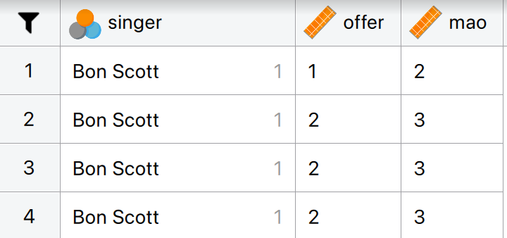
Thinking back to Labcoat Leni’s Real Research 3.1, Oxoby (2008) also measured the minimum acceptable offer; these MAOs (in dollars) are below (again, these are approximations based on the plots in the paper). Enter these data into JASP and save this file as
acdc.jasp.
- Bon Scott group: 2, 3, 3, 3, 3, 4, 4, 4, 4, 4, 4, 4, 4, 5, 5, 5, 5, 5
- Brian Johnson group: 0, 1, 2, 2, 3, 3, 3, 3, 3, 4, 4, 4, 4, 4, 4, 4, 4, 1
The data can be found in the file acdc.jasp and the first four rows should look like this:
Task 4.5
According to some highly unscientific research done by a UK department store chain and reported in Marie Clare magazine https://tinyurl.com/mcsgh shopping is good for you: they found that the average women spends 150 minutes and walks 2.6 miles when she shops, burning off around 385 calories. In contrast, men spend only about 50 minutes shopping, covering 1.5 miles. This was based on strapping a pedometer on a mere 10 participants. Although I don’t have the actual data, some simulated data based on these means are below. Enter these data into JASP and save them as
shopping.jasp.
The data can be found in the file shopping.jasp.
Task 4.6
I wondered whether a fish or cat made a better pet. I found some people who had either fish or cats as pets and measured their life satisfaction and how much they like animals. Enter these data into JASP and save as
pets.jasp.
The data can be found in the file pets.jasp.
Task 4.7
One of my favourite activities, especially when trying to do brain-melting things like writing statistics books, is drinking tea. I am English, after all. Fortunately, tea improves your cognitive function, well, in older Chinese people at any rate (Feng et al., 2010). I may not be Chinese and I’m not that old, but I nevertheless enjoy the idea that tea might help me think. Here’s some data based on Feng et al.’s study that measured the number of cups of tea drunk and cognitive functioning in 15 people. Enter these data in JASP and save the file as
tea_15.jasp.
The data can be found in the file tea_15.jasp.
Task 4.8
Statistics and maths anxiety are common and affect people’s performance on maths and stats assignments; women in particular can lack confidence in mathematics (Field, 2010, 2014). Zhang et al. (2013) did an intriguing study in which students completed a maths test in which some put their own name on the test booklet, whereas others were given a booklet that already had either a male or female name on. Participants in the latter two conditions were told that they would use this other person’s name for the purpose of the test. Women who completed the test using a different name performed better than those who completed the test using their own name. (There were no such effects for men.) The data below are a random subsample of Zhang et al.’s data. Enter them into JASP and save the file as
zhang_sample.jasp
The correct format is as in the file zhang_sample.jasp.
Task 4.9
What is a nominal variable?
A nominal variable is a type of categorical variable where the categories (i.e., levels) have no inherent order or ranking. They are simply labels used to distinguish different groups. Examples of nominal variables are Eye-color (levels: brown/blue/green) and Types of Pet (levels: dog/cat/bird/fish).
Task 4.10
What is the difference between wide and long format data?
Long format data are arranged such that scores on an outcome variable appear in a single column and rows represent a combination of the attributes of those scores (for example, the entity from which the scores came, when the score was recorded etc.). In long format data, scores from a single entity can appear over multiple rows where each row represents a combination of the attributes of the score (e.g., levels of an independent variable or time point at which the score was recorded etc.). In contrast, wide format data are arranged such that scores from a single entity appear in a single row and levels of independent or predictor variables are arranged over different columns. As such, in designs with multiple measurements of an outcome variable, for each case the outcome variable scores will be spread across multiple columns with each column containing the score for one level of an independent variable, or for the time point at which the score was observed. Columns can also represent attributes of the score or entity that are fixed over the duration of data collection (e.g., participant sex, employment status etc.).
Chapter 5
Task 5.1
The file
students.jaspcontains data relating to groups of students and lecturers. Using these data plot and interpret a raincloud plot showing the mean number of friends that students and lecturers have.
First of all access the Raincloud plot analysis in the Descriptives Module. Here, specify the variable Friends as the Dependent Variable, while using Group as the Primary Factor. You can then display the Mean and its Confidence Interval by going to the Advanced tab and ticking Mean and Interval around mean.
The resulting raincloud plot will look like this:
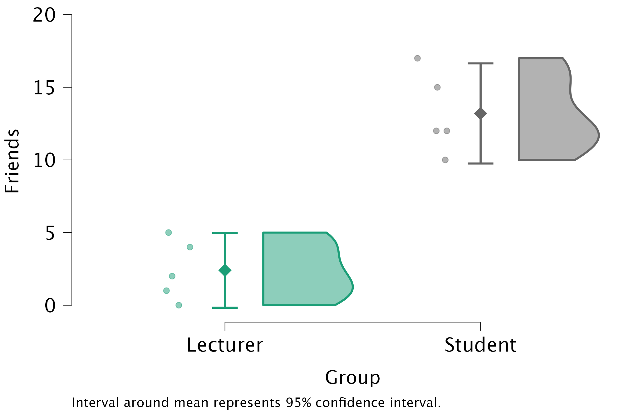
We can conclude that, on average, students had more friends than lecturers. The file alex_05_01-06.jasp contains the output and settings discussed above.
Task 5.2
Using the same data, plot and interpret a raincloud plot showing the mean alcohol consumption for students and lecturers.
Follow the same steps as in Task 5.1, but now with alcohol consumption as the dependent variable.
The raincloud plot will look like this:
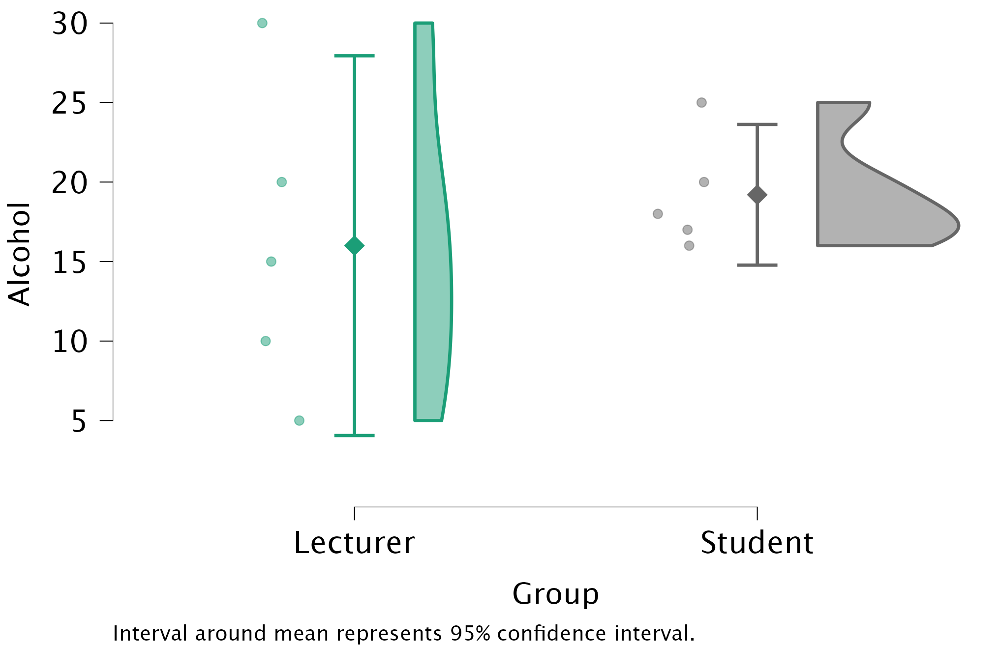
We can conclude that, on average, students and lecturers drank similar amounts, but the error bars tell us that the mean is a better representation of the population for students than for lecturers (there is more variability in lecturers’ drinking habits compared to students’). The file alex_05_01-06.jasp contains the output and settings discussed above.
Task 5.3
Using the same data, plot and interpret a raincloud plot showing the mean income for students and lecturers.
Follow the same steps as in Task 5.1, but now with income as the dependent variable.
The raincloud plot will look like this:
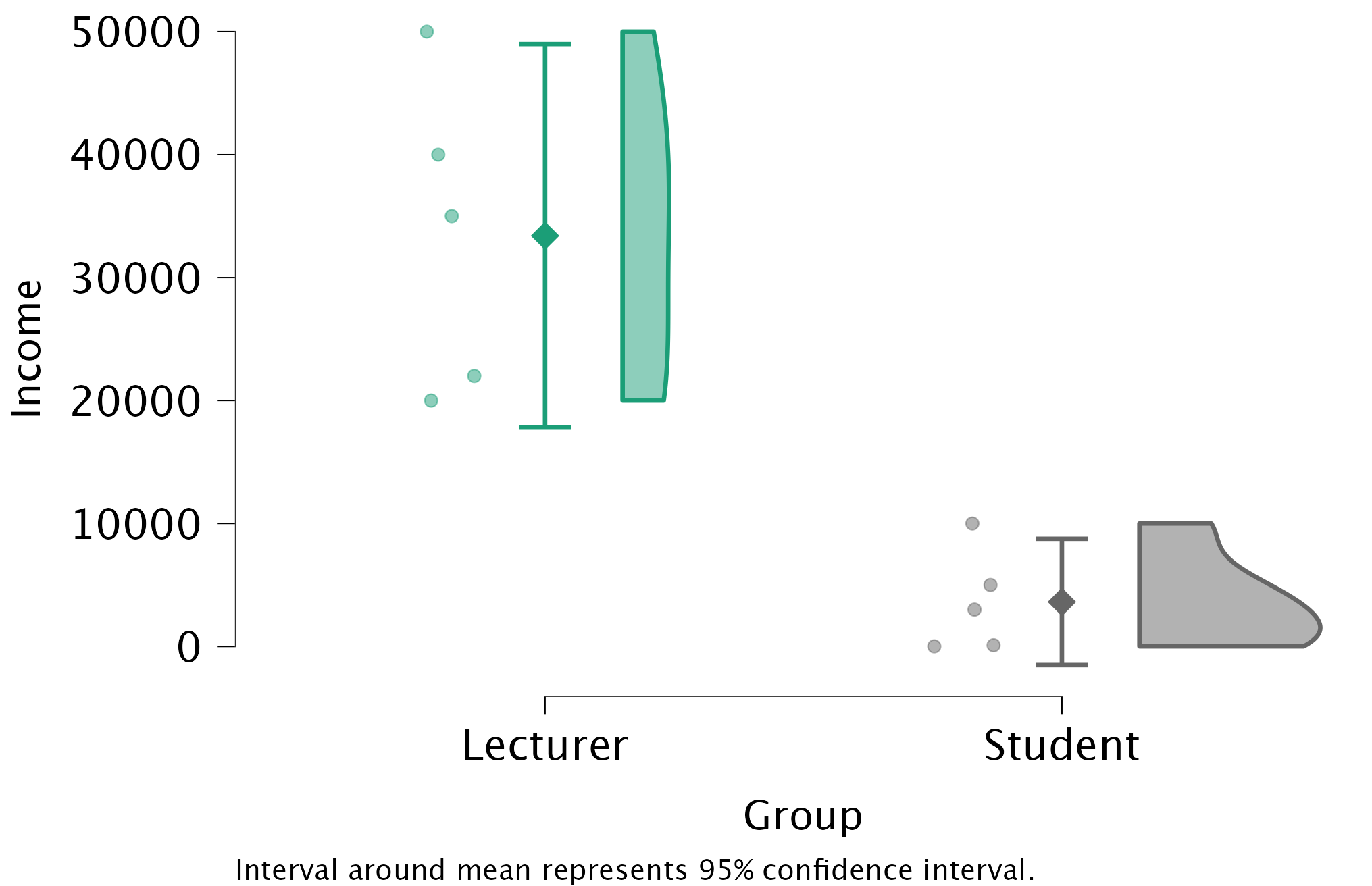
We can conclude that, on average, students earn less than lecturers, but the error bars tell us that the mean is a better representation of the population for students than for lecturers (there is more variability in lecturers’ income compared to students’). The file alex_05_01-06.jasp contains the output and settings discussed above.
Task 5.4
Using the same data, plot and interpret a raincloud plot showing the mean neuroticism for students and lecturers.
Follow the same steps as in Task 5.1, but now with neuroticism as the dependent variable. The raincloud plot will look like this:
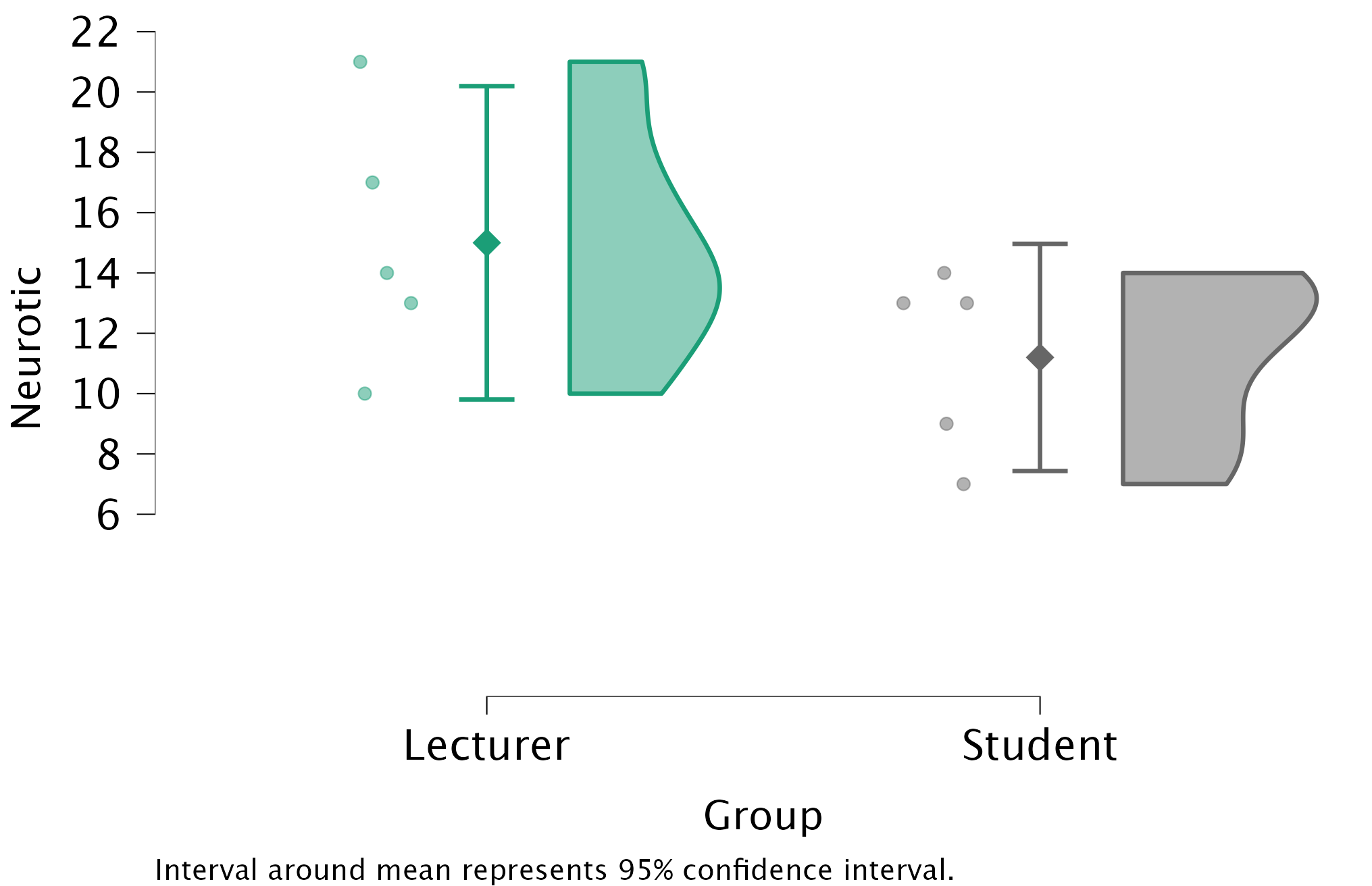
We can conclude that, on average, students are slightly less neurotic than lecturers. The file alex_05_01-06.jasp contains the output and settings discussed above.
Task 5.5
Using the same data, plot and interpret a scatterplot with regression lines of alcohol consumption and neuroticism grouped by lecturer/student.
Go to Descriptives \(\rightarrow\) Descriptive Statistics and drag Alcohol and Neurotic into the Variables box (whichever variable you drag there first will end up on the \(x\)-axis. To get a scatterplot with split lines later, specify the grouping variable (lecturers or students) as the Split variable. Next, go to the Customizable Plots tab and tick the box Scatter plots to produce the following plot:
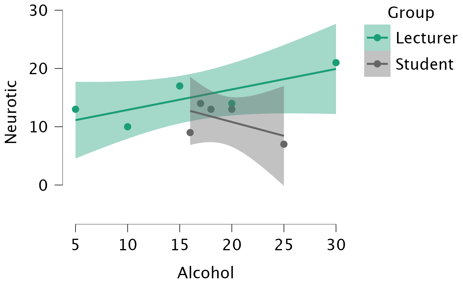
We can conclude that for lecturers, as neuroticism increases so does alcohol consumption (a positive relationship), but for students the opposite is true, as neuroticism increases alcohol consumption decreases. The file alex_05_01-06.jasp contains the output and settings discussed above.
Task 5.6
Using the same data, plot and interpret a scatterplot matrix with regression lines of alcohol consumption, neuroticism and number of friends.
Go to Descriptives \(\rightarrow\) Descriptive Statistics and drag Alcohol, Neurotic, and Friends into the Variables box. To get a matrix scatterplot, go to the Basic Plots tab and tick the box Correlation plots to produce the follow plot:
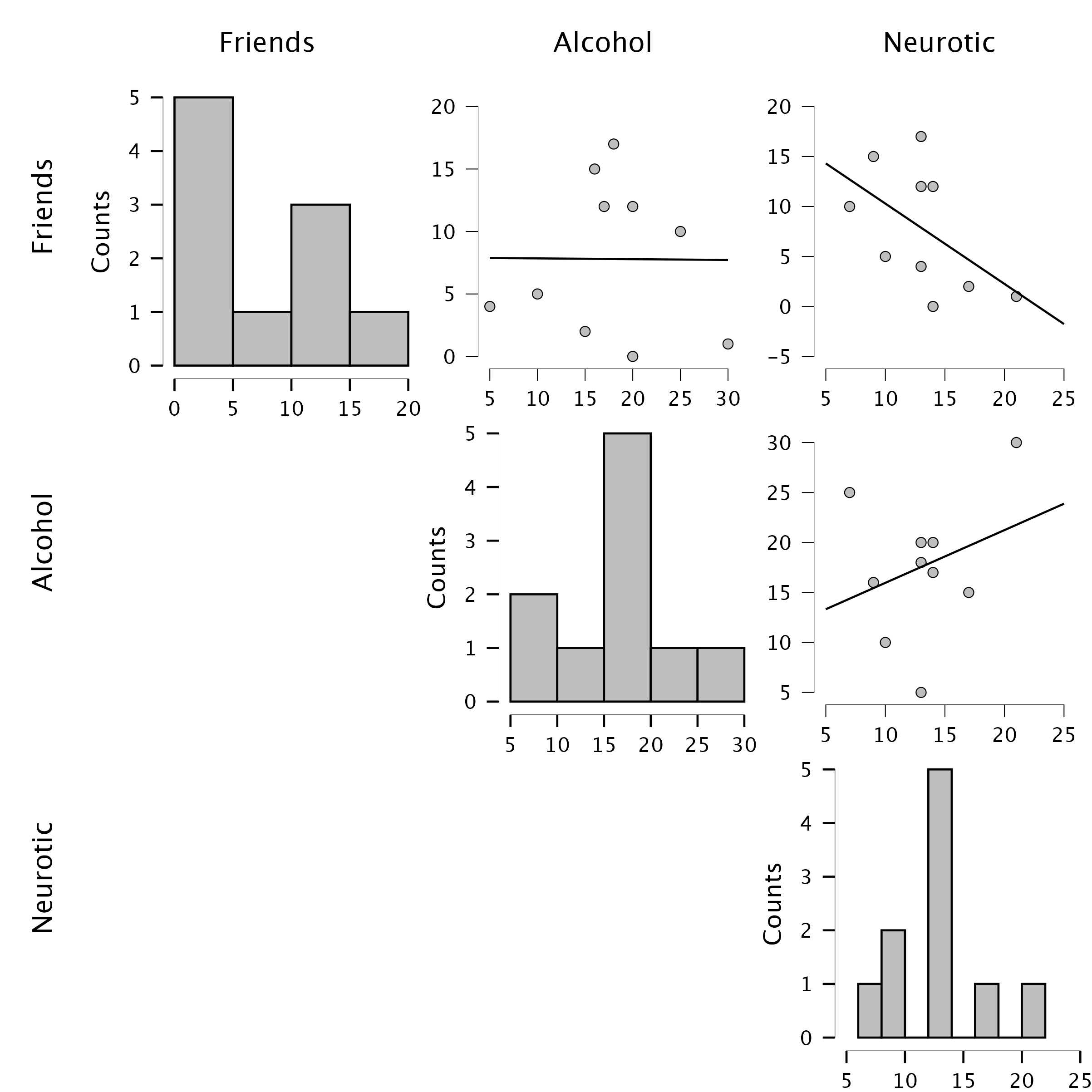
We can conclude that there is no relationship (flat line) between the number of friends and alcohol consumption; there was a negative relationship between how neurotic a person was and their number of friends (line slopes downwards); and there was a slight positive relationship between how neurotic a person was and how much alcohol they drank (line slopes upwards). The file alex_05_01-06.jasp contains the output and settings discussed above.
Task 5.7
Using the
zang_sample.jaspdata from Chapter 4 (Task 8), plot a raincloud plot of the mean test accuracy as a function of the type of name participants completed the test under (x-axis) and whether they identified as man or woman (different coloured rainclouds).
Go to the Raincloud plot analysis in the Descriptives Module. Here, specify the variable accuracy as the Dependent Variable, while using name_type as the Primary Factor and sex as the primary factor. You can then display the Mean and its Confidence Interval by going to the Advanced tab and ticking Mean and Interval around mean.
The plot shows that, on average, males did better on the test than females when using their own name (the control) but also when using a fake female name. However, for participants who did the test under a fake male name, the women did better than males. The file alex_05_07.jasp contains the output and settings discussed above.
Task 5.8
Using the
pets.jaspdata from Chapter 4 (Task 6), plot two raincloud plots comparing scores when having a fish or cat as a pet (x-axis): one for the animal liking variable, and the other for life satisfaction.
Go to the Raincloud plot analysis in the Descriptives Module. Here, specify the variable accuracy as the Dependent Variable, while using name_type as the Primary Factor and sex as the primary factor. You can then display the Mean and its Confidence Interval by going to the Advanced tab and ticking Mean and Interval around mean.
For animal love, the plot shows that the mean love of animals was the same for people with cats and fish as pets. For life satisfaction, the plot shows that, on average, life satisfaction was higher in people who had cats for pets than for those with fish. The file alex_05_08.jasp contains the output and settings discussed above.
Task 5.9
Using the same data as above, plot a scatterplot of animal liking scores against life satisfaction (plot scores for those with fishes and cats in different colours).
Follow the same steps as in Task 5.6, but with animal and life_satisfaction as Variables and pet as the Split variable. The file alex_05_09.jasp contains the plot and settings. We can conclude that as love of animals increases, so does life satisfaction (a positive relationship). This relationship seems to be similar for both types of pets (i.e., both lines have a similar slope).
Task 5.10
Using the
tea_15.jaspdata from Chapter 4 (Task 7), plot a scatterplot showing the number of cups of tea drunk (x-axis) against cognitive functioning (y-axis).
The scatterplot (and near-flat line especially) tells us that there is a tiny relationship (practically zero) between the number of cups of tea drunk per day and cognitive function. The file alex_05_10.jasp contains the plot and settings.
Chapter 6
Task 6.1
Using the
notebook.jaspdata, check the assumptions of normality and homogeneity of variance for the two films (ignoregender). Are the assumptions met?
The results/settings can be found in the file alex_06_01.jasp. The results can be viewed in your browser here.
The Q-Q plots suggest that for both films the expected quantile points are close to those that would be expected from a normal distribution (i.e. the dots fall close to the diagonal line). The descriptive statistics confirm this conclusion. The skewness statistics gives rise to a z-score of \(z_\text{skew} = \frac{−0.302}{0.512} = –0.59\) for The Notebook, and \(z_\text{skew} = \frac{0.04}{0.512} = 0.08\) for a documentary about notebooks. These show no excessive (or significant) skewness. For kurtosis these values are \(z_\text{kurtosis} = \frac{−0.281}{0.992} = –0.28\) for The Notebook, and \(z_\text{kurtosis} = \frac{–1.024}{0.992} = –1.03\) for a documentary about notebooks. None of these z-scores are large enough to concern us. More important the raw values of skew and kurtosis are close enough to zero.
ImportantProceed with caution
In the Chapter we talk a lot about NOT using significance tests of assumptions, so proceed with caution here. The Shapiro-Wilk test shows no significant deviation from normality for both films. If you chose to ignore my advice and use these sorts of tests then you might assume normality. However, the sample is small and these tests would have been very underpowered to detect a deviation from normal.
Task 6.2
The file
jasp_exam.jaspcontains data on students’ performance on an JASP exam. Four variables were measured:exam(first-year JASP exam scores as a percentage),computer(measure of computer literacy as a percentage),lecture(percentage of JASP lectures attended) andnumeracy(a measure of numerical ability out of 15). There is a variable calleduniindicating whether the student attended Sussex University (where I work) or Duncetown University. Compute and interpret descriptive statistics forexam,computer,lectureandnumeracyfor the sample as a whole.
The results/settings can be found in the file alex_06_02.jasp. The results can be viewed in your browser here.
The output shows the table of descriptive statistics for the four variables in this example. We can put the different variables in rows (rather than columns) by ticking the box Transpose descriptives table. To include the range of the scores, you can tick the box Range in the Statistics tab. Histograms are added by ticking the box Distribution plots in the Basic plots tab.
From the resulting table, we can see that, on average, students attended nearly 60% of lectures, obtained 58% in their JASP exam, scored only 51% on the computer literacy test, and only 5 out of 15 on the numeracy test. In addition, the standard deviation for computer literacy was relatively small compared to that of the percentage of lectures attended and exam scores. The range of scores on the exam was wide (15-99%) as was lecture attendence (8-100%).
Descriptive statistics and histograms are a good way of getting an instant picture of the distribution of your data. This snapshot can be very useful:
- The exam scores (
exam) look suspiciously bimodal (there are two peaks, indicative of two modes). The bimodal distribution of JASP exam scores alerts us to a trend that students are typically either very good at statistics or struggle with it (there are relatively few who fall in between these extremes). Intuitively, this finding fits with the nature of the subject: once everything falls into place it’s possible to do very well on statistics modules, but before that enlightenment occurs it all seems hopelessly difficult! - The numeracy test (
numeracy) has produced very positively skewed data (the majority of people did very badly on this test and only a few did well). This corresponds to what the skewness statistic indicated. - Lecture attendance (
lectures) looks relatively normally distributed. There is a slight negative skew suggesting that although most students attend at least 40% of lectures there is a small tail of students whop attend very few lectures. These students might have disengaged from the module and perhaps need some help to get back on track. - Computer literacy (
computer) is fairly normally distributed. A few people are very good with computers and a few are very bad, but the majority of people have a similar degree of knowledge).
Task 6.3
Calculate and interpret the z-scores for skewness for all variables.
\[ \begin{aligned} z_{\text{skew, jasp}} &= \frac{−0.107}{0.241} = −0.44 \\ z_{\text{skew, numeracy}} &= \frac{0.961}{0.241} = 3.99 \\ z_{\text{skew, computer literacy}} &= \frac{-0.174}{0.241} = −0.72 \\ z_{\text{skew, attendance}} &= \frac{−0.422}{0.241} = −1.75 \\ \end{aligned} \]
It is pretty clear that the numeracy scores are quite positively skewed because they have a z-score that is unusually high (nearly 4 standard deviations above the expected value of 0). This skew indicates a pile-up of scores on the left of the distribution (so most students got low scores). For the other three variables, the z-scores fall within reasonable limits although (as we saw before, attendance is quite negatively skewed suggesting some students have disengaged from their statistics module.)
Task 6.4
Calculate and interpret the z-scores for kurtosis for all variables.
\[ \begin{aligned} z_{\text{kurtosis, jasp}} &= \frac{−1.105}{0.478} = −2.31 \\ z_{\text{kurtosis, numeracy}} &= \frac{0.946}{0.478} = 1.98 \\ z_{\text{kurtosis, computer literacy}} &= \frac{0.364}{0.478} = 0.76 \\ z_{\text{kurtosis, attendance}} &= \frac{-0.179}{0.478} = −0.37 \\ \end{aligned} \]
- The JASP scores have negative excess kurtosis and the distribution is so-called platykurtic. In practical terms this means that there are fewer extreme scores than expected in the the distribution (the tails of the distribution are said to be thin/light because there are fewer scores than expected in them).
- The numeracy scores have positive excess kurtosis and the distribution is so-called leptokurtic. In practical terms this means that there are more extreme scores than expected in the the distribution (the tails of the distribution are said to be fat/heavy because there are more scores than expected in them).
- For computer literacy and attendance scores, the levels of excess kurtosis are within reasonable boundaries of what we might expect. In a broad sense we can assume these distributions are approximately mesokurtic.
Task 6.5
Look at and interpret the descriptive statistics for
numeracyandexam, separate for each university.
If we want to obtain separate descriptive statistics for each of the universities, we can specify a Split variable. The results/settings can be found in the file alex_06_05.jasp. The results can be viewed in your browser here.
The output table now contains output separately for each university. From this table it is clear that Sussex students scored higher on both their JASP exam and the numeracy test than their Duncetown counterparts. Looking at the means, on average Sussex students scored an amazing 36% more on the JASP exam than Duncetown students, and had higher numeracy scores too (what can I say, my students are the best).
The histograms of these variables split according to the university attended show numerous things. The first interesting thing to note is that for exam marks, the distributions are both fairly normal. This seems odd because the overall distribution was bimodal. However, it starts to make sense when you consider that for Duncetown the distribution is centred around a mark of about 40%, but for Sussex the distribution is centred around a mark of about 76%. This illustrates how important it is to look at distributions within groups. If we were interested in comparing Duncetown to Sussex it wouldn’t matter that overall the distribution of scores was bimodal; all that’s important is that residuals within each group are from a normal distribution, and in this case it appears to be true. When the two samples are combined, these two normal distributions create a bimodal one (one of the modes being around the centre of the Duncetown distribution, and the other being around the centre of the Sussex data).
For numeracy scores, the distribution is slightly positively skewed (there is a larger concentration at the lower end of scores) in both the Duncetown and Sussex groups. Therefore, the overall positive skew observed before is due to the mixture of universities.
Task 6.6
Repeat Task 5 but for the computer
literacyand percentage of lectures attended.
The results/settings can be found in the file alex_06_06.jasp. The results can be viewed in your browser here.
The JASP output is again split for each university separately. From these tables it is clear that Sussex and Duncetown students scored similarly on computer literacy (both means are very similar). Sussex students attended slightly more lectures (63.27%) than their Duncetown counterparts (56.26%). The histograms are also split according to the university attended. All of the distributions look fairly normal. The only exception is the computer literacy scores for the Sussex students. This is a fairly flat distribution apart from a huge peak between 50 and 60%. It’s slightly heavy-tailed (right at the very ends of the curve the bars come above the line) and very pointy. This suggests positive kurtosis. If you examine the values of kurtosis you will find extreme positive kurtosis as indicated by a value that is more than 2 standard deviations from 0 (i.e. no excess kurtosis), \(z = \frac{1.38}{0.662} = 2.08\).
Task 6.7
Conduct and interpret a Shapiro-Wilk test for
numeracyandexam.
The correct response to this task should be “but you told me never to do a Shapiro-Wilk test”.
ImportantProceed with caution
The Shapiro-Wilk (S-W) test can be accessed in the Descriptives analysis.
The results/settings can be found in the file alex_06_07.jasp. The results can be viewed in your browser here.
For JASP exam scores, the S-W test is significant, S-W = 0.96, p = 0.005, and this is true also for numeracy scores, S-W = 0.92, p < .001. These tests indicate that both distributions are significantly different from normal. This result is likely to reflect the bimodal distribution found for exam scores, and the positively skewed distribution observed in the numeracy scores. However, these tests confirm that these deviations were significant (but bear in mind that the sample is fairly big.)
As a final point, bear in mind that when we looked at the exam scores for separate groups, the distributions seemed quite normal; now if we’d asked for separate tests for the two universities (by dragging uni in the Split box) the S-W test will have been different. You can see this in the second analysis that’s listed in the .jasp file.
Note that the percentages on the JASP exam are not significantly different from normal within the two groups. This point is important because if our analysis involves comparing groups, then what’s important is not the overall distribution but the distribution in each group.
Task 6.9
Transform the
numeracyscores (which are positively skewed) using one of the transformations described in this chapter. Do the data become normal?
We can achieve these transformations using the Compute column functionality, using either the drag-and-drop mode (see Section Section 6.10.4) or syntax mode. For those of you wanting to use syntax mode, below are three lines of code for transforming numeracy to its natural logarithm, its square root, and its reciprocal.
ln(numeracy)   # Natural logarithm
sqrt(numeracy) # Square root
1/numeracy     # Reciprocal
Having created these variables, drag numeracy and your three new variables (in my case ln_numeracy, sqrt_numeracy, and recip_numeracy) to the box labelled Variables in the Descriptive Statistics analysis. Be sure to also tick the box Q-Q plots in the Basic plots tab. The results/settings and new variables can be found in the file alex_06_09.jasp. The results can be viewed in your browser here.
For each Q-Q plot we want to compare the distance of the points to the diagonal line to the same distances for the raw scores. For the raw scores, the observed values deviate from normal (the diagonal) at the extremes, but mainly for large observed values (because the distributioon is positively skewed).
- The log transformation improves the distribution a bit The positive skew is mitigated by the log transformation (large scores are made less extreme) resulting in dots on the Q-Q plot that are much closer to the line for large observed values.
- Similarly, the square root transformation mitigates the positive skew too by having a greater effect on large scores. The result is again a Q-Q plot with dots that are much closer to the line for large observed values that for the raw data.
- Conversely, the reciprocal transformation makes things worse! The result is a Q-Q plot with dots that are much further from the line than for the raw data.
Task 6.10
Find out what effect a natural log transformation would have on the four variables measured in
jasp_exam.jasp.
We follow the same steps as in Task 6.9, for transforming variables, but now apply the log() transformation to all four observed variables. The results/settings and new variables can be found in the file alex_06_10.jasp. The results can be viewed in your browser here.
- Numeracy: as a result of the transformation, the data seem somewhat more normally distributed (i.e., points in the Q-Q plot are more alligned along the diagonal).
- Exam: the bimodal distribution we saw before is not magically transformed away, and needs to be dealt with in another way, such as using the Split variable to assess normality for each group separately.
- Computer: the original variable seems to be more normally distributed than the transformed variable. This shows that the log-transformation can also have a detrimental effect!
- Numeracy: here, the transformation also does not seem to have a beneficial effect.
This reiterates my point from the book chapter that transformations are often not a magic solution to problems in the data.
Chapter 7
Task 7.1
A student was interested in whether there was a positive relationship between the time spent doing an essay and the mark received. He got 45 of his friends and timed how long they spent writing an essay (hours) and the percentage they got in the essay (
essay). He also translated these grades into their degree classifications (grade): in the UK, a student can get a first-class mark (the best), an upper-second-class mark, a lower second, a third, a pass or a fail (the worst). Using the data in the fileessay_marks.jaspfind out what the relationship was between the time spent doing an essay and the eventual mark in terms of percentage and degree class (draw a scatterplot too).
The results/settings can be found in the file alex_07_01.jasp. The results can be viewed in your browser here.
The results indicate that the relationship between time spent writing an essay and grade awarded was not significant, Pearson’s r = 0.27, 95% BCa CI [-0.018, 0.506], p = 0.077. Note that I conducted a two-tailed test here, which is better when you want to include a confidence interval. To test a one-tailed alternative hypothesis, you can change the option Alt. Hypothesis in JASP. In this case, it would yield a p-value that is significant for \(\alpha = 0.05\), and demonstrates why people who like to cheat at science like to change their alternative hypothesis after the results are in (i.e., HARK’ing).
The second part of the question asks us to do the same analysis but when the percentages are recoded into degree classifications. The degree classifications are ordinal data (not interval): they are ordered categories. So we shouldn’t use Pearson’s test statistic, but Spearman’s and Kendall’s ones instead.
In both cases the correlation is non-significant. There was no significant relationship between degree grade classification for an essay and the time spent doing it, \(\rho\) = 0.19, p = 0.204, and \(\tau\) = –0.16, p = 0.178. Note that the direction of the relationship has reversed. This has happened because the essay marks were recoded as 1 (first), 2 (upper second), 3 (lower second), and 4 (third), so high grades were represented by low numbers. This example illustrates one of the benefits of not taking continuous data (like percentages) and transforming them into categorical data: when you do, you lose information and often statistical power!
Task 7.2
Using the
notebook.jaspdata from Chapter 3, quantify the relationship between the participant’s gender and arousal.
The results/settings can be found in the file alex_07_02-03.jasp. The results can be viewed in your browser here.
Gender identity is a categorical variable with two categories, therefore, we need to quantify this relationship using a point-biserial correlation. I used a two-tailed test because one-tailed tests should never really be used. I have also asked for the bootstrapped confidence intervals as they are robust. The results show that there was no significant relationship between biological sex and arousal because the p-value is larger than 0.05 and the bootstrapped confidence intervals cross zero, \(r_\text{pb}\) = –0.20, 95% BCa CI [–0.50, 0.13], p = 0.266.
Task 7.3
Using the notebook data again, quantify the relationship between the film watched and arousal.
The results/settings can be found in the file alex_07_02-03.jasp. The results can be viewed in your browser here.
There was a significant relationship between the film watched and arousal, \(r_\text{pb}\) = –0.87, 95% BCa CI [–0.91, –0.81], p < 0.001. Looking in the data at how the groups were coded, you should see that The Notebook had a code of 1, and the documentary about notebooks had a code of 2, therefore the negative coefficient reflects the fact that as film goes up (changes from 1 to 2) arousal goes down. Put another way, as the film changes from The Notebook to a documentary about notebooks, arousal decreases. So The Notebook gave rise to the greater arousal levels.
Task 7.4
As a statistics lecturer I am interested in the factors that determine whether a student will do well on a statistics course. Imagine I took 25 students and looked at their grades for my statistics course at the end of their first year at university: first, upper second, lower second and third class (see Task 1). I also asked these students what grade they got in their high school maths exams. In the UK GCSEs are school exams taken at age 16 that are graded A, B, C, D, E or F (an A grade is the best). The data for this study are in the file
grades.jasp. To what degree does GCSE maths grade correlate with first-year statistics grade?
The results/settings can be found in the file alex_07_04.jasp. The results can be viewed in your browser here.
Let’s look at these variables. In the UK, GCSEs are school exams taken at age 16 that are graded A, B, C, D, E or F. These grades are categories that have an order of importance (an A grade is better than all of the lower grades). In the UK, a university student can get a first-class mark, an upper second, a lower second, a third, a pass or a fail. These grades are categories, but they have an order to them (an upper second is better than a lower second). When you have categories like these that can be ordered in a meaningful way, the data are said to be ordinal. The data are not interval, because a first-class degree encompasses a 30% range (70–100%), whereas an upper second only covers a 10% range (60–70%). When data have been measured at only the ordinal level they are said to be non-parametric and Pearson’s correlation is not appropriate. Therefore, the Spearman correlation coefficient is used.
In the file, the scores are in two columns: one labelled stats and one labelled gcse. Each of the categories described above has been coded with a numeric value. In both cases, the highest grade (first class or A grade) has been coded with the value 1, with subsequent categories being labelled 2, 3 and so on. Note that for each numeric code I have provided a value label (just like we did for coding variables).
In the question I predicted that better grades in GCSE maths would correlate with better degree grades for my statistics course. This hypothesis is directional and so a one-tailed test could be selected; however, in the chapter I advised against one-tailed tests so I have done two-tailed.
The JASP output shows the Spearman correlation on the variables stats and gcse. The output shows a matrix giving the correlation coefficient between the two variables (0.455), underneath is the significance value of this coefficient (0.022) and then the sample size (25). [Note: it is good to check that the value of N corresponds to the number of observations that were made. If it doesn’t then data may have been excluded for some reason.]
I also requested the bootstrapped confidence intervals (–0.014, 0.738). The significance value for this correlation coefficient is less than 0.05; therefore, it can be concluded that there is a significant relationship between a student’s grade in GCSE maths and their degree grade for their statistics course. However, the bootstrapped confidence interval crosses zero, suggesting (under the usual assumptions) that the effect in the population could be zero. It is worth remembering that if we were to rerun the analysis we would get different results for the bootstrap confidence interval. In fact, I have rerun the analysis, and the resulting output is below. You can see that this time the confidence interval does not cross zero (0.079, 0.705), which suggests that there is likely to be a positive effect in the population (as GCSE grades improve, there is a corresponding improvement in degree grades for statistics). The p-value is only just significant (0.022), although the correlation coefficient is fairly large (0.455). This situation demonstrates that it is important to replicate studies.
We could also look at Kendall’s correlation. The output is much the same as for Spearman’s correlation. The value of Kendall’s coefficient is less than Spearman’s (it has decreased from 0.455 to 0.354), but it is still statistically significant (because the p-value of 0.029 is less than 0.05). The bootstrapped confidence intervals do not cross zero (0.042, 0.632) suggesting that there is likely to be a positive relationship in the population. We cannot assume that the GCSE grades caused the degree students to do better in their statistics course.
We could report these results as follows:
Task 7.5
In Figure 2.3 (in the book) we saw some data relating to people’s ratings of dishonest acts and the likeableness of the perpetrator (for a full description see Jane Superbrain Box 2.1). Compute the Spearman correlation between ratings of dishonesty and likeableness of the perpetrator. The data are in
honesty_lab.jasp.
The results/settings can be found in the file alex_07_05.jasp. The results can be viewed in your browser here.
The results show that the relationship between ratings of dishonesty and likeableness of the perpetrator was significant because the p-value is less than 0.05 (p < 0.001) and the bootstrapped confidence intervals do not cross zero (0.770, 0.895). The value of Spearman’s correlation coefficient is quite large and positive (0.844), indicating a large positive effect: the more likeable the perpetrator was, the more positively their dishonest acts were viewed.
Task 7.6
: In Chapter 4 (Task 6) we looked at data from people who had fish or cats as pets and measured their life satisfaction and, also, how much they like animals (
pets.jasp). Is there a significant correlation between life satisfaction and the type of animal the person had as a pet?
The results/settings can be found in the file alex_07_06-07.jasp. The results can be viewed in your browser here.
pet is a categorical variable with two categories (fish or cat). Therefore, we need to look at this relationship using a point-biserial correlation. I also asked for 95% confidence intervals (given the small sample, we might have been better off with bootstrap confidence intervals, but I want to mix things up). I used a two-tailed test because one-tailed tests should never really be used (see book chapter for more explanation). The results show that there was a significant relationship between type of pet and life satisfaction because the oberved p-value is less than the criterion of 0.05 and the confidence intervals do not cross zero, \(r_\text{pb}\) = 0.63, 95% CI [0.25, 0.83], p = 0.003. Looking at how the groups were coded, fish had a code of 1 and cat had a code of 2, therefore this result reflects the fact that as the type of pet changes (from fish to cat) life satisfaction goes up. Put another way, as having a cat as a pet was associated with greater life satisfaction.
Task 7.7
Repeat the analysis above taking account of animal liking when computing the correlation between life satisfaction and the type of animal the person had as a pet.
The results/settings can be found in the file alex_07_06-07.jasp. The results can be viewed in your browser here.
We can conduct a partial correlation between life satisfaction and the pet the person has while ‘adjusting’ for the effect of liking animals. The output for the partial correlation is a matrix of correlations for the variables pet and life_satisfaction but adjusting for the love of animals. Note that the top and bottom of the table contain identical values, so we can ignore one half of the table. First, notice that the partial correlation between pet and life_satisfaction is 0.701, which is greater than the correlation when the effect of animal liking is not adjusted for (r = 0.630). The correlation has become more statistically significant (its p-value has decreased from 0.003 to < 0.001) and the confidence interval [0.47, 0.87] still doesn’t contain zero. In terms of variance, the value of \(R^2\) for the partial correlation is 0.491, which means that type of pet shares 49.1% of the variance in life satisfaction (compared to 39.7% when when not adjusting for love of animals). Running this analysis has shown us that the relationship between the type of pet and life satisfaction is not due to how much the owners love animals.
Task 7.8
In Chapter 4 (Task 7) we looked at data based on findings that the number of cups of tea drunk was related to cognitive functioning (Feng et al., 2010). The data are in the file
tea_15.jasp. What is the correlation between tea drinking and cognitive functioning? Is there a significant effect?
The results/settings can be found in the file alex_07_08.jasp. The results can be viewed in your browser here.
Because the numbers of cups of tea and cognitive function are both interval variables, we can conduct a Pearson’s correlation coefficient. If we request bootstrapped confidence intervals then we don’t need to worry about checking whether the data are normal because they are robust. I chose a two-tailed test because it is never really appropriate to conduct a one-tailed test (see the book chapter). The results indicate that the relationship between number of cups of tea drunk per day and cognitive function was not significant. We can tell this because our p-value is greater than 0.05 (the typical criterion), and the bootstrapped confidence intervals cross zero, indicating that under the usual assumption that this sample is one of the 95% that generated a confidence interval containing the true value, the effect in the population could be zero (i.e. no effect). Pearson’s r = 0.078, 95% BCa CI [–0.38, 0.52], p = 0.783.
Task 7.9
The research in the previous task was replicated but in a larger sample (N = 716), which is the same as the sample size in Feng et al.’s research (
tea_716.jasp). Conduct a correlation between tea drinking and cognitive functioning. Compare the correlation coefficient and significance in this large sample, with the previous task. What statistical point do the results illustrate?
The results/settings can be found in the file alex_07_09.jasp. The results can be viewed in your browser here.
The results show that although the value of Pearson’s r has not changed, it is still very small (0.078), the relationship between the number of cups of tea drunk per day and cognitive function is now just significant (p = 0.038) if you use the common criterion of \(\alpha = 0.05\), and the confidence intervals no longer cross zero (0.001, 0.156). (Although note that the lower confidence interval is very close to zero, suggesting that under the usual assumptions the effect in the population could be very close to zero.)
This example indicates one of the downfalls of significance testing; you can get significant results when you have large sample sizes even if the effect is very small. Basically, whether you get a significant result or not is at the mercy of the sample size.
Task 7.10
In Chapter 6 we looked at hygiene scores over three days of a rock music festival (
download.jasp). Using Spearman’s correlation, were hygiene scores on day 1 of the festival significantly correlated with those on day 3?
The results/settings can be found in the file alex_07_10.jasp. The results can be viewed in your browser here.
The hygiene scores on day 1 of the festival correlated significantly with hygiene scores on day 3. The value of Spearman’s correlation coefficient is 0.344, which is a positive value suggesting that the smellier you are on day 1, the smellier you will be on day 3, \(r_\text{s}\) = 0.34, 95% BCa CI [0.16, 0.50], p < 0.001.
Task 7.11
Using the data in shopping.jasp (Chapter 4, Task 5), find out if there is a significant relationship between the time spent shopping and the distance covered.
The results/settings can be found in the file alex_07_11-12.jasp. The results can be viewed in your browser here.
The variables time and distance are both interval. Therefore, we can conduct a Pearson’s correlation. I chose a two-tailed test because it is never really appropriate to conduct a one-tailed test (see the book chapter). The results indicate that there was a significant positive relationship between time spent shopping and distance covered using the common criterion of \(\alpha = 0.05\). We can tell that the relationship was significant because the p-value is smaller than 0.05. More important, the robust confidence intervals do not cross zero suggesting (under the usual assumptions) that the effect in the population is unlikely to be zero. Also, our value for Pearson’s r is very large (0.83) indicating a large effect. Pearson’s r = 0.83, 95% BCa CI [0.59, 0.96], p = 0.003.
Task 7.12
What effect does accounting for the participant’s sex have on the relationship between the time spent shopping and the distance covered?
The results/settings can be found in the file alex_07_11-12.jasp. The results can be viewed in your browser here.
To answer this question, we need to conduct a partial correlation between the time spent shopping (interval variable) and the distance covered (interval variable) while ‘adjusting’ for the effect of sex (dichotomous variable). The partial correlation between time and distance is 0.820, which is slightly smaller than the correlation when we don’t adjust for sex (r = 0.830). The correlation has become slightly less statistically significant (its p-value has increased from 0.003 to 0.007). In terms of variance, the value of \(R^2\) for the partial correlation is 0.672, which means that time spent shopping now shares 67.2% of the variance in distance covered when shopping (compared to 68.9% when not adjusted for sex). Running this analysis has shown us that time spent shopping alone explains a large portion of the variation in distance covered.
Chapter 8
Task 8.1
In Chapter 7 (Task 9) we looked at data based on findings that the number of cups of tea drunk was related to cognitive functioning (Feng et al., 2010). Using a linear model that predicts cognitive functioning from tea drinking, what would cognitive functioning be if someone drank 10 cups of tea? Is there a significant effect? (
tea_716.jasp)
The results/settings can be found in the file alex_08_01.jasp. The results can be viewed in your browser here.
Looking at the output, we can see that we have a model that significantly improves our ability to predict cognitive functioning. The positive standardized beta value (0.078) indicates a positive relationship between number of cups of tea drunk per day and level of cognitive functioning, in that the more tea drunk, the higher your level of cognitive functioning. We can then use the model to predict level of cognitive functioning after drinking 10 cups of tea per day. The first stage is to define the model by replacing the b-values in the equation below with the values from the Coefficients output. In addition, we can replace the X and Y with the variable names so that the model becomes:
\[ \begin{aligned} \widehat{\text{Cognitive functioning}}_i &= b_0 + b_1 \text{Tea drinking}_i \\ \ &= 49.22 +(0.460 \times \text{Tea drinking}_i) \end{aligned} \]
We can predict cognitive functioning, by replacing Tea drinking in the equation with the value 10:
\[ \begin{aligned} \widehat{\text{Cognitive functioning}}_i &= 49.22 +(0.460 \times \text{Tea drinking}_i) \\ &= 49.22 +(0.460 \times 10) \\ &= 53.82 \end{aligned} \]
Therefore, if you drank 10 cups of tea per day, your predicted level of cognitive functioning would be 53.82.
Task 8.2
Estimate a linear model for the
pubs.jaspdata in Jane Superbrain Box 8.1 predictingmortalityfrom the number ofpubs. Try repeating the analysis but bootstrapping the confidence intervals.
The results/settings can be found in the file alex_08_02.jasp. The results can be viewed in your browser here.
Looking at the output, we can see that the number of pubs significantly predicts mortality, t(6) = 3.33, p = 0.016. The positive beta value (0.806) indicates a positive relationship between number of pubs and death rate in that, the more pubs in an area, the higher the rate of mortality (as we would expect). The value of \(R^2\) tells us that number of pubs accounts for 64.9% of the variance in mortality rate – that’s over half!
To get the bootstrap confidence intervals to work, you’ll need to select Percentile bootstrap (not BCa). The last table in the output shows that the bootstrapped confidence intervals are both positive values – they do not cross zero (8.288, 100.00). Assuming this interval is one of the 95% that contain the population value then it appears that there is a positive and non-zero relationship between number of pubs in an area and its mortality rate.
Task 8.3
In Jane Superbrain Box 2.1 we encountered data (
honesty_lab.jasp) relating to people’s ratings of dishonest acts and the likeableness of the perpetrator. Run a linear model with bootstrapping to predict ratings ofdishonestyfrom thelikeablenessof the perpetrator.
The results/settings can be found in the file alex_08_03.jasp. The results can be viewed in your browser here.
The output shows that the likeableness of the perpetrator significantly predicts ratings of dishonest acts, t(98) = 14.80, p < 0.001. The positive standardized beta value (0.83) indicates a positive relationship between likeableness of the perpetrator and ratings of dishonesty, in that, the more likeable the perpetrator, the more positively their dishonest acts were viewed (remember that dishonest acts were measured on a scale from 0 = appalling behaviour to 10 = it’s OK really). The value of \(R^2\) tells us that likeableness of the perpetrator accounts for 69.1% of the variance in the rating of dishonesty, which is over half.
The last table in the output shows that the bootstrapped confidence intervals do not cross zero (0.81, 1.07). Assuming sample is one of the 95% that produces an interval containing the population value it appears that there is a non-zero relationship between the likeableness of the perpetrator and ratings of dishonest acts.
Task 8.4
A fashion student was interested in factors that predicted the salaries of catwalk models. She collected data from 231 models (
supermodel.jasp). For each model she asked them their salary per day (salary), their age (age), their length of experience as models (years), and their industry status as a model as reflected in their percentile position rated by a panel of experts (status). Use a linear model to see which variables predict a model’s salary. How valid is the model?
The results/settings can be found in the file alex_08_04.jasp. The results can be viewed in your browser here.
The model
To begin with, a sample size of 231 with three predictors seems reasonable because this would easily detect medium to large effects (see the diagram in the chapter). Overall, the model is a significant fit to the data, F(3, 227) = 17.07, p < .001. The adjusted \(R^2\) (0.17) suggests that 17% of the variance in salaries can be explained by the model when adjusting for the number of predictors.
In terms of the individual predictors we could report:
The next part of the question asks whether this model is valid.
Multicollinearity: For the
ageandyearsvariables, VIF values are above 10 (or alternatively, tolerance values are all well below 0.2), indicating multicollinearity in the data. Looking at the variance proportions for these variables it seems like they are expressing similar information. In fact, the correlation between these two variables is around .9! So, these two variables are measuring very similar things. Of course, this makes perfect sense because the older a model is, the more years she would’ve spent modelling! So, it was fairly stupid to measure both of these things! This also explains the weird result that the number of years spent modelling negatively predicted salary (i.e. more experience = less salary!): in fact if you do a simple regression withyearsas the only predictor of salary you’ll find it has the expected positive relationship. This hopefully demonstrates why multicollinearity can bias the regression model.Residuals: There are six cases that have a standardized residual greater than 3, and two of these are fairly substantial (case 5 and 135). We have 5.19% of cases with standardized residuals above 2, so that’s as we expect, but 3% of cases with residuals above 2.5 (we’d expect only 1%), which indicates possible outliers.
Homoscedasticity and independence of errors: The scatterplot of Residuals vs. Predicted does not show a random pattern. There is a distinct funnelling, indicating heteroscedasticity. The partial plots (especially the one for
age) also seem to indicate some heteroscedasticity.Normality of errors: The histogram reveals a skewed distribution, indicating that the normality of errors assumption has been broken. The normal Q-Q plot verifies this because the dashed line deviates considerably from the straight line (which indicates what you’d get from normally distributed errors).
All in all, several assumptions have not been met and so this model is probably fairly unreliable.
Task 8.5
A study was carried out to explore the relationship between aggression and several potential predicting factors in 666 children who had an older sibling. Variables measured were
parenting_style(high score = bad parenting practices),computer_games(high score = more time spent playing computer games),television(high score = more time spent watching television),diet(high score = the child has a good diet low in harmful additives), andsibling_aggression(high score = more aggression seen in their older sibling). Past research indicated that parenting style and sibling aggression were good predictors of the level of aggression in the younger child. All other variables were treated in an exploratory fashion. Analyse them with a linear model (child_aggression.jasp).
We need to conduct this analysis hierarchically, entering parenting style and sibling aggression in the first step. The remaining variables are entered in a second step. The results/settings can be found in the file alex_08_05.jasp. The results can be viewed in your browser here.
Based on the final model (which is actually all we’re interested in) the following variables predict aggression:
The histogram and Q-Q plots suggest that errors are (approximately) normally distributed. The scatterplot helps us to assess both homoscedasticity and independence of errors. The scatterplot of Residual vs. Predicted does show a random pattern and so indicates no violation of the independence of errors assumption. Also, the errors on the scatterplot do not funnel out, indicating homoscedasticity of errors, thus no violations of these assumptions.
Task 8.6
Repeat the analysis in Labcoat Leni’s Real Research 8.1 using bootstrapping for the confidence intervals. What are the confidence intervals for the regression parameters?
First, enter grade, age and sex into the model. In a second model, enter extraversion. In the final block, enter narcissism. Additionally, you can activate bootstrapping. The results/settings can be found in the file alex_08_06.jasp. The results can be viewed in your browser here.
Facebook status update frequency: The main benefit of the bootstrap confidence intervals and significance values is that they do not rely on assumptions of normality or homoscedasticity, so under the usual assumptions they give us an accurate estimate of the true population value of b for each predictor. The bootstrapped confidence intervals do not affect the conclusions reported in Ong et al. (2011). Ong et al.’s prediction was still supported in that, after controlling for age, grade and gender, narcissism significantly predicted the frequency of Facebook status updates over and above extroversion, b = 0.066 [0.03, 0.11], p = 0.003.
Facebook profile picture rating: Similarly, the bootstrapped confidence intervals for the second regression are consistent with the conclusions reported in Ong et al. (2011). That is, after adjusting for age, grade and gender, narcissism significantly predicted the Facebook profile picture ratings over and above extroversion, b = 0.173 [0.10, 0.23], p = 0.001.
Task 8.7
Coldwell et al. (2006) investigated whether household chaos predicted children’s problem behaviour over and above parenting. From 118 families they recorded the age and gender of the youngest child (
child_ageandchild_gender). They measured dimensions of the child’s perceived relationship with their mum: (1) warmth/enjoyment (child_warmth), and (2) anger/hostility (child_anger). Higher scores indicate more warmth/enjoyment and anger/hostility respectively. They measured the mum’s perceived relationship with her child, resulting in dimensions of positivity (mum_pos) and negativity (mum_neg). Household chaos (chaos) was assessed. The outcome variable was the child’s adjustment (sdq): the higher the score, the more problem behaviour the child was reported to be displaying. Conduct a hierarchical linear model in three steps: (1) enter child age and gender; (2) add the variables measuring parent–child positivity, parent–child negativity, parent–child warmth, parent–child anger; (3) add chaos. Is household chaos predictive of children’s problem behaviour over and above parenting? (coldwell_2006.jasp).
To summarize the dialog boxes to run the analysis, first, enter child_age and child_gender into the model and set sdq as the outcome variable. In a new block, add child_anger, child_warmth, mum_pos and mum_neg into the model. In a final block, add chaos to the model. The results/settings can be found in the file alex_08_07.jasp. The results can be viewed in your browser here.
From the output we can conclude that household chaos significantly predicted younger sibling’s problem behaviour over and above maternal parenting, child age and gender, t(88) = 2.09, p = 0.039. The positive standardized beta value (0.218) indicates that there is a positive relationship between household chaos and child’s problem behaviour. In other words, the higher the level of household chaos, the more problem behaviours the child displayed. The value of \(R^2\) (0.11) tells us that household chaos accounts for 11% of the variance in child problem behaviour.
Chapter 9
Task 9.1
Is arachnophobia (fear of spiders) specific to real spiders or will pictures of spiders evoke similar levels of anxiety? Twelve arachnophobes were asked to play with a big hairy tarantula with big fangs and an evil look in its eight eyes and at a different point in time were shown only pictures of the same spider. The participants’ anxiety was measured in each case. Do a t-test to see whether anxiety is higher for real spiders than pictures (
big_hairy_spider.jasp).
We have 12 arachnophobes who were exposed to a picture of a spider (picture) and on a separate occasion a real live tarantula (real). Their anxiety was measured in each condition (half of the participants were exposed to the picture before the real spider while the other half were exposed to the real spider first). The results/settings can be found in the file alex_09_01-02.jasp. The results can be viewed in your browser here.
The \(t\)-test table tells us whether the difference between the means of the two conditions was significant;y different from zero. First, the table tells us the mean difference between scores. The table also reports the standard error of differences (t = −7/2.8311 = −2.47). The size of t is compared against known values (under the null hypothesis) based on the degrees of freedom. When the same participants have been used, the degrees of freedom are the sample size minus 1 (df = N − 1 = 11). JASP uses the degrees of freedom to calculate the exact probability that a value of t at least as big as the one obtained could occur if the null hypothesis were true (i.e., there was no difference between these means). This probability value is in the column labelled p. The two-tailed probability for the spider data is very low (p = 0.031) and significant because 0.031 is smaller than the widely-used criterion of 0.05. The fact that the t-value is a negative number tells us that the first condition (the picture condition) had a smaller mean than the second (the real condition) and so the real spider led to greater anxiety than the picture. Therefore, we can conclude that exposure to a real spider caused significantly more reported anxiety in arachnophobes than exposure to a picture, t(11) = −2.47, p = .031.
The output also contains a 95% confidence interval for the mean difference. Assuming that this sample’s confidence interval is one of the 95 out of 100 that contains the population value, we can say that the true mean difference lies between −13.231 and −0.769. The importance of this interval is that it does not contain zero (i.e., both limits are negative) because this tells us that the true value of the mean difference is unlikely to be zero.
The effect size is given in the output as \(\hat{d} = -0.68\). Therefore, as well as being statistically significant, this effect is large and probably a substantive finding.
Task 9.2
Plot a raincloud plot of the data in Task 1 (remember to adjust for the fact that the data are from a repeated measures design.)
The results/settings can be found in the file alex_09_01-02.jasp. The results can be viewed in your browser here.
The resulting raincloud plot is in the output linked above. The error bars slightly overlap, which is a reminder that we cannot use overlap of confidence intervals to conclude whether we there is a significant group difference, and it’s much more accurate to instead look at the confidence interval for the difference scores when we are working with a within-subjects design.
Task 9.3
‘Pop psychology’ books sometimes spout nonsense that is unsubstantiated by science. As part of my plan to rid the world of pop psychology I took 20 people in relationships and randomly assigned them to one of two groups. One group read the famous popular psychology book Women are from X and men are from Y, and the other read Marie Claire. The outcome variable was their relationship happiness after their assigned reading. Were people happier with their relationship after reading the pop psychology book? (
pop_psychology.jasp).
The results/settings can be found in the file alex_09_03.jasp. The results can be viewed in your browser here.
From the main output we can obtain the effect size as \(\hat{d} = -0.95 [-1.87, -0.01]\). This means that reading the self-help book reduced relationship happiness by about one standard deviation, which is a fairly massive effect. Note that the corresponding \(p\)-value is dangerously close to the conventional level of 0.05 though, so this result should be taken with a grain of salt.
Task 9.4
Twaddle and Sons, the publishers of Women are from X and men are from Y, were upset about my claims that their book was as useful as a paper umbrella. They ran their own experiment (N = 500) in which relationship happiness was measured after participants had read their book and after reading one of mine (Field & Hole, 2003). (Participants read the books in counterbalanced order with a six-month delay.) Was relationship happiness greater after reading their wonderful contribution to pop psychology than after reading my tedious tome about experiments? (
field_hole.jasp).
The results/settings can be found in the file alex_09_04.jasp. The results can be viewed in your browser here.
From the main output, we can obtain the effect size as \(\hat{d} = 0.12 [0.03, 0.21]\). Therefore, although this effect is highly statistically significant, the size of the effect is very small and represents a trivial finding. In this example, it would be tempting for Twaddle and Sons to conclude that their book produced significantly greater relationship happiness than our book. However, to reach such a conclusion is to confuse statistical significance with the importance of the effect. By calculating the effect size we’ve discovered that although the difference in happiness after reading the two books is statistically different, the size of effect that this represents is very small. Of course, this latter interpretation would be unpopular with Twaddle and Sons who would like to believe that their book had a huge effect on relationship happiness.
Task 9.5
In Chapter 4 (Task 6) we looked at data from people who had fish or cats as pets and measured their life satisfaction as well as how much they like animals (pets.jasp). Conduct a t-test to see whether life satisfaction depends upon the type of pet a person has.
The results/settings can be found in the file alex_09_05-06.jasp. The results can be viewed in your browser here.
From the main output, we can obtain the effect size as \(\hat{d} = -1.63 [-2.65, -0.57]\). As well as being statistically significant, this effect is very large and so represents a substantive finding. Note that I report the results of the Welch version of the \(t\)-test, as I recommended in the book, to have more robustness against possible unequal variances.
Task 9.6
Fit a linear model to the data in Task 5 to see whether life satisfaction is significantly predicted from the type of animal. What do you notice about the t-value and significance in this model compared to Task 5.
The results/settings can be found in the file alex_09_05-06.jasp. The results can be viewed in your browser here.
Compare this output with the one from the previous task: the values of t and p are almost the same. If we would have used the Student \(t\)-test, the results would be identical (Technically, t is different because for the linear model it is a positive value and for the t-test it is negative However, the sign of t merely reflects which way around you coded the dog and goat groups. The linear model, by default, has coded the groups the opposite way around to the t-test.) The main point I wanted to make here is that whether you run these data through the regression or t-test menus, the results are identical (if you give up the robustness to unequal variances, which does not exist in normal regression).
Task 9.7
In Chapter 6 we looked at hygiene scores over three days of a rock music festival (
download.jasp). Do a paired-samples t-test to see whether hygiene scores on day 1 differed from those on day 3.
The results/settings can be found in the file alex_09_07.jasp. The results can be viewed in your browser here.
From the main output, we can obtain the effect size as \(\hat{d} = 0.99 [0.78, 1.21]\). This represents a very large effect. Therefore, as well as being statistically significant, this effect is large and represents a substantive finding.
Task 9.8
A psychologist was interested in the cross-species differences between men and dogs. She observed a group of dogs and a group of men in a naturalistic setting (20 of each). She classified several behaviours as being dog-like (urinating against trees and lampposts, retrieving tennis balls, and attempts to lick their own genitals). For each man and dog she counted the number of dog-like behaviours displayed in a 24-hour period. It was hypothesized that dogs would display more dog-like behaviours than men. Analyse the data in
men_dogs.jaspusing an independent t-test.
The results/settings can be found in the file alex_09_08.jasp. The results can be viewed in your browser here.
We conclude that men and dogs do not significantly differ in the amount of dog-like behaviour they engage in. The output also shows the results of bootstrapping. The confidence interval ranged from -5.49 to 7.90, which implies (assuming that this confidence interval is one of the 95% containing the true effect) that the difference between means in the population could be negative, positive or even zero. In other words, it’s possible that the true difference between means is zero. Therefore, this confidence interval confirms our conclusion that men and dogs do not differ in amount of dog-like behaviour. We can obtain the effect size as \(\hat{d} = 0.12 [-0.51, 0.73]\) and this shows a small effect with a very wide confidence interval that crosses zero. Again, assuming that this confidence interval is one of the 95% containing the true effect, the effect in the population could be negative, positive or zero.
Task 9.9
Both Ozzy Osbourne and Judas Priest have been accused of putting backward masked messages on their albums that subliminally influence poor unsuspecting teenagers into doing Very Bad things. A psychologist was interested in whether backward masked messages could have an effect. He created a version of Taylor Swift’s ‘Shake it Off’ that contained the masked message ‘deliver your soul to the dark lord’ repeated in the chorus. He took this version, and the original, and played one version (randomly) to a group of 32 veterinary students. Six months later he played them whatever version they hadn’t heard the time before. So each student heard both the original and the version with the masked message, but at different points in time. The psychologist measured the number of goats that the students sacrificed in the week after listening to each version. Analyse the data (whether the type of music you hear influences goat sacrificing) in
dark_lord.jasp, using a paired-samples t-test.
The results/settings can be found in the file alex_09_09.jasp. The results can be viewed in your browser here.
The confidence interval ranges from -4.07 to -0.61. It does not cross zero suggesting (if we assume that it is one of the 95% of confidence intervals that contain the true value) that the effect in the population is unlikely to be zero. Therefore, this confidence interval confirms our conclusion that there is a significant difference between the number of goats sacrificed when listening to the song containing the backward message compared to when listing to the song played normally. We can obtain the effect size (corrected for the correlation between observations) as \(\hat{d} = -0.59 [-0.96, -0.21]\). This represents a fairly large effect.
Task 9.10
Thinking back to Labcoat Leni’s Real Research 4.1 test whether the number of offers was significantly different in people listening to Bon Scott than in those listening to Brian Johnson (
acdc.jasp), using an independent t-test. Do your results differ from Oxoby (2008)?
The results/settings can be found in the file alex_09_10.jasp. The results can be viewed in your browser here.
The confidence interval ranged from -1.45 to 0.01, which crosses zero suggesting that (if we assume that it is one of the 95% of confidence intervals that contain the true value) that the effect in the population could be zero. We also obtain a non-significant \(p\)-value, so we cannot conclude that there is a difference in listening numbers. We can obtain the effect size as \(\hat{d} = -0.67 [-1.34, 0.01]\).
Chapter 10
Task 10.1
McNulty et al. (2008) found a relationship between a person’s attractiveness and how much
supportthey give their partner among newlywed heterosexual couples. The data are inmcnulty_2008.jasp, Is this relationship moderated byspouse(i.e., whether the data were from the husband or wife)?
We need to specify three variables:
- Drag the outcome variable (
support) to the box labelled Dependent Variable. - Drag the continuous variable (
attractiveness) to the box labelled Continuous Predictors. - Drag the categorical variable (
spouse) to the box labelled Categorical Predictors.
Then, in the Models tab, select Hayes configuration number 1, and select attractiveness as Independent X and Spouse as Moderator W.
The results/settings can be found in the file alex_10_01.jasp. The results can be viewed in your browser here.
The first part of the output contains the main moderation analysis. Moderation is shown up by a significant interaction effect, and in this case the interaction is highly significant, b = 0.105, 95% CI [0.047, 0.164], z = 3.82, p < 0.001, indicating that the relationship between attractiveness and support is moderated by spouse.
To interpret the moderation effect we can examine the simple slopes, which are shown in the next part of the output. Essentially, the output shows the results of two different regressions: the regression for attractiveness as a predictor of support (1) when the value for spouse equals “Wife” (and the dummy variable that JASP uses, spouseWife equals 1) or “Husband” (and the dummy variable that JASP uses, spouseWife equals 0). We can interpret these regressions as we would any other: we’re interested the value of b (called Estimate in the output), and its significance. From what we have already learnt about regression we can interpret the two models as follows:
- For husbands (
spouseWife= 0), there is a significant negative relationship between attractiveness and support, b = 0.060, 95% CI [-0.1, -0.020], z = -3.01, p = 0.003. - for wives (
spouseWife= 1), there is a significant positive relationship between attractiveness and support, b = 0.046, 95% CI [0.01, 0.08], z = 2.38, p = 0.018.
These results tell us that the relationship between attractiveness of a person and amount of support given to their spouse is different for husbands and wives. Specifically, for wives, as attractiveness increases the level of support that they give to their husbands increases, whereas for husbands, as attractiveness increases the amount of support they give to their wives decreases.
Task 10.2
Produce the simple slopes plots for Task 1.
The results/settings can be found in the file alex_10_01-03.jasp. The results can be viewed in your browser here.
To create a plot of an interaction effect, you can either use Descriptive Statistics in the Descriptives module (Scatter plots with a Split variable when you have a categorical moderator) or use Flexplot in the Descriptives module (when you have a continuous moderator). Since Spouse is a catgorical moderator, we use the Scatter plot with a split variable here.
The resulting plot confirms our results from the simple slops analysis in the previous task. The direction of the relationship between attractiveness and support is different for husbands and wives: the two regression lines slope in different directions. Specifically, for husbands (green line) the relationship is negative (the regression line slopes downwards), whereas for wives (grey line) the relationship is positive (the regression line slopes upwards). Additionally, the fact that the lines cross indicates a significant interaction effect (moderation).
So basically, we can conclude that the relationship between attractiveness and support is positive for wives (more attractive wives give their husbands more support), but negative for husbands (more attractive husbands give their wives less support than unattractive ones). Although they didn’t test moderation, this mimics the findings of McNulty et al. (2008).
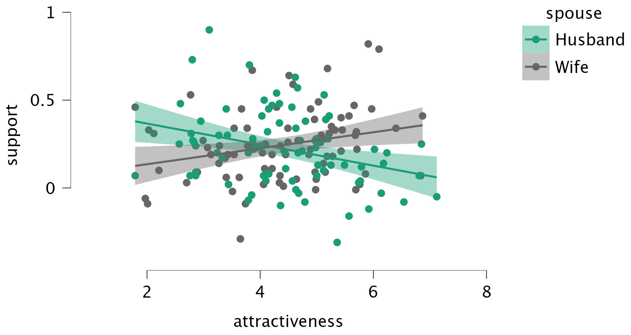
Task 10.3
McNulty et al. (2008) also found a relationship between a person’s
attractivenessand their relationshipsatisfactionamong newlyweds. Using the same data as in Tasks 1 and 2, find out if this relationship is moderated byspouse.
The results/settings can be found in the file alex_10_01-03.jasp. The results can be viewed in your browser here.
We need to specify three variables:
- Drag the outcome variable (
satisfaction) to the box labelled Dependent Variable. - Drag the continuous variable (
attractiveness) to the box labelled Continuous Predictors. - Drag the categorical variable (
spouse) to the box labelled Categorical Predictors.
Then, in the Models tab, select Hayes configuration number 1, and select attractiveness as Independent X and Spouse as Moderator W.
The first part of the output contains the main moderation analysis. Moderation is shown up by a significant interaction effect, and in this case the interaction is not significant, b = 0.547, 95% CI [-0.64, 1.73], z = 0.9, p = 0.366, indicating that the relationship between attractiveness and relationship satisfaction is not significantly moderated by spouse (i.e. the relationship between attractiveness and relationship satisfaction is not significantly different for husbands and wives).
Task 10.4
In this chapter we tested a mediation model of infidelity for Lambert et al.’s data (Lambert et al., 2012). Repeat this analysis but using
hook_upsas the measure of infidelity.
The results/settings can be found in the file alex_10_04.jasp. The results can be viewed in your browser here.
We need to specify three variables:
- Drag the outcome variable (
hook_ups) to the box labelled Dependent Variable. - Drag the continuous variables (
ln_pornandcommit) to the box labelled Continuous Predictors.
Then, in the Models tab, select Hayes configuration number 4, and select ln_porn as Independent X and commit as Mediators M. You can also choose to specify the Paths yourself; in that case make sure to specify a path from ln_porn to hook_ups, with Process Type set to Mediator and Process Variable to commit.
The output (Path coefficients table) shows the results of the linear model that predicts the number of hook-ups from both pornography consumption and commitment. We can see that pornography consumption significantly predicts number of hook-ups even with relationship commitment in the model, b = 1.28, z = 3.07, p = 0.02; relationship commitment also significantly predicts number of hook-ups, b = −0.62, z = −4.93, p < .001. The \(R^2\) value (R-squared table at the top of the output) tells us that the model explains 14.0% of the variance in number of hook-ups. The negative b for commitment tells us that as commitment increases, number of hook-ups declines (and vice versa), but the positive b for consumption indicates that as pornography consumption increases, the number of hook-ups increases also. These relationships are in the predicted direction.
The last line of the Path coefficients table shows us the results of the linear model that predicts commitment from pornography consumption. Pornography consumption significantly predicts relationship commitment, b = -0.47, z = -2.22, p = 0.027. The \(R^2\) value tells us that pornography consumption explains 2% of the variance in relationship commitment, and the fact that the b is negative tells us that the relationship is negative also: as consumption increases, commitment declines (and vice versa).
The next part of the output (Direct and indirect effects table) is the most important because it displays the results for the indirect effect of pornography consumption on number of hook-ups (i.e. the effect via relationship commitment). We’re first told the effect of pornography consumption on the number of hook-ups when relationship commitment is included as a predictor as well (i.e., the direct effect). The second line gives the indirect effect of pornography consumption on the number of hook-ups. We’re given an estimate of this effect (b = 0.292) as well as a standard error and confidence interval. As we have seen many times before, 95% confidence intervals contain the true value of a parameter in 95% of samples. Assuming our sample is one of the 95% that ‘hits’ the true value, we can infer that the true b-value for the indirect effect falls between 0.01 and 0.58. This range does not include zero, and remember that b = 0 would mean ‘no effect whatsoever’; therefore, the fact that the confidence interval does not contain zero means that there is likely to be a genuine indirect effect. The standardized effect is \(ab_{\text{CS}}\) = 0.042. Put another way, relationship commitment is a mediator of the relationship between pornography consumption and the number of hook-ups.
The last part of the output shows the total effect of pornography consumption on number of hook-ups (outcome). When relationship commitment is not in the model, pornography consumption significantly predicts the number of hook-ups, b = 1.57, z = 3.63, p < .001. As is the case when we include relationship commitment in the model, pornography consumption has a positive relationship with number of hook-ups (as shown by the positive b-value).
You could report the results as:
Task 10.5
Tablets like the iPad are very popular. A company owner was interested in how to make his brand of tablets more desirable. He collected data on how cool people perceived a product’s advertising to be (
advert_cool), how cool they thought the product was (product_cool), and how desirable they found the product (desirability). Test his theory that the relationship between cool advertising and product desirability is mediated by how cool people think the product is (tablets.jasp). Am I showing my age by using the word ‘cool’?
The results/settings can be found in the file alex_10_05.jasp. The results can be viewed in your browser here.
We need to specify three variables:
- Drag the outcome variable (
desirability) to the box labelled Dependent Variable. - Drag the continuous variables (
advert_coolandproduct_cool) to the box labelled Continuous Predictors.
Then, in the Models tab, select Hayes configuration number 4, and select advert_cool as Independent X and product_cool as Mediators M. You can also choose to specify the Paths yourself; in that case make sure to specify a path from advert_cool to desirability, with Process Type set to Mediator and Process Variable to product_cool.
The Path coefficients table shows the results of the linear model predicting desirability from how cool people perceived both the advertising and product to be. Cool advertising significantly predicts product desirability even with product_cool in the model, b = 0.20, z = 3.36, p < .001; product_cool also significantly predicts product desirability, b = 0.23, z = 3.71, p < .001. The \(R^2\) values tells us that the model explains 11% of the variance in product desirability. The positive bs for product_cool and advert_cool tell us that as adverts and products increase in how cool they are perceived to be, product desirability increases also (and vice versa). These relationships are in the predicted direction.
The last line of the table shows us the results of the linear model that predicts the perceived ‘coolness’ of the product from the perceived ‘coolness’ of the advertising. We can see that how cool people perceive the advertising to be significantly predicts how cool they think the product is, b = 0.15, z = 2.5, p = .012. The \(R^2\) value tells us that cool advertising explains 2.54% of the variance in how cool they think the product is, and the fact that the b is positive tells us that the relationship is positive also: the more ‘cool’ people think the advertising is, the more ‘cool’ they think the product is (and vice versa).
The Direct and indirect effects table is the most important because it displays the results for the indirect effect of cool advertising on product desirability (i.e. the effect via product_cool). First, we’re again told the effect of cool advertising on the product desirability in isolation (the direct effect). The first bit of new information is the second row of the table, which in this case is the indirect effect of cool advertising on the product desirability. We’re given an estimate of this effect (b = 0.035) as well as a standard error and confidence interval. As we have seen many times before, 95% confidence intervals contain the true value of a parameter in 95% of samples. Assuming our sample is one of the 95% that ‘hits’ the true value, we can infer that the true b-value for the indirect effect falls between \(0.002\) and \(0.068\). This range does not include zero, and remember that b = 0 would mean ‘no effect whatsoever’; therefore, the fact that the confidence interval does not contain zero means that there is likely to be a genuine indirect effect. The standardized effect is \(ab_{\text{CS}}\) = 0.036. Put another way, product_cool is a mediator of the relationship between cool advertising and product desirability.
The Total effects table shows the total effect of cool advertising on product desirability (outcome). The total effect is the effect of the predictor on the outcome when the mediator is not present in the model. When product_cool is not in the model, cool advertising significantly predicts product desirability, b = .235, z = 3.896, p < .001. As is the case when we include product_cool in the model, advert_cool has a positive relationship with product desirability (as shown by the positive b-value).
Chapter 11
Task 11.1
To test how different teaching methods affected students’ knowledge I took three statistics modules (
group) where I taught the same material. For one module I wandered around with a large cane and beat anyone who asked daft questions or got questions wrong (punish). In the second I encouraged students to discuss things that they found difficult and gave anyone working hard a nice sweet (reward). In the final course I neither punished nor rewarded students’ efforts (indifferent). I measured the students’ exam marks (exam). The data are in the fileteach_method.jasp. Fit a model with planned contrasts to test the hypotheses that: (1) reward results in better exam results than either punishment or indifference; and (2) indifference will lead to significantly better exam results than punishment.
The results/settings can be found in the file alex_11_01.jasp. The results can be viewed in your browser here.
The first part of the output is the main ANOVA summary table (note that I selected Welch test to have more robustness against possible unequal variances). We should routinely look at the Fs. Assuming we’re using a 0.05 criterion for significance, because the observed significance value is less than 0.05 we can say that there was a significant effect of teaching style on exam marks. This effect was fairly large, \(\omega^2\) = 0.57 [0.29, 0.73]. At this stage we do not know exactly what the effect of the teaching style was (we don’t know which groups differed). However, I specified contrasts to test the specific hypotheses in the question…
The next part of the output shows the contrasts results, including the Custom contrast setup I used. The first contrast compares reward (-1) against punishment and indifference (both coded with 0.5). The second contrast compares punishment (coded with 1) against indifference (coded with −1). Note that the codes for each contrast sum to zero, and that in contrast 2, reward has been coded with a 0 because it is excluded from that contrast.
The t-test for the first contrast tells us that reward was significantly different from punishment and indifference (it’s significantly different because the value in the column labelled p is less than our criterion of 0.05). Looking at the direction of the means, this contrast suggests that the average mark after reward was significantly higher than the average mark for punishment and indifference combined. This is a massive1 effect \(\hat{d} = -2.32 \ [-3.34, -1.29]\). The second contrast (together with the descriptive statistics) tells us that the marks after punishment were significantly lower than after indifference (again, significantly different because the value in the column labelled Sig. is less than our criterion of 0.05). This effect is also very large, \(\hat{d} = -1.12 \ [-2.09, -0.15]\) As such we could conclude that reward produces significantly better exam grades than punishment and indifference, and that punishment produces significantly worse exam marks than indifference. In short, lecturers should reward their students, not punish them.
1 So big that if these were real data I’d be incredibly suspicious.
Task 11.2
Children wearing superhero costumes are more likely to injure themselves because of the unrealistic impression of invincibility that these costumes could create. For example, children have reported to hospital with severe injuries because of trying ‘to initiate flight without having planned for landing strategies’ (Davies et al., 2007). I can relate to the imagined power that a costume bestows upon you; indeed, I have been known to dress up as Fisher by donning a beard and glasses and trailing a goat around on a lead in the hope that it might make me more knowledgeable about statistics. Imagine we had data (
superhero.jasp) about the severity ofinjury(on a scale from 0, no injury, to 100, death) for children reporting to the accident and emergency department at hospitals, and information on which superhero costume they were wearing (hero): Spiderman, Superman, the Hulk or a teenage mutant ninja turtle. Fit a model with planned contrasts to test the hypothesis that those wearing costumes of flying superheroes (Superman and Spiderman) have more severe injuries.
The results/settings can be found in the file alex_11_02.jasp. The results can be viewed in your browser here.
The means in the descriptives table suggest that children wearing a Ninja Turtle costume had the least severe injuries (M = 26.25), whereas children wearing a Superman costume had the most severe injuries (M = 60.33). Let’s assume we’re using \(\alpha = 0.05\). In the ANOVA output (we should routinely look at the Welch Fs.), the observed significance value is much less than 0.05 and so we can say that there was a significant effect of superhero costume on injury severity. At this stage we still do not know exactly what the effect of superhero costume was (we don’t know which groups differed).
Because there were no specific hypotheses, only that the groups would differ, we can’t look at planned contrasts but we can conduct some post hoc tests. I am going to use Gabriel’s post hoc test because the group sizes are slightly different (Spiderman, N = 8; Superman, N = 6; Hulk, N = 8; Ninja Turtle, N = 8). The output tells us that wearing a Superman costume was significantly different from wearing either a Hulk or Ninja Turtle costume in terms of injury severity, but that none of the other groups differed significantly.
The post hoc test has shown us which differences between means are significant; however, if we want to see the direction of the effects we can look back to the means in the table of descriptives, or (even better) visualize the means by using a Descriptives plot or Raincloud plot. We can conclude that wearing a Superman costume resulted in significantly more severe injuries than wearing either a Hulk or a Ninja Turtle costume (note that overlap of confidence intervals in a descriptives plot is not identical to (non-)signicance in post hoc tests).
Task 11.3
Mobile phones emit microwaves, and so holding one next to your brain for large parts of the day is a bit like sticking your brain in a microwave oven and pushing the ‘cook until well done’ button. If we wanted to test this experimentally, we could get six groups of people and strap a mobile phone on their heads, then by remote control turn the phones on for a certain amount of time each day. After 6 months, we measure the size of any tumour (in mm3) close to the site of the phone antenna (just behind the ear). The six groups experienced 0, 1, 2, 3, 4 or 5 hours per day of phone microwaves for 6 months. Do tumours significantly increase with greater daily exposure? The data are in
tumour.jasp.
The results/settings can be found in the file alex_11_03.jasp. The results can be viewed in your browser here.
The output shows the main ANOVA summary table. We should routinely look at the Welch Fs. Let’s assume we’re using \(\alpha\) = 0.05, because the observed significance of Welch’s F is less than 0.05 we can say that there was a significant effect of mobile phones on the size of tumour.
The output also includes the error bar chart of the mobile phone data. Note that in the control group (0 hours), the mean size of the tumour is virtually zero (we wouldn’t actually expect them to have a tumour) and the error bar shows that there was very little variance across samples - this almost certainly means we cannot assume equal variances. The output also shows the table of descriptive statistics. The means should correspond to those plotted. These diagnostics are important for interpretation later on.
At this stage we still do not know exactly what the effect of the phones was (we don’t know which groups differed). Because there were no specific hypotheses I carried out post hoc tests and stuck to my favourite Games–Howell procedure (because variances were unequal). Each group of participants is compared to all of the remaining groups. First, the control group (0 hours) is compared to the 1, 2, 3, 4 and 5 hour groups and reveals a significant difference in all cases (all the values in the column labelled \(p_{\text{tukey}}\) are less than 0.05). In the next part of the table, the 1 hour group is compared to all other groups. Again all comparisons are significant (all the values in the column labelled \(p_{\text{tukey}}\) are less than 0.05). In fact, all of the comparisons appear to be highly significant except the comparison between the 4 and 5 hour groups, which is non-significant because the value in the column labelled \(p_{\text{tukey}}\) is larger than 0.05.
Task 11.4
Using the data in
glastonbury.jasp, fit a model to see if the change in hygiene (change) is significant across people with different musical tastes (music). Use a simple contrast to compare each group against the no subculture group.
The results/settings can be found in the file alex_11_04.jasp. The results can be viewed in your browser here.
The output shows the main ANOVA table. Let’s assume we’re using \(\alpha\) = 0.05, because the observed significance of Welch’s F is less than 0.05 we can say that the change in hygiene scores was significantly different across the different musical subcultures, F(3, 43.19) = 3.08, p = 0.037.
The contrast analysis shows the Simple contrasts that compare each group to the No subculture group.
Task 11.5
Labcoat Leni’s Real Research 15.2 describes an experiment on quails with fetishes for terrycloth objects. There are two outcome variables (time spent near the terrycloth object and copulatory efficiency) that we won’t analyse. Read Labcoat Leni’s Real Research 15.2 to get the full story then fit a model with Bonferroni post hoc tests on the time spent near the terrycloth object.
The results/settings can be found in the file alex_11_05-06.jasp. The results can be viewed in your browser here.
The main ANOVA table tells us that the group (fetishistic, non-fetishistic or control group) had a significant effect on the time spent near the terrycloth object. To find out exactly what’s going on we can look at our post hoc tests and visualize the means by means of a Descriptives plot with confidence intervals. These results show that fetishistic quails spent significantly more time with the terrycloth than those in the other groups, and that fetishistic quails spent significantly more time with the terrycloth than the control group - fascinating!
For good measure we can also look at the Q-Q plot of the residuals. Most points are nicely located along the diagonal, so luckily that is one less worry for us (researching fetishistic quails is already worrisome enough on its own).
Task 11.6
Repeat the analysis in Task 5 but using copulatory efficiency as the outcome.
The results/settings can be found in the file alex_11_05-06.jasp. The results can be viewed in your browser here.
These results show that male quails have reduced copulatory efficiency (they are less efficient than those that don’t develop a fetish, but it’s worth remembering that they are no worse than quails that had no sexual conditioning – the controls). If you look at Labcoat Leni’s box then you’ll also see that this fetishistic behaviour may have evolved because the quails with fetishistic behaviour manage to fertilize a greater percentage of eggs (so their genes are passed on).
The Q-Q plot shows some deviations from normality though, so these results ought not to be taken 100% seriously (just in case you were still doing that).
Task 11.7
A sociologist wanted to compare murder rates (
murder) recorded in each month in a year at three high-profile locations in London (street): Ruskin Avenue, Acacia Avenue and Rue Morgue. Fit a robust model with bootstrapping to see in which streets the most murders happened. The data are inmurder.jasp.
The results/settings can be found in the file alex_11_07.jasp. The results can be viewed in your browser here.
Looking at the means in the Descriptives table/plot we can see that Rue Morgue had the highest mean number of murders (M = 2.92) and Ruskin Avenue had the smallest mean number of murders (M = 0.83). The main ANOVA shows us the Welch F-statistic for predicting mean murders from location. Let’s assume we’re using \(\alpha\) = 0.05. Because the observed significance value is less than 0.05, we can say that there was a significant effect of street on the number of murders. However, at this stage we still do not know exactly which streets had significantly more murders (we don’t know which groups differed). To investigate, we can look at the Descriptives plot with confidence intervals, or we can conduct hypothesis tests using post hoc tests, where each street is compared to all of the remaining streets. To have a more robust result, we can use bootstrapped confidence intervals.
If we look at the values in the column labelled \(p_{\text{tukey}}\) we can see that the two significant comparisons are between Ruskin Avenue and Rue Morgue (\(p_{\text{tukey}}\)= 0.006) and between Acacia Avenue and Rue Morgue (\(p_{\text{tukey}}\) = 0.03). The BCa 95% confidence intervals corroborate this result, since the intervals do not contain 0 for these two comparisons. Combined with the observed means in the Descriptives table/plot, this tells us that Rue Morgue had the highest number of murders, compared to Ruskin Avenue and Acacia Avenue. Note that values from your bootstrap will slightly differ, since the bootstrap uses random number generation; in order to have these values fluctuate less, you can opt to use more bootstrap replicates (I set mine to 5000).
Chapter 12
Task 12.1
A few years back I was stalked. You’d think they could have found someone a bit more interesting to stalk, but apparently times were hard. It wasn’t particularly pleasant, but could have been a lot worse. I imagined a world in which a psychologist tried two different therapies on different groups of stalkers (25 stalkers in each group – this variable is called
therapy). To the first group he gave cruel-to-be-kind therapy (every time the stalkers followed him around, or sent him a letter, the psychologist attacked them with a cattle prod).The second therapy was psychodyshamic therapy, in which stalkers were hypnotized and regressed into their childhood to process potential childhood trauma. The psychologist measured the number of hours stalking in one week both before (stalk_pre) and after (stalk_post) treatment (stalker.jasp). Analyse the effect of therapy on stalking behaviour after therapy, adjusting for the amount of stalking behaviour before therapy.
The results/settings can be found in the file alex_12_01.jasp. The results can be viewed in your browser here.
First, we conduct an ANOVA to test whether the number of hours spent stalking before therapy (our covariate) is independent of the type of therapy (our predictor variable). It’s important to check this assumption first, because if this is not the case, the ANCOVA might be misleading.
The results show that the main effect of group is not significant, F(1, 48) = 0.06, p = 0.804, which shows that the average level of stalking behaviour before therapy was roughly the same in the two therapy groups. In other words, the mean number of hours spent stalking before therapy is not significantly different in the cruel-to-be-kind and psychodyshamic therapy groups. This result is good news for using this model to adjust for stalking behaviour before therapy.
The ANCOVA results show that the covariate significantly predicts the outcome variable, so the hours spent stalking after therapy depend on the extent of the initial problem (i.e. the hours spent stalking before therapy). More interesting is that after adjusting for the effect of initial stalking behaviour, the effect of therapy is significant. To interpret the results of the main effect of therapy we look at the adjusted means, which tell us that stalking behaviour was significantly lower after the therapy involving the cattle prod than after psychodyshamic therapy (after adjusting for baseline stalking).
To interpret the covariate, we can create a Descriptives plot (always be sure to include error bars!) of the time spent stalking after therapy (outcome variable) and the initial level of stalking (covariate). The resulting plot shows that there is a positive relationship between the two variables: that is, high scores on one variable correspond to high scores on the other, whereas low scores on one variable correspond to low scores on the other.
Task 12.2
A marketing manager tested the benefit of soft drinks for curing hangovers. He took 15 people and got them drunk. The next morning as they awoke, dehydrated and feeling as though they’d licked a camel’s sandy feet clean with their tongue, he gave five of them water to drink, five of them Lucozade (a very nice glucose-based UK drink) and the remaining five a leading brand of cola (this variable is called
drink). He measured how well they felt (on a scale from 0 = I feel like death to 10 = I feel really full of beans and healthy) two hours later (this variable is calledwell). He measured howdrunkthe person got the night before on a scale of 0 = straight edge to 10 = flapping about like a haddock out of water (hangover.jasp). Fit a model to see whether people felt better after different drinks when adjusting for how drunk they were the night before.
The results/settings can be found in the file alex_12_02-03.jasp. The results can be viewed in your browser here.
First let’s check that the predictor variable (drink) and the covariate (drunk) are independent. The results show that the main effect of drink is not significant, F(2, 12) = 1.36, p = 0.295, which shows that the average level of drunkenness the night before was roughly the same in the three drink groups. This result is good news for using this model to adjust for the variable drunk.
The ANCOVA results show that the covariate significantly predicts the outcome variable, so the drunkenness of the person influenced how well they felt the next day. What’s more interesting is that after adjusting for the effect of drunkenness, the effect of drink is significant.
To interpret the covariate we can create a plot of the outcome (well, y-axis) against the covariate ( drunk, x-axis) in the Descriptives Plots tab. The resulting plot shows that there is a negative relationship between the two variables: that is, high scores on one variable correspond to low scores on the other, whereas low scores on one variable correspond to high scores on the other. The more drunk you got, the less well you felt the following day.
In order to investigate the pairwise group differences while taking into account the covariate, we can conduct a post hoc analysis (since that’s based on the marginal means). This analysis makes pairwise comparisons between each adjusted group mean while correcting the \(p\)-values for multiple comparisons. Here, we can see that the only significant difference is between Lucozade and Water. The comparison is Water (1st column) vs. Lucozade (2nd column) and is negative, which indicates that Lucozade had the higher group mean. In human words, that means that people felt better in the Lucozade group than the Water group, after accounting for their drunkenness the night before.
The low sample size is a tad worrisome here though, and is reflected in the very wide confidence intervals we obtain - these data are probably not informative enough to confidently conclude one drink is better than the other in curing hangovers.
Task 12.3
Compute effect sizes for Task 2 and report the results.
The results/settings can be found in the file alex_12_02-03.jasp. The results can be viewed in your browser here.
The effect sizes for the main effect of drink can be calculated as follows (see also Eq. 12.8 in Section 12.4):
\[ \begin{aligned} \omega_p^2 &= \frac{df_\text{drink} \times (\text{MS}_\text{drink} - \text{MS}_\text{residual}) } {\text{SS}_\text{drink} + (N - df_\text{drink}) \times \text{MS}_\text{residual}} \\ &= \frac{2 \times (1.732 - 0.401)}{3.464 + (15 - 2) \times 0.401}\\ &= 0.307 \end{aligned} \]
And for the covariate:
\[ \begin{aligned} \omega_p^2 &= \frac{df_\text{drunk} \times (\text{MS}_\text{drunk} - \text{MS}_\text{residual}) } {\text{SS}_\text{drunk} + (N - df_\text{drunk}) \times \text{MS}_\text{residual}} \\ &= \frac{1 \times (11.187 - 0.401)}{11.187 + (15 - 1) \times 0.401}\\ &= 0.642 \end{aligned} \]
We can get effect sizes for the model parameters from the output.
Task 12.4
The highlight of the elephant calendar is the annual elephant soccer event in Nepal (google it). A heated argument burns between the African and Asian elephants. In 2010, the president of the Asian Elephant Football Association, an elephant named Boji, claimed that Asian elephants were more talented than their African counterparts. The head of the African Elephant Soccer Association, an elephant called Tunc, issued a press statement that read ‘I make it a matter of personal pride never to take seriously any remark made by something that looks like an enormous scrotum’. I was called in to settle things. I collected data from the two types of elephants (
elephant) over a season and recorded how many goals each elephant scored (goals) and how many years of experience the elephant had (experience). Analyse the effect of the type of elephant on goal scoring, covarying for the amount of football experience the elephant has (elephooty.jasp).
The results/settings can be found in the file alex_12_04.jasp. The results can be viewed in your browser here.
First, let’s check that the predictor variable (elephant) and the covariate (experience) are independent. To do this we can run a one-way ANOVA. The ANOVA result shows that the main effect of elephant is not significant, F(1, 118) = 1.38, p = 0.24, which shows that the average level of prior football experience was roughly the same in the two elephant groups. This result is good news for using this model to adjust for the effects of experience.
The ANCOVA results show that the experience of the elephant significantly predicted how many goals they scored, F(1, 117) = 9.93, p = 0.002. After adjusting for the effect of experience, the effect of elephant is also significant. In other words, African and Asian elephants differed significantly in the number of goals they scored. The adjusted means tell us, specifically, that African elephants scored significantly more goals than Asian elephants after adjusting for prior experience, F(1, 117) = 8.59, p = 0.004.
To interpret the covariate we can create a Descriptives plot of the outcome (goals, y-axis) against the covariate ( experience, x-axis), including an error region to reflect our uncertainty. The resulting plot shows that there is a (loose) positive relationship between the two variables that if you use your imagination looks like an elephant: the more prior football experience the elephant had, the more goals they scored in the season.
Task 12.5
In Chapter 4 (Task 6) we looked at data from people who had fish or cats as pets and measured their life satisfaction and, also, how much they like animals (
pets.jasp). Fit a model predicting life satisfaction from the type of pet a person had and their animal liking score (covariate).
The results/settings can be found in the file alex_12_05-06.jasp. The results can be viewed in your browser here.
First, check that the predictor variable (pet) and the covariate (animal) are independent. To do this we can run a one-way ANOVA. The output shows that the main effect of wife is not significant, F(1, 18) = 0.06, p = 0.81, which shows that the average level of love of animals was roughly the same in the two type of animal wife groups. This result is good news for using this model to adjust for the effects of the love of animals.
The ANCOVA results show that love of animals significantly predicted life satisfaction, F(1, 17) = 10.32, p = 0.005. After adjusting for the effect of love of animals, the effect of pet is also significant. In other words, life satisfaction differed significantly in those with cats as pets compared to those with fish. The adjusted means tell us, specifically, that life satisfaction was significantly higher in those who owned a cat, F(1, 17) = 16.45, p = 0.001.
To interpret the covariate we can create a Descriptives plot of the outcome (life_satisfaction, y-axis) against the covariate ( animal, x-axis), including some error bars to reflect our uncertainty. The resulting plot shows that there is a positive relationship between the two variables: the greater ones love of animals, the greater ones life satisfaction.
Task 12.6
Fit a linear model predicting life satisfaction from the type of pet and the effect of love of animals using what you learnt in Chapter 9. Compare this model to your results for Task 5. What differences do you notice and why?
The results/settings can be found in the file alex_12_05-06.jasp. The results can be viewed in your browser here.
To fit the linear model, we use the Regression module in JASP, and go to Linear Regression.
- Drag the outcome variable (
life_satisfaction) to the box labelled Dependent Variable. - Drag the continuous predictor variable (
animal) to the box labelled Covariates. - Drag the categorical predictor variable (
pet) to the box labelled Factors.
From the output we can see that both love of animals, t(17) = 3.21, p = 0.005, and type of pet, t(17) = 4.06, p = 0.001, significantly predicted life satisfaction. In other words, after adjusting for the effect of love of animals, type of pet significantly predicted life satisfaction.
Now, let’s look again at the output from Task 5 (above), in which we conducted an ANCOVA predicting life satisfaction from the type of animal to which a person was married and their animal liking score (covariate).
The covariate, love of animals, was significantly related to life satisfaction, F(1, 17) = 10.32, p = 0.005, \(\omega_p^2\) = 0.318. There was also a significant effect of the type of pet after adjusting for love of animals, F(1, 17) = 16.45, p < 0.001, \(\omega_p^2\) = 0.436, indicating that life satisfaction was significantly higher for people who had cats as pets (M = 59.56, SE = 4.01) than for those with fish (M = 38.55, SE = 3.27).
The conclusions are the same as from the linear model, but more than that:
- The p-values for both effects are identical.
- This is because there is a direct relationship between t and F. In fact \(F = t^2\). Let’s compare the ts and Fs of our two effects:
- For love of animals, when we ran the analysis as ‘regression’ we got t = 3.213. If we square this value we get \(t^2 = 3.213^2 = 10.32\). This is the value of F that we got when we ran the model as ‘ANCOVA’.
- for the type of pet, when we ran the analysis as ‘regression’ we got t = 4.055. If we square this value we get \(t^2 = 4.055^2 = 16.44\). This is the value of F that we got when we ran the model as ‘ANCOVA’.
Basically, this task is all about showing you that despite the menu structure in JASP creating false distinctions between models, when you do ‘ANCOVA’ and ‘regression’ you are, in both cases, using the general linear model and accessing it via different menus.
Task 12.7
In Chapter 10 we compared the number of mischievous acts in people who had invisibility cloaks to those without (cloak). Imagine we replicated that study, but changed the design so that we recorded the number of mischievous acts in these participants before the study began (
mischief_pre) as well as during the study (mischief). Fit a model to see whether people with invisibility cloaks get up to more mischief than those without when factoring in their baseline level of mischief (invisibility_base.jasp).
The results/settings can be found in the file alex_12_07.jasp. The results can be viewed in your browser here.
First, check that the predictor variable (cloak) and the covariate (mischief1) are independent. To do this we can run a one-way ANOVA. The ANOVA results show that the main effect of cloak is not significant, F(1, 78) = 0.14, p = 0.71, which shows that the average level of baseline mischief was roughly the same in the two cloak groups. This result is good news for using this model to adjust for the effects of baseline mischief.
The ANCOVA results show that baseline mischief significantly predicted post-intervention mischief, F(1, 77) = 7.40, p = 0.008. After adjusting for baseline mischief, the effect of cloak is also significant. In other words, mischief levels after the intervention differed significantly in those who had an invisibility cloak and those who did not. The adjusted means tell us, specifically, that mischief was significantly higher in those with invisibility cloaks, F(1, 77) = 11.33, p = 0.001. Additionally, we can look at the partial effect sizes and their 95% confidence intervals, which for both predictor variables do not include 0.
To interpret the covariate create a Descriptives plot of the outcome (mischief_post, y-axis) against the covariate ( mischief_pre, x-axis), including error bars. The resulting plot shows that there is a positive relationship between the two variables: the greater ones mischief levels before the cloaks were assigned to participants, the greater ones mischief after the cloaks were assigned to participants.
Chapter 13
Task 13.1
People have claimed that listening to heavy metal, because of its aggressive sonic palette and often violent or emotionally negative lyrics, leads to angry and aggressive behaviour (Selfhout et al., 2008). As a very non-violent metal fan this accusation bugs me. Imagine I designed a study to test this possibility. I took groups of self-classifying metalheads and non-metalheads (
fan) and assigned them randomly to listen to 15 minutes of either the sound of an angle grinder scraping a sheet of metal (control noise), metal music, or pop music (soundtrack). Each person rated theirangeron a scale ranging from 0 (‘All you need is love, da, da, da-da-da’) to 100 (‘All you wanna do is drag me down, all I wanna do is stamp you out’). Fit a model to test my idea (metal.jasp).
To fit the model, open the ANOVA module, navigate to Classical ANOVA, and
- Drag the outcome variable (
anger) to the box labelled Dependent Variable. - Drag the predictor variables (
fanandsoundtrack) to the box labelled Fixed Factors.
The results/settings can be found in the file alex_13_01.jasp. The results can be viewed in your browser here.
The ANOVA table in the output shows that the main effect of music is significant, F(2, 84) = 116.82, p < .001, as is the interaction, F(2, 84) = 433.28, p < 0.001, but the main effect of whether someone was a metal music fan, F(1, 84) = 0.07, p = 0.788. Let’s look at these effects in turn by plotting the means using the Raincloud plots from the Descriptives module. Note that you can also plot the means using Descriptives plots tab in ANOVA module, but they will look less funky.
The plot of the main effect of soundtrack shows that the significant effect is likely to reflect the fact that the sound of an angle grinder led to (on average) highest anger than pop or metal. The table of post hoc tests tells us more. First, anger was significantly higher after hearing an angle grinder compared to listening to both metal and pop (in both cases the value in the column labelled p is less than 0.05). Levels of anger were statistically comparable after listening to pop and metal (p = 0.371).
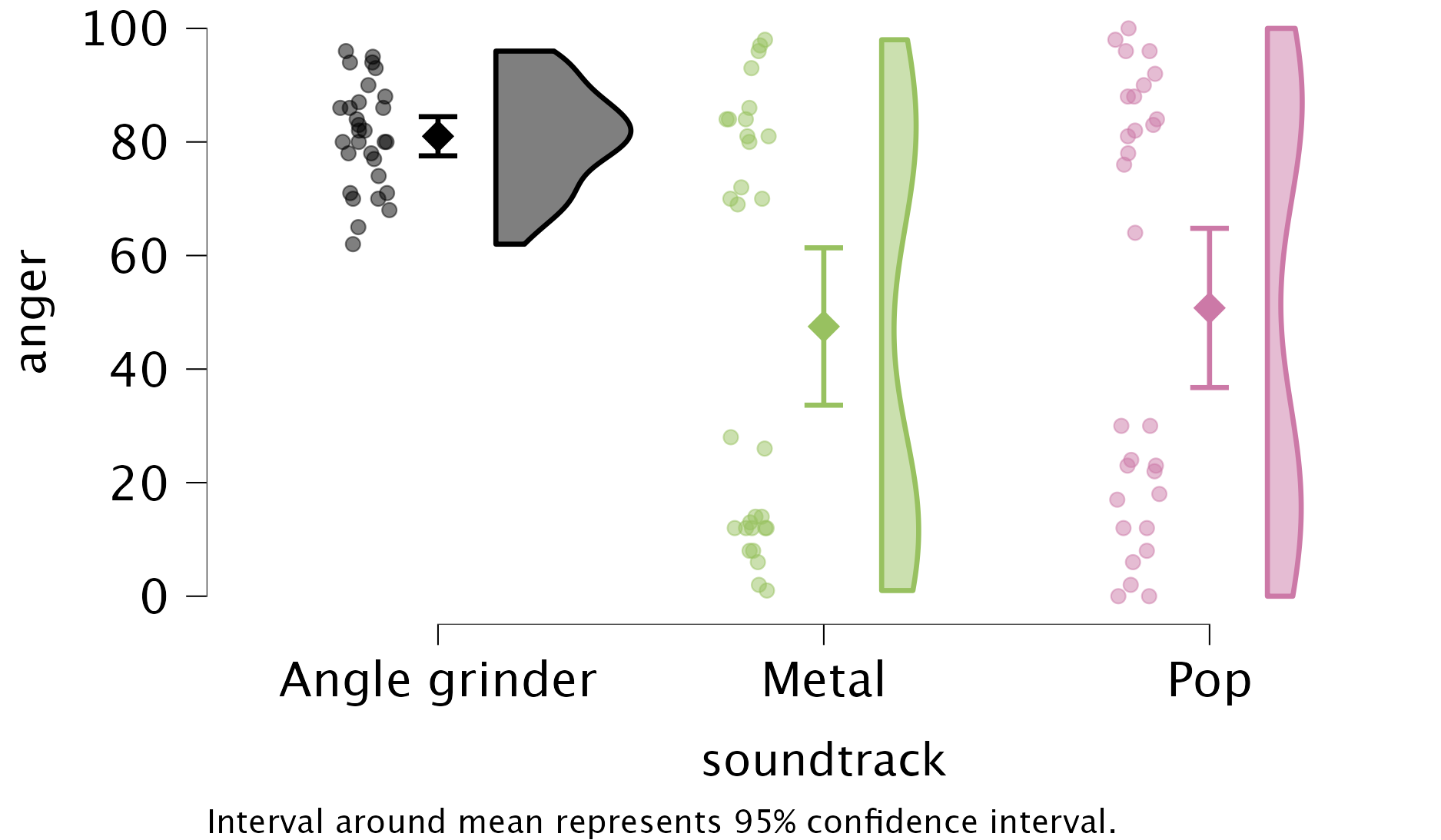
The main effect of fan was not significant, and the plot shows that when you ignore the type of soundtrack used, older people and younger people, on average, gave almost identical ratings.
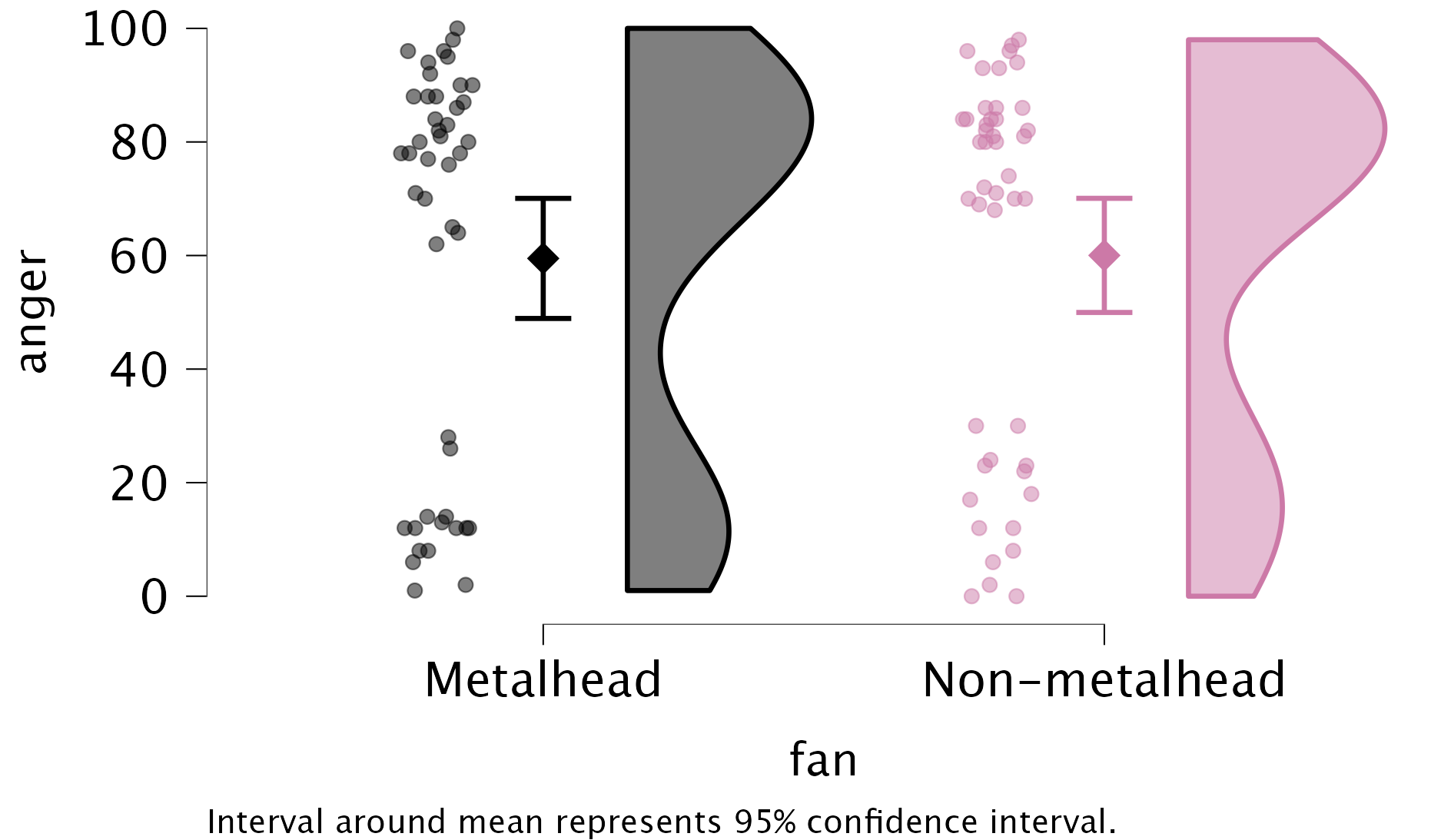
The interaction effect is shown in the raincloud plot below. Three things stand out (combined with the simple main effects analysis):
- Anger was high after listening to an angle grinder and this wasn’t significantly different for fans of metal and pop music, F(1, 84) = 0.30, p = 0.586.
- After listening to metal music anger was significantly lower for fans of metal music than for fans of pop music, F(1, 84) = 431.55, p < 0.001.
- After listening to pop music anger was significantly higher for fans of metal music than for fans of pop music, F(1, 84) = 434.79, p < 0.001.
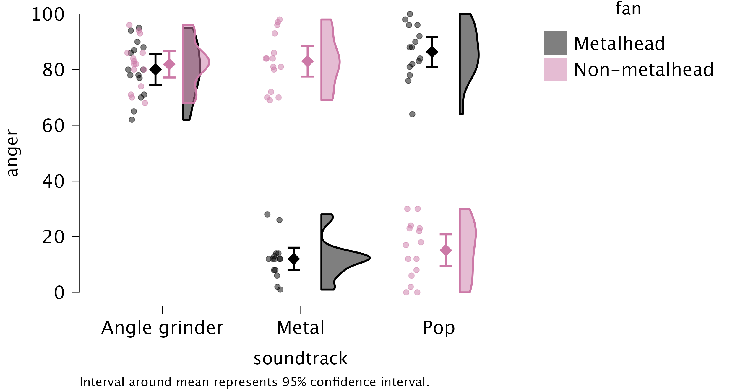
Task 13.2
Compute omega squared for the effects in Task 1 and report the results of the analysis.
Since we have multiple predictor variables, we should calculate the partial version of omega squared. Let’s start with the effect size for soundtrack (see also Eq. 12.8 in Section 12.4): \[
\begin{aligned}
\omega_p^2 &= \frac{df_\text{soundtrack} \times (\text{MS}_\text{soundtrack} - \text{MS}_\text{residual}) } {\text{SS}_\text{soundtrack} + (N - df_\text{soundtrack}) \times \text{MS}_\text{residual}} \\
&= \frac{2 \times (10234.878 - 87.61)}{20469.756 + (90 - 2) \times 87.61}\\
&\approx 0.720
\end{aligned}
\]
For the main effect of fan we obtain: \[
\begin{aligned}
\omega_p^2 &= \frac{df_\text{fan} \times (\text{MS}_\text{fan} - \text{MS}_\text{residual}) } {\text{SS}_\text{fan} + (N - df_\text{fan}) \times \text{MS}_\text{residual}} \\
&= \frac{1 \times (6.4 - 87.61)}{6.4 + (90 - 1) \times 87.61}\\
&\approx 0
\end{aligned}
\]
For the interaction effect between soundtrack and fan we obtain: \[
\begin{aligned}
\omega_p^2 &= \frac{df_\text{interaction} \times (\text{MS}_\text{interaction} - \text{MS}_\text{residual}) } {\text{SS}_\text{interaction} + (N - df_\text{interaction}) \times \text{MS}_\text{residual}} \\
&= \frac{2 \times (37959.633 - 87.61)}{75919.267 + (90 - 2) \times 87.61}\\
&\approx 0.906
\end{aligned}
\]
We could report (remember if you’re using APA format to drop the leading zeros before p-values and \(\omega_p^2\), for example report p = .035 instead of p = 0.035):
Task 13.3
In Chapter 5 we used some data that related to male and female arousal levels when watching The Notebook or a documentary about notebooks (
notebook.jasp). Fit a model to test whether men and women differ in their reactions to different types of films.
To fit the model, go to the ANOVA menu and
- Drag the outcome variable (
Arousal) to the box labelled Dependent Variable. - Drag the predictor variables (
Gender_identityandGilm) to the box labelled Fixed Factors.
The results/settings can be found in the file alex_13_03.jasp. The results can be viewed in your browser here.
The output shows that the main effect of gender_identity is significant, F(1, 36) = 7.29, p = 0.011, as is the main effect of film, F(1, 36) = 141.87, p < 0.001 and the interaction, F(1, 36) = 4.64, p = 0.038. Given that the interaction is significant we should focus on this effect (because it makes the main effects hard to interpret by themselves). To dissect the interaction effect we can look at the conditional post hoc tests for the interaction effect, which shows gender differences, for each of the two films separately. Psychological arousal is statistically comparable for those identifying as men and women during the documentary about notebooks (it is low for both genders), t(36) = 0.39,\(p_{tukey}\) = 0.702, \(d\) = 0.172. However, for the notebook those identifying as men experienced significantly greater psychological arousal than those identifying as women, t(36) = 11.78, \(p_{tukey}\) = 0.002, \(d\) = 1.535. These results are visualized in the raincloud and descriptives plots.
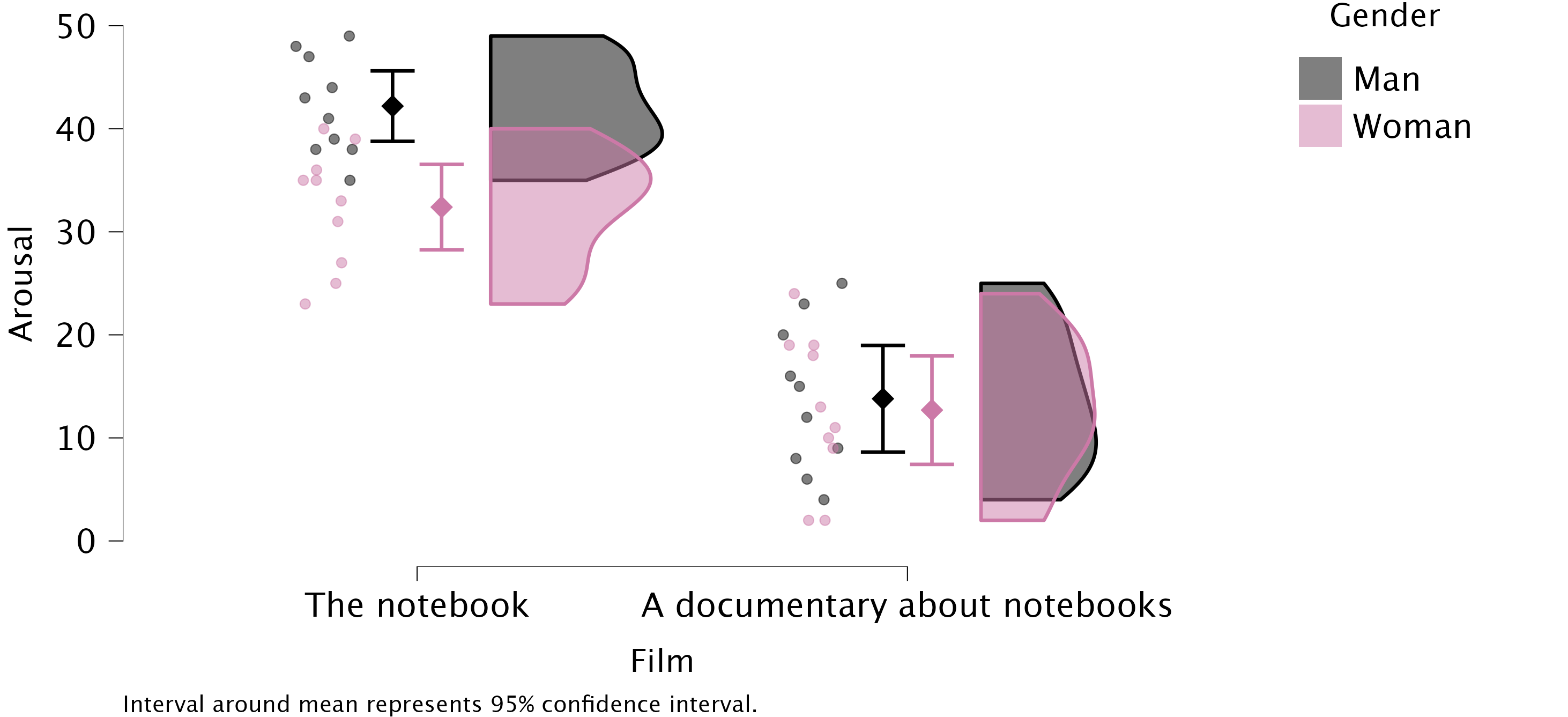
Task 13.4
Compute omega squared for the effects in Task 3 and report the results of the analysis.
Since we have multiple predictor variables, we should calculate the partial version of omega squared. Let’s start with the effect size for Gender (see also Eq. 12.8 in Section 12.4): \[
\begin{aligned}
\omega_p^2 &= \frac{df_\text{gender} \times (\text{MS}_\text{gender} - \text{MS}_\text{residual}) } {\text{SS}_\text{gender} + (N - df_\text{gender}) \times \text{MS}_\text{residual}} \\
&= \frac{1 \times (297.025 - 40.769)}{297.025 + (40 - 1) \times 40.769}\\
&\approx0.136
\end{aligned}
\]
For the main effect of Film we obtain: \[
\begin{aligned}
\omega_p^2 &= \frac{df_\text{fan} \times (\text{MS}_\text{fan} - \text{MS}_\text{residual}) } {\text{SS}_\text{fan} + (N - df_\text{fan}) \times \text{MS}_\text{residual}} \\
&= \frac{1 \times (5784.025 - 40.769)}{5784.025 + (40 - 1) \times 40.769}\\
&\approx 0.779
\end{aligned}
\]
For the interaction effect between Gender and Film we obtain: \[
\begin{aligned}
\omega_p^2 &= \frac{df_\text{interaction} \times (\text{MS}_\text{interaction} - \text{MS}_\text{residual}) } {\text{SS}_\text{interaction} + (N - df_\text{interaction}) \times \text{MS}_\text{residual}} \\
&= \frac{1 \times (189.225 - 40.769)}{189.225 + (40 - 1) \times 40.769}\\
&\approx 0.083
\end{aligned}
\]
We could report (remember if you’re using APA format to drop the leading zeros before p-values and \(\omega^2\), for example report p = .035 instead of p = 0.035):
Task 13.5
In Chapter 4 we used some data that related to learning in men and women when either reinforcement or punishment was used in teaching (
teaching.jasp). Analyse these data to see whether men and women’s learning differs according to the teaching method used.
To fit the model, go to the ANOVA menu and
- Drag the outcome variable (
mark) to the box labelled Dependent Variable. - Drag the predictor variables (
genderandmethod) to the box labelled Fixed Factors.
The results/settings can be found in the file alex_13_05.jasp. The results can be viewed in your browser here.
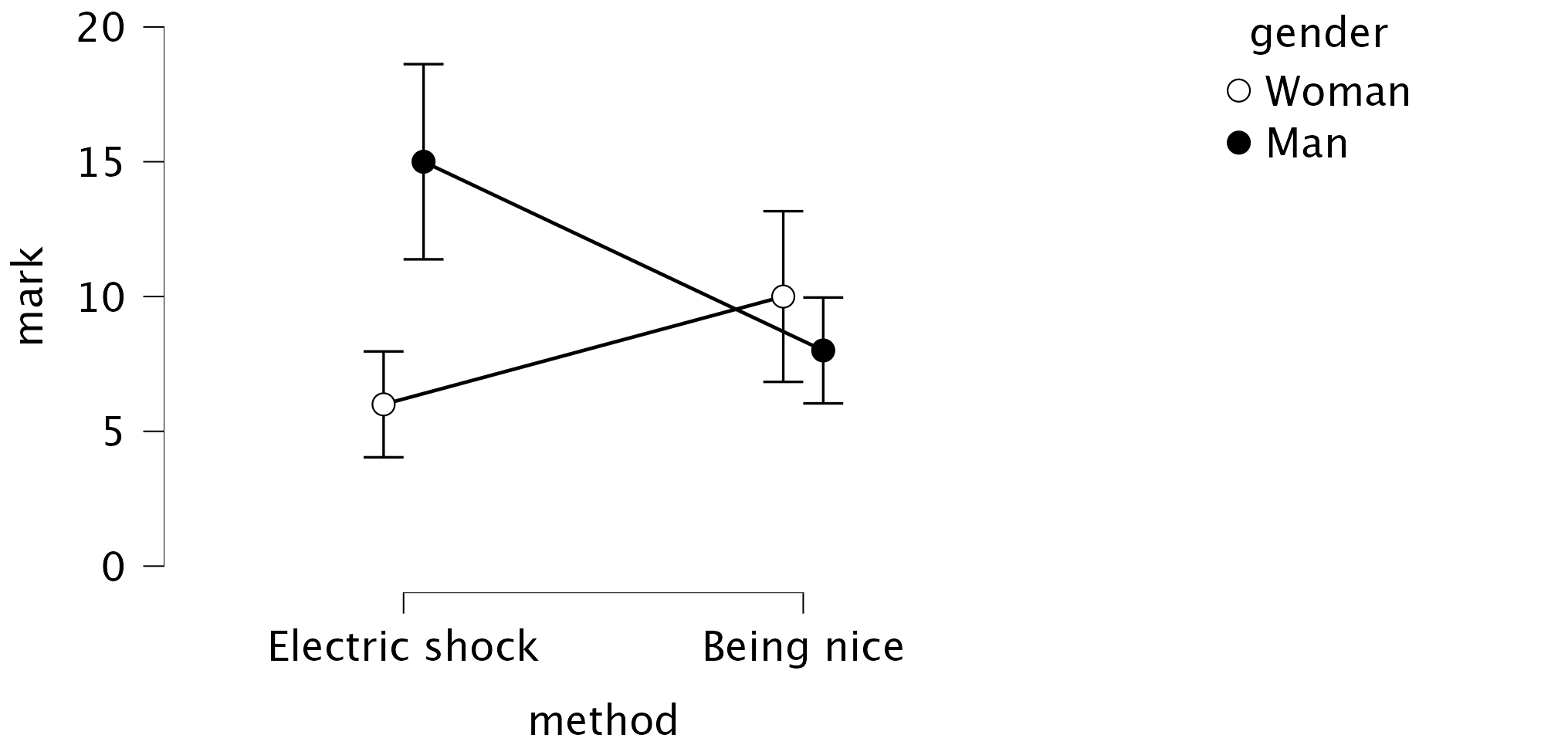
Task 13.6
At the start of this Chapter I described a way of empirically researching whether I wrote better songs than my old bandmate Malcolm, and whether this depended on the type of song (a symphony or song about flies). The outcome variable was the number of screams elicited by audience members during the songs. Plot the data and fit a model to test my hypothesis that the type of song moderates which songwriter is preferred (
escape.jasp).
The results/settings can be found in the file alex_13_06.jasp. The results can be viewed in your browser here.
To produce the plot, we can use the Raincloud plots from the Descriptives module and specify the variables as follows:
- Drag
screamsto the box labelled Dependent Variables. - Drag
songwriterto the box labelled Primary Factor. - Drag
song_typeto the box labelled Secondary Factor.
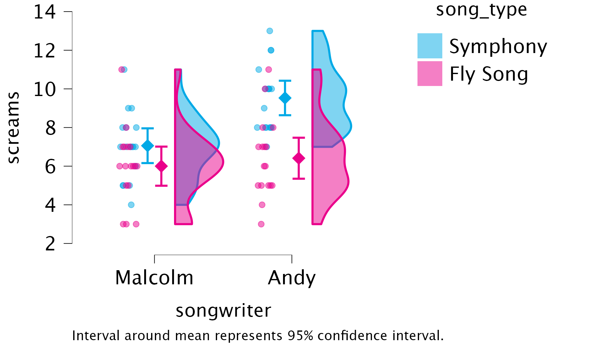
To fit the model, specify an ANOVA:
- Drag the outcome variable (
screams) to the box labelled Dependent Variable. - Drag the predictor variables (
song_typeandsongwriter) to the box labelled Fixed Factors.
Task 13.7
Compute omega squared for the effects in Task 6 and report the results of the analysis.
Since we have multiple predictor variables, we should calculate the partial version of omega squared. Let’s start with the effect size for song_type (see also Eq. 12.8 in Section 12.4):
\[ \begin{aligned} \omega_p^2 &= \frac{df_\text{songtype} \times (\text{MS}_\text{songtype} - \text{MS}_\text{residual}) } {\text{SS}_\text{songtype} + (N - df_\text{songtype}) \times \text{MS}_\text{residual}} \\ &= \frac{1 \times (74.132 - 3.551)}{74.132 + (68 - 1) \times 3.551}\\ &\approx 0.226 \end{aligned} \]
For the main effect of songwriter we obtain: \[
\begin{aligned}
\omega_p^2 &= \frac{df_\text{songwriter} \times (\text{MS}_\text{songwriter} - \text{MS}_\text{residual}) } {\text{SS}_\text{songwriter} + (N - df_\text{songwriter}) \times \text{MS}_\text{residual}} \\
&= \frac{1 \times (35.309 - 3.551)}{35.309 + (68 - 1) \times 3.551}\\
&\approx 0.116
\end{aligned}
\]
For the interaction effect between song_type and songwriter we obtain: \[
\begin{aligned}
\omega_p^2 &= \frac{df_\text{interaction} \times (\text{MS}_\text{interaction} - \text{MS}_\text{residual}) } {\text{SS}_\text{interaction} + (N - df_\text{interaction}) \times \text{MS}_\text{residual}} \\
&= \frac{1 \times (18.015 - 3.551)}{18.015 + (68 - 1) \times 3.551}\\
&\approx 0.057
\end{aligned}
\] We could report (remember if you’re using APA format to drop the leading zeros before p-values and \(\omega^2\), for example report p = .035 instead of p = 0.035).
Task 13.8
There are reports of increases in injuries related to playing games consoles. These injuries were attributed mainly to muscle and tendon strains. A researcher hypothesized that a stretching warm-up before playing would help lower injuries, and that athletes would be less susceptible to injuries because their regular activity makes them more flexible. She took 60 athletes and 60 non-athletes (
athlete); half of them played on a Nintendo Switch and half watched others playing as a control (switch), and within these groups half did a 5-minute stretch routine before playing/watching whereas the other half did not (stretch). The outcome was a pain score out of 10 (where 0 is no pain, and 10 is severe pain) after playing for 4 hours (injury). Fit a model to test whether athletes are less prone to injury, and whether the prevention programme worked (switch.jasp)
This design is a 2(Athlete: athlete vs. non-athlete) by 2(switch: playing switch vs. watching switch) by 2(Stretch: stretching vs. no stretching) three-way independent design. To fit the model, fhead over to the ANOVA menu and
- Drag the outcome variable (
injury) to the box labelled Dependent Variable. - Drag the predictor variables (
athlete,switchandstretch) to the box labelled Fixed Factors.
The results/settings can be found in the file alex_13_08.jasp. The results can be viewed in your browser here. The files does not show every descriptives plot I’m about to discuss, but you can tweak the options yourself by having different configurations of which variables (if any) are in the boxes Horizontal axis, Separate plots and Separate lines.
Although the three-way interaction is significant and so supersedes all lower-order effects, we will look at each effect in turn to get some practice at interpretation. There was a significant main effect of athlete, F(1, 112) = 64.82, p < .001, \(\omega_p^2\) = 0.347. Figure 11 show that, on average, athletes had significantly lower injury scores than non-athletes.
athlete
There was a significant main effect of stretching, F(1, 112) = 11.05, p = 0.001, \(\omega_p^2\) = 0.077. Figure 12 show that stretching significantly decreased injury score compared to not stretching. However, the two-way interaction with athletes will show us that this is true only for athletes and non-athletes who played on the switch, not for those in the control group (you can also see this pattern in the three-way interaction plot). This is an example of how main effects can be misleading.
stretching
There was also a significant main effect of switch, F(1, 112) = 55.66, p < .001, \(\omega_p^2\) = 0.313. Figure 13 shows (not surprisingly) that playing on the switch resulted in a significantly higher injury score compared to watching other people playing on the switch (control).
switch
There was not a significant athlete by stretch interaction F(1, 112) = 1.23, p = 0.270, \(\omega_p^2\) = 0.002. Figure 14 shows that (not taking into account playing vs. watching the switch) while non-athletes had higher injury scores than athletes overall, stretching decreased the number of injuries in both athletes and non-athletes by roughly the same amount (compare the vertical distance between the the circle and triangle in each group).
athlete \(\times\) stretching
There was a significant athlete by switch interaction F(1, 112) = 45.18, p < .001, \(\eta_p^2\) = 0.269. Figure 15 shows that (not taking stretching into account) non-athletes had low injury scores when watching but high injury scores when playing whereas athletes had low injury scores both when playing and watching.
athlete \(\times\) switch
There was a significant stretch by switch interaction F(1, 112) = 14.19, p < .001, \(\omega_p^2\) = 0.099. Figure 17 shows that (not taking athlete into account) stretching before playing on the switch significantly decreased injury scores, but stretching before watching other people playing on the switch did not significantly reduce injury scores. This is not surprising as watching other people playing on the switch is unlikely to result in sports injury!

switch \(\times\) stretching
There was a significant athlete by stretch by switch interaction F(1, 112) = 5.94, p < .05, \(\omega_p^2\) = 0.04. What this means is that the effect of stretching and playing on the switch on injury score was different for athletes than it was for non-athletes. In the presence of this significant interaction it makes no sense to interpret the main effects. Figure 17 shows this three-way effect and includes the significance of the simple effects analysis in the output. Using this information, it seems that for athletes, stretching and playing on the switch has very little effect: their injury scores were low regardless of whether they played on the switch, watched other people playing, stretched or did not stretch. However, for the non-athletes, watching other people play on the switch compared to playing it themselves significantly decreased injuries both when they stretched and did not stretch. Based on the means it looks as though this difference is a little smaller after stretching than not (although we don’t have a direct test of this).
athlete \(\times\) switch \(\times\) stretching
Task 13.9
A researcher was interested in what factors contributed to injuries resulting from game console use. She tested 40 participants who were randomly assigned to either an active or static game played on either a Nintendo Switch or Xbox One Kinect. At the end of the session their physical condition was evaluated on an injury severity scale. The data are in the file
xbox.jaspwhich contains the variablesgame(0 = static, 1 = active),console(0 = Switch, 1 = Xbox), andinjury(a score ranging from 0 (no injury) to 20 (severe injury)). Fit a model to see whether injury severity is significantly predicted from the type of game, the type of console and their interaction.
To fit the model, access the ANOVA menu and
- Drag the outcome variable (
injury) to the box labelled Dependent Variable. - Drag the predictor variables (
game, andconsole) to the box labelled Fixed Factors.
The results/settings can be found in the file alex_13_09.jasp. The results can be viewed in your browser here.
The output shows the main analysis and conditional post hoc tests to dissect the two-way interaction. The two-way interaction is significant and so supersedes all lower-order effects. Figure 18 shows the interaction visually.
injury \(\times\) game
Chapter 14
Task 14.1
It is common that lecturers obtain reputations for being ‘hard’ or ‘light’ markers, but there is often little to substantiate these reputations. A group of students investigated the consistency of marking by submitting the same essays to four different lecturers. The outcome was the percentage mark given by each lecturer and the predictor was the lecturer who marked the report (
tutor_marks.jasp). Compute the F-statistic for the effect of marker by hand.
There were eight essays, each marked by four different lecturers. The data are in Table 9 The mean mark that each essay received and the variance of marks for a particular essay are shown too. Now, the total variance within essay marks will in part be due to different lecturers marking (some are more critical and some more lenient), and in part by the fact that the essays themselves differ in quality (individual differences). Our job is to tease apart these sources.
| Essay id | Tutor 1 | Tutor 2 | Tutor 3 | Tutor 4 | \(\overline{X}_\text{essay}\) | \(s_\text{essay}^2\) |
|---|---|---|---|---|---|---|
| qegggt | 62 | 58 | 63 | 64 | 61.75 | 6.92 |
| nghnol | 63 | 60 | 68 | 65 | 64.00 | 11.33 |
| gcomqu | 65 | 61 | 72 | 65 | 65.75 | 20.92 |
| hphjhp | 68 | 64 | 58 | 61 | 62.75 | 18.25 |
| jrcbpi | 69 | 65 | 54 | 59 | 61.75 | 43.58 |
| acnlxu | 71 | 67 | 65 | 50 | 63.25 | 84.25 |
| tenwth | 78 | 66 | 67 | 50 | 65.25 | 132.92 |
| unwyka | 75 | 73 | 75 | 45 | 67.00 | 216.00 |
The total sum of squares
The \(\text{SS}_\text{T}\) is calculated as:
\[ \text{SS}_\text{T} = \sum_{i=1}^{N} (x_i-\overline{X})^2 \]
To use this equation we need the overall mean of all marks (regardless of the essay marked or who marked it). Table 10 shows descriptive statistics for all marks. The grand mean (the mean of all scores) is 63.94.
| Mean | SD | IQR | Min | Max | n |
|---|---|---|---|---|---|
| 63.94 | 7.42 | 7.75 | 45 | 78 | 32 |
To get the total sum of squares, we take each mark, subtract from it the mean of all scores (63.94) and square this difference (that’s the \((x_i-\overline{X})^2\) in the equation) to get the squared errors. Table 11 shows this process. We then add these squared differences to get the sum of squared error:
\[ \begin{aligned} \text{SS}_\text{T} &= 3.76 + 35.28 + 0.88 + 0.00 + 0.88 + 15.52 + 16.48 + 1.12 + \\ &\quad 1.12 + 8.64 + 64.96 + 1.12 + 16.48 + 0.00 + 35.28 + 8.64 +\\ &\quad 25.60 + 1.12 + 98.80 + 24.40 + 49.84 + 9.36 + 1.12 + 194.32 +\\ &\quad 197.68 + 4.24 + 9.36 + 194.32 + 122.32 + 82.08 + 122.32 + 358.72 +\\ &= 1705.76 \end{aligned} \]
The degrees of freedom for this sum of squares is \(N–1\), or 31.
| Essay id | Tutor | Mark | Mean | Error (score - mean) | Error squared | |
|---|---|---|---|---|---|---|
| qegggt | Tutor 1 | 62 | 63.94 | -1.94 | 3.76 | |
| qegggt | Tutor 2 | 58 | 63.94 | -5.94 | 35.28 | |
| qegggt | Tutor 3 | 63 | 63.94 | -0.94 | 0.88 | |
| qegggt | Tutor 4 | 64 | 63.94 | 0.06 | 0.00 | |
| nghnol | Tutor 1 | 63 | 63.94 | -0.94 | 0.88 | |
| nghnol | Tutor 2 | 60 | 63.94 | -3.94 | 15.52 | |
| nghnol | Tutor 3 | 68 | 63.94 | 4.06 | 16.48 | |
| nghnol | Tutor 4 | 65 | 63.94 | 1.06 | 1.12 | |
| gcomqu | Tutor 1 | 65 | 63.94 | 1.06 | 1.12 | |
| gcomqu | Tutor 2 | 61 | 63.94 | -2.94 | 8.64 | |
| gcomqu | Tutor 3 | 72 | 63.94 | 8.06 | 64.96 | |
| gcomqu | Tutor 4 | 65 | 63.94 | 1.06 | 1.12 | |
| hphjhp | Tutor 1 | 68 | 63.94 | 4.06 | 16.48 | |
| hphjhp | Tutor 2 | 64 | 63.94 | 0.06 | 0.00 | |
| hphjhp | Tutor 3 | 58 | 63.94 | -5.94 | 35.28 | |
| hphjhp | Tutor 4 | 61 | 63.94 | -2.94 | 8.64 | |
| jrcbpi | Tutor 1 | 69 | 63.94 | 5.06 | 25.60 | |
| jrcbpi | Tutor 2 | 65 | 63.94 | 1.06 | 1.12 | |
| jrcbpi | Tutor 3 | 54 | 63.94 | -9.94 | 98.80 | |
| jrcbpi | Tutor 4 | 59 | 63.94 | -4.94 | 24.40 | |
| acnlxu | Tutor 1 | 71 | 63.94 | 7.06 | 49.84 | |
| acnlxu | Tutor 2 | 67 | 63.94 | 3.06 | 9.36 | |
| acnlxu | Tutor 3 | 65 | 63.94 | 1.06 | 1.12 | |
| acnlxu | Tutor 4 | 50 | 63.94 | -13.94 | 194.32 | |
| tenwth | Tutor 1 | 78 | 63.94 | 14.06 | 197.68 | |
| tenwth | Tutor 2 | 66 | 63.94 | 2.06 | 4.24 | |
| tenwth | Tutor 3 | 67 | 63.94 | 3.06 | 9.36 | |
| tenwth | Tutor 4 | 50 | 63.94 | -13.94 | 194.32 | |
| unwyka | Tutor 1 | 75 | 63.94 | 11.06 | 122.32 | |
| unwyka | Tutor 2 | 73 | 63.94 | 9.06 | 82.08 | |
| unwyka | Tutor 3 | 75 | 63.94 | 11.06 | 122.32 | |
| unwyka | Tutor 4 | 45 | 63.94 | -18.94 | 358.72 | |
| Total | — | — | — | — | — | 1705.76 |
The within-participant sum of squares
The within-participant sum of squares, \(\text{SS}_\text{W}\), is calculated using the variance in marks for each essay, which are shown in Table 9. The ns are the number of scores on which the variances are based (i.e. in this case the number of marks each essay received, which was 4).
\[ \text{SS}_\text{W} = s_\text{essay 1}^2(n_1-1)+s_\text{essay 2}^2(n_2-1) + s_\text{essay 3}^2(n_3-1) +\ldots+ s_\text{essay 8}^2(n_8-1) \]
Using the values in in Table 9 we get
\[ \begin{aligned} \text{SS}_\text{W} &= s_\text{essay 1}^2(n_1-1)+s_\text{essay 2}^2(n_2-1) + s_\text{essay 3}^2(n_3-1) +\ldots+ s_\text{essay 8}^2(n_8-1) \\ &= 6.92(4-1) + 11.33(4-1) + 20.92(4-1) + 18.25(4-1) + \\ &\quad 43.58(4-1) + 84.25(4-1) + 132.92(4-1) + 216.00(4-1)\\ &= 1602.51. \end{aligned} \]
The degrees of freedom for each essay are \(n–1\) (i.e. the number of marks per essay minus 1). To get the total degrees of freedom we add the df for each essay
\[ \begin{aligned} \text{df}_\text{W} &= df_\text{essay 1}+df_\text{essay 2} + df_\text{essay 3} +\ldots+ df_\text{essay 8} \\ &= (4-1) + (4-1) + (4-1) + (4-1) + (4-1) + (4-1) + (4-1) + (4-1)\\ &= 24 \end{aligned} \]
A shortcut would be to multiply the degrees of freedom per essay (3) by the number of essays (8): \(3 \times 8 = 24\)
The model sum of squares
We calculate the model sum of squares \(\text{SS}_\text{M}\) as:
\[ \sum_{g = 1}^{k}n_g(\overline{x}_g-\overline{x}_\text{grand})^2 \]
Therefore, we need to subtract the mean of all marks (in Table 9) from the mean mark awarded by each tutor (in Table 12), then squares these differences, multiply them by the number of essays marked and sum the results.
| tutor | Mean | Variance |
|---|---|---|
| Tutor 1 | 68.88 | 31.84 |
| Tutor 2 | 64.25 | 22.21 |
| Tutor 3 | 65.25 | 47.93 |
| Tutor 4 | 57.38 | 62.55 |
Using the values in Table 12, \(\text{SS}_\text{M}\) is
\[ \begin{aligned} \text{SS}_\text{M} &= 8(68.88 – 63.94)^2 +8(64.25 – 63.94)^2 + 8(65.25 – 63.94)^2 + 8(57.38–63.94)^2\\ &= 554 \end{aligned} \] The degrees of freedom are the number of conditions (in this case the number of markers) minus 1, \(df_M = k-1 = 3\)
The residual sum of squares
We now know that there are 1706 units of variation to be explained in our data, and that the variation across our conditions accounts for 1602 units. Of these 1602 units, our experimental manipulation can explain 554 units. The final sum of squares is the residual sum of squares (\(\text{SS}_\text{R}\)), which tells us how much of the variation cannot be explained by the model. Knowing \(\text{SS}_\text{W}\) and \(\text{SS}_\text{M}\) already, the simplest way to calculate \(\text{SS}_\text{R}\) is through subtraction
\[ \begin{aligned} \text{SS}_\text{R} &= \text{SS}_\text{W}-\text{SS}_\text{M}\\ &=1602.51-554\\ &=1048.51. \end{aligned} \]
The degrees of freedom are calculated in a similar way
\[ \begin{aligned} df_\text{R} &= df_\text{W}-df_\text{M}\\ &= 24-3\\ &= 21. \end{aligned} \]
The mean squares
Next, convert the sums of squares to mean squares by dividing by their degrees of freedom
\[ \begin{aligned} \text{MS}_\text{M} &= \frac{\text{SS}_\text{M}}{df_\text{M}} = \frac{554}{3} = 184.67 \\ \text{MS}_\text{R} &= \frac{\text{SS}_\text{R}}{df_\text{R}} = \frac{1048.51}{21} = 49.93. \\ \end{aligned} \]
The F-statistic
The F-statistic is calculated by dividing the model mean squares by the residual mean squares:
\[ F = \frac{\text{MS}_\text{M}}{\text{MS}_\text{R}} = \frac{184.67}{49.93} = 3.70. \]
This value of F can be compared against a critical value based on its degrees of freedom (which are 3 and 21 in this case).
Task 14.2
Repeat the analysis for Task 1 using JASP and interpret the results.
To fit the model, follow the procedure described in Chapter 14.
- Type a name (I typed
Tutor) for the repeated measures variable (default name isRM Factor 1- click on it to change it) in the box labelled Repeated Measures Factors. - To change/add levels in your newly defined Repeated Measures Factor, click on
Level 1to rename, or click onNew Levelto add another level. - Move the variables representing the levels of your repeated measures variable) to the box labelled Repeated Measures Cells.
The results/settings can be found in the file alex_14_02.jasp. The results can be viewed in your browser here.
You’ll find in your output that Mauchley’s test indicates no significant violation of sphericity, but I have argued in the book that you should ignore this test and routinely correct for sphericity, so that’s what we’ll do. The ANOVA table tells us about the main effect of Tutor. If we look at the Greenhouse-Geisser corrected values, we would conclude that tutors did not significantly differ in the marks they award, F(1.67, 89.53) = 3.70, p = 0.063. If, however, we look at the Huynh-Feldt corrected values, we would conclude that tutors did significantly differ in the marks they award, F(2.14, 70.09) = 3.70, p = 0.047. Which to believe then? Well, this example illustrates just how silly it is to have a categorical threshold like p < 0.05 that lead to completely opposite conclusions. The best course of action here would be report both results openly, compute some effect sizes and focus more on the size of the effect than its p-value.
The output shows the Holm post hoc tests, which we should ignore if we’re wedded to p-values. The only significant difference between group means is between Prof Field and Prof Smith. Looking at the means of these markers, we can see that I give significantly higher marks than Prof Smith. However, there is a rather anomalous result in that there is no significant difference between the marks given by Prof Death and myself, even though the mean difference between our marks is higher (11.5) than the mean difference between myself and Prof Smith (4.6). The reason is the sphericity in the data. The interested reader might like to run some correlations between the four tutors’ grades. You will find that there is a very high positive correlation between the marks given by Prof Smith and myself (indicating a low level of variability in our data). However, there is a very low correlation between the marks given by Prof Death and myself (indicating a high level of variability between our marks). It is this large variability between Prof Death and myself that has produced the non-significant result despite the average marks being very different (this observation is also evident from the standard errors).
Task 14.3
Calculate the effect sizes for the analysis in Task 1.
In repeated-measures ANOVA, the equation for \(\omega^2\) is:
\[ \omega^2 = \frac{[\frac{k-1}{nk}(\text{MS}_\text{M}-\text{MS}_\text{R})]}{\text{MS}_\text{R}+\frac{\text{MS}_\text{B}-\text{MS}_\text{R}}{k}+[\frac{k-1}{nk}(\text{MS}_\text{M}-\text{MS}_\text{R})]} \]
To get \(\text{MS}_\text{B}\) we need \(\text{SS}_\text{W}\), which is not in the output. However, we can obtain it as follows:
\[ \begin{aligned} \text{SS}_\text{T} &= \text{SS}_\text{B} + \text{SS}_\text{M} + \text{SS}_\text{R} \\ \text{SS}_\text{B} &= \text{SS}_\text{T} - \text{SS}_\text{M} - \text{SS}_\text{R} \\ \end{aligned} \]
The next problem is that the output also doesn’t include \(\text{SS}_\text{T}\) but we have the value from Task 1. You should get:
\[ \begin{aligned} \text{SS}_\text{B} &= 1705.868-554.125-1048.375 \\ &=103.37 \end{aligned} \]
The next step is to convert this to a mean squares by dividing by the degrees of freedom, which in this case are the number of essays minus 1:
\[ \begin{aligned} \text{MS}_\text{B} &= \frac{\text{SS}_\text{B}}{df_\text{B}} = \frac{\text{SS}_\text{B}}{N-1} \\ &=\frac{103.37}{8-1} \\ &= 14.77 \end{aligned} \]
The resulting effect size is:
\[ \begin{aligned} \omega^2 &= \frac{[\frac{4-1}{8 \times 4}(184.71-49.92)]}{49.92+\frac{14.77-49.92}{4}+[\frac{4-1}{8 \times4}(184.71-49.92)]} \\ &= \frac{12.64}{53.77} \\ &\simeq 0.24. \end{aligned} \]
Task 14.4
In the previous chapter we came across the beer-goggles effect. In that chapter, we saw that the beer-goggles effect was stronger for unattractive faces. We took a follow-up sample of 26 people and gave them doses of alcohol (0 pints, 2 pints, 4 pints and 6 pints of lager) over four different weeks. We asked them to rate a bunch of photos of unattractive faces in either dim or bright lighting. The outcome measure was the mean attractiveness rating (out of 100) of the faces and the predictors were the dose of alcohol and the lighting conditions (
goggles_lighting.jasp). Do alcohol dose and lighting interact to magnify the beer goggles effect?
To fit the model, follow the procedure described in the Section 14.13. Here is a video that illustrates setting up a factorial Repeated Measures ANOVA for the data in the book:
The results/settings can be found in the file alex_14_04-05.jasp. The results can be viewed in your browser here.
In your output Mauchley’s test will indicates a non-significant violation of sphericity for both variables, but I have argued that you should ignore this test and routinely apply the Greenhouse-Geisser correction, so that’s what we’ll do. Note that the correction does not exist for factors with only 2 variables (i.e., Lighting), so be sure to also keep None ticked under Assumption Checks. All effects are significant at p < 0.001. We’ll look at each effect in turn.
The main effect of lighting shows that the attractiveness ratings of photos was significantly lower when the lighting was dim compared to when it was bright, F(1, 25) = 23.42, p < 0.001, \(\omega_p^2\) = 0.253. The main effect of alcohol shows that the attractiveness ratings of photos of faces was significantly affected by how much alcohol was consumed, F(2.62, 65.47) = 104.39, p < 0.001, \(\omega_p^2\) = 0.746. However, both of these effects are superseded by the interaction, which shows that the effect that alcohol had on ratings of attractiveness was significantly moderated by the brightness of the lighting, F(2.81, 70.23) = 22.22, p < 0.001, \(\omega_p^2\) = 0.351. To interpret this effect let’s move onto the next task.
Task 14.5
Interpret the simple effect of effect of alcohol at different levels of lighting.
The results/settings can be found in the file alex_14_04-05.jasp. The results can be viewed in your browser here.
The interaction effect is visualized in Figure 20. The JASP output shows the simple effect of alcohol at different levels of lighting. These analyses are not particularly helpful because they show that alcohol significantly affected attractiveness ratings both when lights were dim, F(3, 23) = 110.493, p < 0.001, and when they were bright, F(3, 23) = 25.198, p < 0.001.
This is an example where it might be worth looking at the alternative simple effects, that is, the simple effect of lighting within each dose of alcohol. We can do this using the Simple main effects option, or by conducting conditional Post hoc tests. These tables are somewhat more useful in this case because they show that lighting did not have a significant effect on attractiveness ratings after no alcohol, t(25) = 1.22, \(p_{holm}\) = 0.23, had a slightly significant effect after 2 pints of lager, t(25) = 2.14, \(p_{holm}\) = 0.043 (note that here the effect goes in the other direction compared to higher levels of alcohol - always check your Descriptives plots and don’t just focus on p-values!), and more substantial effects after 4, t(25) = -5.21, \(p_{holm}\) < 0.001, and 6 pints, t(25) = -7.46, \(p_{holm}\) < 0.001. Basically the effect of lighting is getting stronger as the alcohol dose increases: you can see this on Figure 20 by the black and white circles getting further apart.
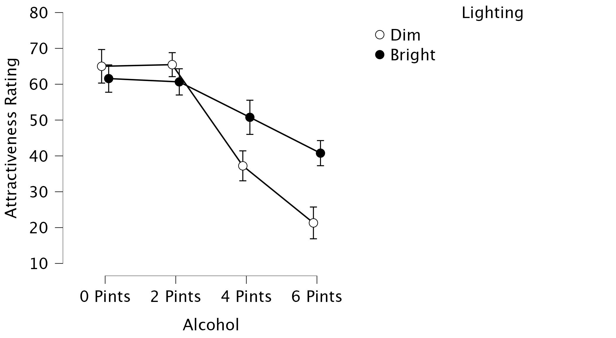
Lighting \(\times\) Alcohol
Task 14.6
Early in my career I looked at the effect of giving children information about entities. In one study (Field, 2006), I used three novel entities (the quoll, quokka and cuscus) and children were told negative things about one of the entities, positive things about another, and given no information about the third (our control). After the information I asked the children to place their hands in three wooden boxes each of which they believed contained one of the aforementioned entities (
field_2006.jasp). Draw an error bar graph of the means (raincloud plot or descriptives plot) and interpret a Q-Q plot of the residuals.
The results/settings can be found in the file alex_14_06.jasp. The results can be viewed in your browser here.
The resulting plot will look like Figure 21. It looks like children took longer on average to approach the box ‘containing’ an animal that they they had heard negative information about.
Based on the Q-Q plot in the output, we can conclude that we have a normality problem, since the dots have a strong curve to them, rather than a straight line. This is, in part, because if a child hadn’t approached the box within 15 seconds we (for ethical reasons) assumed that they did not want to complete the task and so we assigned a score of 15 and asked them to approach the next box.
Back when I conducted these research I log-transformed the scores to reduce the skew. This brings us onto Task 7!
Task 14.7
Log-transform the scores in Task 6, make a Q-Q plot of the transformed scores and interpret it.
The results/settings can be found in the file alex_14_07.jasp. The results can be viewed in your browser here.
You can transform the scores (i.e., create a new column) using the column constructor or using R code (for a refresher, see Section 6.10.4). @#fig-14_7 below shows what the log transformation looks like using the column constructor.
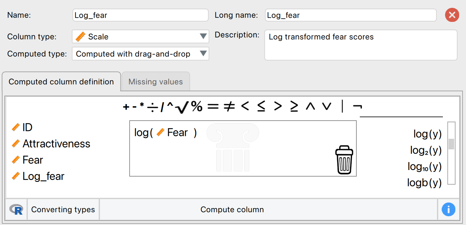
R-lovers can use R code instead for the log transformation. For the negative condition this looks as follows:
ln(bhvneg) To get the Q-Q plots repeat the process described in the previous task, but use the new variables you have created. You’ll see that the grey dots are a lot more aligned with the red diagonal, and so improved on the original situation!
Chapter 15
Task 15.1
A psychologist was interested in the cross-species differences between men and dogs. She observed a group of dogs and a group of men in a naturalistic setting (20 of each). She classified several behaviours as being dog-like (urinating against trees and lampposts, attempts to copulate, and attempts to lick their own genitals). For each man and dog she counted the number of dog-like behaviours displayed in a 24-hour period. It was hypothesized that dogs would display more dog-like behaviours than men. Analyse the data in
men_dogs.jaspwith a Mann–Whitney test.
The results/settings can be found in the file alex_15_01.jasp. The results can be viewed in your browser here.
The output tells us that U is 205, and we had 20 men and 20 dogs. The effect size is, therefore:
\[ \begin{aligned} r_{rb} &= 1-\frac{2U}{n_1 n_2} \\ &= 1-\frac{2\times194.5}{20^2} \\ &\simeq 0.0275 \end{aligned} \]
This represents a tiny effect (it is close to zero) and the 95% confidence interval is quite wide and includes 0, which tells us that there truly isn’t much difference between dogs and men.
We could report something like (note I’ve quoted the mean ranks for each group)
Task 15.2
Both Ozzy Osbourne and Judas Priest have been accused of putting backward masked messages on their albums that subliminally influence poor unsuspecting teenagers into doing Very Bad things. A psychologist was interested in whether backward masked messages could have an effect. He created a version of Taylor Swift’s ‘Shake it off’ that contained the masked message ‘deliver your soul to the dark lord’ repeated in the chorus. He took this version, and the original, and played one version (randomly) to a group of 32 veterinary students. Six months later he played them whatever version they hadn’t heard the time before. So each student heard both the original and the version with the masked message, but at different points in time. The psychologist measured the number of goats that the students sacrificed in the week after listening to each version. Test the hypothesis that the backward message would lead to more goats being sacrificed using a Wilcoxon signed-rank test (
dark_lord.jasp).
We are comparing scores from the same individuals after exposure to two songs, so we need to use the Wilcoxon signed-rank test.
The results/settings can be found in the file alex_15_02.jasp. The results can be viewed in your browser here.
If we define the difference as nomessage - message, so a positive rank is where more goats were sacrificed after no message than after a message (i.e. no message > message). The output tells us that the test statistic is 294.5, and this is the sum of positive ranks so \(T_+ = 294.5\). There are 32 participants, with 4 tied observations, so there were 28 ranks in total and so the sum of all ranks (let’s label this \(T_\text{all}\)) is \(1 + 2 + 3 + \cdots + 28\) or \(T_\text{all} = \sum_{i = 1}^{28} x_i = 406\). The sum of negative ranks is, therefore, \(T_- = T_\text{all}-T_+ = 406 - 294.5 = 111.5\). You can verify this in JASP by specifying the difference as message - nomessage The effect size is, therefore:
\[ \begin{aligned} r_{rb} &= \frac{T_+ - T_-}{T_+ + T_-} \\ &= \frac{294.5 - 111.5}{406} \\ &\simeq 0.45 \end{aligned} \]
This effect size tells us proportionately how many more positive ranks there were than negative ranks (0.45 or 45%). Since we want to test the hypothesis that more goats are slaughtered after hearing a message, we specify such a one-sided alternative hypothesis, and observe a p-value of 0.982. Such a non-significant p-value is because our observed effect actually goes into the opposite direction! We could report something like (note that I’ve quoted the mean ranks):
This illustrates why it’s safer to do a two-sided test if you just want to test for a difference: if we would have done a two-sided test, the p-value would be 0.037 for both definitions of the difference scores. However, be sure to then not attribute a one-sided interpretation to this two-sided p-value.
Task 15.3
A media researcher was interested in the effect of television programmes on domestic life. She hypothesized that through ‘learning by watching’, certain programmes encourage people to behave like the characters within them. She exposed 54 couples to three popular TV shows, after which the couple were left alone in the room for an hour. The experimenter measured the number of times the couple argued. Each couple viewed all TV shows but at different points in time (a week apart) and in a counterbalanced order. The TV shows were EastEnders (a UK TV show which portrays the lives of extremely miserable, argumentative, London folk who spend their lives assaulting each other, lying and cheating), Friends (which portrays unrealistically considerate and nice people who love each other oh so very much—but I love it anyway), and a National Geographic programme about whales (this was a control). Test the hypothesis with Friedman’s ANOVA (
eastenders.jasp).
The results/settings can be found in the file alex_15_03.jasp. The results can be viewed in your browser here.
Now, let’s report everything!
Task 15.4
A researcher was interested in preventing coulrophobia (fear of clowns) in children. She did an experiment in which different groups of children (15 in each) were exposed to positive information about clowns. The first group watched adverts in which Ronald McDonald is seen dancing with children and singing about how they should love their mums. A second group was told a story about a clown who helped some children when they got lost in a forest (what a clown was doing in a forest remains a mystery). A third group was entertained by a real clown, who made balloon animals for the children. A final, control, group had nothing done to them at all. Children rated how much they liked clowns from 0 (not scared of clowns at all) to 5 (very scared of clowns). Use a Kruskal–Wallis test to see whether the interventions were successful (
coulrophobia.jasp).
The results/settings can be found in the file alex_15_04.jasp. The results can be viewed in your browser here.
Task 15.5
Thinking back to Labcoat Leni’s Real Research 4.1, test whether the number of offers was significantly different in people listening to Bon Scott compared to those listening to Brian Johnson (
acdc.jasp). Compare your results to those reported by Oxoby (2008).
The results/settings can be found in the file alex_15_05-06.jasp. The results can be viewed in your browser here.
The output tells us that U is 105.5, and we had 18 people who listened to each singer (n_1 = n_2 = 18). The effect size \(r_rb\) equals -0.35. This represents a medium effect: when listening to Brian Johnson people proposed higher offers than when listening to Bon Scott, suggesting that they preferred Brian Johnson to Bon Scott.However, the 95% confidence interval indicates quite some uncertainty about this effect size and is located close to 0, so we probably need to collect more data to make any meaningful statements about the true difference in offers. We could report something like (note that I’ve quoted the mean ranks from the descriptives table):
Task 15.6
Repeat the analysis above, but using the minimum acceptable offer – see Chapter 4, Task 3.
The results/settings can be found in the file alex_15_05-06.jasp. The results can be viewed in your browser here.
The output tells us that U is 236, and we had 18 people who listened to each singer (n_1 = n_2 = 18). The effect size \(r_rb\) equals 0.46. This represents a fairly strong effect: looking at the mean ranks in the output above, we can see that people accepted lower offers when listening to Brian Johnson than when listening to Bon Scott. We could report something like (note that I’ve quoted the mean ranks from the descriptives table):
Task 15.7
Using the data in
shopping.jasp(Chapter 4, Task 4), test whether men and women spent significantly different amounts of time shopping?
The results/settings can be found in the file alex_15_07-08.jasp. The results can be viewed in your browser here.
The output tells us that U is 4 and the effect size \(r_rb\) = -0.68, This represents a large effect, which highlights how large effects can be non-significant in small samples due to the high degree of uncertainty. The mean ranks and raincloud plot show that women spent more time shopping than men. We could report something like (note that I’ve quoted the mean ranks from the descriptives table):
Task 15.8
Using the same data, test whether men and women walked significantly different distances while shopping.
The results/settings can be found in the file alex_15_07-08.jasp. The results can be viewed in your browser here.
The output tells us that U is 18 and the effect size \(r_rb\) = -0.44. Again this represents a fairly strong effect, and highlights how large effects can be non-significant in small samples due to the high degree of uncertainty. The mean ranks and raincloud plot show that women spent more time shopping than men. We could report something like (note that I’ve quoted the mean ranks from the descriptives table):
Task 15.9
Using the data in
pets.jasp(Chapter 4, Task 5), test whether people with fish or cats as pets differed significantly in their life satisfaction.
The results/settings can be found in the file alex_15_09.jasp. The results can be viewed in your browser here.
The output tells us that U is 9, and we had 12 fish owners (\(n_1 = 12\)) and 8 cat owners (\(n_2 = 8\)). The effect size \(r_rb\) = -0.813. This represents a very strong effect: looking at the mean ranks in the output above, we can see that life satisfaction was higher in those who had cats for a pet. We could report something like (note that I’ve quoted the mean ranks from the descriptives table):
Task 15.10
Use the
jasp_exam.jasp(Chapter 6, Task 2) data to test whether students at the Universities of Sussex and Duncetown differed significantly in their JASP exam scores, their numeracy, their computer literacy, and the number of lectures attended.
The results/settings can be found in the file alex_15_09.jasp. The results can be viewed in your browser here.
Task 15.11
Use the
download.jaspdata from Chapter 6 to test whether hygiene levels changed significantly over the three days of the festival.
The results/settings can be found in the file alex_15_11.jasp. The results can be viewed in your browser here.
Let’s report everything!
Chapter 16
Task 16.1
Research suggests that people who can switch off from work (
detachment) during off-hours are more satisfied with life and have fewer symptoms of psychological strain (Sonnentag, 2012). Factors at work, such as time pressure, affect your ability to detach when away from work. A study of 1709 employees measured their time pressure (time_pressure) at work (no time pressure, low, medium, high and very high time pressure). Data generated to approximate Figure 1 in Sonnentag (2012) are in the filesonnentag_2012.jasp. Carry out a chi-square test to see if time pressure is associated with the ability to detach from work.
In this example, put the variable time_pressure into the box called Rows, detachment into the box called Columns, and frequency into the box called Counts.
The results/settings can be found in the file alex_16_01.jasp. The results can be viewed in your browser here.
The chi-square test is highly significant, \(\chi^2\)(4) = 15.55, p = .004, indicating that the profile of low-detachment and very low-detachment responses differed significantly across different time pressures.
Looking at the standardized residuals, the only time pressure for which these are significant is very high time pressure, which showed the greatest split of whether the employees experienced low detachment (36%) or very low detachment (64%). Within the other time pressure groups all of the standardized residuals are lower than 1.96. It’s interesting to look at the direction of the residuals (i.e., whether they are positive or negative). For all time pressure groups except very high time pressure, the residual for ‘low detachment’ was positive but for ‘very low detachment’ was negative; these are, therefore, people who responded more than we would expect that they experienced low detachment from work and less than expected that they experienced very low detachment from work. It was only under very high time pressure that the opposite pattern occurred: the residual for ‘low detachment’ was negative but for ‘very low detachment’ was positive; these are, therefore, people who responded less than we would expect that they experienced low detachment from work and more than expected that they experienced very low detachment from work.
In short, there are similar numbers of people who experience low detachment and very low detachment from work when there is no time pressure, low time pressure, medium time pressure and high time pressure. However, when time pressure was very high, significantly more people experienced very low detachment than low detachment.
Task 16.2
Labcoat Leni’s Real Research 16.1 describes a study (Daniels, 2012) that looked at the impact of sexualized images of atheletes compared to performance pictures on women’s perceptions of the athletes and of themselves. Women looked at different types of pictures (
picture) and then did a writing task. Daniels identified whether certain themes were present or absent in each written piece (theme_present). We looked at the self-evaluation theme, but Daniels idetified others: commenting on the athlete’s body/appearance (athletes_body), indicating admiration or jelousy for the athlete (admiration), indicating that the athlete was a role model or motivating (role_model), and their own physical activity (self_physical_activity). Test whether the type of picture viewed was associated with commenting on the athlete’s body/appearance (daniels_2012.jasp).
The results/settings can be found in the file alex_16_02-05.jasp. The results can be viewed in your browser here.
The chi-square test is highly significant, \(\chi^2\)(1) = 104.92, p < .001. This indicates that the profile of theme present vs. theme absent differed across different pictures.
Let’s check that the expected frequencies assumption has been met. We have a 2 \(\times\) 2 table, so all expected frequencies need to be greater than 5. If you look at the expected counts in the contingency table, we see that the smallest expected count is 34.6 (for women who saw pictures of performance athletes and did self-evaluate). This value exceeds 5 and so the assumption has been met.
Looking at the standardized residuals, they are significant (i.e., greater than an absolute value of 1.96) for both pictures of performance athletes and sexualized pictures of athletes. If we look at the direction of these residuals (i.e., whether they are positive or negative), we can see that for pictures of performance athletes, the residual for ‘theme absent’ was positive but for ‘theme present’ was negative; this indicates that in this condition, more people than we would expect did not include the theme her appearance and attractiveness and fewer people than we would expect did include this theme in what they wrote. In the sexualized picture condition on the other hand, the opposite was true: the residual for ‘theme absent’ was negative and for ‘theme present’ was positive. This indicates that in the sexualized picture condition, more people than we would expect included the theme her appearance and attractiveness in what they wrote and fewer people than we would expect did not include this theme in what they wrote.
Caution
These results are reported in the article as follows:
Figure 23: Extract from article
Task 16.3
Using the data in Task 2, see whether the type of picture viewed was associated with indicating admiration or jelousy for the athlete.
The results/settings can be found in the file alex_16_02-05.jasp. The results can be viewed in your browser here.
The chi-square test is highly significant, \(\chi^2\)(1) = 28.98, p < .001. This indicates that the profile of theme present vs. theme absent differed across different pictures.
Looking at the standardized residuals, they are significant for both pictures of performance athletes and sexualized pictures of athletes. If we look at the direction of these residuals (i.e., whether they are positive or negative), we can see that for pictures of performance athletes, the residual for ‘theme absent’ was positive but for ‘theme present’ was negative; this indicates that in this condition, more people than we would expect did not include the theme My admiration or jealousy for the athlete and fewer people than we would expect did include this theme in what they wrote. In the sexualized picture condition, on the other hand, the opposite was true: the residual for ‘theme absent’ was negative and for ‘theme present was positive’. This indicates that in the sexualized picture condition, more people than we would expect included the theme My admiration or jealousy for the athlete in what they wrote and fewer people than we would expect did not include this theme in what they wrote.
Caution
These results are reported in the article as follows:
Figure 24: Extract from article
Task 16.4
Using the data in Task 2, see whether the type of picture viewed was associated with indicating that the athlete was a role model or motivating.
The results/settings can be found in the file alex_16_02-05.jasp. The results can be viewed in your browser here.
The chi-square test is highly significant, \(\chi^2\)(1) = 47.50, p < .001. This indicates that the profile of theme present vs. theme absent differed across different pictures.
Looking at the standardized residuals, they are significant for both types of pictures. If we look at the direction of these residuals (i.e., whether they are positive or negative), we can see that for pictures of performance athletes, the residual for ‘theme absent’ was negative but was positive for ‘theme present’. This indicates that when looking at pictures of performance athletes, more people than we would expect included the theme Athlete is a good role model and fewer people than we would expect did not include this theme in what they wrote. In the sexualized picture condition on the other hand, the opposite was true: the residual for ‘theme absent’ was positive and for ‘theme present’ it was negative. This indicates that in the sexualized picture condition, more people than we would expect did not include the theme Athlete is a good role model in what they wrote and fewer people than we would expect did include this theme in what they wrote.
Caution
These results are reported in the article as follows:
Figure 25: Extract from article
Task 16.5
Using the data in Task 2, see whether the type of picture viewed was associated with the participant commenting on their own physical activity.
The results/settings can be found in the file alex_16_02-05.jasp. The results can be viewed in your browser here.
The chi-square test is significant, \(\chi^2\)(1) = 5.91, p = .02. This indicates that the profile of theme present vs. theme absent differed across different pictures.
Looking at the standardized residuals, they are not significant for either type of picture (i.e., they are less than 1.96). If we look at the direction of these residuals (i.e., whether they are positive or negative), we can see that for pictures of performance athletes, the residual for ‘theme absent’ was negative and for ‘theme present’ was positive. This indicates that when looking at pictures of performance athletes, more people than we would expect included the theme My own physical activity and fewer people than we would expect did not include this theme in what they wrote. In the sexualized picture condition on the other hand, the opposite was true: the residual for ‘theme absent’ was positive and for ‘theme present’ it was negative. This indicates that in the sexualized picture condition, more people than we would expect did not include the theme My own physical activity in what they wrote and fewer people than we would expect did include this theme in what they wrote.
Caution
These results are reported in the article as follows:
Figure 26: Extract from article
Task 16.6
I wrote much of the third edition of this book in the Netherlands (I have a soft spot for it). The Dutch travel by bike much more than the English. I noticed that many more Dutch people cycle while steering with only one hand. I pointed this out to one of my friends, Birgit Mayer, and she said that I was a crazy English fool and that Dutch people did not cycle one-handed. Several weeks of me pointing at one-handed cyclists and her pointing at two-handed cyclists ensued. To put it to the test I counted the number of Dutch and English cyclists who ride with one or two hands on the handlebars (
handlebars.jasp). Can you work out which one of us is correct?
The results/settings can be found in the file alex_16_06-07.jasp. The results can be viewed in your browser here.
The value of the chi-square statistic is 5.44. This value has a two-tailed significance of .020, which is smaller than .05 (hence significant), which suggests that the pattern of bike riding (i.e., relative numbers of one- and two-handed riders) significantly differs in English and Dutch people. The significant result indicates that there is an association between whether someone is Dutch or English and whether they ride their bike one- or two-handed.
Looking at the frequencies, this significant finding seems to show that the ratio of one- to two-handed riders differs in Dutch and English people. In Dutch people 17.2% ride their bike one-handed compared to 82.8% who ride two-handed. In England, though, only 9.9% ride their bike one-handed (almost half as many as in Holland), and 90.1% ride two-handed. If we look at the standardized residuals (in the contingency table) we can see that the only cell with a residual approaching significance (a value that lies outside of ±1.96) is the cell for English people riding one-handed (z = -1.9). The fact that this value is negative tells us that fewer people than expected fell into this cell.
Task 16.7
Compute and interpret the odds ratio for Task 6.
The results/settings can be found in the file alex_16_06-07.jasp. The results can be viewed in your browser here.
The odds of someone riding one-handed if they are Dutch are:
\[ \text{odds}_\text{one-handed, Dutch} = \frac{120}{578} = 0.21 \]
The odds of someone riding one-handed if they are English are:
\[ \text{odds}_\text{one-handed, English} = \frac{17}{154} = 0.11 \]
Therefore, the odds ratio is:
\[ \text{odds ratio} = \frac{\text{odds}_\text{one-handed, Dutch}}{\text{odds}_\text{one-handed, English}} = \frac{0.21}{0.11} = 1.90 \]
In other words, the odds of riding one-handed if you are Dutch are 1.9 times higher than if you are English (or, conversely, the odds of riding one-handed if you are English are about half that of a Dutch person).
Task 16.8
Certain editors at Sage like to think they’re great at football (soccer). To see whether they are better than Sussex lecturers and postgraduates we invited employees of Sage to join in our football matches. Every person played in one match. Over many matches, we counted the number of players that scored goals. Is there a significant relationship between scoring goals and whether you work for Sage or Sussex? (
sage_editors_can't_play_football.jasp)
The results/settings can be found in the file alex_16_08-09.jasp. The results can be viewed in your browser here.
The Contingency Table contains the number of cases that fall into each combination of categories. We can see that in total 28 people scored goals and of these 5 were from Sage Publications and 23 were from Sussex; 49 people didn’t score at all (63.6% of the total) and, of those, 19 worked for Sage (38.8% of the total that didn’t score) and 30 were from Sussex (61.2% of the total that didn’t score).
Before moving on to look at the test statistic itself we check that the assumption for chi-square has been met. The assumption is that in 2 \(\times\) 2 tables (which is what we have here), all expected frequencies should be greater than 5. The smallest expected count is 8.7 (for Sage editors who scored). This value exceeds 5 and so the assumption has been met.
Pearson’s chi-square test examines whether there is an association between two categorical variables (in this case the job and whether the person scored or not). The value of the chi-square statistic is 3.63. This value has a two-tailed significance of .057, which is bigger than .05 (hence, non-significant). Because we made a specific prediction (that Sussex people would score more than Sage people), there is a case to be made that we can halve this p-value, which would give us a significant association (because p = .0285, which is less than .05). However, as explained in the book, I’m not a big fan of one-tailed tests. Also, bear i mind that this should definitely not be done after seeing the data, if you want to do honest science. In any case, we’d be well-advised to look for other information such as an effect size. Which brings us neatly onto the next task …
Task 16.9
Compute and interpret the odds ratio for Task 8.
The odds of someone scoring given that they were employed by SAGE are:
\[ \text{odds}_\text{scored, Sage} = \frac{5}{19}= 0.26 \]
The odds of someone scoring given that they were employed by Sussex are:
\[ \text{odds}_\text{scored, Sussex} = \frac{23}{30} = 0.77 \]
Therefore, the odds ratio is:
\[ \text{odds ratio} = \frac{\text{odds}_\text{scored, Sage}}{\text{odds}_\text{scored, Sussex}} = \frac{0.26}{0.77} = 0.34 \] The odds of scoring if you work for Sage are 0.34 times as high as if you work for Sussex; another way to express this is that if you work for Sussex, the odds of scoring are 1/0.34 = 2.95 times higher than if you work for Sage.
Chapter 17
Task 17.1
A ‘display rule’ refers to displaying an appropriate emotion in a situation. For example, if you receive a present that you don’t like, you should smile politely and say ‘Thank you, Auntie Kate, I’ve always wanted a rotting cabbage’; you do not start crying and scream ‘Why did you buy me a rotting cabbage?!’ A psychologist measured children’s understanding of display rules (with a task that they could pass or fail), their age (months), and their ability to understand others’ mental states (‘theory of mind’, measured with a false belief task that they could pass or fail). Can
displayrule understanding (did the child pass the test: yes/no?) be predicted from theory of mind (did the child pass the false belief,fb, task: yes/no?),ageand their interaction? (display.jasp.)
The results/settings can be found in the file alex_17_01-02.jasp. The results can be viewed in your browser here.
Follow the general procedure from Chapter 17 to fit the model. Drag display to the Dependent Variable box, then specify the predictor variable. Since age is continuous, it goes into the box labelled Covariates, while fb is categorical and therefore goes into the box labelled Factors. For categorical predictors JASP uses dummy variables explained in the book, and uses the category listed at the top in the Variable settings as the reference category. To access the Variable Settings, go to the data viewer and double click on the column name of a nominal variable. Here, you can also reorder the levels by clicking on a row and using the up/down buttons.
To compare the impact of each predictor separately, go to the Model tab and add two models. Model 0 should not include any predictors, Model 1 should only include fb, Model 2 should include fb and age, and finally Model 3 should include fb, age, and their interaction. To input the interaction, hold Ctrl (⌘ on a mac) while selecting both predictors, then add them to Model 3.
The Model Summary table tells us about the model fits of all models, starting with the baseline model \(M_0\), where only the constant is included (i.e. all predictor variables are omitted). The log-likelihood of this baseline model is 96.124. This represents the fit of the model when including only the constant. Initially every child is predicted to belong to the category in which most observed cases fell. In this example there were 39 children who had display rule understanding and only 31 who did not. Therefore, of the two available options it is better to predict that all children had display rule understanding because this results in a greater number of correct predictions. Overall, the model correctly classifies 55.7% of children (since 55.7% of the children actually had display rule understanding).
In \(M_1\), false-belief understanding (fb) is added to the model as a predictor. As such, a child is now classified as having display rule understanding based on whether they passed or failed the false-belief task. The output above shows summary statistics about the new model. The overall fit of the new model is assessed using the Deviance. Remember that large values of the deviance statistic indicate poorly fitting statistical models.
If fb has improved the fit of the model then the value of Deviance should be less than the value when only the constant was included (because lower values of Deviance indicate better fit). When only the constant was included, Deviance = 96.124, but now fb has been included this value has been reduced to 70.042. This reduction tells us that the model is better at predicting display rule understanding than it was before fb was added. We can assess the significance of the change in a model by taking the log-likelihood of the new model and subtracting the log-likelihood of the baseline model from it. The value of the model chi-square statistic (\(\Delta\chi^2\)) works on this principle and is, therefore, equal to Deviance with fb included minus the value of Deviance when only the constant was in the model (\(\Delta\chi^2 =\) 96.124 − 70.042 = 26.083). This value has a chi-square distribution. In this example, the value is significant at the .05 level and so we can say that overall the model predicts display rule understanding significantly better than with fb included than with only the constant included. The output also shows various \(R^2\) statistics, which we’ll return to in due course.
The Coefficients table tells us the estimates for the coefficients for the predictors included in the model (namely, fb and the constant). The coefficient represents the change in the logit of the outcome variable associated with a one-unit change in the predictor variable. The logit of the outcome is the natural logarithm of the odds of Y occurring.
The Wald statistic has a chi-square distribution and tells us whether the b coefficient for that predictor is significantly different from zero. If the coefficient is significantly different from zero then we can assume that the predictor is making a significant contribution to the prediction of the outcome (Y). For these data it seems to indicate that false-belief understanding is a significant predictor of display rule understanding (note the significance of the Wald statistic is less than .05).
Cox and Snell’s \(R^2\) is 0.311 (see earlier output), which is calculated from this equation:
\[ R_{\text{CS}}^{2} = 1 - exp\bigg(\frac{\text{Deviance}_\text{new} - ({Deviance}_\text{baseline})}{n}\bigg) \]
The Deviance of \(M_1\) is 70.04 and Deviance of \(M_0\) is 96.124. The sample size, n, is 70, which gives us:
\[ \begin{align} R_{\text{CS}}^{2} &= 1 - exp\bigg(\frac{70.04 - 96.124}{70}\bigg) \\ &= 1 - \exp( -0.3726) \\ &= 1 - e^{- 0.3726} \\ &= 0.311 \end{align} \]
Nagelkerke’s adjustment (see earlier output) is calculated from:
\[ \begin{align} R_{N}^{2} &= \frac{R_\text{CS}^2}{1 - \exp\bigg( -\frac{-2\text{LL}_\text{baseline}}{n} \bigg)} \\ &= \frac{0.311}{1 - \exp\big( - \frac{96.124}{70} \big)} \\ &= \frac{0.311}{1 - e^{-1.3732}} \\ &= \frac{0.311}{1 - 0.2533} \\ &= 0.416 \end{align} \]
As you can see, there’s a fairly substantial difference between the two values, which is why it’s generally good to include multiple estimates of the explained variance.
The Odds Ratio (in the Coefficients table) is the change in odds. If the value is greater than 1 then it indicates that as the predictor increases, the odds of the outcome occurring increase. Conversely, a value less than 1 indicates that as the predictor increases, the odds of the outcome occurring decrease. In this example, we can say that the odds of a child who has false-belief understanding also having display rule understanding are 15 times higher than those of a child who does not have false-belief understanding.
In the options, we requested a confidence interval for the Odds Ratio and it can also be found in the output. Remember that if we ran 100 experiments and calculated confidence intervals for the value of Odds Ratio, then these intervals would encompass the actual value of the odds ratio in the population (rather than the sample) on 95 occasions. So, assuming that this experiment was one of the 95% where the confidence interval contains the population value then the population value of Odds Ratio lies between 4.84 and 51.71. However, this experiment might be one of the 5% that ‘misses’ the true value.
We can also look at the Model Summary table to see if the other predictors (age and the interaction effect) add predictive value to the model. First, we have \(M_3\), which reduced the Deviance by another 2.3, compared to \(M_2\). We can use this result (\(\Delta\chi^2\)) combined with its degrees of freedom (68-67 = 1), obtain the p-value of 0.131 that is listed in the table. The decrease in Deviance is therefore not significant, which indicates that age does not improve our model predictions to the extent that it’s worth including in the model. Here we also see BIC shining. The BIC is similar to the Deviance, in that a lower number indicates better model fit, but the BIC has some extra heavy penalty for model complexity (i.e., the number of predictors). That is a nice feature because in model selection we generally want to have a built-in Occam’s razor, where we want to predict as well as possible, while using as few predictors as possible. Since \(M_3\) has an additional predictor, while not improving the predictions much, the BIC for \(M_3\) is actually higher than that of \(M_2\) - bad news for \(M_3\)! The same goes for \(M_4\), where adding the interaction does not improve model fit significantly (\(\Delta\chi^2\)(1) = 0.123, p = .726), and where the BIC is even higher than that of \(M_3\).
Assuming we are content that the model is accurate and that false-belief understanding has some substantive significance, then we could conclude that false-belief understanding is the single best predictor of display rule understanding. Furthermore, age and the interaction of age and false-belief understanding did not significantly predict display rule understanding. This conclusion is fine in itself, but to be sure that the model is a good one, it is important to examine the residuals, which brings us nicely onto the next task.
Task 17.2
Are there any influential cases or outliers in the model for Task 1?
First, we need to make sure we obtain output for the best model, based on the adventure we had in the previous exercise. This was the model with only fb, so make sure that you now have a logistic regression with the baseline model (\(M_0\)) and a single alternative model (\(M_1\)) that has the predictor in it. To obtain information about influential cases, we need to look at the Casewise diagnostics option, which can be found under the Statistics tab. To detect outliers, you can use a threshold for the standardized residual (anything greater than 3 is worth investigating) or Cook’s distance (values close to, or greater than, 1 are usually problematic). Luckily, there do not seem to be any observations that cross the problematic thresholds - the residual threshold needs to be set to 1.5 to even have some cases appear in the table!
Task 17.3
The behaviour of drivers has been used to claim that people of a higher social class are more unpleasant (Piff et al., 2012). Piff and colleagues classified social class by the type of car (
vehicle) on a five-point scale and observed whether the drivers cut in front of other cars at a busy intersection (vehicle_cut). Do a logistic regression to see whether social class predicts whether a driver cut in front of other vehicles (piff_2012_vehicle.jasp).
The results/settings can be found in the file alex_17_03.jasp. The results can be viewed in your browser here.
The first row in the Model Summary table tells us about the model when only the constant is included.In this example there were 34 participants who did cut off other vehicles at intersections and 240 who did not. Therefore, of the two available options it is better to predict that all participants did not cut off other vehicles because this results in a greater number of correct predictions. Therefore, this baseline model made correct predictions for \(240/274\) = 87.6% of the observations, and incorrect predictions for \(34/274\) = 12.4% of the observations. The table labelled Coefficients at this stage contains only the constant, which has a value of \(b_0 = −1.95\).
The second row of the Model Summary table deals with the model after the predictor variable (vehicle) has been added to the model. As such, a person is now classified as either cutting off other vehicles at an intersection or not, based on the type of vehicle they were driving (as a measure of social status). The model fit has improved significantly because the chi-square in the table is significant, \(\Delta\chi^2\)(1) = 4.16, p = .041. Therefore, the model that includes the variable vehicle predicted whether or not participants cut off other vehicles at intersections better than the model that includes only the constant.
The Confusion matrix indicates how well the model predicts group membership. In step 1, the model correctly classifies 240 participants who did not cut off other vehicles and does not misclassify any (i.e. it correctly classifies 100% of cases). For participants who do did cut off other vehicles, the model correctly classifies 0 and misclassifies 34 cases (i.e. correctly classifies 0% of cases). The overall accuracy of classification is, therefore, the weighted average of these two values (87.6%). Therefore, the accuracy is no different than when only the constant was included in the model.
The Coefficients table shows that the significance of the Wald statistic is .047, which is less than .05. Therefore, we can conclude that the status of the vehicle the participant was driving significantly predicted whether or not they cut off another vehicle at an intersection. However, I’d interpret this significance in the context of the classification table, which showed us that adding the predictor of vehicle did not result in any more cases being more accurately classified.
The Odds Ratio is the change in odds of the outcome resulting from a unit change in the predictor. In this example, the Odds Ratio for vehicle in step 1 is 1.441, which is greater than 1, indicating that as the predictor (vehicle) increases, the value of the outcome also increases, that is, the value of the categorical variable moves from 0 (did not cut off vehicle) to 1 (cut off vehicle). The 95% confidence interval ranges from 1.005 to 2.067, which just excludes 1, further underscoring the significance.
While the inclusion of vehicle seems to have significantly improved on the model fit, the model has not improved in accuracy, and if we look at the BIC (which is a little stricter about including additional predictors than Deviance is), it has actually increased as a result of looking at the vehicle that someone is driving. While this example highlights why it’s a good idea to look at various model fit metrics (\(\Delta\chi^2\), BIC, Odds ratio, confusion matrix) because they do not seem to be in agreement here, it does make the inference trickier and I would be a bit hesitant before making any strong claims based on these data.
Task 17.4
In a second study, Piff et al. (2012) observed the behaviour of drivers and classified social class by the type of car (
vehicle), but the outcome was whether the drivers cut off a pedestrian at a crossing (pedestrian_cut). Do a logistic regression to see whether social class predicts whether or not a driver prevents a pedestrian from crossing (piff_2012_pedestrian.jasp).
The results/settings can be found in the file alex_17_04.jasp. The results can be viewed in your browser here.
The first row in the Model Summary table tells us about the model when only the constant is included. In this example there were 54 participants who did cut off pedestrians at intersections and 98 who did not. Therefore, of the two available options it is better to predict that all participants did not cut off other vehicles because this results in a greater number of correct predictions. The contingency table for the model in this basic state shows that predicting that all participants did not cut off pedestrians results in 0% accuracy for those who did cut off pedestrians, and 100% accuracy for those who did not. Overall, the model correctly classifies 64.5% of participants, because 98/152 = 64.5% of the participants did not cut off pedestrians. The table labelled Coefficients at this stage contains only the constant, which has a value of \(b_0\) = −0.596.
The second row in the Model Summary table tells us what happened after the predictor variable (vehicle) has been added to the model. As such, a person is now classified as either cutting off pedestrians at an intersection or not, based on the type of vehicle they were driving (as a measure of social status). The output shows summary statistics about the new model. The overall fit of the new model is significant because the Model chi-square in the table labelled Omnibus Tests of Model Coefficients is significant, \(\Delta\chi^2\)(1) = 4.86, p = .028. Therefore, the model that includes the variable vehicle predicted whether or not participants cut off pedestrians at intersections better than the model that includes only the constant.
The Confusion matrix indicates how well the model predicts group membership. In step 1, the model correctly classifies 91 participants who did not cut off pedestrians and does not misclassify any (i.e. it correctly classifies 92.9% of cases). For participants who do did cut off pedestrians, the model correctly classifies 6 and misclassifies 48 cases (i.e. correctly classifies 11.1% of cases). The overall accuracy of classification is the weighted average of these two values (63.8%). Therefore, the accuracy (0verall) has decreased slightly (from 64.5% to 63.8%).
The Coefficients table shows that the significance of the Wald statistic is .031, which is less than .05. Therefore, we can conclude that the status of the vehicle the participant was driving significantly predicted whether or not they cut off pedestrians at an intersection. The Odds Ratio is the change in odds of the outcome resulting from a unit change in the predictor. In this example, the Odds Ratio for vehicle in step 1 is 1.495, which is greater than 1, indicating that as the predictor (vehicle) increases, the value of the outcome also increases, that is, the value of the categorical variable moves from 0 (did not cut off pedestrian) to 1 (cut off pedestrian). However, just as in the previous exericse the BIC (which is slightly higher for \(M_1\)) and confusion matrix (which shows poorer predictions for \(M_1\)) do not seem to agree with this significance - perhaps it’s time to stop using 0.05 as the significance threshold and opt for something more strict, like 0.01 or 0.005?
Task 17.5
Four hundred and sixty-seven lecturers completed questionnaire measures of
burnout(burnt out or not), perceivedcontrol(high score = low perceived control),copingability (high score = high ability to cope with stress), stress fromteaching(high score = teaching creates a lot of stress for the person), stress fromresearch(high score = research creates a lot of stress for the person) and stress from providingpastoralcare (high score = providing pastoral care creates a lot of stress for the person). Cooper et al. (1988) model of stress indicates that perceived control and coping style are important predictors of burnout. The remaining predictors were measured to see the unique contribution of different aspects of a lecturer’s work to their burnout. Conduct a logistic regression to see which factors predict burnout. (burnout.jasp).
Follow the general instructions for logistic regression in Chapter 17 to fit the model. The model should be fit hierarchically because Cooper’s model indicates that perceived control and coping style are important predictors of burnout. So, these variables should be entered in Model 1. Model 2 should contain all other variables.
The results/settings can be found in the file alex_17_05.jasp. The results can be viewed in your browser here.
The overall fit of Model 1 is significant compared to the baseline Model 0, \(\Delta\chi^2\)(2) = 165.93, p < .001. Model 1 accounts for 29.9% or 44.1% of the variance in burnout (depending on which measure of \(R^2\) you use). The overall fit of Model 2 is significant after adding the new variables (teaching, research, and pastoral), \(\Delta\chi^2\)(3) = 42.98, p < .001. The final model accounts for 36.1% or 53.1% of the variance in burnout (depending on which measure of \(R^2\) you use).
Based on the Coefficients table, we can make conclusions about individual predictors based on their Wald statistics, p-values, and odds ratio’s (including their confidence intervals). For Model 1, both predictors seem to significantly predict burnout. For Model 2, all predictors except for research seem to significantly predict burnout. Since ‘Burnt Out’ is coded as 1, an odds ratio greater than 1 (or regression estimate that is positive) indicates that an increase in a variable is likely to occur with an increase in burnout.
Task 17.6
An HIV researcher explored the factors that influenced condom use with a new partner (relationship less than 1 month old). The outcome measure was whether a condom was used (use: condom used = 1, not used = 0). The predictor variables were mainly scales from the Condom Attitude Scale (Sacco et al., 1991):
gender; the degree to which the person views their relationship as ‘safe’ from sexually transmitted disease (safety); the degree to which previous experience influences attitudes towards condom use (experience); whether or not the couple used a condom in their previous encounter (previous: 1 = condom used, 0 = not used, 2 = no previous encounter with this partner); the degree of self-control that a person has when it comes to condom use (self_control); the degree to which the person perceives a risk from unprotected sex (risk_perception). Previous research has shown that gender, relationship safety and perceived risk predict condom use (Sacco et al., 1991). Verify these previous findings and test whether self-control, previous usage and sexual experience predict condom use (condom.jasp).
Follow the general instructions from Chapter 17 to fit the model. First specify the continuous predictors in the Covariates box and the categorical predictors in the Factors box. The, go to the Model tab and enter risk_perception, safety and gender in Model 1, and previous, self_control and experience in Model 2. We can ignore interaction effects for now.
The results/settings can be found in the file alex_17_06-07.jasp. The results can be viewed in your browser here.
The footnote tells us that the level Condom Used has been used as class 1, and so the regresson weights and odds ratio’s should be interpreted in this context (i.e., higher weights and odds ratio’s increase condom use).
The output for \(M_0\) provides information about the model after the variables risk_perception, safety and gender have been added. The Deviance has dropped to 105.77, which is a change of 30.89 (i.e., \(\Delta\chi^2 = 30.89\)). Thus, the Deviance value tells us about the model as a whole, whereas the \(\Delta\chi^2\) tells us how the model has improved relative to the previous model. The change in the amount of information explained by the model is significant (\(\Delta\chi^2\)(3) = 30.89, p < .001) and so using perceived risk, relationship safety and gender as predictors significantly improves our ability to predict condom use, compared to predictions based solely on the base rate of condom use.
The table labelled Coefficients tells us the parameters of the model for the first model. The significance values of the Wald statistics for each predictor indicate that both perceived risk (Wald = 17.78, p < .001) and relationship safety (Wald = 4.54, p = .033) significantly predict condom use. Gender, however, does not (Wald = 0.41, p = .523).
The odds ratio for perceived risk (Odds Ratio = 2.56 [1.65, 3.96] indicates that if the value of perceived risk goes up by 1, then the odds of using a condom also increase (because the odds ratio is greater than 1). The confidence interval for this value ranges from 1.65 to 3.96, so if this is one of the 95% of samples for which the confidence interval contains the population value the value of the odds ratio in the population lies somewhere between these two values. In short, as perceived risk increase by 1, people are just over twice as likely to use a condom.
The odds ratio for relationship safety (Odds Ratio = 0.63 [0.41, 0.96] indicates that if the relationship safety increases by one point, then the odds of using a condom decrease (because the odds ratio is less than 1). The confidence interval for this value ranges from 0.41 to 0.96, so if this is one of the 95% of samples for which the confidence interval contains the population value the value of the odds ratio in the population lies somewhere between these two values. In short, as relationship safety increases by one unit, subjects are about 1.6 times less likely to use a condom.
The odds ratio for gender (Odds Ratio = 0.729 [0.28, 1.93] indicates that as gender changes from 1 (female) to 0 (male), then the odds of using a condom decrease (because the odds ratio is less than 1). The confidence interval for this value crosses 1. Assuming that this is one of the 95% of samples for which the confidence interval contains the population value this means that the direction of the effect in the population could indicate either a positive (Odds Ratio > 1) or negative (Odds Ratio < 1) relationship between gender and condom use.
We can now look at the output for Model 2 to see what happens to the model when our new predictors are added (previous use, self-control and sexual experience). So, we begin with the model that we had in block 1 and we then add previous, self_control and experience to it. The effect of adding these predictors to the model is to reduce the Deviance to 87.97, which is a reduction of 17.80 compared to the previous model (i.e., \(\Delta\chi^2\) = 17.8). This additional improvement of block 2 is significant (\(\Delta\chi^2\)(4) = 17.80, p = .001), which tells us that including these three new predictors in the model has significantly improved our ability to predict condom use.
The Coefficients contains more details of Model 2. The significance values of the Wald statistics for each predictor indicate that both perceived risk (Wald = 16.04, p < .001) and relationship safety (Wald = 4.17, p = .041) still significantly predict condom use and, as in Model 1, gender does not (Wald = 0.00, p = .996).
Previous use has been split into two components (according to whatever level is highest in the Variable Settings for previous). Looking at the output, we can see that previous(Condom used) and previous(First Time with partner) are featured, which means that both of these categories are being compared to No Condom (which is in indeed the top category in the Variable Settings). Based on the regression results, we can tell that (1) using a condom on the previous occasion does predict use on the current occasion (Wald = 3.88, p = .049); and (2) there is no significant difference between not using a condom on the previous occasion and this being the first time (Wald = 0.00, p = .991). Of the other new predictors we find that self-control predicts condom use (Wald = 7.51, p = .006) but sexual experience does not (Wald = 2.61, p = .106).
The odds ratio for perceived risk (Odds Ratio = 2.58[1.62, 4.11] indicates that if the value of perceived risk goes up by 1, then the odds of using a condom also increase (because the odds ratio is greater than 1). The confidence interval for this value ranges from 1.62 to 4.11, so if this is one of the 95% of samples for which the confidence interval contains the population value the value of the odds ratio in the population lies somewhere between these two values. In short, as perceived risk increase by 1, people are just over twice as likely to use a condom.
The odds ratio for relationship safety (Odds Ratio = 0.62 [0.39, 0.98] indicates that if the relationship safety increases by one point, then the odds of using a condom decrease (because the odds ratio is less than 1). The confidence interval for this value ranges from 0.39 to 0.98, so if this is one of the 95% of samples for which the confidence interval contains the population value the value of the odds ratio in the population lies somewhere between these two values. In short, as relationship safety increases by one unit, subjects are about 1.6 times less likely to use a condom.
The odds ratio for gender (Odds Ratio = 0.996 [0.33, 3.07] indicates that as gender changes from 1 (female) to 0 (male), then the odds of using a condom decrease (because the odds ratio is less than 1). The confidence interval for this value crosses 1. Assuming that this is one of the 95% of samples for which the confidence interval contains the population value this means that the direction of the effect in the population could indicate either a positive (Odds Ratio > 1) or negative (Odds Ratio < 1) relationship between gender and condom use.
The odds ratio for previous(Condom used) (Odds Ratio = 2.97[1.01, 8.75) indicates that if the value of previous usage goes up by 1 (i.e., changes from not having used one to having used one), then the odds of using a condom also increase. If this is one of the 95% of samples for which the confidence interval contains the population value then the value of the odds ratio in the population lies somewhere between 1.01 and 8.75. In other words it is a positive relationship: previous use predicts future use. For previous(First Time with partner) the odds ratio (Odds Ratio = 0.98 [0.06, 15.29) indicates that if the value of previous usage goes changes from not having used one to this being the first time with this partner), then the odds of using a condom do not change (because the value is very nearly equal to 1). If this is one of the 95% of samples for which the confidence interval contains the population value then the value of the odds ratio in the population lies somewhere between 0.06 and 15.29 and because this interval contains 1 it means that the population relationship could be either positive or negative (and very wide ranging).
The odds ratio for self-control (Odds Ratio = 1.42 [1.10, 1.82] indicates that if self-control increases by one point, then the odds of using a condom increase also. As self-control increases by one unit, people are about 1.4 times more likely to use a condom. If this is one of the 95% of samples for which the confidence interval contains the population value then the value of the odds ratio in the population lies somewhere between 1.10 and 1.82. In other words it is a positive relationship
Finally, the odds ratio for sexual experience (Odds Ratio = 1.20[0.95, 1.49] indicates that as sexual experience increases by one unit, people are about 1.2 times more likely to use a condom. If this is one of the 95% of samples for which the confidence interval contains the population value then the value of the odds ratio in the population lies somewhere between 0.06 and 15.29 and because this interval contains 1 it means that the population relationship could be either positive or negative.
If we want to know how well the final model predicts to observed data, we can look at the Confusion Matrix (the option can be found in the Statistics tab). The confusion table tells us that the model is now correctly classifying 78% of cases.
Task 17.7
How reliable is the model in Task 6?
The results/settings can be found in the file alex_17_06-07.jasp. The results can be viewed in your browser here.
First, we’ll check for multicollinearity (see the book for how to do this) using the output. The table labelled Multicollinearity Diagnostics shows that the tolerance values for all variables are close to 1 and VIF values are much less than 10, which suggests no collinearity issues.
Residuals should be checked for influential cases and outliers. The output lists cases with standardized residuals greater than 2. In a sample of 100, we would expect around 5–10% of cases to have standardized residuals with absolute values greater than this value. For these data we have only four cases (out of 100) and only one of these has an absolute value greater than 3. Therefore, we can be fairly sure that there are no outliers (the number of cases with large standardized residuals is consistent with what we would expect).
Task 17.8
Using the final model from Task 6, what are the probabilities that participants 12, 53 and 75 will use a condom?
Using filtering (R code generatedFilter & (id == 12 | id == 53 | id == 75), and then click the “eye” icon to hide observations that were filtered out), I’ve made an overview of these participants and their scores:
Combined with the estimated regression coefficients from Task 17.6, this allows us to compute the probabilities of condom usage for each of these participants by plugging all the numbers into the logistic regression equation: \[ p(Y_i) = \frac{1}{1 + e^{-Z}} \\ \] where
\[
Z = b_0 + b_1X_{1i} + b_2X_{2i} + ... + b_nX_{ni}
\] Let’s start with participant 53. For the values of X, remember that we need to check how the categorical variables were coded (e.g., 1 for female, and 0 for male). The table below shows the values of b (regression estimates from the JASP output) and X (data for participant 53) and then multiplies them. Note that I use 0 for the dummy variables Previous (Condom) and ‘Previous (First)’, since participant 53 scored “No Condom” on ‘previous’. When computing predictions, always make sure to also include the intercept!
| Predictor | b | X | bX |
|---|---|---|---|
| Perceived risk | 0.949 | 5 | 4.745 |
| Relationship safety | -0.482 | 4 | -1.928 |
| Biological sex | -0.003 | 1 | -0.003 |
| Previous use (Condom) | 1.087 | 0 | 0.000 |
| Previous use (First) | -0.017 | 0 | 0.000 |
| Self-control | 0.348 | 2 | 0.696 |
| Sexual experience | 0.180 | 4 | 0.720 |
| Intercept | -4.957 | 1 | -4.957 |
We now sum the values in the last column, which gives \(-0.727\) and use that as z into the logistic regression equation (mind the double “-” sign):
\[ \begin{align} p(Y_i) &= \frac{1}{1 + e^{-Z}} \\ &= \frac{1}{1 + e^{--0.727}} \\ &= \frac{1}{1 + 2.0689} \\ &= \frac{1}{3.0689} \\ &= 0.326 \end{align} \]
Now we continue with participant 75:
| Predictor | b | X | bX |
|---|---|---|---|
| Perceived risk | 0.949 | 1 | 0.949 |
| Relationship safety | -0.482 | 0 | 0.000 |
| Biological sex | -0.003 | 0 | 0.000 |
| Previous use (Condom) | 1.087 | 1 | 1.087 |
| Previous use (First) | -0.017 | 0 | 0.000 |
| Self-control | 0.348 | 3 | 1.044 |
| Sexual experience | 0.180 | 5 | 0.900 |
| Intercept | -4.957 | 1 | -4.957 |
which leads to (mind the double “-” sign):
\[ \begin{align} p(Y_i) &= \frac{1}{1 + e^{-Z}} \\ &= \frac{1}{1 + e^{--0.977}} \\ &= \frac{1}{1 + 2.6565} \\ &= \frac{1}{3.6565} \\ &= 0.2735 \end{align} \]
And for participant 12 we get:
| Predictor | b | X | bX |
|---|---|---|---|
| Perceived risk | 0.949 | 6 | 5.694 |
| Relationship safety | -0.482 | 5 | -2.410 |
| Biological sex | -0.003 | 0 | 0.000 |
| Previous use (Condom) | 1.087 | 0 | 0.000 |
| Previous use (First) | -0.017 | 0 | 0.000 |
| Self-control | 0.348 | 5 | 1.740 |
| Sexual experience | 0.180 | 6 | 1.080 |
| Intercept | -4.957 | 1 | -4.957 |
which leads to:
\[ \begin{align} p(Y_i) &= \frac{1}{1 + e^{-Z}} \\ &= \frac{1}{1 + e^{-1.147}} \\ &= \frac{1}{1 + 0.3176} \\ &= \frac{1}{1.3176} \\ &= 0.759 \end{align} \]
In terms of making a prediction of condom use (so either predicting a yes or a no), we could round to 0 or 1 and therefore predict that participant 12 would use a condom, while participants 53 and 75 would not.
Task 17.9
A female who used a condom in her previous encounter scores 2 on all variables except perceived risk (for which she scores 6). Use the model in Task 6 to estimate the probability that she will use a condom in her next encounter.
You were probably sad when the last exercise ended, so let’s do the whole thing once more!
Use the logistic regression equation:
\[ p(Y_i) = \frac{1}{1 + e^{-Z}} \\ \] where
\[ Z = b_0 + b_1X_{1i} + b_2X_{2i} + ... + b_nX_{ni} \]
We need to use the values of b from the final model and the values of X for each variable. The values of b we can get from the earlier output in Task 17.6.
For the values of X, remember that we need to check how the categorical variables were coded. For example, a female is coded as 0, so that will be the value of X for this person. Similarly, she used a condom with her previous partner so this will be coded as 1 for previous (Condom used) and 0 for previous (First Time).
The table below shows the values of b and X and then multiplies them.
| Predictor | b | X | bX |
|---|---|---|---|
| Perceived risk | 0.949 | 6 | 5.694 |
| Relationship safety | -0.482 | 2 | -0.964 |
| Biological sex | -0.003 | 0 | 0.000 |
| Previous use (1) | 1.087 | 1 | 1.087 |
| Previous use (2) | -0.017 | 0 | 0.000 |
| Self-control | 0.348 | 2 | 0.696 |
| Sexual experience | 0.180 | 2 | 0.360 |
| Constant | -4.957 | 1 | -4.957 |
We now sum the values in the last column to get the number in the brackets in the equation above:
\[ \begin{align} Z &= 5.694 -0.964 + 0.000 + 1.087 + 0.000 + 0.696 + 0.360 -4.957 \\ &= 1.916 \end{align} \]
Replace this value of z into the logistic regression equation:
\[ \begin{align} p(Y_i) &= \frac{1}{1 + e^{-Z}} \\ &= \frac{1}{1 + e^{-1.916}} \\ &= \frac{1}{1 + 0.147} \\ &= \frac{1}{1.147} \\ &= 0.872 \end{align} \]
Therefore, there is a 0.872 probability (87.2% if you prefer) that she will use a condom on her next encounter.
Task 17.10
At the start of the chapter we looked at whether the type of instrument a person plays is connected to their personality. A musicologist measured
extroversionand agreeableness in 200 singers and guitarists (instrument). Use logistic regression to see which personality variables (ignore their interaction) predict which instrument a person plays (sing_or_guitar.jasp).
The results/settings can be found in the file alex_17_10.jasp. The results can be viewed in your browser here.
The first line of the Model Summary table tells us about the model when only the constant is included (i.e., all predictor variables are omitted). The Deviance of this baseline model is 271.957, which represents the fit of the model when including only the constant. At this point, the model predicts that every participant is a singer, because this results in more correct classifications than if the model predicted that everyone was a guitarist. You can see this because the intercept is negative and ‘Singer’ is coded as 0.
The second line of the Model Summary table describes the model fit after these predictors have been added to the model. The overall fit of the new models is assessed using the Deviance. Remember that large values of the Deviance statistic indicate poorly fitting statistical models. The value of the Deviance for a new model should, therefore, be smaller than the value for the previous model if the fit is improving (the same goes for the BIC and AIC). When only the constant was included, Deviance = 271.96, but with the two predictors added it has reduced to 46.78 (i.e., \(\Delta\chi^2 =\) 225.18), which tells us that the model is better at predicting which instrument participants’ played when both predictors are included.
The Confusion matrix how well the model predicts group membership. Overall it correctly classifies 103 of the 106 singers and 87 of the 91 guitarists. Overall then, it correctly classifies 96.4% of cases. A huge number (which you might want to think about for the following task!).
The table labelled Coefficients tells us the estimates for the coefficients for the predictors included in the model. These coefficients represents the change in the logit (log odds) of the outcome variable associated with a one-unit change in the predictor variable. The Wald statistics suggest that both extroversion, Wald(1) = 22.90, p < .001, and agreeableness, Wald(1) = 15.30, p < .001, significantly predict the instrument played. The corresponding odds ratio (labelled Odds Ratio) tells us the change in odds associated with a unit change in the predictor. The odds ratio for extroversion is 0.238, which is less than 1 meaning that as the predictor (extroversion) increases, the odds of the outcome decrease, that is, the odds of being a guitarist (compared to a singer) decrease. In other words, more extroverted participants are more likely to be singers. The odds ratio for agreeableness is 1.429, which is greater than 1 meaning that as agreeableness increases, the odds of the outcome increase, that is, the odds of being a guitarist (compared to a singer) increase. In other words, more agreeable people are more likely to be guitarists. Note that the odds ratio for the constant is insanely large, which brings us neatly onto the next task …
Task 17.11
Which problem associated with logistic regression might we have in the analysis in Task 10?
Looking at the confusion matrix, it looks as though we might have complete separation. The model almost perfectly predicts group membership (notice how the conditional estimates plot almost shows a cut-off in extroversion that determines whether someone will be a guitar player), which sounds good but can be curse in disguise… Complete separation can lead to inflated regression estimates or standard errors, which makes it very hard to properly quantify the uncertainty in our inference.
References
Coldwell, J., Pike, A., & Dunn, J. (2006). Household chaos – links with parenting and child behaviour. Journal of Child Psychology and Psychiatry, 47(11), 1116–1122. https://doi.org/10.1111/j.1469-7610.2006.01655.x
Cooper, C. L., Sloan, S. J., & Williams, S. (1988). Occupational Stress Indicator management guide. NFER-Nelson.
Daniels, E. (2012). Sexy versus strong: What girls and women think of female athletes. Journal of Applied Developmental Psychology, 33, 79–90. https://doi.org/10.1016/j.appdev.2011.12.002
Davies, P., Surridge, J., Hole, L., & Munro-Davies, L. (2007). Superhero-related injuries in paediatrics: a case series. Archives of Disease in Childhood, 92, 242–243. https://doi.org/10.1136/adc.2006.109793
Feng, L., Gwee, X., Kua, E. H., & Ng, T. P. (2010). Cognitive function and tea consumption in community dwelling older Chinese in Singapore. Journal of Nutrition Health & Aging, 14, 433–438.
Field, A. P. (2006). The behavioral inhibition system and the verbal information pathway to children’s fears. Journal of Abnormal Psychology, 115, 742–752. https://doi.org/10.1037/0021-843x.115.4.742
Field, A. P. (2010). Non-Sadistical Methods for Teaching Statistics. In Upton, Dominic & Trapp, Annie (Eds.), Teaching Psychology in Higher Education (pp. 134–163). John Wiley & Sons, Ltd. https://doi.org/10.1002/9781444320732.ch6
Field, A. P. (2014). Skills in mathematics and statistics in psychology and tackling transition (p. 44) [Report]. The Higher Education Academy. https://www.advance-he.ac.uk/knowledge-hub/skills-mathematics-and-statistics-psychology-and-tackling-transition
Field, A. P., & Hole, G. J. (2003). How to design and report experiments. Sage.
Lambert, N. M., Negash, S., Stillman, T. F., Olmstead, S. B., & Fincham, F. D. (2012). A love that doesn’t last: pornography consumption and weakened commitment to one’s romantic partner. Journal of Social and Clinical Psychology, 31, 410–438. https://doi.org/https://doi.org/10.1521/jscp.2012.31.4.410
McNulty, J. K., Neff, L. A., & Karney, B. R. (2008). Beyond initial attraction: physical attractiveness in newlywed marriage. Journal of Family Psychology, 22, 135–143. https://doi.org/https://doi.org/10.1037/0893-3200.22.1.135
Ong, E. Y. L., Ang, R. P., Ho, J. C. M., Lim, J. C. Y., Goh, D. H., Lee, C. S., & Chua, A. Y. K. (2011). Narcissism, extraversion and adolescents’ self-presentation on Facebook. Personality and Individual Differences, 50, 180–185. https://doi.org/10.1016/j.paid.2010.09.022
Oxoby, R. J. (2008). On the efficiency of AC/DC: Bon Scott versus Brian Johnson. Economic Enquiry, 47, 598–602. https://doi.org/10.1111/j.1465-7295.2008.00138.x
Piff, P. K., Stancato, D. M., Côté, S., Mendoza-Dentona, R., & Keltner, D. (2012). Higher social class predicts increased unethical behavior. Proceedings of the National Academy of Sciences, 109, 4086–4091.
Sacco, W. P., Levine, B., Reed, D., & Thompson, K. (1991). Attitudes about condom use as an AIDS-relevant behavior: Their factor structure and relation to condom use. Psychological Assessment: A Journal of Consulting and Clinical Psychology, 3, 265–272.
Selfhout, M. H. W., Delsing, M. J. M. H., ter Bogt, T. F. M., & Meeus, W. H. J. (2008). Heavy metal and hip-hop style preferences and externalizing problem behavior: a two-wave longitudinal study. Youth & Society, 39(4), 435–452. https://doi.org/10.1177/0044118X07308069
Sonnentag, S. (2012). Psychological detachment from work during leisure time: the benefits of mentally disengaging from work. Current Directions in Psychological Science, 21, 114–118. https://doi.org/10.1177/0963721411434979
Zhang, S., Schmader, T., & Hall, W. M. (2013). L’eggo my ego: reducing the gender gap in math by unlinking the self from performance. Self and Identity, 12, 400–412. https://doi.org/10.1080/15298868.2012.687012